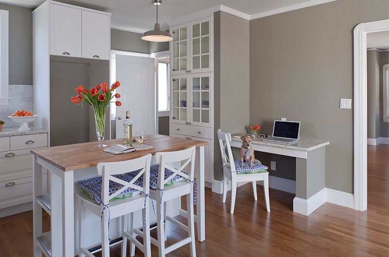
The latest trend in interior design and decorating has seen a grand and at times vibrant use of colors that dazzle with energy and playfulness. The modern homeowner has become far more accepting of brilliant colors in the last few years, as designers have moved away from the 90s trend of beige and cream. Yet, with this trend comes the risk of overcompensating on the brilliant side of the color spectrum and shaping interiors that have far too much color and very little serenity. The idea that a neutral color palette results in a snooze-fest is as much a myth as the perception that bright colors are not befitting of a sophisticated setting.

by Tamara Magel Studio
Most people who have color commitment issues or are too lazy to redecorate every season or two tend to opt for a neutral color scheme. But this is precisely where one starts going wrong with this approach. Decorating with calm and neutral shades requires as much attention and care as the use of bold hues. Creating a calming effect, neutrals are a great choice for both the public and private spaces in the home. And today we tell you how to decorate using neutrals with purpose and panache –
1. Subtle Shades of Neutrals
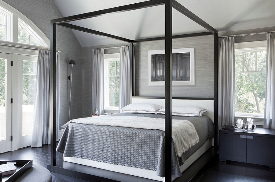
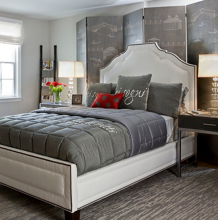
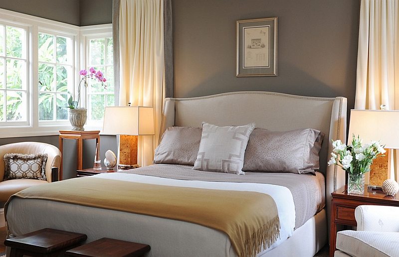
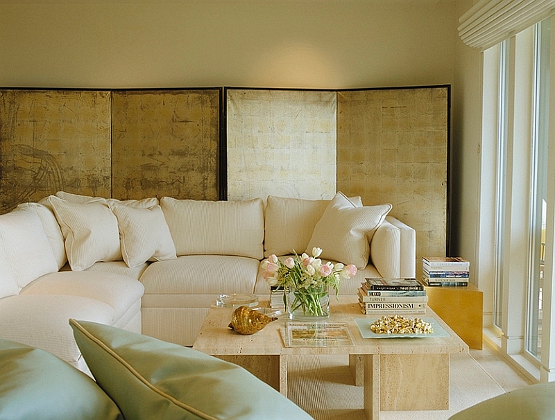
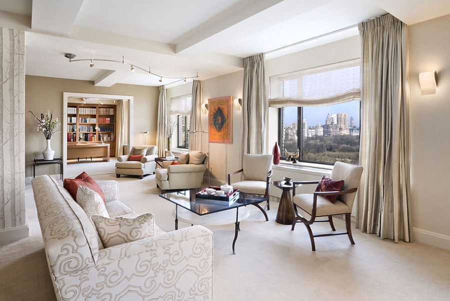
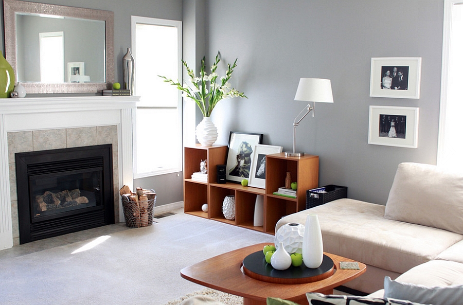
Using a neutral color scheme does not mean you need to just stick to one kind of neutral. It also does not limit the range of shades that you can use. Combine the different shades of cream, gray or even white to create interiors that vary from the breezy to the cozy! Gray has arguably become the hottest neutral of the last few years, and the ‘gray craze’ only seems to be growing by the day. One of the advantages of using the many shades of gray is that you can combine both hot and cool hues of the color to fashion a stunning space. This ‘tone-on-tone’ style of decorating also looks classy and is almost never out of style.

2. Tantalizing Textures
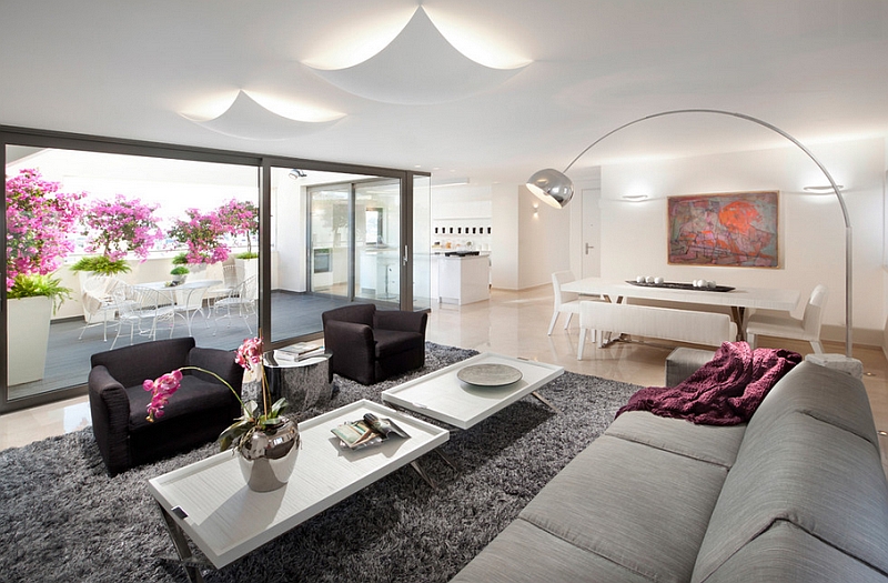
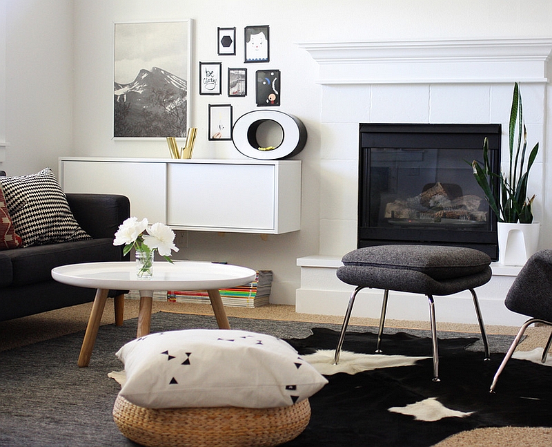
We often pay so much attention to the visual aspect of decorating and get so engrossed with color that the idea of shaping an interior with textures seems to elude us. A room draped in neutral shades can still seem exciting when you introduce a wonderful combination of textures. The use of leather in the living room lends an air of luxury, while decor crafted from natural fibers like wicker and bamboo gives the space a more soothing appeal. Plush rugs, a gorgeous Pashmina throw or two and some beautiful throw pillows combine to paint a comfy and elegant picture.

by Elad Gonen

by Brian Dittmar Design
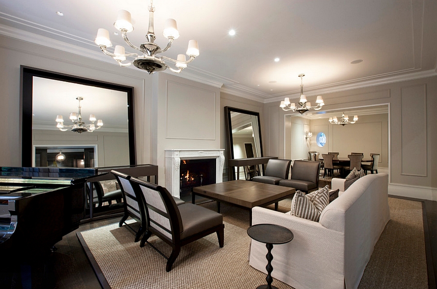
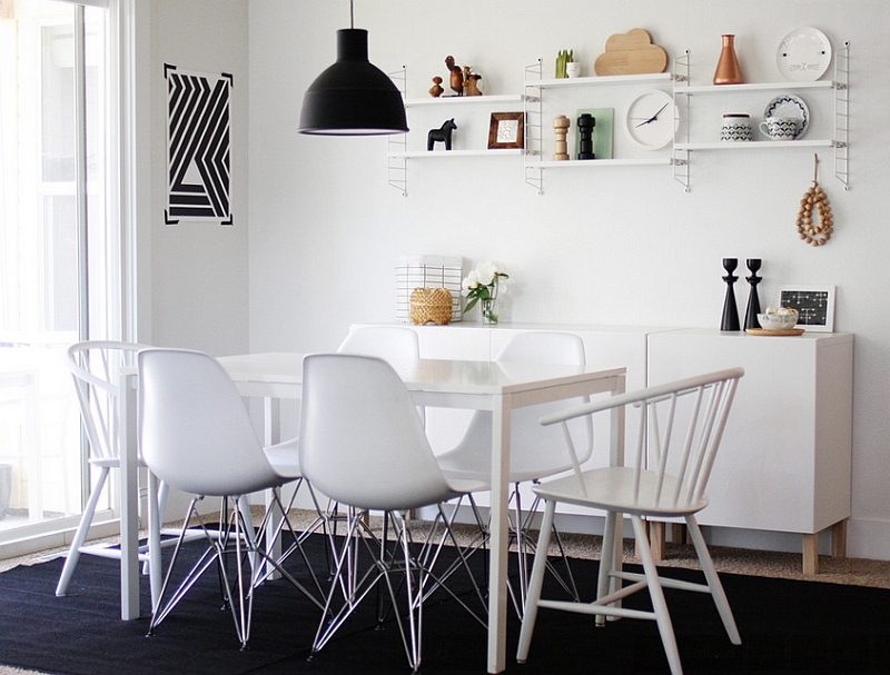
3. Shiny Silver and Glittering Gold
The last two years have not only seen a bold spurt in the use of color, but also the presence of bright metallic accents in design and decorating. Many modern designers are taking inspiration from the retro designs of the 60s and 70s to fashion modern reinterpretations that sizzle in gorgeous golden, silver and copper finishes. This approach was so evident that one of the biggest names in global design circles, Tom Dixon, embraced this trend with his latest Gentleman’s Club that stole the show at this year’s Milan Design Week.

Simple pendants, elaborate chandeliers, smart chairs, subtly placed vases and exclusive nightstands can all be used to usher in a dash of metal without disturbing the neutral color scheme. In fact, these sparkling accents look far more attractive when coupled with a calm color palette than one that uses brighter hues.

by dSPACE Studio Ltd
4. Varied Geometric Patterns
If shades and even textures seem all too common to you, then try introducing diverse shapes that give the interior plenty of geometric contrast. Since most contemporary living rooms, bedrooms and dining areas are dominated by simple straight lines, an odd curve ball here and there helps a great deal indeed. In fact, varied geometric shapes often usher in a sense of excitement far more effectively than the use of diverse shades or colors. Unique coffee tables that stand out visually, plush ottomans in interesting shapes and innovative DIY wall art additions are a few of the many choices on offer.

by Corynne Pless Photographers
5. An Ode to Nature
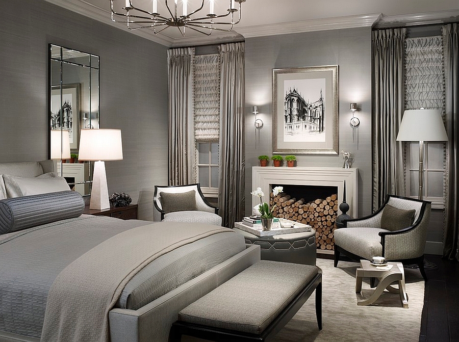
Sustainable design and eco-friendly materials have become much more than a mere fashion statement in the last decade. Bringing you closer to nature even in a posh, urban setting, natural materials and neutral color schemes go hand-in-hand with effortless ease. Furnishings made from rattan and bamboo are durable, lightweight and can also take the rigors of life on the porch or out in the backyard. Another great way to add inviting warmth to the neutral color palette is through the use of wood in different finishes that lend contrast to the space both visually and texturally.

by Caroline Bass Citi Habitats
6. A Dash of Black Magic
Nothing gives definition and sharpness to a space in neutral colors like black! Instead of using black in an excessive fashion, use it to lend shape to the room, demarcate spaces and accentuate the architectural features and decor additions that you wish to highlight. The idea here is inherently simple and timeless. If you want your lighters shades to create the maximum visual impact, then they need to be paired with darker tones in a balanced and elegant fashion. Black is the icing on the cake that truly completes this interplay between the light and the dark!


by Jennifer Hagler
7. Dazzle with Lighting
As always, lighting plays a crucial role in bringing the best out of the neutral color palette. In most cases it is natural illumination that seems like an ideal match for the unassuming color scheme. The golden rule of lighting is to make a room filled with lighter hues lighter and one with darker hues darker! Since we are going with pale and neutral colors, let the space feel as natural, open and airy as possible. Once dusk sets in, use multiple layers of accent, focused and ambient lighting to get the job done.

by Vanni Archive/Architectural Photography

by Michael Abrams Limited
Have you ever noticed how the best rooms and inspirational interiors are often the ones that seem the simplest of them all? Interior decorating is not what you can add, but what you can take away, and a neutral color palette allows you to do this in the most natural fashion. Of course, you can always add a hint of color to make it seem more appealing and personalized!

by Leclair Decor

by Suzie Parkinson from SÜZA DESIGN