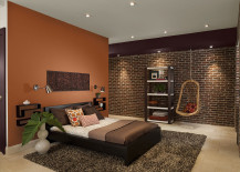
Is it just us, or does orange get a bum rap? In addition to being nearly impossible to rhyme, it tends to be one of the last crayons picked out of the box. But when used properly, this sunny color can infuse a room with a balanced sense of energy and vibrancy — a bold feel that’s less garish than red and a happy mood that’s not as juvenile as yellow. If you’re hoping to invigorate your home with a punch of orange, read on for some techniques that will allow you to try it out in a tasteful but impactful way.
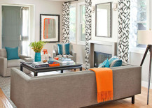

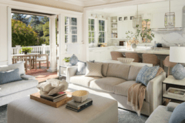
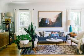
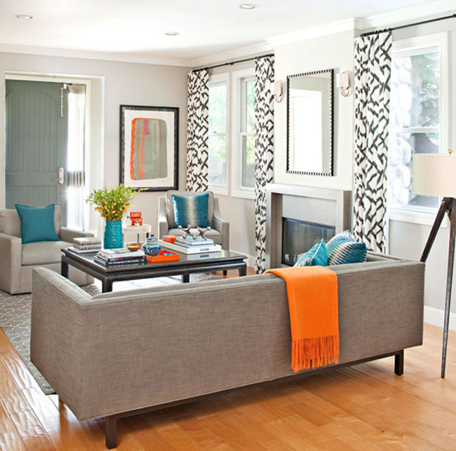
Just like a little shake of cinnamon or a few flecks of saffron (both of which happen to be in the orange color family), it only takes a touch of orange to add visual interest to a space. Seen at Better Homes and Gardens, this living room illustrates the point well: just a few accessories in shades of clementine and tangerine are enough to create a splash without overpowering the other decor.
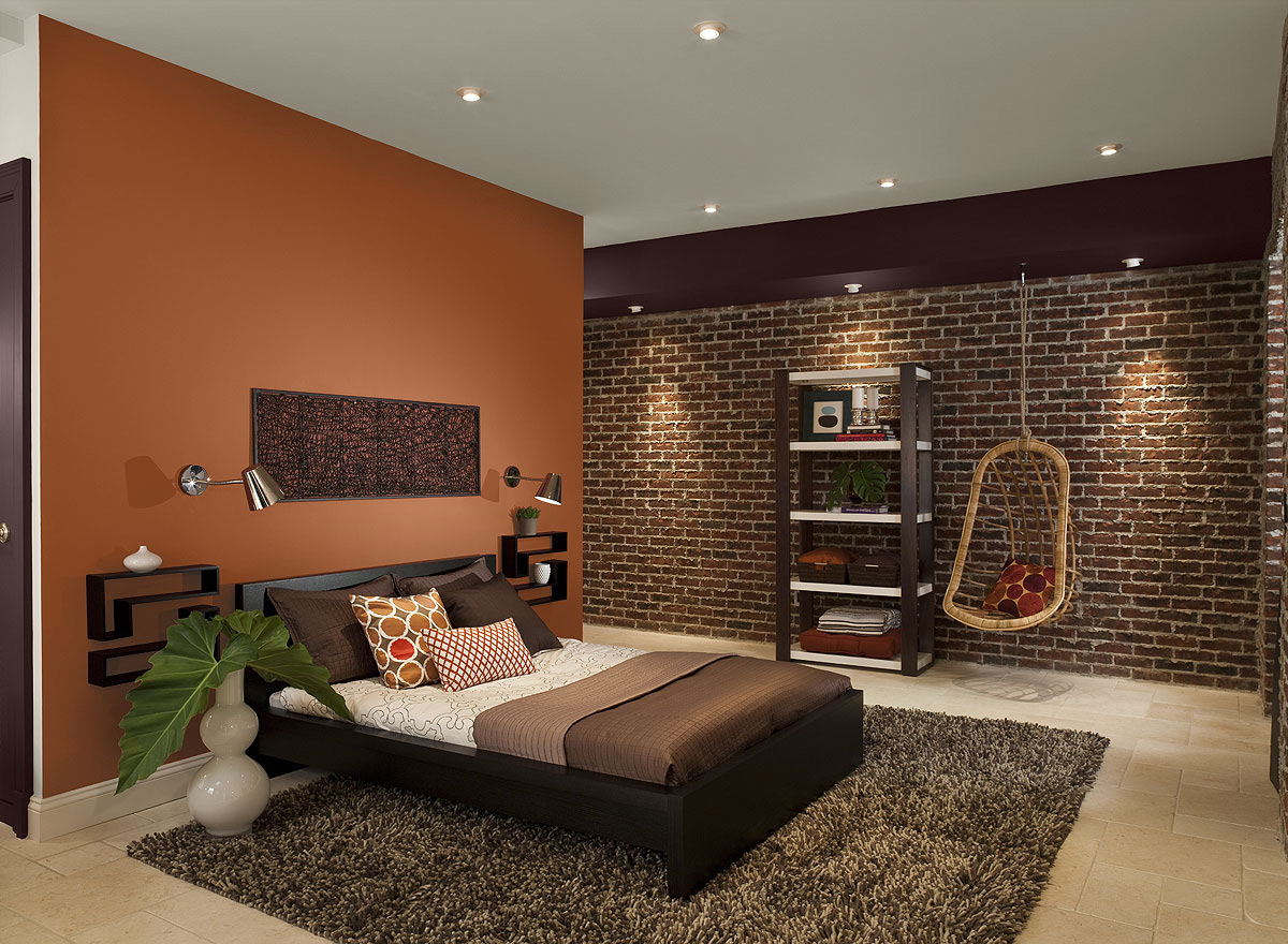
One of the things that might scare you about decorating with orange is its boldness. To utilize it in a more subtle way, combine it with a less contrasting color like brown. As you can see in this paint pairing put together by Benjamin Moore, “Fall Harvest” moves into “Caponata” in a way that is very gradual and not harsh to the eye.
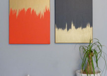
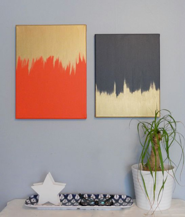
Orange tends to have a youthful feel to it, but if you’re worried about it coming off as too casual or even cheap, pair it with gold. As you can see from this simple DIY art project featured on Dans Le Lakehouse, gold elevates orange to the next level when they’re placed side-by-side, and this doesn’t just go for wall art. You could do the same with gold-accented furniture, accessories or table settings.
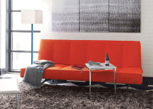
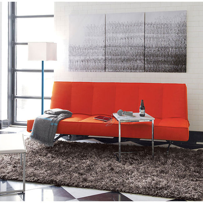
Another way to keep orange looking tasteful is to keep your furniture selections modern. While a more traditional style of couch might look inexpensive or tacky in a shade of orange, this sleek sleeper sofa from CB2 actually seems even more futuristic and pricey in this hue.
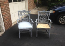
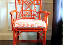
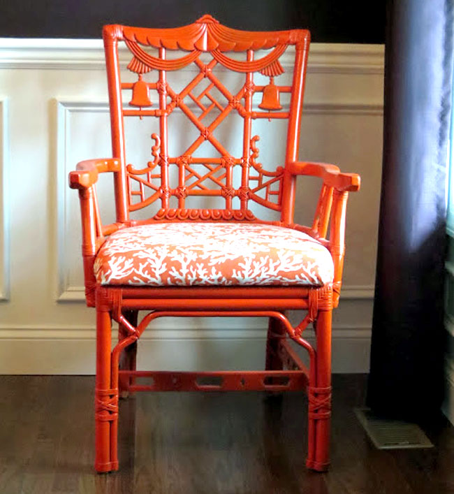
On the other hand, orange can add contemporary flair to a retro piece when done very deliberately. The trick is to choose something that has a very obviously period form, like this marvelous chair seen on Chinoiserie Chic, and then paint or upholster it with a pop of color that would never be seen during that era.
Because it’s so saturated, orange complements patterns in a fresh way, while the patterns help out by breaking up some of the heaviness. Take this DIY folding chair seen at Design for Mankind, for example. It might look too extreme if the seat itself were also orange, but the trendy chevron balances out the pop of color in a way that harmonizes instead of competing.
![]()
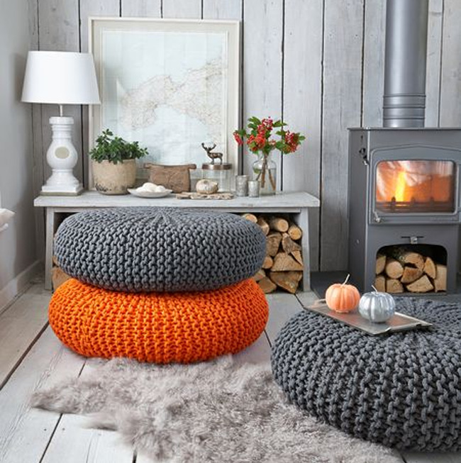
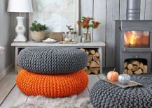
While pairing it with gold gives a feeling of opulence, orange coupled with silver or grey lends an air of sophistication. You could even use larger swaths of grey and orange like the Nordic House knitted poufs seen here, and accent with smaller bits of silver shimmer.
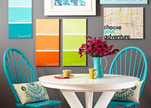
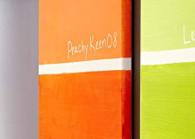
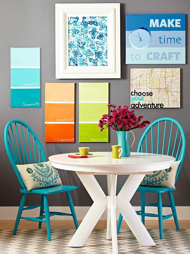
Another way to incorporate just a spot of orange into a room is with cheeky wall art, like this DIY project seen at Better Homes and Gardens. A play on the iconic Pantone color swatch, this literal use of the hue attracts attention without detracting from the other elements in the space.
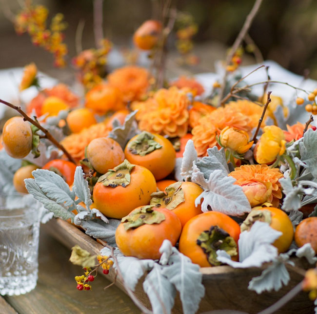
If you’re attracted to orange but want to start out with a more non-committal way of incorporating it, flowers, fruits and veggies are temporary solutions that will allow you to take a test-run with the color. We suggest copying Santa Barbara Chic‘s grocery store-chic centerpiece as a way to dip your toe into the paint can without going off the deep end.
We hope you found our tips useful. Now get ready to infuse your home with some persimmon, tangerine or creamsicle!