Welcome to our comprehensive guide on understanding analogous color schemes. If you’re a designer, artist, or simply someone interested in the world of color, this article will provide you with valuable insights and practical tips on utilizing analogous color schemes effectively in various creative endeavors.
Analogous color schemes, also known as harmonious color schemes, play a vital role in the world of design, art, and aesthetics. They offer a visually pleasing and cohesive approach to color composition, making them a popular choice in interior design, graphic design, fashion, and beyond.
So, let’s dive into the world of analogous color schemes and explore their definition, psychology, implementation, and impact across different creative disciplines.
What Is An Analogous Color Scheme?

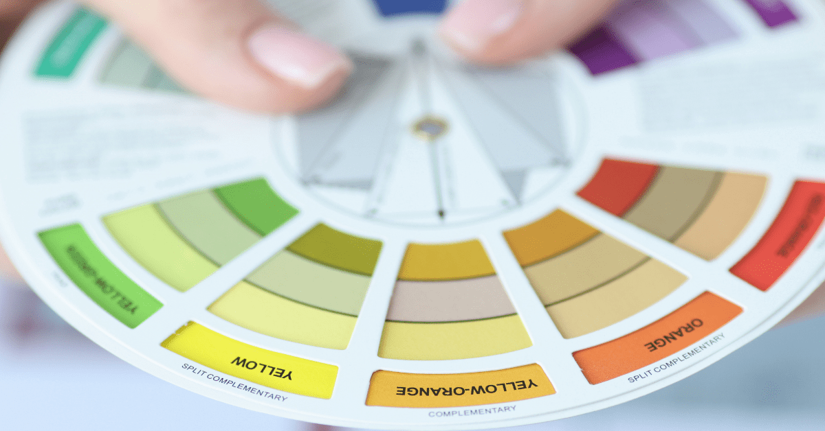
Analogous color schemes refer to a group of colors that are adjacent to each other on the color wheel. These colors share similar undertones and create a sense of harmony when used together in a design or composition. Understanding the relationship between analogous colors and the color wheel is essential for mastering the art of color harmony.
The Psychology Behind Analogous Color Schemes
Colors have the power to evoke emotions and influence human perception. Analogous color schemes, with their seamless transitions and subtle contrasts, can create a calming, unified, or energetic atmosphere depending on the specific colors chosen. By delving into the psychological impact of harmonious color schemes, designers can strategically use colors to convey specific moods and messages in their work.
Implementing Analogous Color Schemes in Design
Implementing harmonious color schemes in your design projects can be a powerful way to create visually pleasing and harmonious compositions. Here are some practical tips and inspiring examples to help you make the most of harmonious color schemes in your creative endeavors:
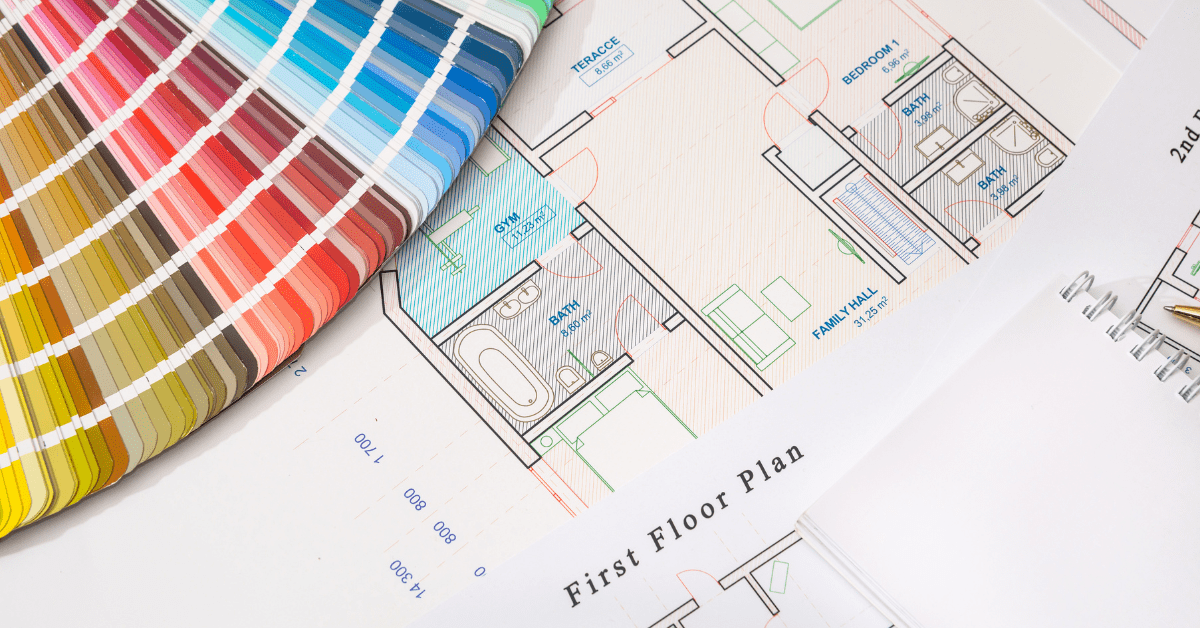
Selecting the Right Color Combinations:
Start by choosing a primary color as your focal point. This will be the dominant color in your scheme.
Identify adjacent colors on the color wheel that harmonize with the primary color. These will be your analogous colors.
Consider the number of analogous colors you want to include; typically, 2 to 3 colors work well.


Balancing Warm and Cool Tones:
Analogous color schemes often feature a range of warm or cool colors. Strive for a balance between these to create visual interest.
Warm tones like reds, oranges, and yellows can add energy, while cool tones like blues and greens can bring a sense of calm. Find the right equilibrium for your project.
Creating Contrast and Focal Points:
To avoid a monotonous look, introduce subtle variations in shades and tints within your analogous colors.
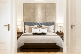
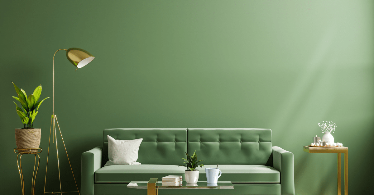
Use the primary color for focal points, such as important elements in a graphic design or a statement piece of furniture in an interior design project.


Experimenting with Neutrals:
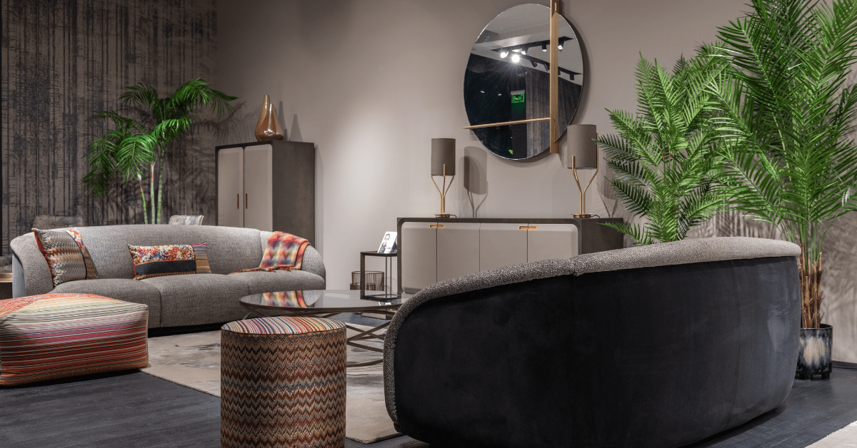
Introducing neutral colors, such as grays, whites, or blacks, can complement and balance the analogous color scheme, adding sophistication and contrast.
Considering Lighting:
Analogous color schemes can appear differently under different lighting conditions. Test your color combinations in the actual lighting environment, where they will be used to ensure they achieve the desired effect.


Drawing Inspiration from Nature:
Nature is an excellent source of inspiration when choosing color schemes. Study the colors of natural scenes, such as sunsets, forests, or seascapes, for inspiration and guidance.
Examining Successful Designs:
Analyze the work of experienced designers who have effectively used harmonious color schemes. Understanding their techniques can provide valuable insights for your own projects.

Common Mistakes When Using Analogous Color Schemes
While analogous color schemes offer numerous benefits, there are potential pitfalls that designers should be aware of. Recognizing and avoiding these common mistakes is crucial to ensure your designs achieve the desired impact:
Color Clashes:
Avoid using analogous colors that clash or create visual discomfort. Some adjacent colors on the color wheel may not naturally harmonize, so careful selection is essential.
Monotony:
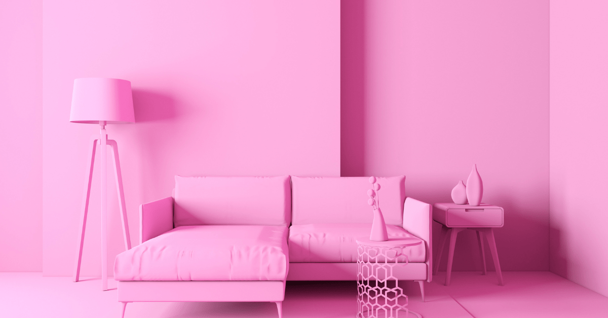
Using too many analogous colors without introducing variety can result in a monotonous and uninteresting design. Ensure there are elements that break the pattern and add contrast.

Lack of Focal Point:
Neglecting to establish a focal point can lead to a design that lacks direction and fails to draw the viewer’s eye. Use one color as a focal point to guide attention.
Overlooking Contrast:
While analogous color schemes emphasize harmony, it’s important to maintain some contrast to create visual interest. Vary the shades, tints, or tones of the chosen colors.

Ignoring Lighting Conditions:
Failing to consider how lighting affects the appearance of analogous colors can result in designs that look different than intended in specific environments. Always test your color choices in the target lighting.
Neglecting User Experience:
In digital design, it’s essential to consider the user’s experience. Ensure that the text is legible and the chosen colors do not cause eye strain.


Lack of Context:
Consider the context and purpose of your design. Analogous color schemes may work well for certain projects, but they may not be suitable for all. Tailor your color scheme to the project’s goals and audience.
Not Seeking Feedback:
Avoid working in isolation. Share your design with peers, mentors, or clients to gather feedback and make necessary adjustments.
By understanding these potential mistakes and following the practical tips for implementing analogous color schemes effectively, you can harness the full creative potential of harmonious color compositions while avoiding common design pitfalls.
Embracing the Versatility and Beauty of Analogous Color Schemes

As we conclude our exploration of analogous color schemes, we hope you’ve gained a deeper understanding and appreciation for the power of color harmony in creative endeavors. Whether you’re a seasoned professional or an aspiring artist, embracing the versatility and beauty of such color schemes can enrich your work and captivate your audience.
Analogous color schemes are a valuable tool for designers, artists, and creators across diverse disciplines. By mastering the art of color harmony and understanding the psychology of color, you can elevate your designs, evoke emotions, and communicate compelling narratives through the seamless blending of analogous colors. So, go forth and unleash the creative potential of harmonious color schemes in your next project!