We at Decoist love a good dose of color. Do you ever notice how a powerful color can change your mood? There are clear relationships between colors and emotions, and today’s post is dedicated to this phenomenon (also known as color psychology). Whether you’re a fan of bold reds, soothing blues, sunny yellows or regal purples, understanding the relationship between color and mood can help you strategically select hues for your interior, especially if you’re trying to beat the winter blues.
From the basics of color psychology to the subtleties of radiant interior design, the tips, suggestions and photos that follow are meant to inspire and empower. And don’t worry–even if you don’t have the freedom to paint your walls, there are plenty of ways you can strategically incorporate color into your home. Read on for more details…
Color Basics
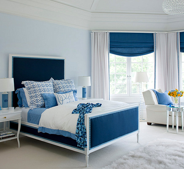
Let’s start with the basics. There’s a reason why blue is such a popular color for interiors. It calms and soothes, ushering in a sense of tranquility. Blue evokes the color of the sea and the sky, and darker shades such as navy can create a relaxing nautical vibe. Below we see an elegant bedroom decked out in shades of blue. [from Plum Interiors]

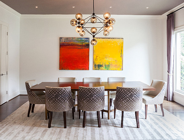
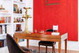
Bright shades such as vivid yellow and bold red have the power to energize (and even stimulate the appetite). No wonder they’re a popular choice restaurants, as well as residential dining rooms. [from Laura U, Inc.]

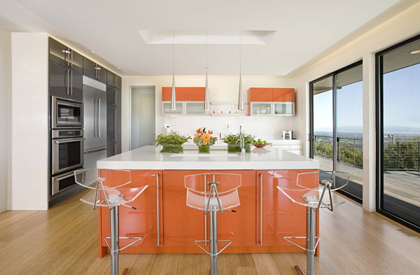
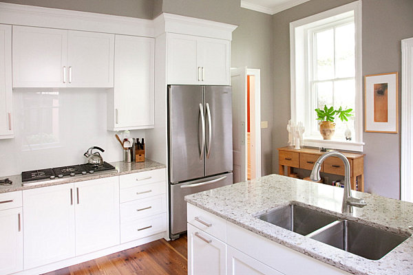
Orange has a similar stimulating effect, which is why this shade is appropriate for the kitchen, especially when you’re needing that extra boost of energy to finish the dishes! [from Mark English Architects]

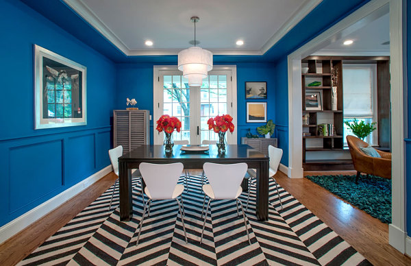
While we know that blue can be a calming hue, remember that each color has a variety of shades, all of which can have very different effects. For example, electric blue is often more energizing than calming. While this shade may not be ideal for relaxing spaces such as the bedroom, it’s an unexpected yet perfect choice for dining rooms, especially when combined with vibrant flowers, as shown below… [from Annie Elliott Interior Design]

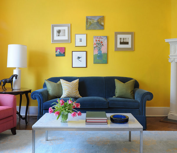
The same goes for yellow! Soft lemony shades are soothing, while richer, more saturated shades of yellow have an energizing effect. The living room below features a variety of bright colors, making it a visually intriguing space. [from Annie Elliott Interior Design]

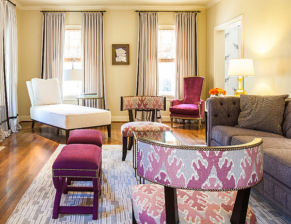
Let’s talk neutrals. Often grounding and stabilizing, neutral hues such as cream and gray can also veer into dreary territory if they’re not accented with other cheerful colors. The beige living room below is given a rich feel with the help of upholstery in varying shades of purple. [from Laura U, Inc.]

Gray can also be calming–a perfect hue for uniting a range of decor choices in large and small spaces alike. Dependable and steady, this color can be kept from drabsville with vibrant accents, such as the taxicab yellow throw pillows and coffee table tray in the living area below. [photo by Julie Soefer for Laura U, Inc.]

It’s All in the Shade
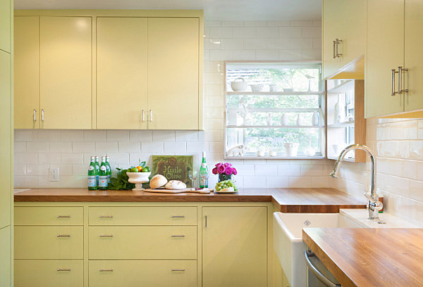
Now that we have a basic idea of the colors that energize, the colors that calm and the colors that lay the groundwork for vibrant accents, let’s take a look at a very important subtlety–the shade of choice! It’s impossible to say that one color always has the same effect. For example, remember those taxicab yellow accents in the picture above? Imagine an entire room painted in that hue… It would definitely be intense, and even upbeat. But yellow can also take on a soothing effect, especially when lemony shades are selected, as shown in the kitchen below… [photo by Whit Preston for TAS Construction via Houzz]

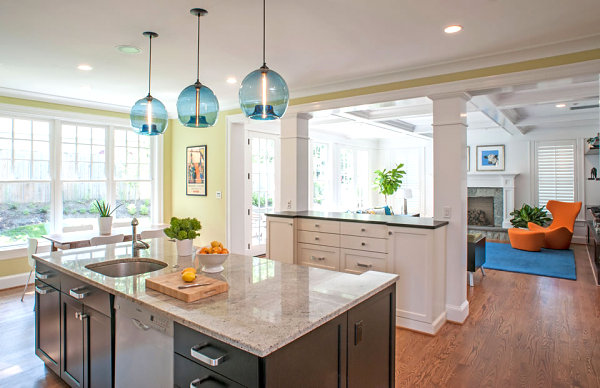
Green is another color that can have many effects. Typically seen as peaceful, healthy and happy, green also blends well with a variety of hues, from violet to orange. But a rich kelly green living room has a very different effect than the tranquility of this citrus-toned kitchen… [from Annie Elliott Interior Design]

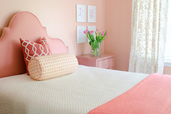
Would you paint your bedroom fire orange? A powerful choice, it may also be a bit too stirring to inspire sleep. But lighten the tone and you have coral… a soothing shade of red-orange that evokes the serenity of the beach. [by John Magor Photography for JWS Interiors]

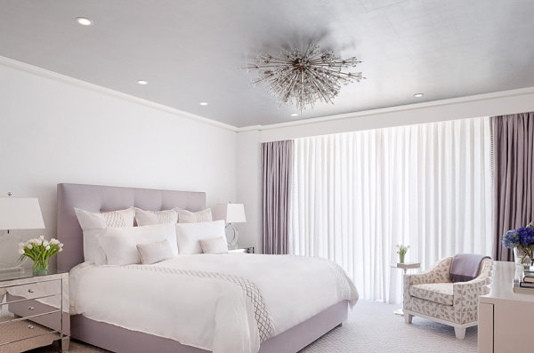
Similarly, purple is rich, mysterious and regal. Lighten it up a bit, and you have the chill yet elegant hue of lavender, another popular choice for bedrooms… [from Bungalow5]

Many people stereotype gray as a cold, lifeless color. But if you choose a warm shade of gray, the hue becomes inviting rater than institutional! The kitchen below utilizes the perfect shade, especially since the space blends cool metallic tones with warm wooden accents. If you’re wondering about the origin of this “greige,” it’s SW7023 Requisite Gray by Sherwin-Williams! [photo by Matt Bolt for Gaylord Design LLC]

Accents are Powerfully Subtle
You’ve decided that you need calm, relaxing rooms to thrive, yet you can’t help but be drawn to bold colors… What’s a design enthusiast to do?! Don’t ever forcefully eliminate a color you love! Color psychology is helpful, but if you use it to separate you from intense, bright colors that naturally make you happy, it becomes counterproductive. So you’re an orange fanatic that is a bit overwhelmed by spaces entirely covered in this hue… Rather than covering your walls in fiery shades, liven up you living room with orange cushions and pillows! Yes, accents make all the difference. [from CB2]

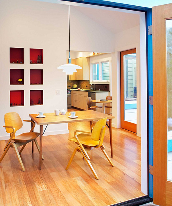
Accent shades are particularly helpful for renters. So you can’t paint the walls of your home… But maybe you can enliven the back of your shelves with contact paper that can be removed without pulling the paint from the surface. And if you DO own your home and you favor the clean look of white walls, don’t hesitate to paint an accent surface, such as the square recessed shelving below. [from Chr DAUER Architects]

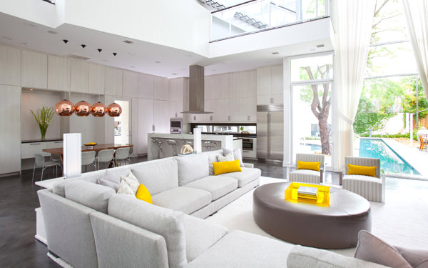
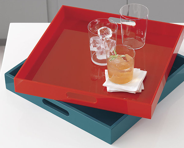
Another way to add a bright pop of color? Shiny trays, such as the Square Hi-Gloss Swoon Trays from CB2 featured in the next image…

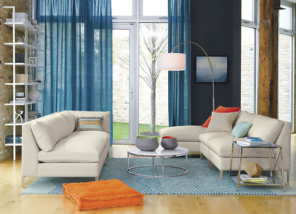
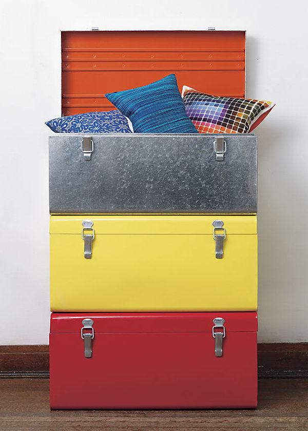
Get creative with your accessories. The bigger the item, the more color you can add to your interior. Whether you choose a vibrant pillow or a radiant trunk, choose colors that uplift you. Remember that hues such as red, orange, yellow and electric blue are energizing! [from CB2]

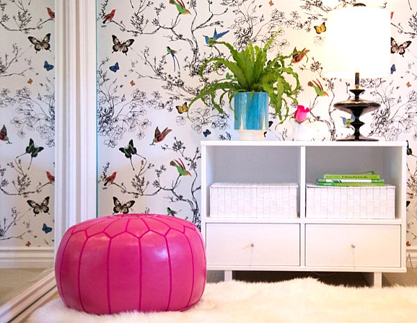
Decorative accents are a particularly helpful way to incorporate colors that you love…but that you just couldn’t see on your wall. For example, a hot pink pouf is a great way to celebrate a rosy, vibrant hue without overwhelming the teen bedroom in the next featured image. [from JAC Interiors]

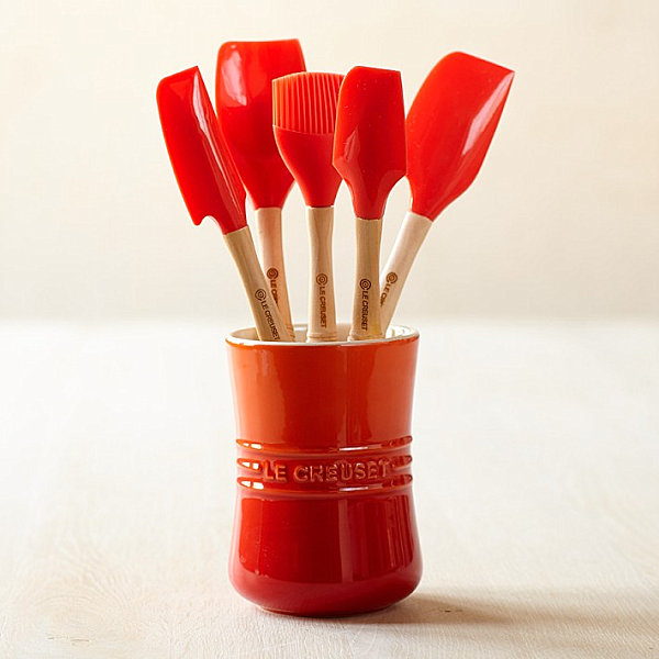
And even the smallest of touches can make a big difference. A container of bright red cooking tools really pop against the white walls of a kitchen, especially on the coldest and starkest of winter days. [from Williams-Sonoma]

Understanding the effect of colors on our emotions can be crucial in helping us design spaces that lift our moods. While it’s important to pay attention to emotions associated with key colors, this information should never be used to exclude your favorite hues from your home. If you love a color, it likely uplifts you on some level! Finding ways to work this hue into your space can be as simple as going with a shade that is calming rather than stimulating, or incorporating a vivid, energizing color through accent pieces. Then again, certain rooms such as kitchen and dining areas are the perfect places to try out bold, intense shades. Happy decorating!


![Backyard Landscaping Trends [10 Inspiring Ideas!]](https://cdn.decoist.com/wp-content/uploads/2021/04/Fire-Pit-in-Backyard-28968-270x180.jpg)