The task of choosing where and how to display artwork or hang photos around your home can seem like a daunting one. You may have a handful of photos or prints that you love but you don’t feel like they’re enough to stand on their own so you’re looking for the best way to display them. Creating a gallery wall is a great way to show off your artwork and add some personality to your home!
Deciding What Type of Gallery Wall is Right for You
There’s a number of things to consider when choosing how to best implement a gallery wall in your home. Think about what you’re hoping to accomplish with your gallery wall. Do you want to make the living room of a small apartment seem more interesting by adding colorful photos and frames without taking up precious floor space, or are you looking to fill that blank wall above your desk with a photo wall that’s crisp and unified looking? Once you decide what you’re trying to convey with your photo wall, it’ll be easier to decide between a clean layout like a linear or grid style versus a salon-style that’s more of a focal point in the room.
Before you get started on creating your gallery wall, we need to discuss one of the most important parts of your design process: the planning stage.
Always Plan your Gallery Wall
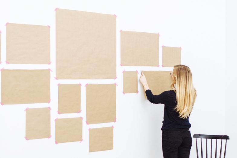
The importance of planning your gallery wall before you start hanging your art cannot be overstated. As with any project, you should be measuring twice, hammering once. Using paper templates is a great way to plan your gallery wall. The paper templates help you envision the sizing of each photo, work out the spacing and layout of your gallery wall, and helps with installing your hanging hardware in the right places. Another option if you don’t want to use paper templates is to lay out your pieces on the floor in an area that’s the same size as your wall space. Even if you want your gallery wall to be a salon-style that’s more eclectic, take the time to plan your wall before you start hanging.
If you’re still wondering how to get started you can watch our step-by-step Decoist Video: Gallery Wall How-To.

Part of planning your gallery wall is choosing which wall or area of your home you want to display your artwork in, as well as choosing the right layout. Here are a few suggestions on how to implement a photo gallery wall in your home to get you started:
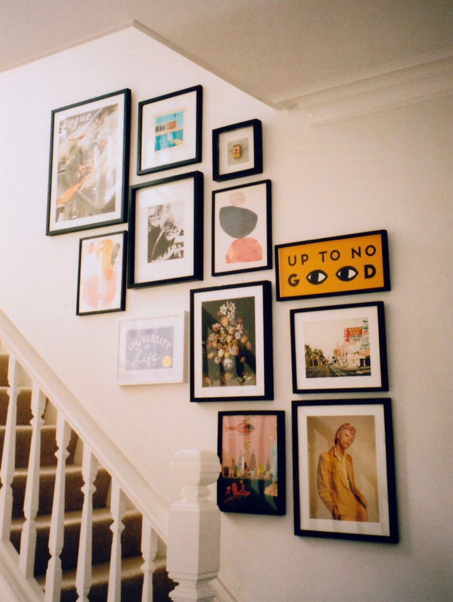
An Ascending Staircase Gallery
Having a consistent starting point is key for a successful gallery wall, which can make implementing a staircase gallery tricky. Use painters tape and a measuring tape to measure a certain distance—60” for example—from each step, and mark it on the wall. Use one piece of tape to connect those points ascending the stairs so you have a centerline to work with. When hanging art on a stairway, you’ll also want to keep some of your pieces in line with each other in a more grid-like or linear formation to create a more uniform look.

Leaning on the Ledge
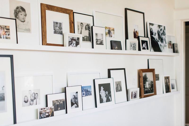
As a more non-committal way to implement a gallery wall, you could create a picture ledge gallery. Your pieces can sit on the ledges and lean against the wall rather than hang as a wall display. This is a more practical option for people looking to decorate a space without leaving holes in the wall. Using ledges also allows you to swap out your art easily. If you have a lot of pieces you love and not enough walls in your home, you can switch out your art as frequently as you like. You won’t have to account for the placement of the nails or hanging hardware every time you want to change out a piece.

Mixing the Media
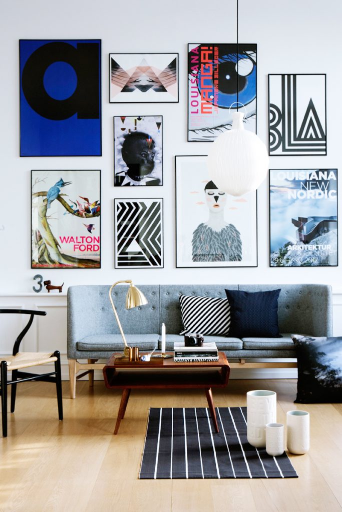
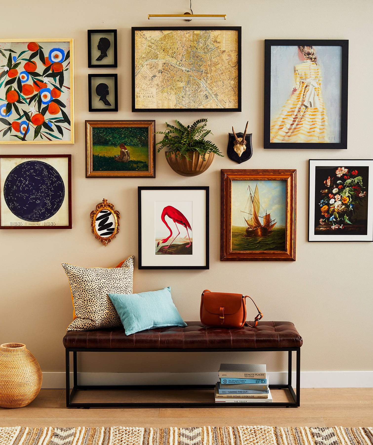
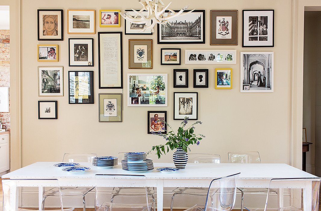
A gallery wall doesn’t need to only be for displaying photos. It can make it a lot more interesting if you mix photos with pieces of artwork, plus adding in wall plates, tapestries, or mirrors. When displaying a mix of photos and artwork you should embrace the lack of symmetry and have a more salon-style layout. Salon-style gives a more relaxed, personalized look because you’re choosing the positioning for everything. The mix-and-match media makes it much easier to expand your gallery wall too, without having to worry about matching frames or the spacing between each piece every time you want to add something new. The salon-style gives you the most creative freedom and makes the most sense for a mixed media gallery display.

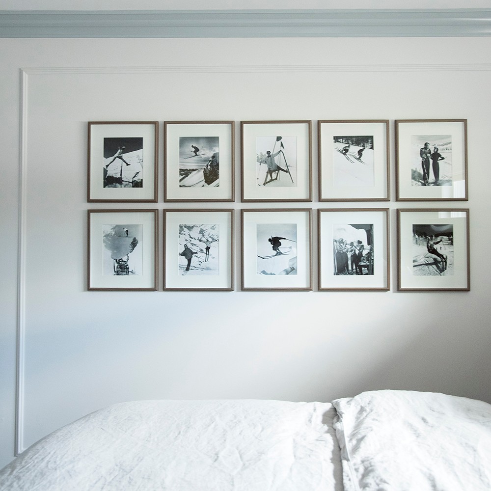
The Classic Grid
If you’re looking for a high impact layout that makes a statement, the grid layout is the way to go. When using a grid layout for your gallery wall, you want to pay extra attention to the details. Make sure all the artwork or photos are the same size, and that they are all framed to match. You’ll also want to be precise with the spacing between photos and use a level for each photo to create the most symmetrical layout. The clean lines and symmetry add balance to the room without drawing all the attention but still looks impressive. The classic grid would be a great way to display a series of family photos on a blank wall in your home.

A gallery wall makes for the perfect focal point in any room, but we’ve got more ideas on how to create a showstopping gallery wall in your bedroom.
A Top-Heavy Display
If the perfectly-symmetrical grid style isn’t for you, but you don’t want to delve too far into the looser feel of a salon-style wall, the top-aligned style is a happy medium. Many gallery walls are arranged to have the center as the focal point, but you’re going to make the top row your centerpiece by aligning them. The definitive line leads the eye, but you’re still free to play around with any pieces that aren’t in that top row. You can also use the top-aligned gallery layout style to display vertical pieces that vary in length, rather than lining up your photos based on the center of each piece.

No Cutting Corners Here
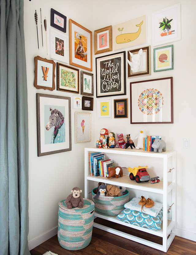
The corner wall layout is the best choice for when you don’t have enough blank space on one wall to create your gallery display, so you expand onto the adjoining wall. A corner gallery wall draws the eye without it feeling like it’s taken over a huge portion of a room. This layout works well to add a pop of color and brighten up a space like that sad, blank corner of your child’s bedroom or those plain white walls in the kitchen behind the breakfast nook.

If a corner wall gallery doesn’t seem like the right idea for your kitchen, here are a few more suggestions for creating gorgeous kitchen gallery walls.
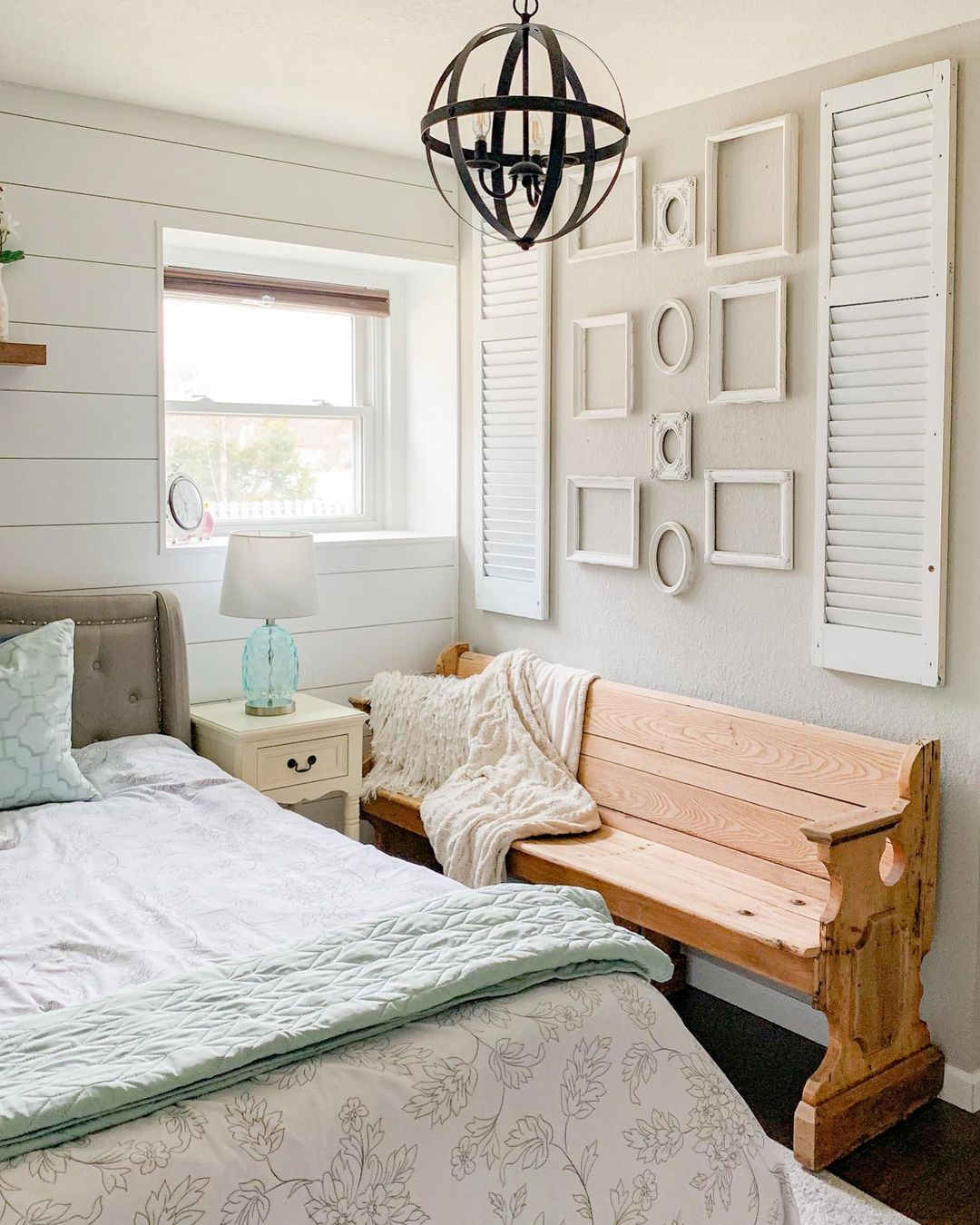
Just the Frames
For the truly indecisive decorator, you can create a gallery wall display that doesn’t have any photos at all! Take all those frames that you’ve been collecting for your gallery wall that you haven’t found the right photos for yet and hang them up anyways. Use multiple frames of varying sizes, shapes, and colors to create a wall arrangement that still draws the eye, even if you don’t have photos to display. You can add artwork slowly over time as you collect pieces you love or leave it as just the frames.

Starting from the Bottom
Inverting the focal point and having a bottom-aligned display rather than the top-aligned creates a place for the eye to rest. A bottom-aligned gallery wall layout is a good choice if you’ve chosen a wall space that is directly above a piece of furniture like a sofa because it creates a strong horizontal reference point. Having a bottom-aligned gallery display also allows you to have room to expand up as much as you want over time while keeping the solid foundation at the bottom.