Color combinations – they are the things that drive both our home decorating and fashion choices. Beyond the home’s functionality, colors are the most significant part of interior design and take up the most time as you plan for a new home. Of course, everyone loves a different color and enjoys a different color combination. While some might love to pair beautiful blues with white, others could prefer sunny yellows or gorgeous greens. But, pairing a neutral with a bold color is one thing. And finding a complementary color for a darker hue is a whole different ballgame. We look today at the best colors to pair with green with that in mind.

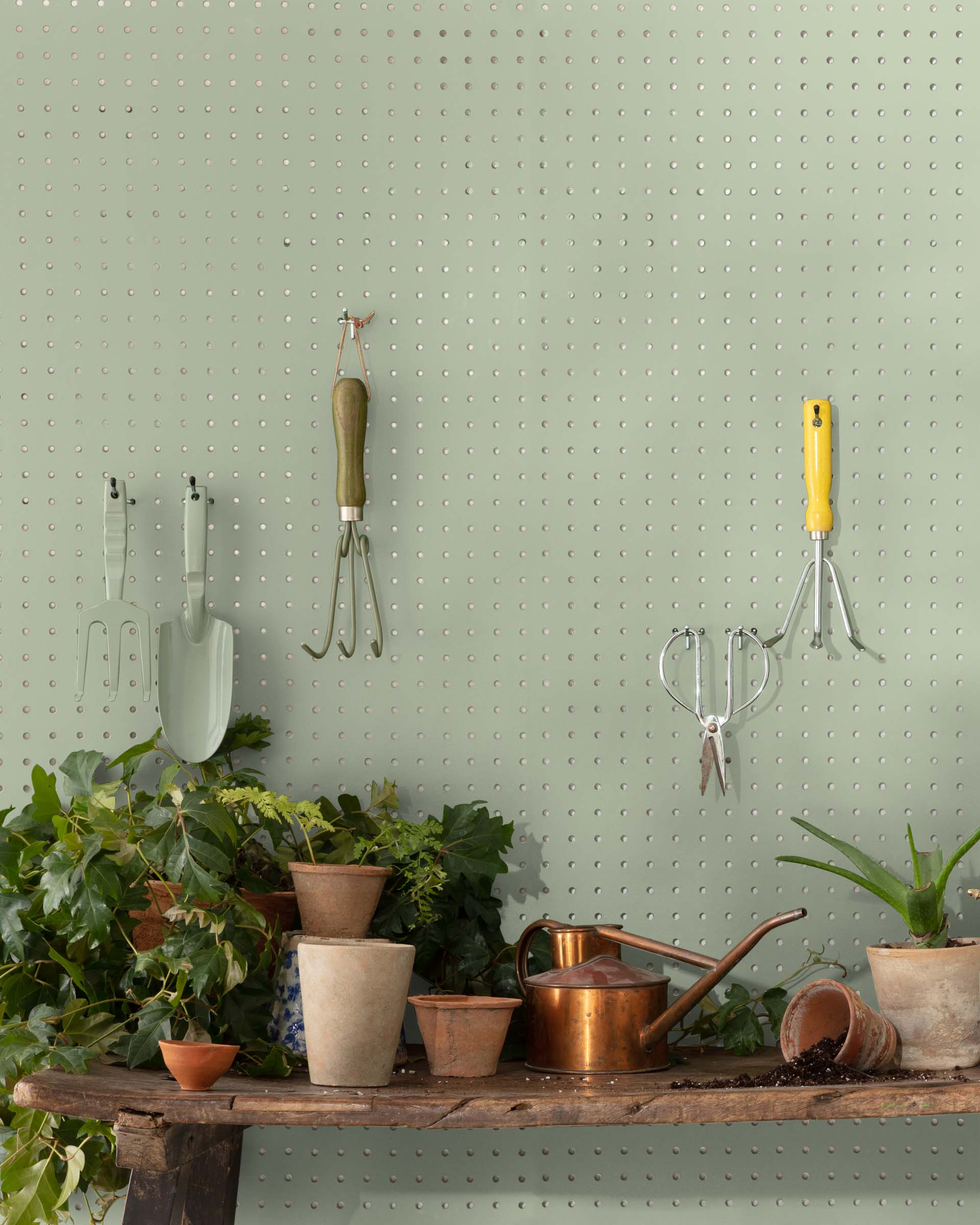
Despite how abundantly green is found in nature, for some reason, it is far less frequently used for home interiors when compared to colors like blue and yellow. Refreshing, calming, and energizing, green makes an impact almost every time. Its many shades ranging from deep green and olive to mint and pastel green, ensure that you have a wide variety to choose from – picking the shade that fits the size and style of the room. And for those looking to add this green goodness to their home, this is a look at colors that go with green –
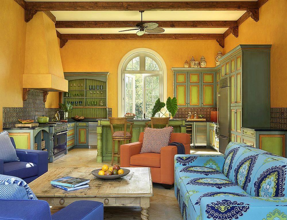
Green + Yellow
Yellow and green are easy combinations to pull off in even the tiniest rooms. It is a duo inspired by nature, the colors of a bright summer morning on a lovely green field! Adding these colors to a room brings a balance of brightness, cheer, serenity, and calm. The more common trend with this color combination is to pick a calming yellow backdrop for the room and complete the space with bright green touches.

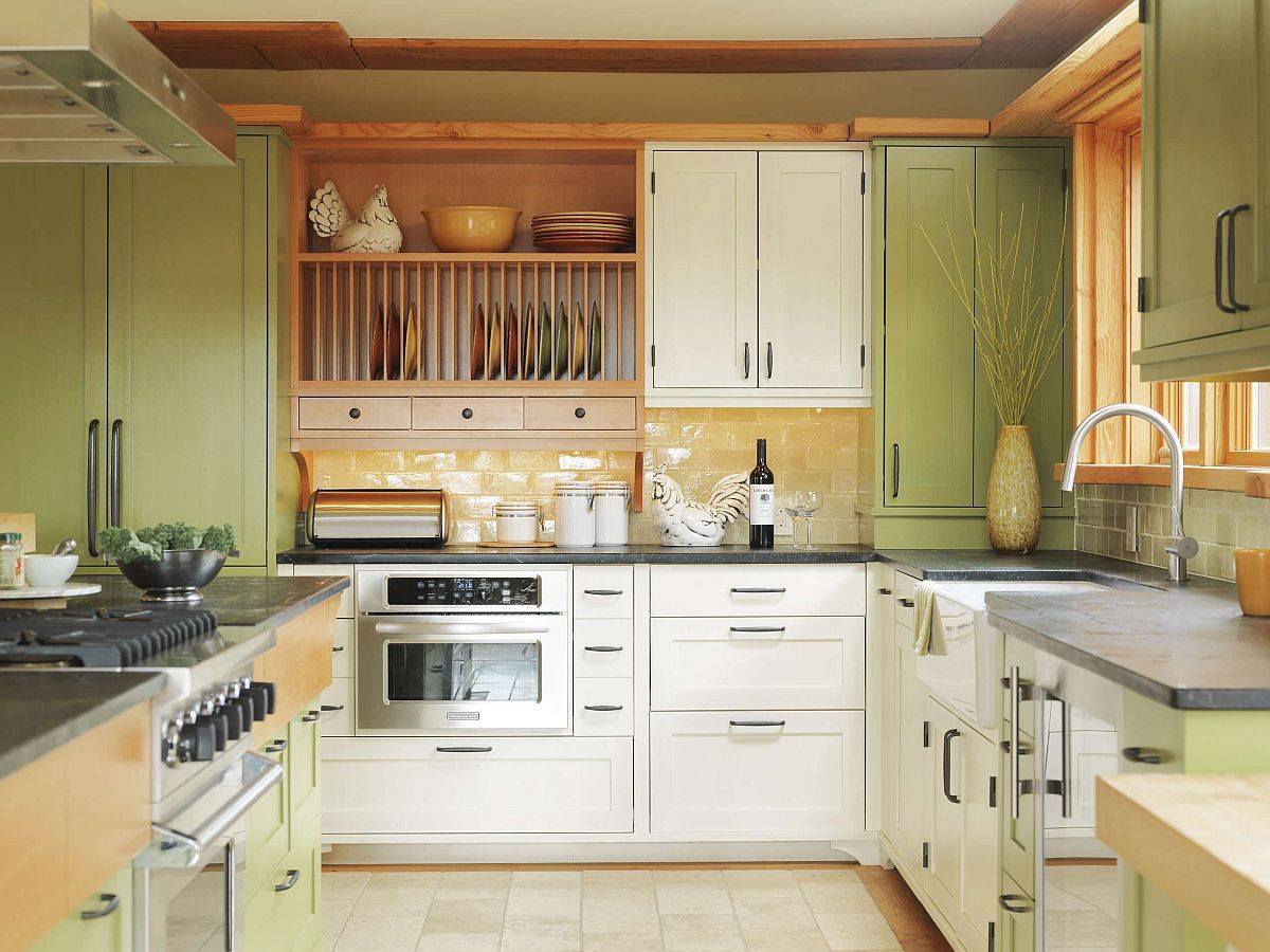
The balance between green and yellow allows you to transform a cold space into something fresh and inviting. When we think of green and yellow, spring comes to mind, and while these colors can be used and manipulated by using different hues, the fact remains that adding in a bit of yellow adds joy.

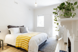
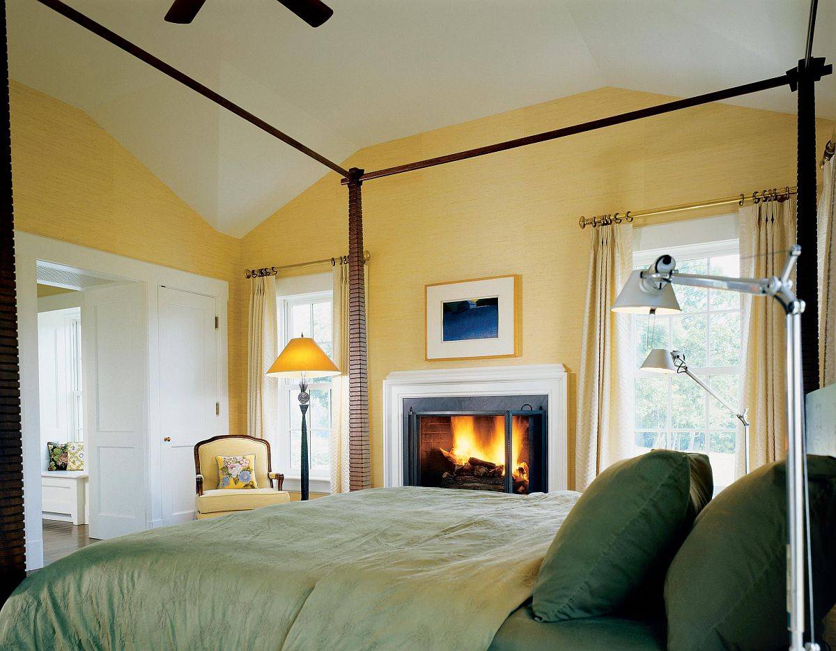
Yellow can also be calming when used in a paler, pastel hue. It cozies up this bedroom space and also provides tranquility. Using green shades in the bedding brings in a spring-like theme while keeping all the colors on the more muted side to not overwhelm the space.

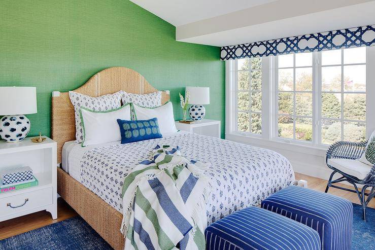
Green + Blue
Blue is a perennially popular color, and green only accentuates its beauty in a neutral room. Accents blue and green can be combined easily in rooms with various styles – from modern and beach to farmhouse and rustic. Green is a more gender-neutral color when compared to blue (which is often related to guys’ spaces), which opens up a wide range of decorating options.

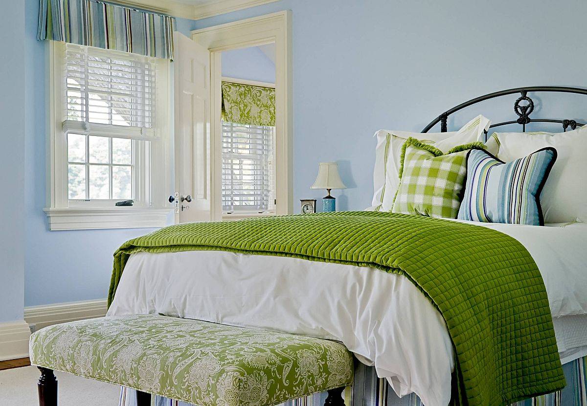
The green grasscloth wallpaper in this room provides a monochromatic background for the seagrass camelback bed. Because the wallpaper is simple, it allowed the designer to add bright blue patterns and textures to give the room a cheerful and jovial feel.
Tip: Don’t be afraid to mix patterns — Stripes, damasks, and ornamental and geometric patterns can go together, as seen here with a striped throw in complementary colors.

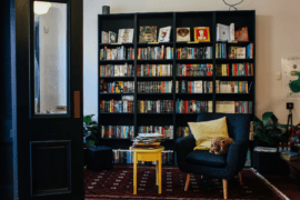
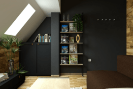
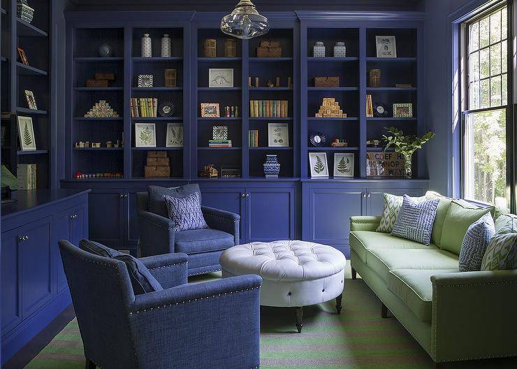
Navy takes the show in this intimate library. Keeping the vibe dark and moody quiets this space but adding in just a pop of light green with this sofa keeps the room from being too heavy.
When designing and choosing colors, you can have your space unbalanced. Sometimes if colors are par for par, the room can look too matchy-matchy. Design experts generally use the 60-30-10 Rule – 60% of a dominant color
30% of a secondary color and 10% of an accent color. Adding a hint of a new color adds a vital element and conversation piece.

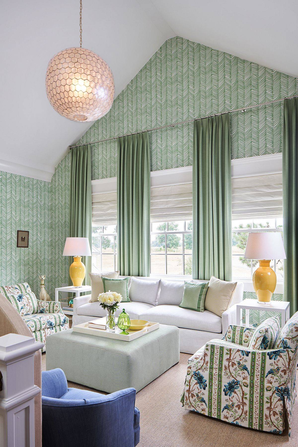
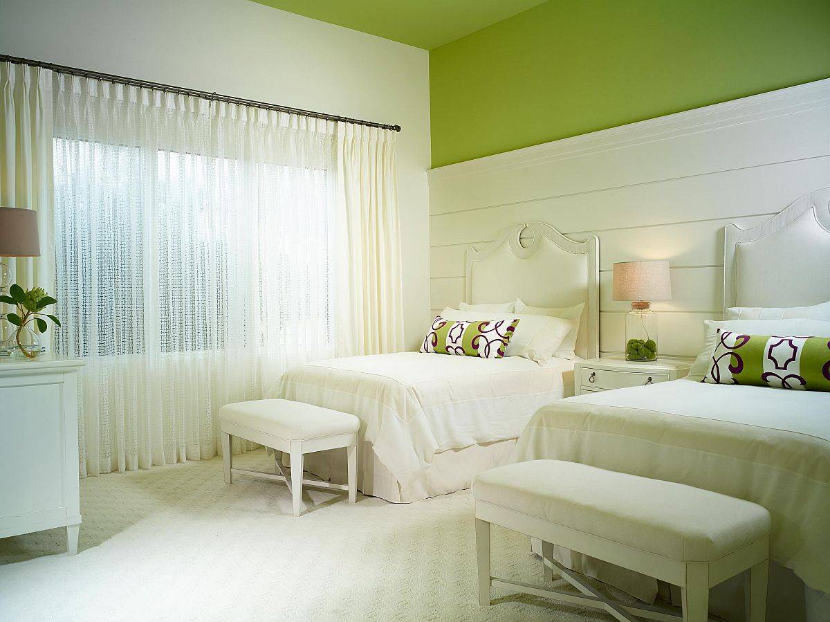
Green + White
We know that this pretty much goes unsaid, but any bright color coupled with a white backdrop for the interior is often our first go-to choice. And in the case of green, you cannot go wrong with this approach. Some of the best rooms that use the colors have a healthy dose of white, which provides a much-needed visual balance –especially in small spaces.

Crisp and clean is green and white paired together. The geometric floor-to-ceiling wallpaper provides a modern element to this classic living room. It gives just a hint of edginess without going overboard.
Tip: Take a look at the curtain height. Bringing the curtain rod up makes the window appear much taller, giving this room a grander look. If you have the height — use it.

Add in just a 3/4 lime green accent wall that carries onto the ceiling for a focal point of color. It takes this all-white room and gives it the right amount of needed color. You can also add complementary accent pieces in the same color.

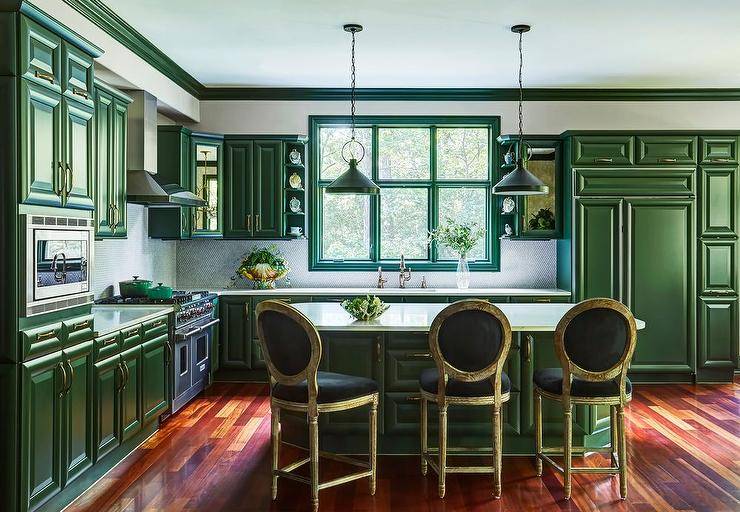
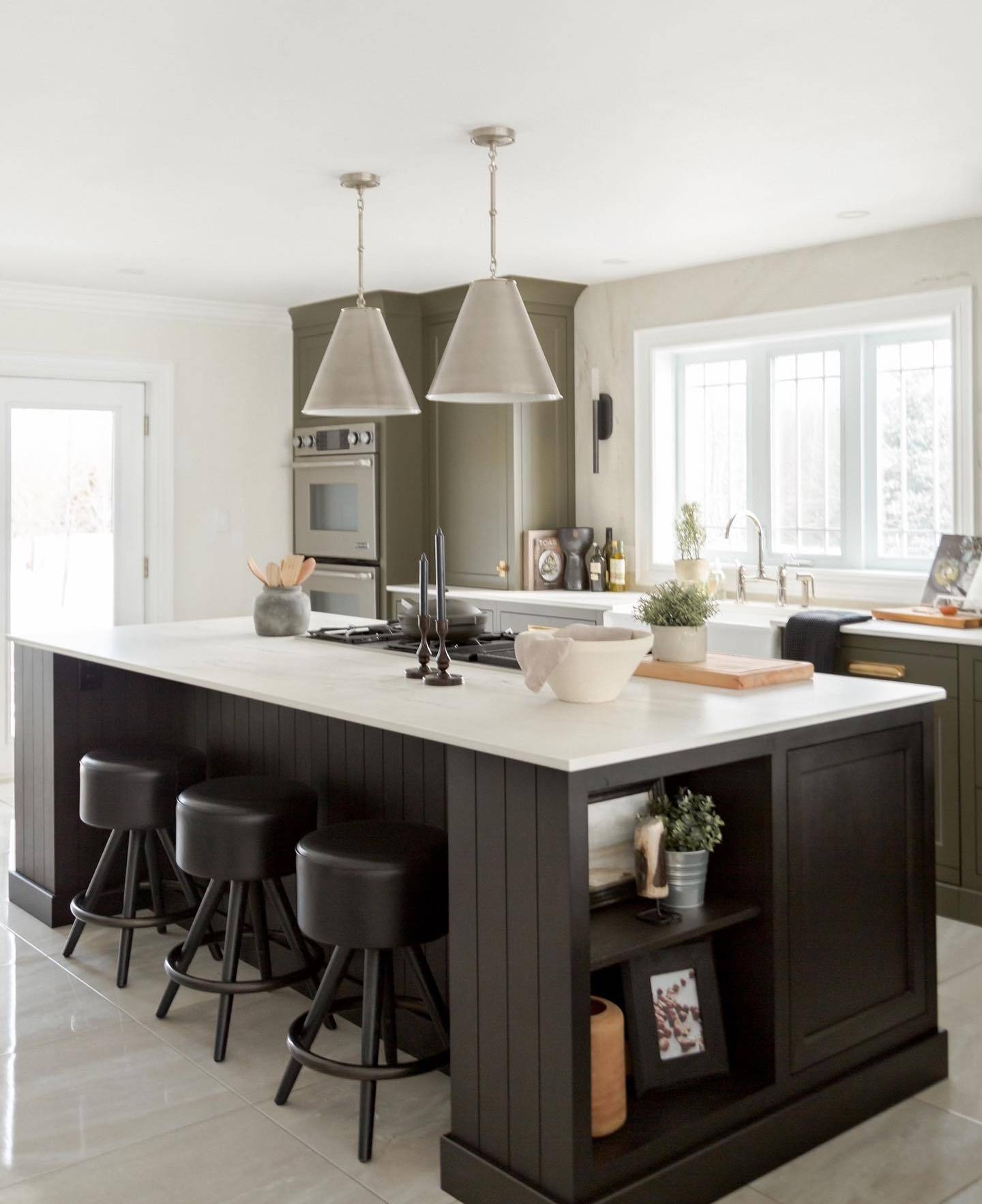
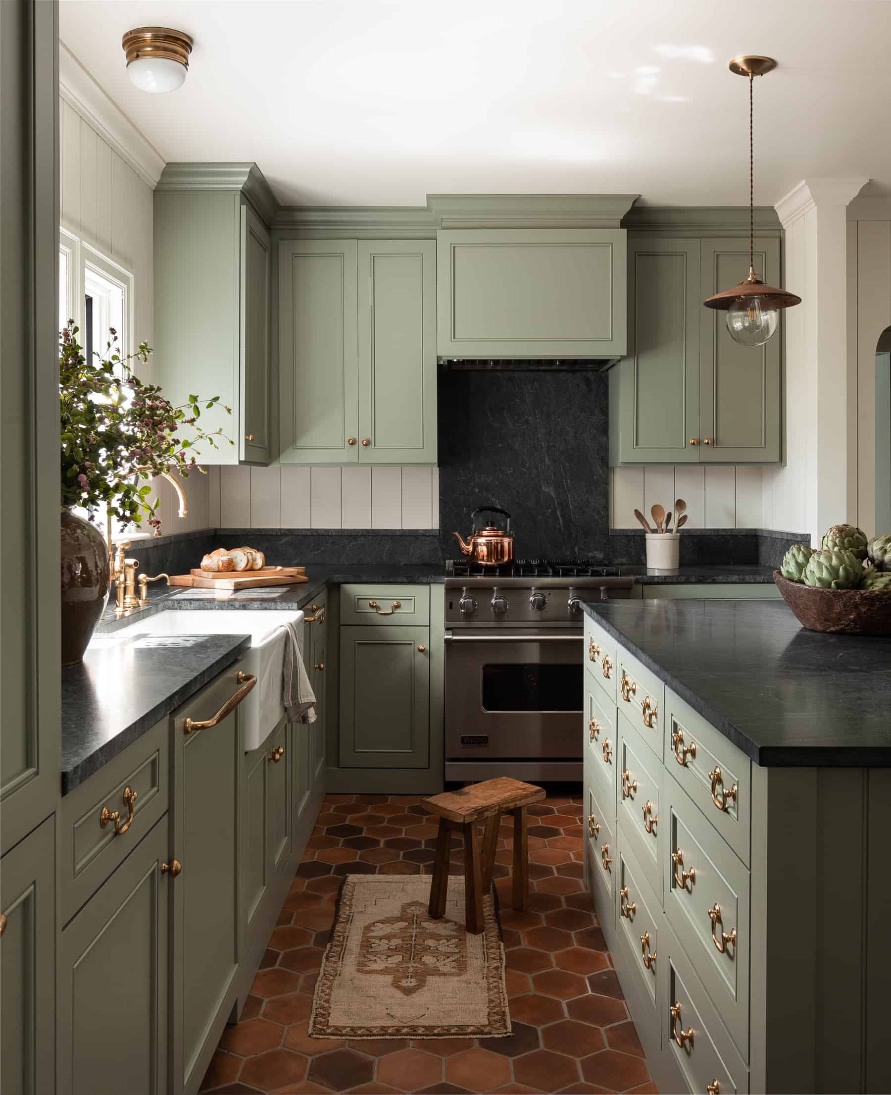
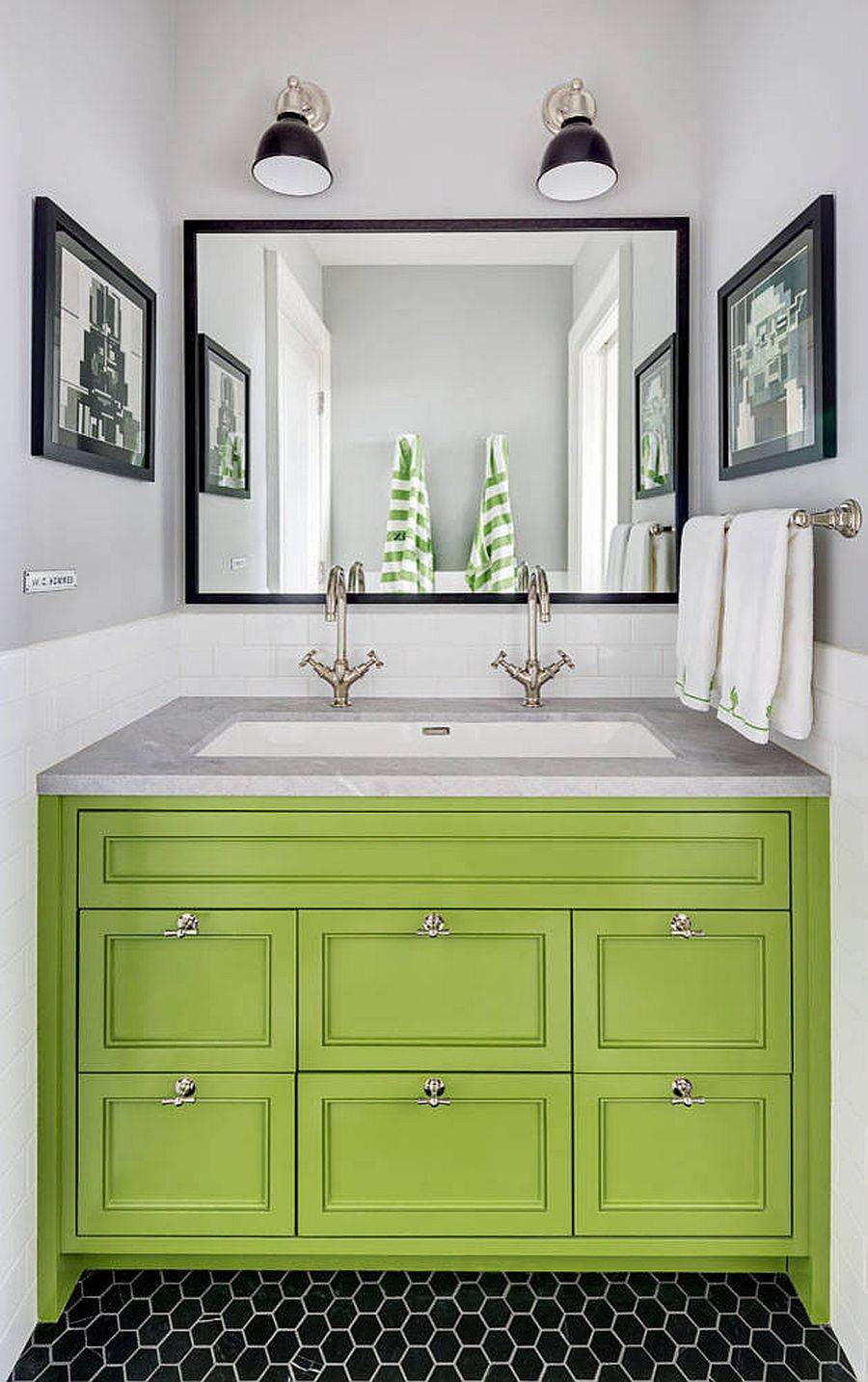
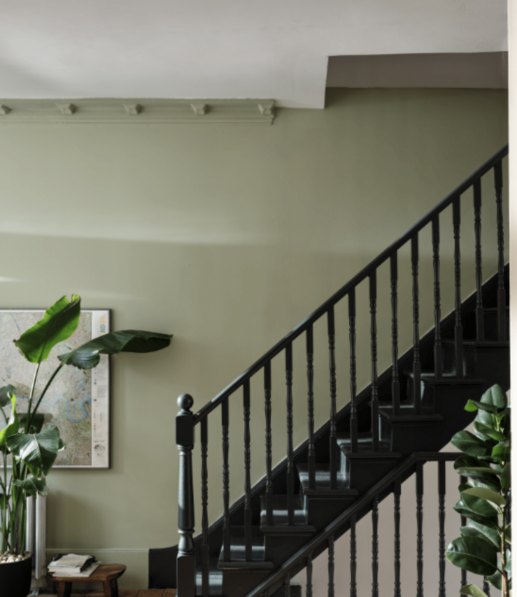
Green + Black
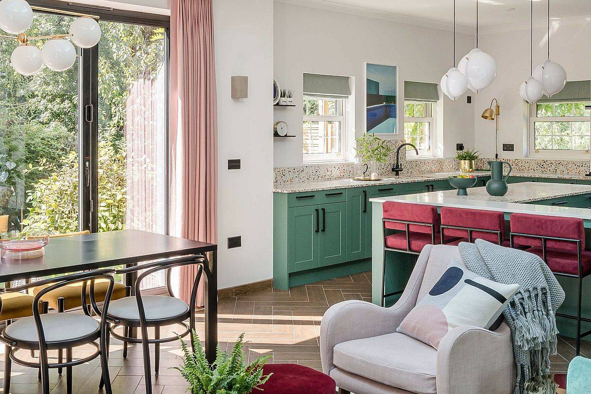
This eclectic kitchen is anything but boring. The striking emerald green is a show-stopper, and adding just a touch of black velvet to the bar stools adds sophistication and elegance.

In this kitchen, an earthy mossy green tone is used for the cabinetry, which provides a muted background to let this stunning large black island be the star of the show. Each color has a role to play, and sometimes green can be the star, but in this case, it makes a beautiful backup to the focal point of this kitchen.

On the opposite side of things, this kitchen allows the cabinetry to be the focal point but adds tremendous black elements with this stunning black countertop. I love how this designer didn’t shy away from adding brown tones to the flooring and the light fixtures.

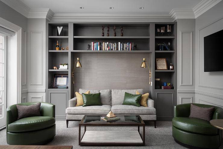
Green + Gray
Not happy with more white in your home? As the hottest neutral of the decade comes to your rescue, not to worry. Gray and green are not a particularly ‘natural’ color combination. But it can be incredibly charming when done right with the right shades of gray and green.

Dark grey can be incorporated with green as well. When working with dark grey, try not to use too light of a green. Working in accompanying greens like an olive or a dark hunter green goes nicely with dark grey and is easy on the eyes.
Textures like leather also work nicely with dark colors and look edgy. The mixture of modern furniture and traditional wainscotting and trim give this room an eclectic and cultured look.

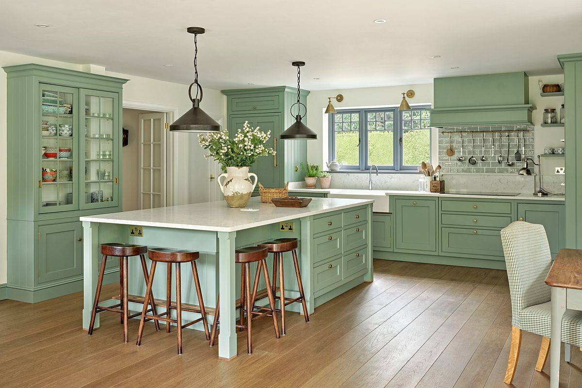
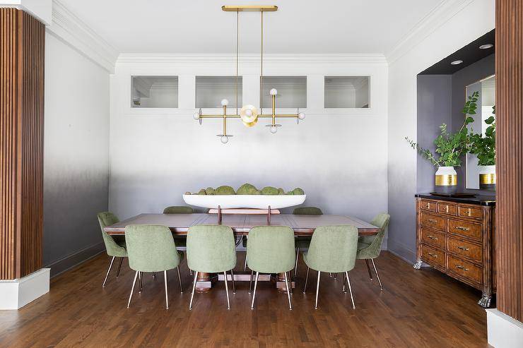
Green + Brown
In this seemingly simplistic dining room, one doesn’t almost notice all the different colors at play here. The focal point is the muted sage dining chairs, but do you see how warm the space is thanks to the brown tones from all the wood?
The subtle fading grey wall that starts at the bottom and tapers into an ombre halfway up is almost not noticed, but then when you do see it, it adds that wow factor.

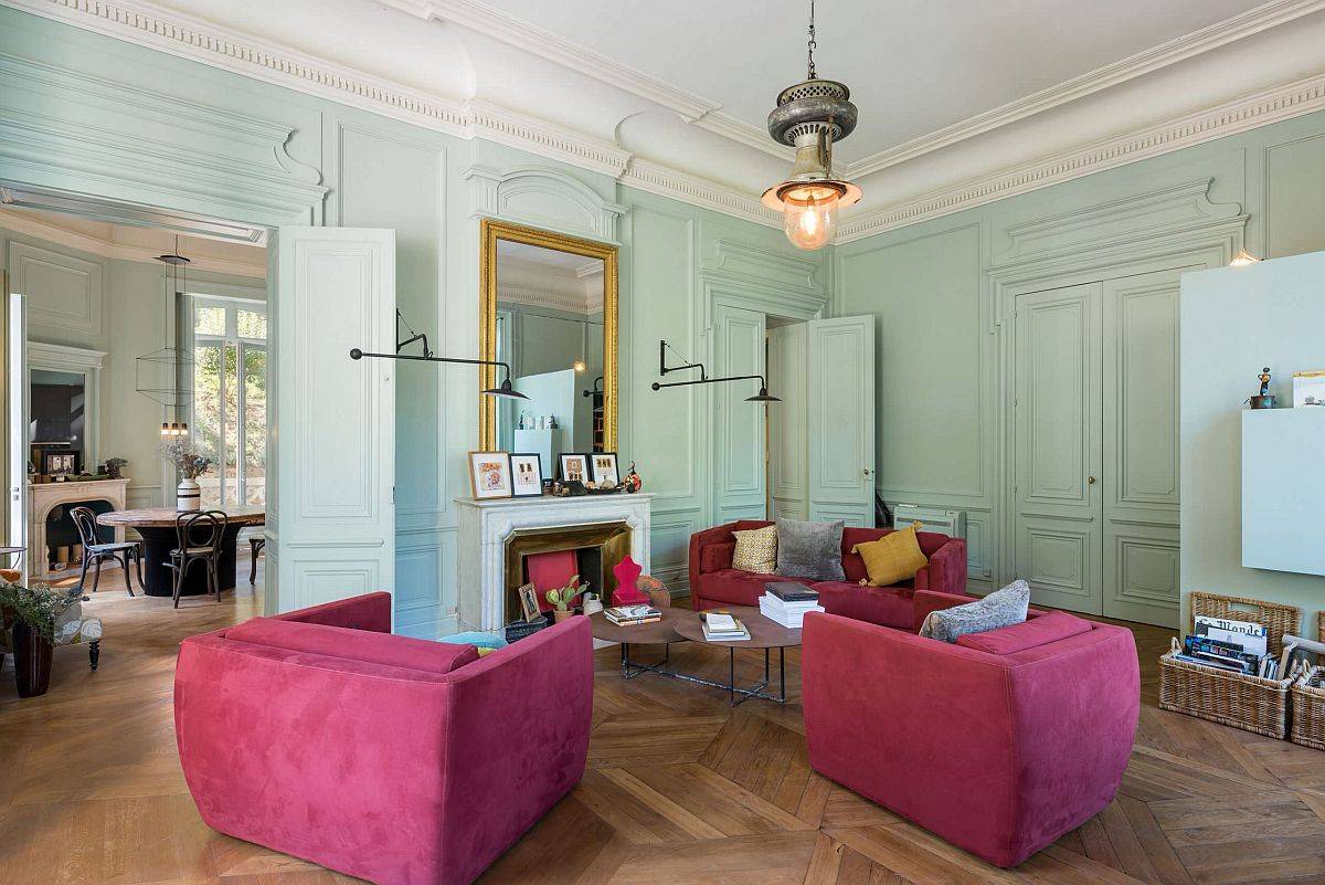
Green + Pink
This might come as a surprise for those who do not regularly follow decorating trends, but pink coupled with green is a color duo powering its way up the trends chart. Hot pinks like fuchsia are especially popular in this regard, and the combination brings a touch of feminine finesse.

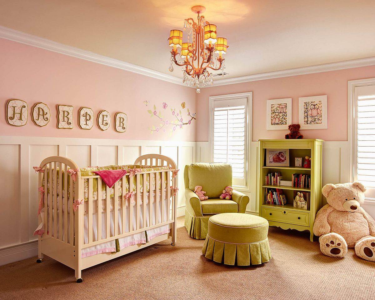
Pink and green are always classic choices for a girl’s nursery and are among the most popular color choices for design trends when planning a baby’s room. Blush pink paired with an avocado green strays from the pastel green and gives a more boho modern vibe.

Related Content: 18 Colors that Go With Pink: How to Decorate with Pink
Green + Purple
Green and purple can be used together to create bold, eccentric interiors, or you can use softer shades of purple to create a calm and tranquil space.
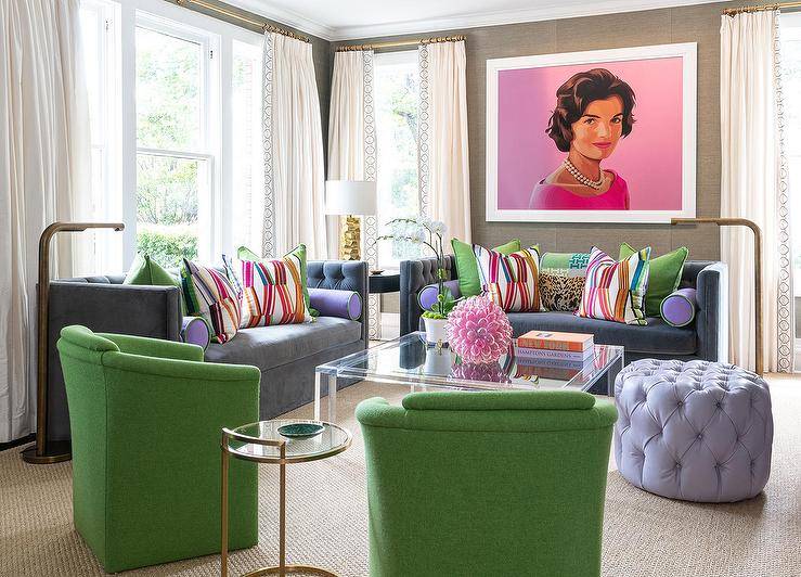
Several different shades of purple are used here to bring this space together with the one complimentary shade of bright green.

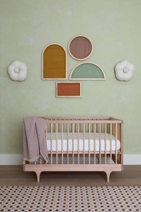
Like pink and green, purple and green can be used as a perfect color combo in the nursery. A modern and simplistic design is seen here in this nursery with a boho and hygge feel to the room.

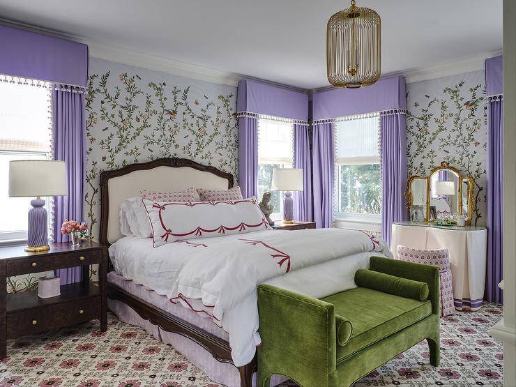
On the brighter side, this purple and green primary suite adds floral wall designs paired with a busy carpet, but it works for this space. Adding a velvet olive green settee at the end of the bed breaks up the purple in the middle of the room and adds sophistication.

Which color would you love to pair with green?
Best Tips for Adding in Green in the Home
- Greenery and plants – What do we love that’s green? Why plants and greenery, of course! Whether it’s real or faux, if you don’t want to commit to changing your space, you can always add in green with a bit of greenery.
- Small furniture or accent pieces – Try starting small with something like a green accent lamp or primarily green art. This will also help you decide if green is how you want to go.
- Base your green off your mood – The shade of green you use in your home should reflect how you want to feel. Different colors of green exude different feelings.
- Remember the 60-30-10 Rule – Divide the color of your room into these percentages —60% of a dominant color, 30% of a secondary color, and 10% of an accent color.
- Test your colors – Take your time and make sure you find the right hue. Buy swathes and test paint, leaving the paint on the wall for a few days to get a feel for what you want.
- Pull from patterns – When working with a pattern, whether in curtains, bedding, rugs, or wallpaper, pull the most significant amount of color from the pattern and use that shade or hue for your accent pieces.
Shades of Green and What they Mean
Whatever way you choose to incorporate green into your space, whether through painting the walls or furniture, consider the feeling or vibe you are after. Do you want a cozy room? A room of sophistication and elegance? Or are you after something dark and moody?
The shade of green you choose will play a big role in this.
Warm Greens
If you want to add a little color without going too bold, a warm green is your best bet. Warm greens tend to be rejuvenating and energetic without going overboard. A warm green is known for having undertones of yellow or orange.
A color like Saybrook Sage from Benjamin Moore is a great example. These warm greens also pair nicely with terracotta-like colors, which are trending right now for a fun neutral boho vibe.

Muted Greens
If it’s tranquility and peace that you’re after, a muted green would be a good choice. Muted greens will make a space feel light and airy and are often used as neutrals. They are an excellent choice for modern farmhouses or people after a mid-century modern vibe.
Vert De Terre from Farrow and Ball is a great muted green. In most cases, these paints have blue or grey undertones.

Dark Greens
Darker greens are for those that are after a lush, rich, and moody vibe. Sophistication and elegance usually accompany these tones, and you can incorporate dark greens into your home design with more than just paint. Try a velvet emerald or dark olive couch.
For paint, Bavarian Forest by Benjamin Moore is a rich deep hue that would look great on an accent wall to add a dark allure to a space.

Bright Greens
For bright and cheery spaces that exude joy and fun, bright greens are the color you are after. These hues are used in children’s bedrooms, playrooms, or sometimes even kitchens where homeowners want a cheerful space.
For brighter greens, it’s best to put your color into your furniture and accents, as painting your walls a bright green color may tire eyes over time, but an odd accent wall can be a nice touch, too.

Frequently Asked QuestionsFAQ
What type of color is green?
Green is a color that balances. It evokes freshness and new beginnings. When it comes to the color spectrum, green can be both warm and cool but tends to lean more to the cooler side. Green, like most colors, can be both traditional and trendy. It's an earthy hue that brings lush grass and feelings of spring to our minds.
How do I find the right shade of green for my space?
From olive to hunter green and then right back to lime, there is a shade of green that will go in almost any space. The key is first to identify the feel and vibe you are after.
Different shades of green radiate different feelings when used in home design. A lighter green like a celadon should be chosen if you are after a calm, serene space. Darker greens like emerald and hunter green give a room a sophisticated and cozier vibe.
Do a color swatch test once you are ready and have a few greens that you have picked out. Take each color and paint a large strip on your wall. Don't be too hasty, either. Leave the colors on the wall for a few days and see which color you like best after you have looked at them in your space for a while. Some paint companies are now also offering giant peel and stick swatches. This makes selecting a paint color easy and mess-free.
How do I use green as a neutral?
The trick is to find a green with a gray or brown undertone. On the paint chip, you would choose the lightest green color with a gray or brown undertone at the bottom. A color like Sagey by Sherwin Williams is an excellent choice for using green as a neutral. It is pale and muted, and while it's not as dominant as its deeper related hues, it's the perfect fit for tiny and intimate spaces.
Are there any colors that don't go with green?
When it comes to styling, every color in the rainbow can match well with green it's all about the execution. Some say that green and orange should never go together, but green and orange can be pretty striking if done correctly and with the right shades. For example, using a brighter orange with more earthy greens is an excellent complementary balance of the two colors.
Further reading – Read up on other color pairings here:
18 Colors that Go With Pink: How to Decorate with Pink
10 Colors That Pair Well With Black
Colors That Go With Lavender [15 Inspirational Photos]
Colors That Go with Brown: 10 Ways to Decorate With Brown