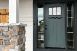
Burgundy has been a favored color choice for fashion, lip colors, and weddings, but more than that, for interior design. Burgundy is a warm and alluring shade that looks fantastic on everything from living room walls to elegant furnishings.
Numerous colors go with burgundy, as it is a delightfully adaptable shade. It looks good with neutrals and calm colors. It also looks pleasing when incorporated into colorful patterns. Whether you’re on the quest for excellent furnishings or are interested in what color assortments you can use in your home, there are tons of pairings to decide from that go with burgundy.
What is Burgundy?
Burgundy is a dark reddish-brown color with undertones of cool purple. It is often mistaken for maroon, a slightly brighter, brick-colored red that lacks the purple undertones.
Burgundy gained its name because it resembled the richly colored red wines exported from Burgundy, France. Similar wine-like colors like Merlot or Berry resemble burgundy and are also typically mixed up with one another. The color represents sophistication, power, and ambition.
It is also considered a sign of wealth. Although it is a shade of red, burgundy generally doesn’t have the adverse connotations associated with traditional red colors. It is a more enjoyable and energetic color than an aggressive one.
Burgundy can look sleek and modern, wildly bold, eclectic, or just plain cozy, depending on the chosen color pairing.
When pairing burgundy with other colors, keep in mind the following:
- Work with complementary, analogous, or triadic color schemes for the best results;
- Burgundy can be both a base or an accent color, depending on your preference ;
- Burgundy shades will look different in varying lights.
Complementary Colors For Burgundy
The colors opposite burgundy on the color wheel are yellow and green. This creates a high-contrast, striking look when these colors are used together.
Try using pale yellows and greens for a more subtle take on this color combination. This will create a softer look that is perfect for any room in your home.
Psychology of Burgundy
Burgundy, as a deep hue of the color red, signifies strength and power. It is seen as more severe than lighter shades of red, lacking fun. However, it has the same energy as a more classic red, which can provoke excitement and passion. This powerful energy, combined with the psychological seriousness of the color, gives it a sense of high ambition.
Unlike red, burgundy rarely creates negative emotions. It is more reserved and introverted, and as a warm color, encourages feelings of comfort.
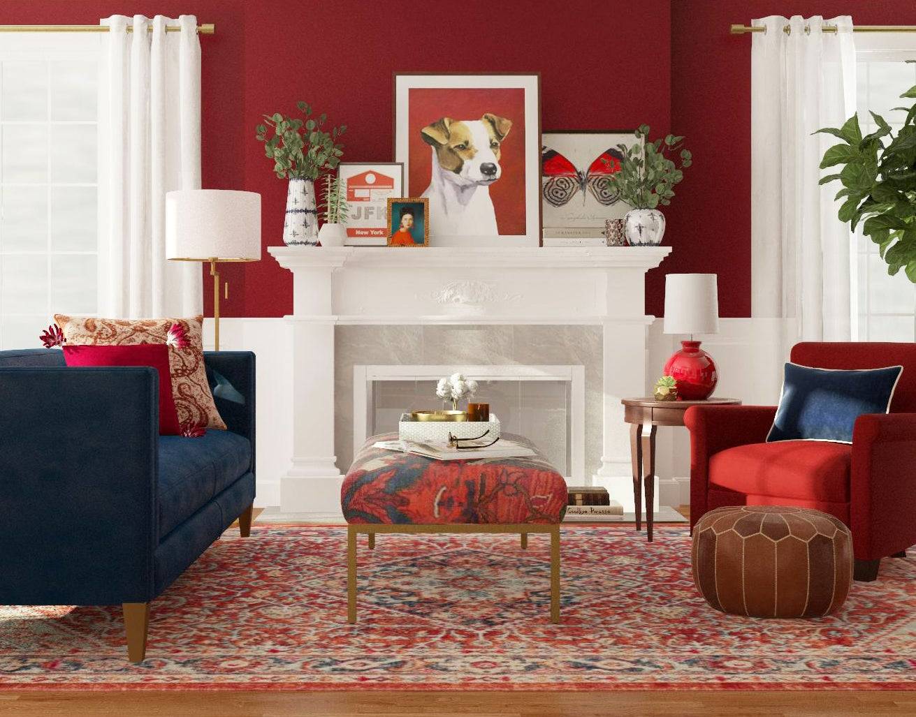
Burgundy and Navy
Burgundy and navy is a classic color combination that oozes class and refinement. Both colors are warm and rich, with an abundance of contrast for visual interest in a room painted in a light, neutral color.

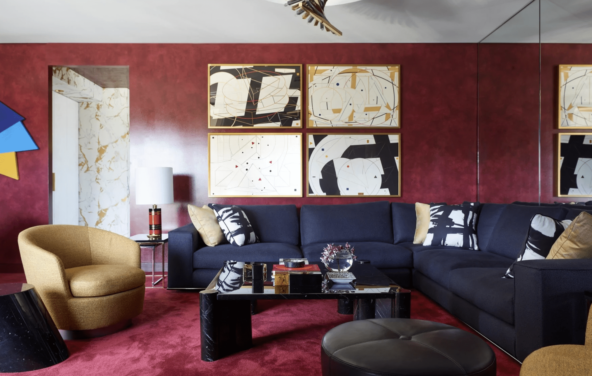
Shades of blue are generally viewed as calm, soothing colors. However, navy, a darker shade, is an authoritarian color that represents power and importance. It is also a highly professional color used frequently in uniforms or corporate offices, but in the home, it adds an element of luxury and elegance.

When combined with the strength and purpose burgundy denotes, you get an intense color combo with plenty of visual interest and contrast. Burgundy and navy can be a bold pairing when both colors are used in large quantities.
Avoid overpowering the eye by balancing the colors with a lighter neutral, like cream or white. Alternatively, you could use navy as a base color and accent with the brighter shade of burgundy.

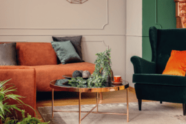
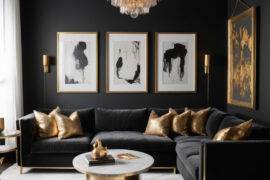
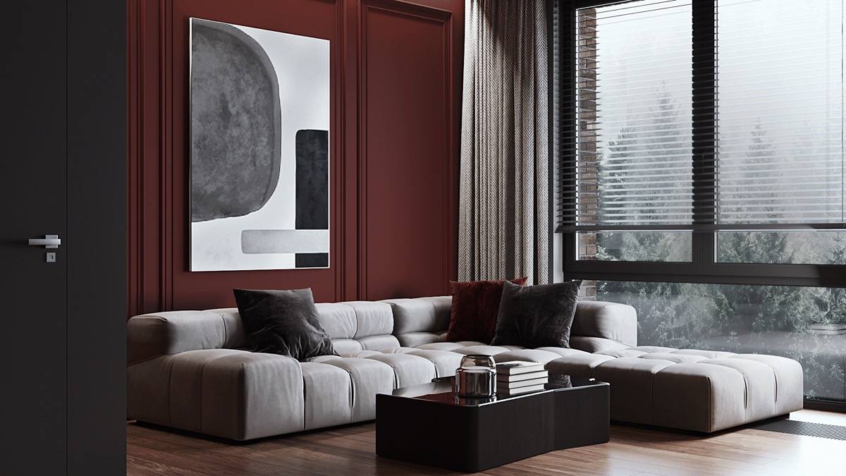
Burgundy and Black
Burgundy and black is a potent color combination that packs a lot of drama. It is a reasonably classic combo used in fashion, art, and interior design for decades, thanks to its aesthetically delightful contrast.

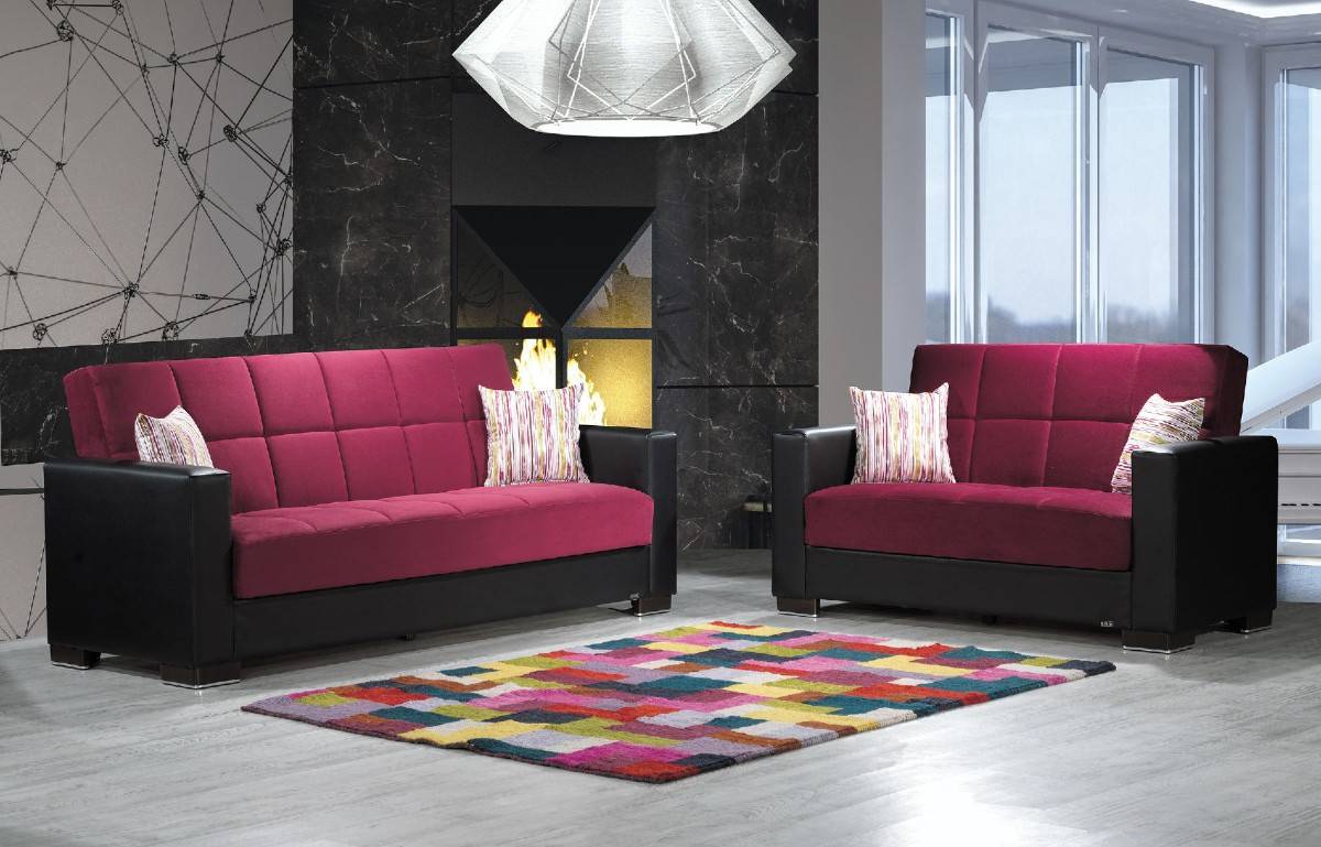
Black is a rich color that signifies refinement and complexity. There are hundreds of shades of black as well. Some shades are more saturated than others, but all pair nicely with burgundy. Bringing these colors into your home or personal style is uncomplicated.

This color scheme translates well to patterns. Don’t be afraid to have fun mixing pops of burgundy with patterned fabrics like black and white stripes or polka dots.
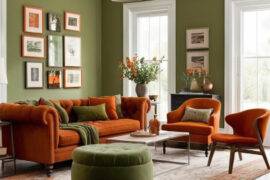
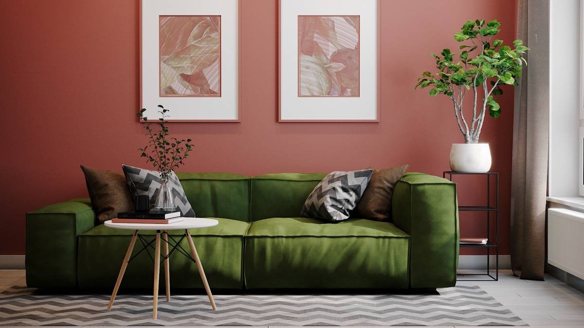
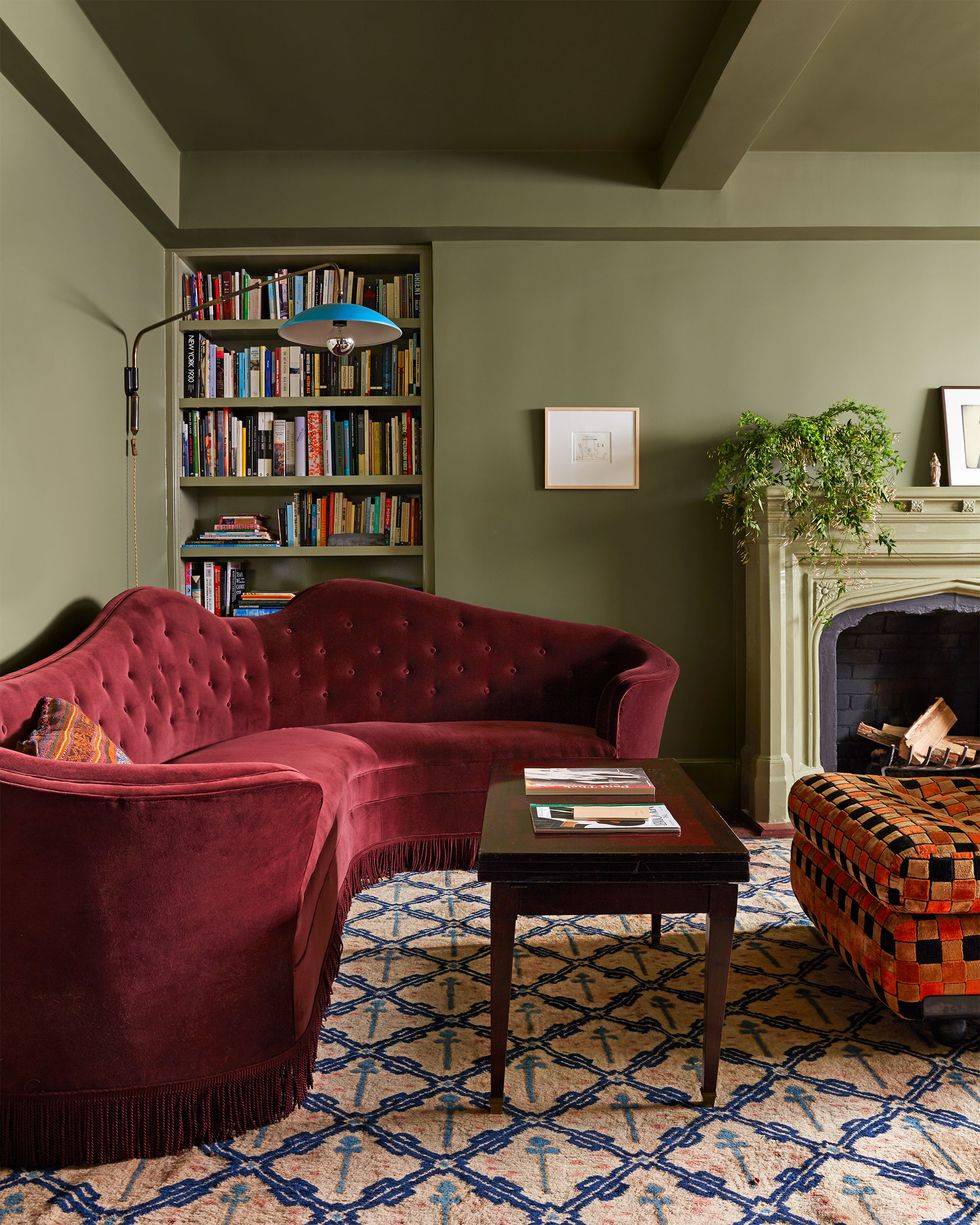
Burgundy and Green
Although classic red and green are typically seen as Christmas colors, putting this color scheme into motion in your home won’t automatically scream “Merry Christmas.” The purplish tones of the burgundy deepen and soften the reddish tones.

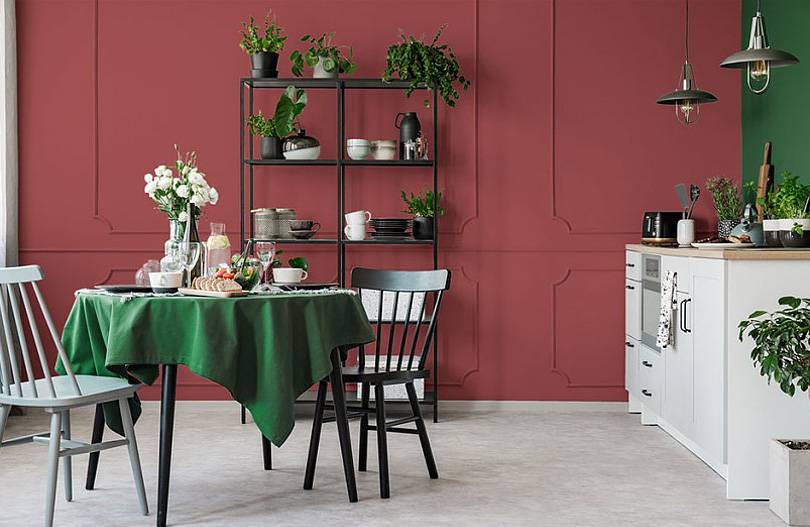
This color scheme looks especially lovely in extravagant fabrics like velvet or satin. Using them together in conjunction with lighter colors offers daring contrast, while pairing them with darker shades like mustard and navy creates an exotic look.

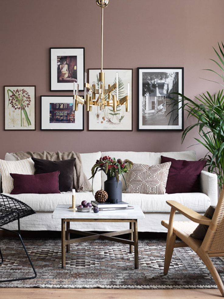
Burgundy and Cream
Burgundy is very rich, and because of this, you may want to pair it with a neutral color like cream to help offset some of its boldness. Cream is a calming color that is closer to yellow than it is to white.

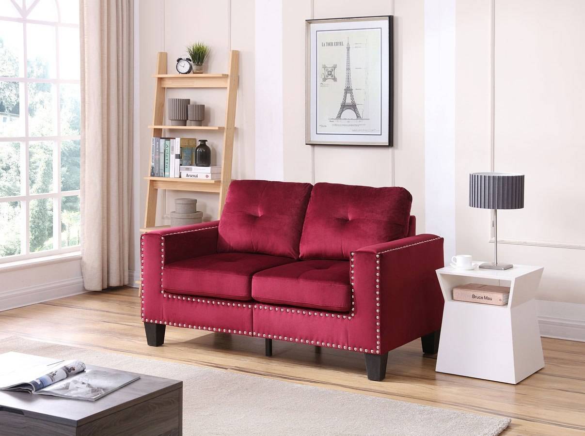
As a result, it has a warmth that pairs well with the warmth of burgundy. Overall, this color scheme is definitive without straying too far into the more traditional but uninspired burgundy and white color pairing.

Cream and burgundy is a classic color combination that works well in various home decor styles. The neutral cream color can help to tone down the intensity of the burgundy, making it a good choice for rooms that get a lot of natural light. This color combo can also create a warm and inviting feeling in a space.
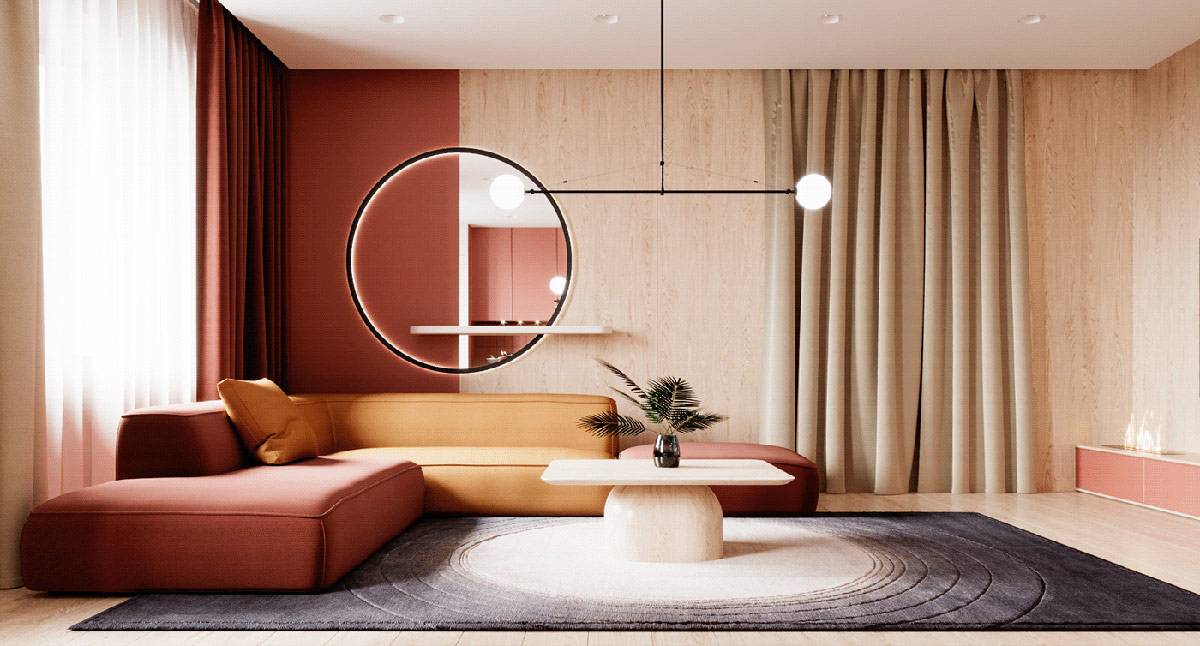
Burgundy and Brown
For a more manly take on burgundy, try pairing it with shades of dark brown. This combination is rich and earthy, and it brings to mind warm fall afternoons. There are many ways to achieve this color combo.

For example, you could combine velvety burgundy drapes with rich chestnut leather furniture to make a warm and cozy study. Accenting dark brown furniture with burgundy pillows or accent chairs will also help the neutrals pop.
Burgundy and Peach
Peach is a shade somewhere in between cream and blush-pink that has undertones of orange in it as well. This pair may seem unusual, but the warmth and cheeriness of the peach pops against the depth of burgundy, making for a calming color combination that adds a little fun and depth to your home decor.
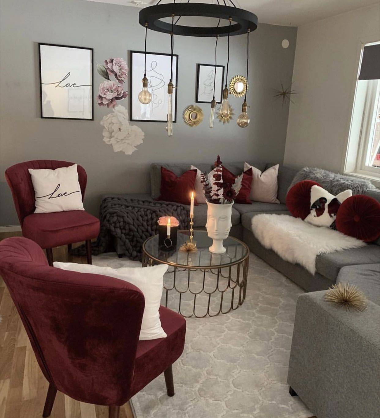
Burgundy and Charcoal Gray
Charcoal gray is presently a trendy color for home decor. It is a versatile dark shade of gray that, depending on its undertones, can look either warm or cool. Combining this neutral shade with a rich, deep burgundy can warm up a cool gray and give any room a moody atmosphere. This color scheme can be either masculine or feminine as well.

Burgundy and Teal
If you’re hoping for a joyful and innovative color scheme, try pairing a blue-green teal with burgundy. The two are complementary and will improve each other’s power and help one another pop.

Teal, a deep variation of blue and green, completes the warm reds present in burgundy. While both are strong and bold, the pairing is a more feminine palette overall.
Burgundy and teal also share some similar tones and shades, which helps to create a cohesive and stylish color scheme.
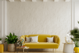
Burgundy and Mustard Yellow
Burgundy and mustard are another spectacular color combo. Although the pair might seem improbable to work together, they are a warm, vibrant duo that complements each other well. Both are earthy colors that add a touch of classiness and richness to any room in your home.
Burgundy and mustard yellow is a great color combination for those who want their home to have a unique, modern vibe. This color scheme can be used in any room of your house, but it looks especially significant in the kitchen or living room. To create this look, start with a burgundy base and then add accents of mustard yellow throughout the room. You can use this color scheme on walls, floors, furniture, and accessories.

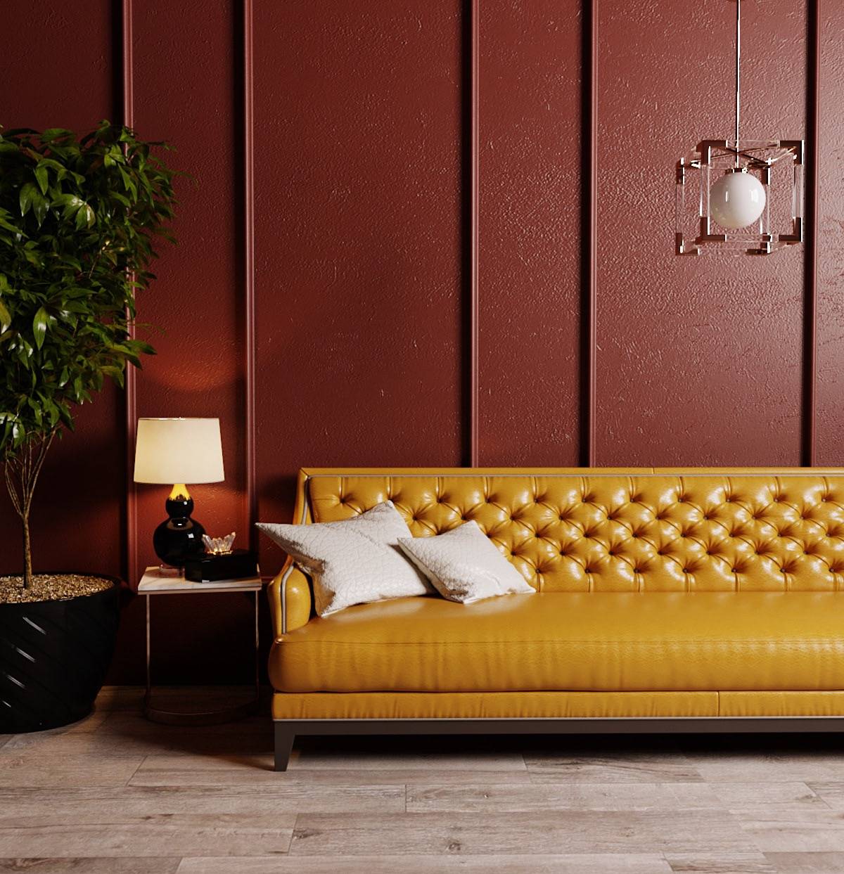
A valuable tip for making these two shades work together is to ensure they are the same shade. If that sounds confusing, aim to get both colors in the same level of brightness or darkness.

Mustard yellow is a great color to use as an accent color because it is both eye-catching and unique. It also goes well with various other colors, making it easy to create a cohesive look in your home. When using mustard yellow as an accent color, pair it with a light or neutral-colored base. This will help to create a balanced look in the room.
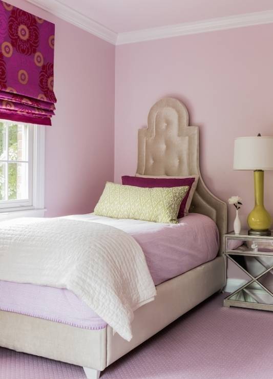
Burgundy and Blush
For a color scheme that is sleek, feminine, and elegant, you can’t go wrong with blending burgundy and blush. The softness of this shade of pink pops against the dark, purplish-red hues in the burgundy.

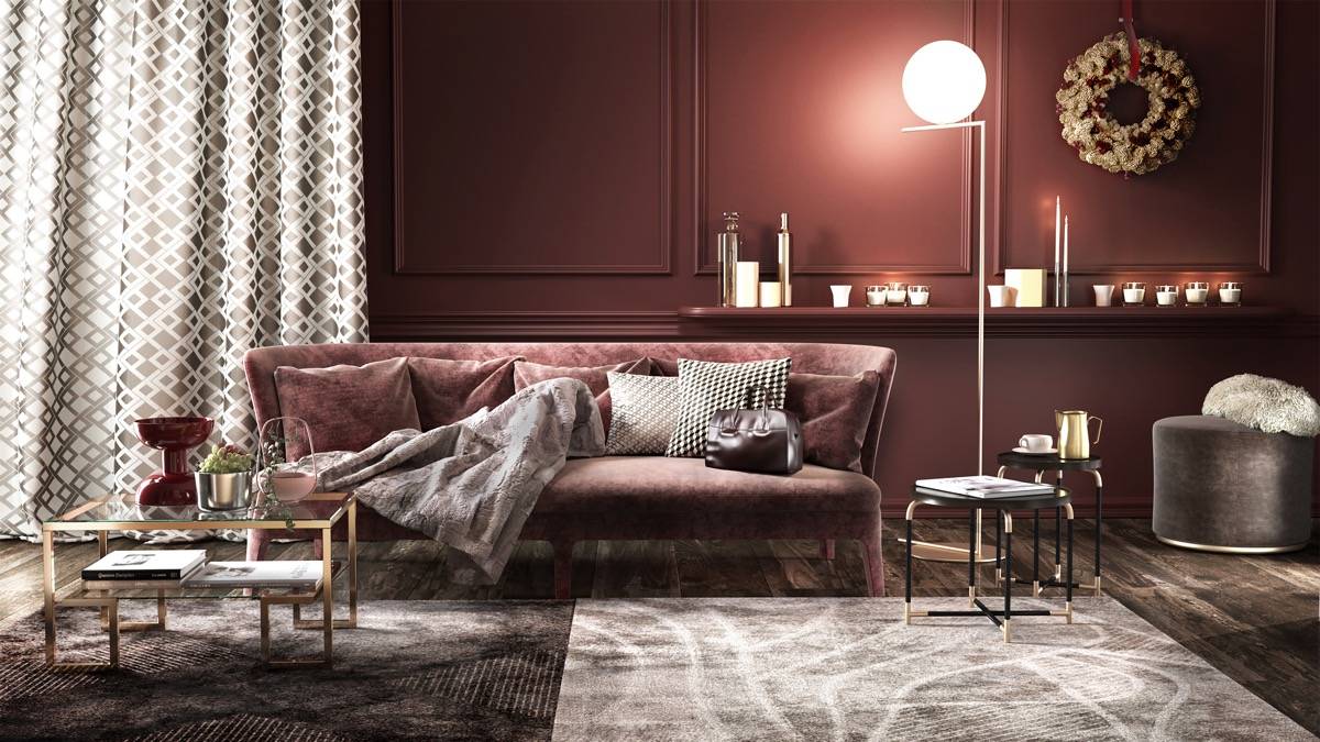
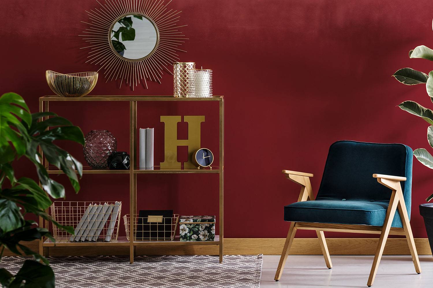
Burgundy and Gold
Burgundy doesn’t just pair well with other standard colors. It also looks beautiful with metallics like gold. Pairing gold with burgundy results in a rich and lush combo that is timeless.

The warmth these two colors ooze may overwhelm one another if you’re not cautious. Be sure to offset a burgundy and gold color scheme with dark woods and light, delicate colors like white or ivory for contrast.
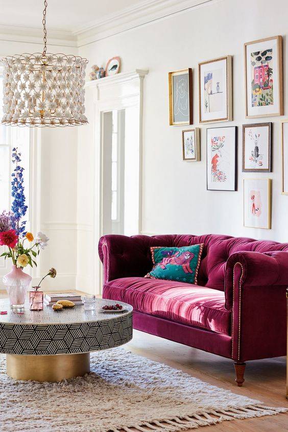
Burgundy and Pink
Burgundy and pink may seem like an unlikely pair, but they actually complement each other perfectly in interior home design. Burgundy, a deep shade of red with hints of purple, can add warmth and richness to a room. On the other hand, pink, a lighter and softer hue, can bring a touch of femininity and playfulness. Together, they create a balance of boldness and subtlety that can make a room feel cohesive and inviting.

One way to incorporate burgundy and pink into your home design is by using them as accent colors. For example, a burgundy throw pillow on a pink couch can create a striking contrast. Alternatively, pink curtains against a burgundy accent wall can add depth and texture to a room. Another option is to use burgundy and pink in a patterned fabric or wallpaper. This can create a cohesive look while still allowing each color to stand out.
When it comes to furniture, burgundy and pink can be used in a variety of ways. A burgundy leather armchair can add sophistication to a room, while a pink velvet sofa can create a cozy and inviting atmosphere. Mixing and matching different shades of burgundy and pink can also create a layered and nuanced look.
Burgundy and Silver
Burgundy and silver are two colors that complement each other beautifully in interior home design. Burgundy is a deep, rich shade of red that exudes elegance and sophistication, while silver is a metallic color that adds a touch of glamour and shine. When used together, these colors create a luxurious and inviting atmosphere that can make any room feel warm and cozy.

One of the reasons why burgundy and silver work so well together is that they are both strong colors that can stand on their own. Burgundy is a bold color that can add depth and richness to a space, while silver can bring a touch of glamour and sparkle. When paired together, they create a dynamic contrast that can draw the eye and create a sense of balance.
Burgundy and Sage
If you’re looking to add an extra touch of elegance to your home design, consider combining burgundy and sage. These two colors complement each other beautifully, especially when it comes to interior decor.
One of the reasons why burgundy and sage work so well together is that they are complementary colors. On the color wheel, burgundy is located opposite sage, which means that they enhance each other’s intensity and vibrancy when placed side by side. This creates a vibrant and eye-catching contrast that can add depth and interest to a room.

Another reason why these colors work together is that they both have a natural, organic feel to them. Burgundy is reminiscent of wine and grapes, while sage evokes images of lush forests and gardens. Together, they create a sense of nature and warmth that can make a room feel cozy and inviting.
Burgundy and Cerulean
Burgundy is a deep, rich shade of red that exudes warmth and sophistication, while cerulean is a bright, cheerful blue that adds a pop of color and lightness to any space. Together, these two colors create a beautiful contrast that can make a room feel cozy and inviting.
One of the reasons burgundy and cerulean work so well together is because they are complementary colors. Complementary colors are opposite each other on the color wheel, and when paired together, they create a dynamic visual effect. The deep red of burgundy and the bright blue of cerulean are two such colors that complement each other perfectly.

Another reason these two colors work well together is because they create a balanced color scheme. When using burgundy and cerulean in interior home design, it is important to balance the two colors so that one does not overpower the other. By using burgundy as a base color and adding accents of cerulean, or vice versa, you can create a harmonious color scheme that is both visually appealing and balanced.
Burgundy and Plum
Burgundy and plum are two colors that are often used together in interior home design, and for good reason. These two hues complement each other perfectly, creating a rich and luxurious atmosphere that can transform any space into a cozy and inviting retreat.
One reason why burgundy and plum work so well together is because they are both deep and intense shades that evoke feelings of warmth and comfort. Burgundy is a deep red color that is often associated with passion, while plum is a darker shade of purple that is known for its regal and sophisticated vibe. When paired together, these two colors create a sense of opulence and elegance that can instantly elevate the look and feel of any room.

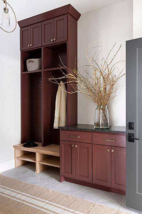
What Furniture to Choose if You Want to Use Burgundy
Furniture that looks good when combined with burgundy is not an obvious choice. A lot depends on the result you’re aiming at and on the burgundy color shades you pick.
Classic interiors benefit best from natural wooden furniture. They are perfect both for intense burgundy-colored walls and in case you use only burgundy decorations.
If you like bold combinations, consider upholstered furniture in a characteristic shade – emerald green or orange-yellow. Such a combination looks perfect in the living room – especially if the interior is enormous.
What Style is Best for the Color Burgundy?
Depending on the elements you choose and the hues you combine – you can achieve various interior styles with burgundy. The color can be perfectly accentuated with furniture and decorations.
The color burgundy is most often used in classic and elegant interiors. Glamour or Art Deco styles are other good options. You can also use this color in an industrial style. It might be more difficult – nonetheless, burgundy in such interiors has appeared quite often recently.
Best Ways to Use Burgundy in Your Home
- Burgundy is an excellent choice for walls in rooms you want to be warm and comforted, such as a den or dining room.
- Limit burgundy in bedrooms because although it is more reserved than brighter reds, it still carries lots of energy, which can be overstimulating for some people.
- Burgundy accent pillows and throw blankets are a fun alternative to traditional gray or black. Use them in a neutral-colored space where you want to add a bit of color and warmth.
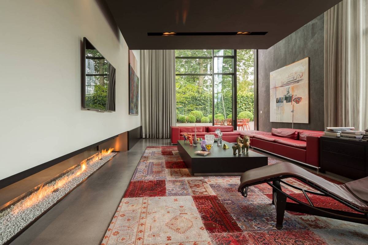
Burgundy is often found in oriental rugs, which can easily be incorporated into traditional and modern interiors.
Frequently Asked Questions (FAQs)
Is burgundy a good interior design color?
Absolutely! Burgundy looks wonderful on walls, on pieces of furniture, or as accents in home decor.
What colors accent burgundy?
Dozens of beautiful colors work with burgundy, including shades of blue, purple, yellow, and green.
Does burgundy go with gold?
Burgundy looks excellent with gold-colored fabrics or metals found in light fixtures or accessories.
What is a complementary color for burgundy?
Since burgundy is a shade of red, a complementary color would be green. This could include blue greens, like teal, or more traditional greens, like forest green.
Is maroon the same as burgundy?
No. Although both exist in the red family, maroon has brown undertones that give it a brick-red color, whereas burgundy is a combination of red, blue, and purple that gives it a more berry-colored tone.