When it comes to designing a space, color is one of the most important aspects to consider. In particular, blue is a popular choice for interior design because of its calming and serene qualities. However, selecting complementary colors to pair with blue can be a bit challenging. In this article, we will explore various colors that go well with blue, as well as tips and tricks for incorporating them into your design.
First, let’s dive into some color theory. Blue is a cool color, which means it pairs well with other cool tones such as greens, purples, and grays. However, if you want to create a bold statement, pairing blue with a warm color such as orange or yellow can create a striking contrast.
Another important aspect to consider when pairing colors is the saturation level. A saturated blue can pair well with a lighter, pastel color, while a muted or gray-blue may work better with a deeper, richer tone.
Now, let’s take a look at some specific colors that pair well with blue:
Black
Black is a classic color that pairs well with blue in interior design. The combination of blue and black creates a sleek and sophisticated look that is perfect for modern and minimalist spaces.

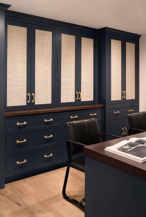
When used sparingly, black accents such as furniture, artwork, or decorative accessories can add depth and contrast to a blue room, creating a striking visual impact.
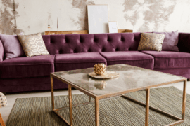
Purple
Purple is a complementary color to blue, which means they are opposite each other on the color wheel. Pairing blue and purple in interior design creates a sense of balance and harmony.

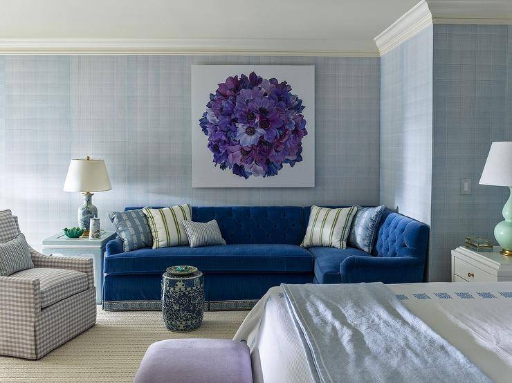
Depending on the shades used, the combination of blue and purple can create a calming and relaxing atmosphere or a bold and vibrant one. For example, pairing a soft blue with a lavender or lilac shade can create a serene and peaceful space, while pairing a deep blue with a rich plum or eggplant shade can create a bold and dramatic effect.

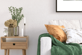
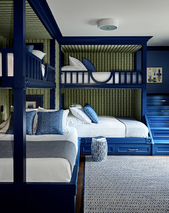
Green
Green and blue are analogous colors, meaning they sit next to each other on the color wheel. This makes them a natural pairing, as they create a harmonious and soothing effect. Consider pairing a soft blue with a muted sage green for a tranquil and natural vibe.


Beige
Beige is a neutral color that pairs well with almost any color, including blue. The combination of blue and beige creates a fresh and timeless look that is perfect for creating a coastal or beachy vibe.

When using beige with blue, it’s important to choose shades that complement each other. For example, pairing a light blue with a warm beige creates a soft and inviting feel, while pairing a bold blue with a cool beige creates a more modern and sophisticated look.
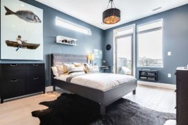
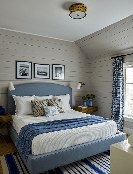
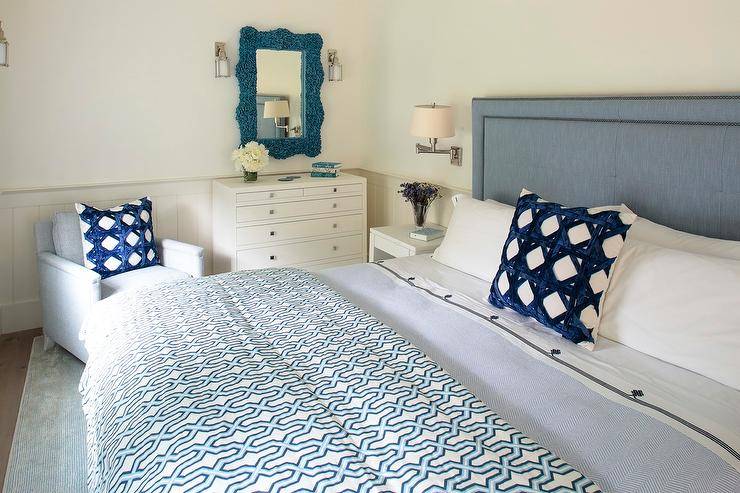
Gray
Gray is a neutral color that pairs well with almost any color, including blue. A blue and gray color scheme can create a sophisticated and timeless look. Consider pairing a dark navy blue with a light gray for a classic and elegant feel.

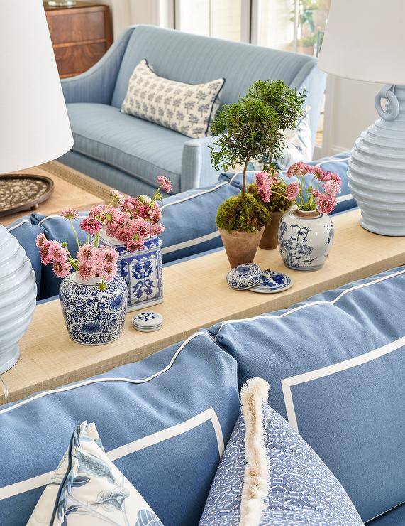
Pink
Pink is a surprising but effective color to pair with blue. A light, pastel pink can create a soft and feminine look, while a bright fuchsia can create a bold and playful statement. Consider pairing a baby blue with a blush pink for a charming and whimsical space.


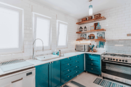
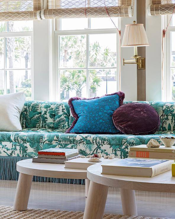
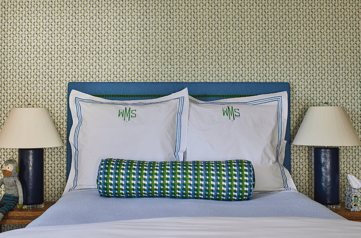
Teal
Teal is a blue-green color that pairs well with blue in interior design. The combination of blue and teal creates a calming and soothing effect that is perfect for creating a relaxing atmosphere.

When using teal with blue, it’s important to balance the shades to avoid overwhelming the space. For example, pairing a light blue with a dark teal creates a sense of depth and contrast, while pairing a bold blue with a light teal creates a more subtle and muted effect.
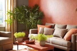
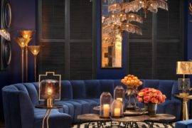
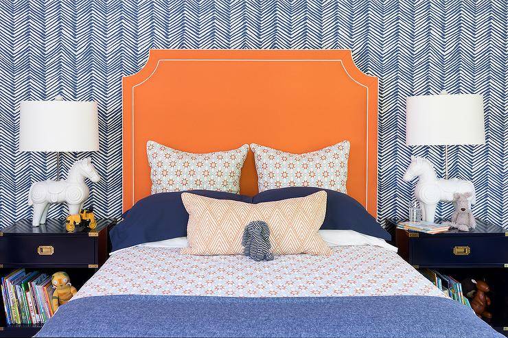
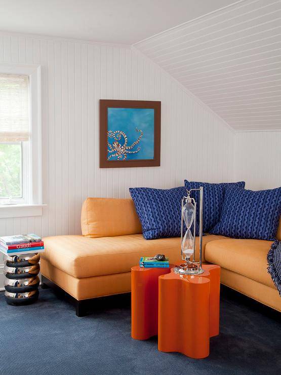
Orange
As mentioned earlier, orange is a warm color that creates a bold contrast with blue. Pairing a deep navy blue with a burnt orange can create a cozy and inviting atmosphere. Alternatively, pairing a lighter blue with a coral orange can create a fun and energetic space.


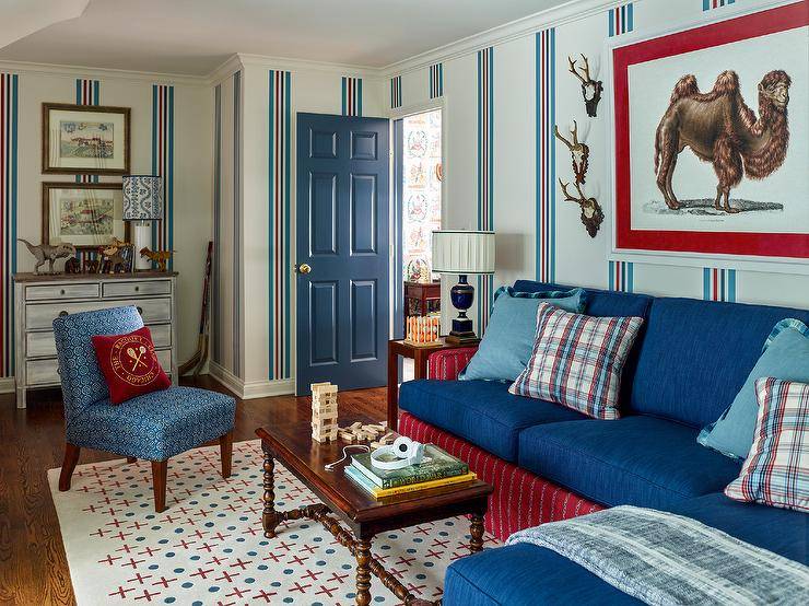
Red
Red is a bold and vibrant color that can be paired with blue in interior design to create a dramatic and eye-catching look. When using red with blue, it’s important to balance the shades to avoid overwhelming the space.

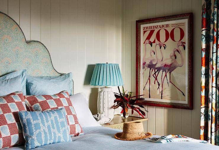
For example, pairing a light blue with a deep red creates a sense of contrast and drama, while pairing a bold blue with a bright red creates a more playful and energetic effect. Red accents such as throw pillows, curtains, or artwork can add a pop of color to a blue room, making it more lively and dynamic.

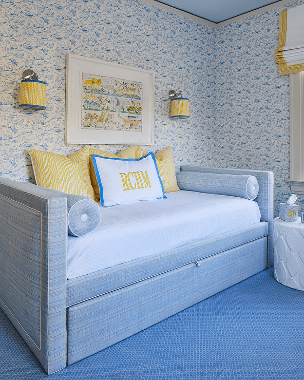
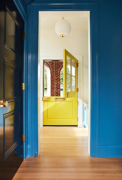
Yellow
Yellow is another warm color that pairs well with blue. A soft, buttery yellow can create a sunny and cheerful space when paired with a light blue. A deep, golden yellow can create a luxurious and rich look when paired with a royal blue.


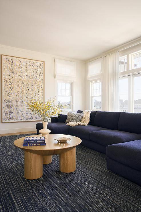
White
White is a classic color that complements blue beautifully. It creates a crisp and clean look that is perfect for a beachy or coastal interior design theme. White can also help to brighten up a room that has a lot of blue.

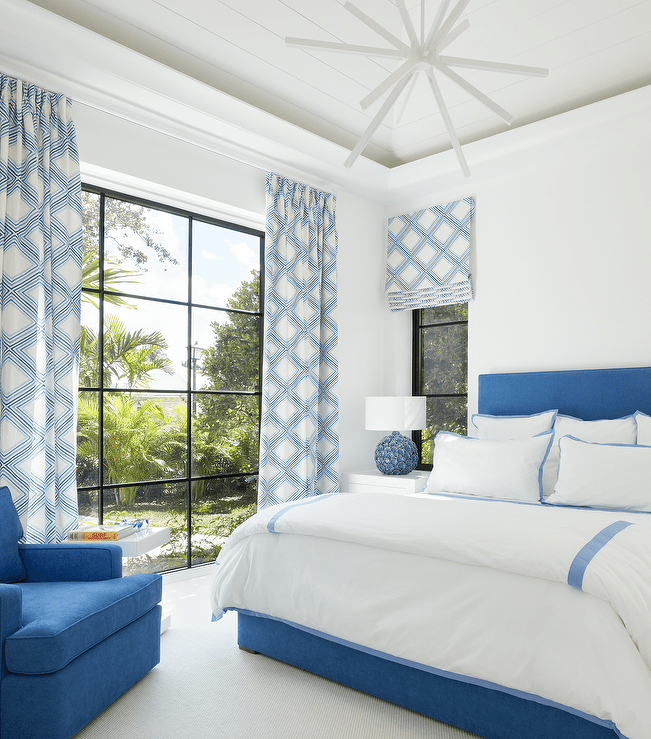
When pairing blue and white, it is essential to get the right balance. Too much white can make the room feel cold and sterile, while too much blue can be overwhelming. Consider using white as a backdrop and adding blue accents through pillows, throws, and artwork.
60-30-10 Rule
When incorporating multiple colors into your design, it’s important to consider the balance and distribution of each color. A general rule of thumb is to use the 60-30-10 rule. This means that 60% of the room should be one dominant color (in this case, blue), 30% should be a secondary color, and 10% should be an accent color. This will create a visually balanced and cohesive space.

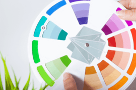
Color Theory
Understanding color theory can help you choose the right colors to pair with blue. Color theory is the study of how colors interact with each other and how they can be combined to create different moods and atmospheres.

The color wheel is an essential tool in color theory. It is a circular diagram that shows the relationships between primary, secondary, and tertiary colors. Colors that are opposite each other on the color wheel are complementary colors. When paired together, they create a vibrant and dynamic look.
Blue’s complementary color is orange. While orange may seem like an unlikely color to pair with blue, it can create a dramatic and striking look. When using orange with blue, consider using it as an accent color rather than a primary color. This will create a balanced and harmonious look that is visually appealing.
There are many colors that pair well with blue, including green, gray, pink, orange, and yellow. By considering color theory and the saturation level of each color, you can create a beautiful and harmonious design. Remember to balance the distribution of each color using the 60-30-10 rule for a cohesive and visually pleasing space. Happy designing!
Frequently Asked Questions (FAQs)
What are some popular shades of blue for designing and decorating?
There are many shades of blue that are popular, including navy, baby blue, sky blue, turquoise, and royal blue. The shade that works best will depend on the room’s lighting, the desired mood, and the existing color scheme.
Is blue a good color for creating a calming atmosphere in a room?
Yes, blue is often used to create a calm and serene atmosphere in a room. Lighter shades of blue, such as baby blue or sky blue, can help to make a space feel relaxed and peaceful.
How can I incorporate blue into my existing color scheme?
If you have a neutral color scheme, consider adding blue accent pieces such as throw pillows or decorative objects. For a more bold statement, try painting an accent wall in a shade of blue. If you have a warmer color scheme, consider using cooler shades of blue to balance out the warmth.
What colors pair well with blue?
Blue pairs well with a range of colors, including white, gray, beige, and yellow. For a more dramatic look, try pairing blue with orange or pink.
Can blue be used in small spaces?
Yes, blue can be used in small spaces to create a feeling of depth and openness. Lighter shades of blue can help to make a small space feel brighter and more open.
Is it okay to mix different shades of blue in a room?
Yes, mixing different shades of blue can create a beautiful and cohesive look in a room. Just be sure to balance out the different shades with neutral colors like white or gray.
How can I use blue to create a coastal-themed room?
Blue is often used in coastal-themed rooms to create a beachy, relaxed vibe. Consider using shades of blue that mimic the ocean and pair them with natural materials like wood and woven fabrics. Adding seashells, driftwood, and other beachy accents can also help to create a coastal feel.