I get so much inspiration from browsing the fall arrivals at my favorite boutiques and retail destinations. Kate here, and when it comes to interior design, a new season is a reason to celebrate a slew of new finds. I’m not trying to close the door on summer in any way, but the fall collections are in, and a new wave of color combinations has taken center stage. Today I spotlight three of my favorite combos with the help of new merchandise from some of my favorite design and decor retailers. Enjoy!
Teal and Gold
One of the top color combinations for fall: teal and gold. And I’m not just saying that because the walls of my bedroom are teal and my bedding features dashes of gold. But that’s a nice coincidence, right?! This first featured combination includes golds that range from metallic to yellow, as well as teals of the green and blue variety. [from West Elm]

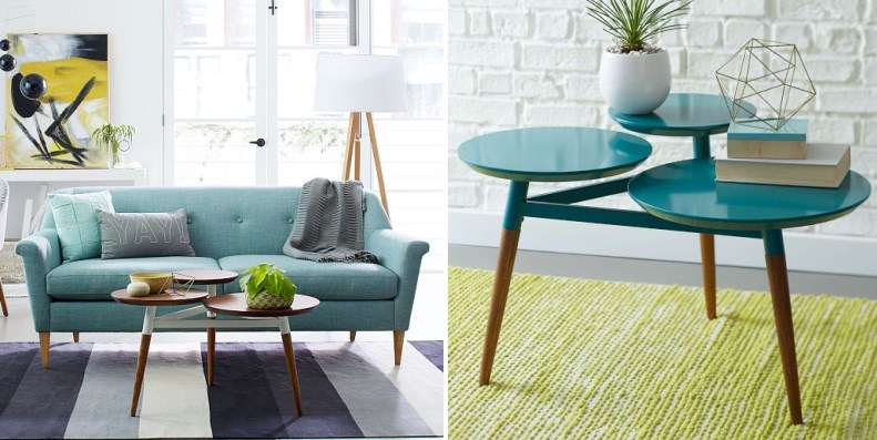
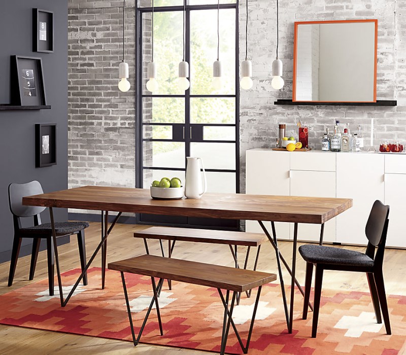
You may remember this next image from Sherry’s recent article on stylish coffee tables. Note the layers of teal, complete with bold shades of gold, all set against a backdrop of gray. In fact, grey is an ideal anchoring color for the teal and gold combo.

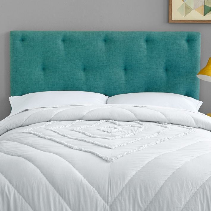
If you look closely at the image below, you can see a yellow-gold reading lamp next to a teal Tufted Hang-Up Headboard from West Elm. Yellow + blue = perfection!

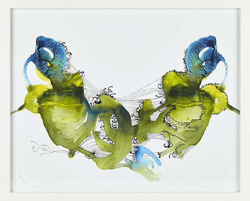
As you accessorize your teal and gold room, keep in mind that shades of blue and green work well for accents such as artwork, as shown by the cobalt and olive hues in this Patience Print by Deb Haugen from Crate & Barrel:

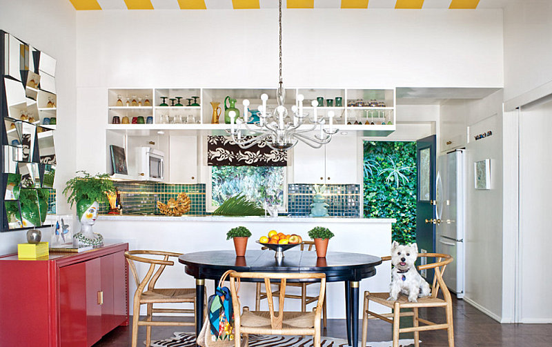
Gold and teal can also go breezy. Isn’t this bold kitchen refreshing?! Yellow and white stripes combine with teal tile and plenty of greenery. Add a dose of red for a vivid accent hue. [from California Home & Design]

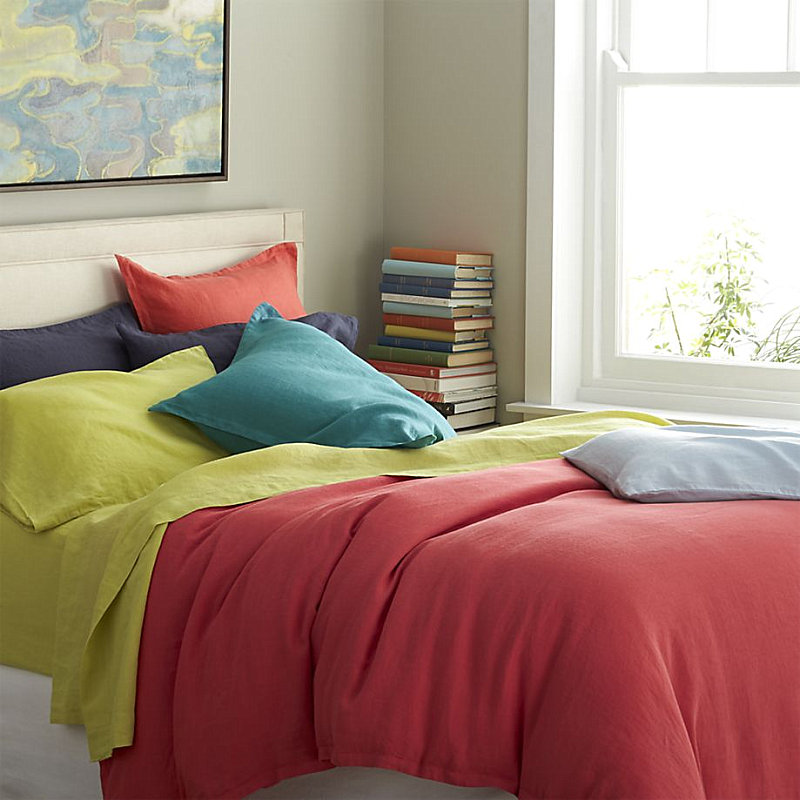
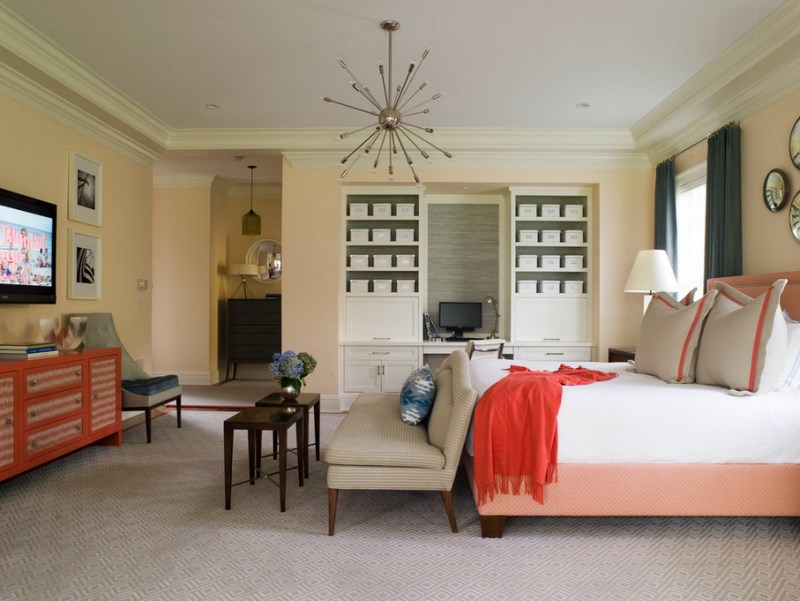
Speaking of red, note how the coral bedding below beautifully enhances the yellow sheets and teal pillow. These linen sheets are from Crate & Barrel…

Grey and Hot Peach
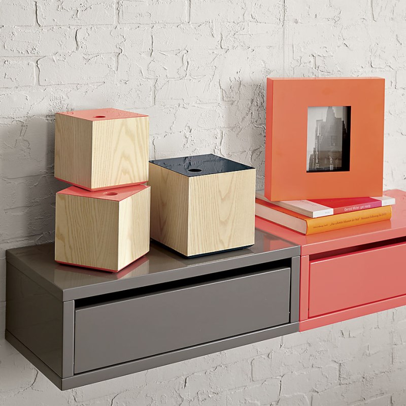
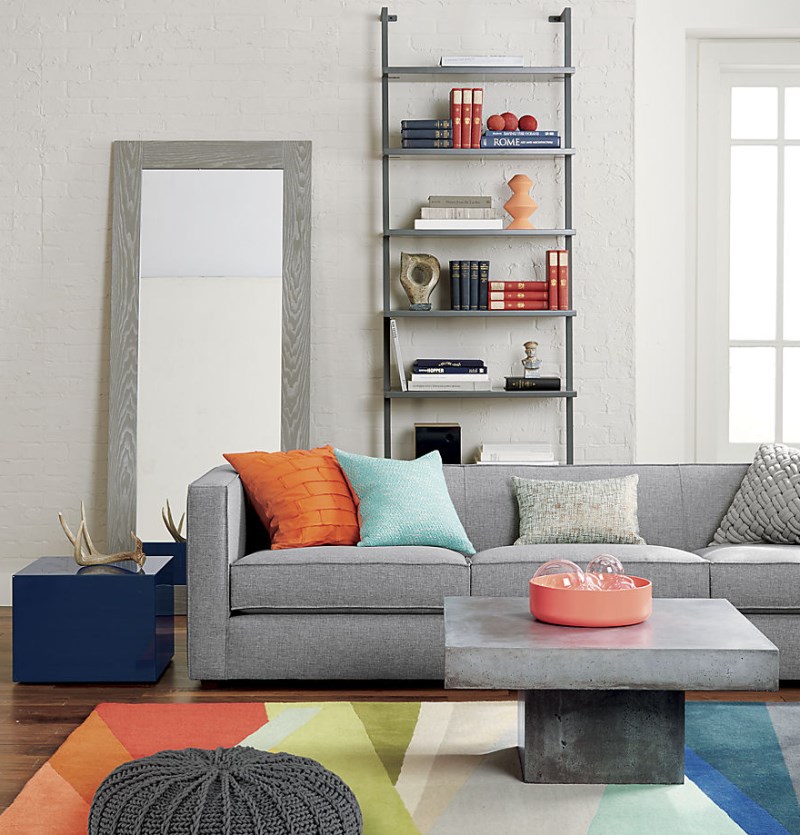
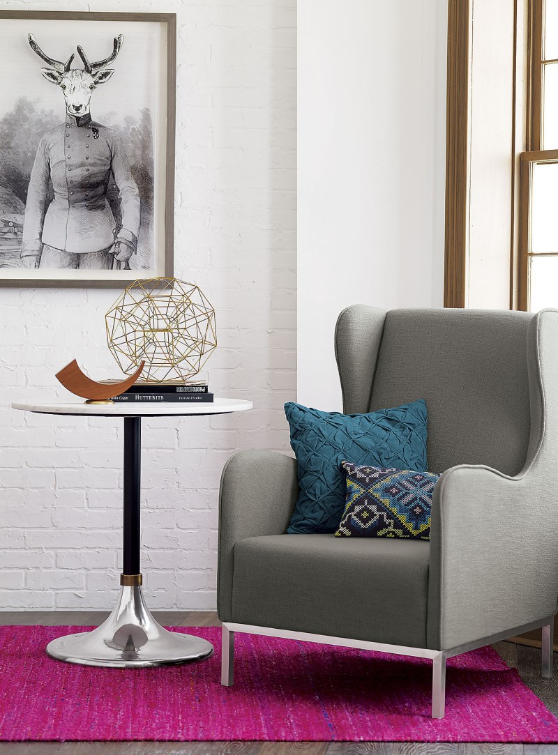
Ready for another great color combo? How about hot peach and gray?! In fact, any shade of peach or orange can beautifully complement a range of grey tones, from charcoal to silver. The wall-mounted shelving from CB2 (shown below) celebrates the powerful juxtaposition of these two color families:

Don’t hesitate to bring in a variety of orange tones, including coral and persimmon. These shades are a great way to enhance lighter shades of peach, and they beautifully punctuate grey spaces. [from West Elm]

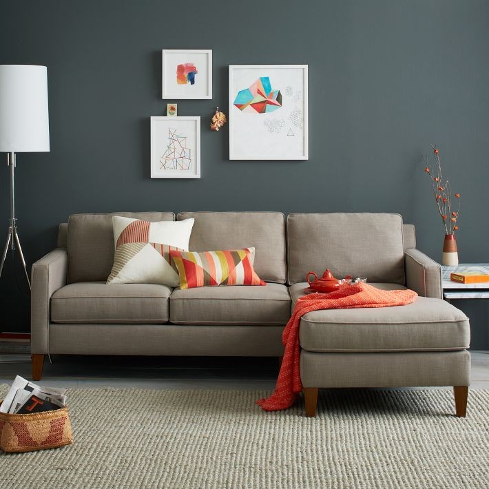
On a similar note, we see bright pops of coral add dimension to a light peach room in the image below. Grey tones can be found throughout, and shades of blue serve as the perfect accent. [from S.B. Long Interiors]

Retailers such as CB2 are featuring a variety of peach and orange decor finds this season, including the Electric Neon Peach Serve Bowl below. Again, note the range of orange tones on display, especially since a multi-hued rug is involved:

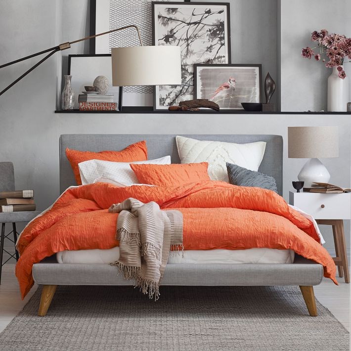
Don’t hold back with the hot peach, even if it veers into fiery orange territory! There’s nothing like a radiant pop of color, as shown with the vibrant bedding and Mod Upholstered Bed from West Elm below:

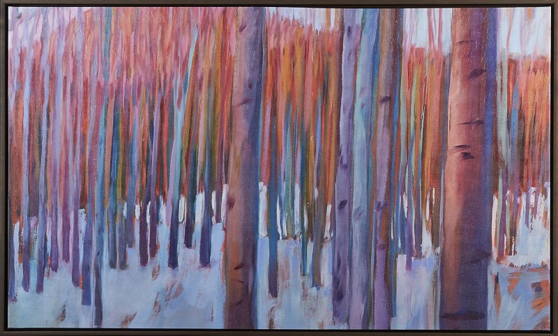
What other hues can you introduce into this color combo? How about lavender?! Note the flowers in the image above, as well as the purple tones in this Aspen Symphony Print by Pam Spicer from Crate & Barrel. A delicious blend, don’t you think?!

Greys and oranges can even work well in the kitchen. Note the full range of tones from both color families in the space below, thanks to features such as the Tajikistan Wool Dhurrie Rug from CB2, complete with a pixel diamond pattern:

Berry Fabulous
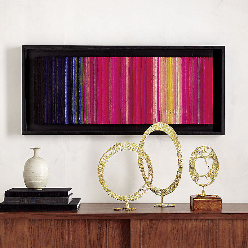
Today’s last featured color combination includes a range of berry hues. Indigo, cobalt, magenta and fuchsia are colors you might find in the mix. In fact, this season, berry tones are getting a modern twist, as shown by the artwork below from CB2:

To avoid a berry-licious overload, try combining rich shades of blue and purple with white walls. The brightness of the white keeps the berry shades in check while simultaneously allowing them to truly shine. [from CB2]

Isn’t this subtle take on berry hues divine? The lightest of pinks meets an array of rich blues for an unexpected twist that’s surprisingly modern. [from CB2]

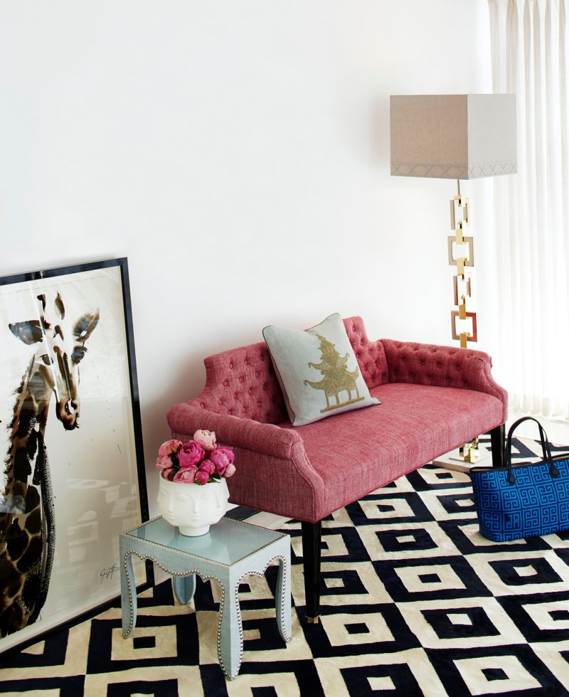
Below we see the Regent Bench from Jonathan Adler, artfully combined with shades of blue, pink and magenta. Tying it all together is a black and white patterned rug, proving that black and white can provide a fresh, modern backdrop to berry hues.

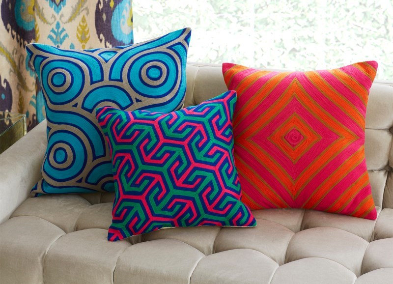
Also from Jonathan Adler is this trio of attention-grabbing pillows. Note the use of ultra-brights such as neon pink and orange. Yes, fiery shades pair well with berry hues!

Red can even be a delightful accent color when combined with berry hues. It’s modern. It’s unexpected. And its strikingly present in the room below from CB2:

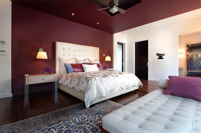
For a darker take on red, try maroon as an anchoring wall color for berry accents in your interior. This decadent color combination is enticing for spaces such as the bedroom. [from Phil Kean Design Group]

I have to say…I’m in love with this new take on vibrant color! Fall promises to be a rich-hued season, thanks to an array of new decor finds in unexpected color combinations. Which combo is your favorite? Leave a comment below!


