There’s no denying that color affects our mood. Those who are sensitive to their surroundings may instantly feel the energy created by a bright red kitchen, as well as the calm evoked by a serene blue bedroom. Others may not notice the color one way or another, but the effect is still there. Color has the power to invigorate, to soothe, to inspire creativity, and even to stimulate the appetite. Start paying attention to the number of red, orange and bright yellow restaurant interiors!
Today we embark on a journey of color. But rather than going the rainbow route, we take a look at some interesting hues and combinations that are making waves in today’s design world. And yes, we’ll throw in a bit of color theory for fun! After all, you can use color to create specific moods and feelings in your home, such as relaxed, joyful and safe. So bring your paintbrush along and get ready for a radiant read!..
Orange You Crazy for Warm Tones?
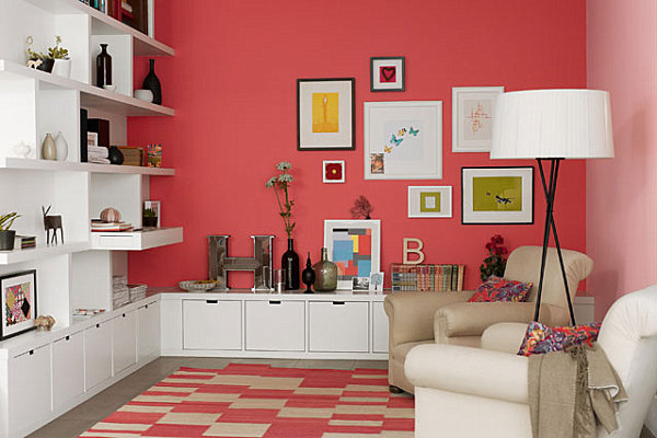
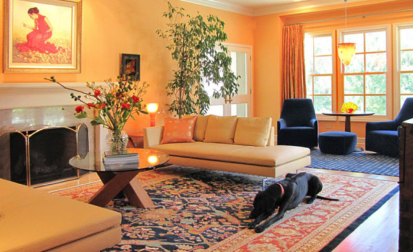
Ever notice how red is a popular dining room color? That’s no coincidence! Colors that energize, such as reds, oranges and bright yellows, are perfect for rooms centered around the preparation and enjoyment of food! But don’t assume that all warm tones with a rosy or orange-y glow should be kept out of living and sleeping spaces. Calmer versions of these hues, such as coral and peach, make a lovely addition to the most tranquil of rooms. Why? Because coral evokes the beach, and who doesn’t feel rejuvenated by a journey to the ocean? There are also bright versions of coral that make a unique, joyful statement in the home, as shown by the living room below. [from Easy Living]

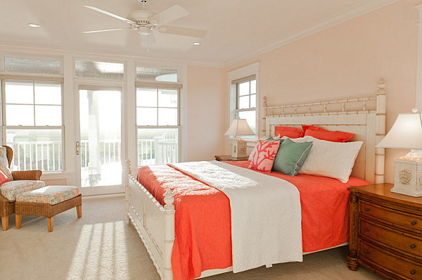
Peach is soft like the lightest hues in the sunset, and it blends well with sandy shades, as well as (of course) coral! Though the bedding below is ultra bright, the gentle wall color keeps this bedroom serene. [from Blue Sky Building Company]

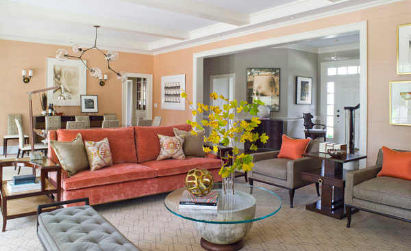
Coral can veer pink, or it can veer into rusty shades, as shown by this next featured living room. What a gorgeous blend of rich peach, warm coral, rust, sand and gray! This space is happy, energized and chill at the same time… [from S.B. Long Interiors]

Coral also beautifully combines with blue, especially shades of navy. Not only does this blend create an elegant look, it makes a nautical statement that once again evokes the rejuvenating power of the beach (or the elegance of a sophisticated beach hotel)! [from S.B. Long Interiors]

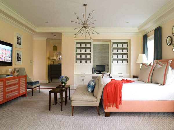
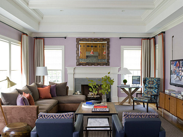
The same upscale look applies to the combination of peach and navy, which seamlessly integrates a warm glow with a rich, solid shade of blue to accent the room at hand. [from Irene Turner Interior Design and Renovation]

Tranquil Blues
Shades of blue are soothing, steady and powerful (but in a chill way). Not to mention, they combine well with blue-gone-glam hues such as lavender. Notice the touches of coral in the room below as well?! [from S.B. Long Interiors]

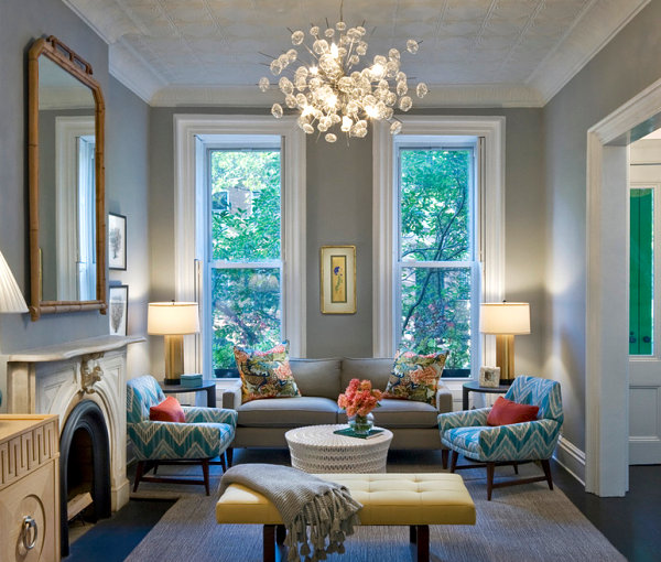
Royal blue is regal, isn’t it?! This strong shade can be accented with a range of colors. We love how the next featured space tones it down a bit by going with unexpected pops of color in hues such as green, brown and pink. [from Easy Living]

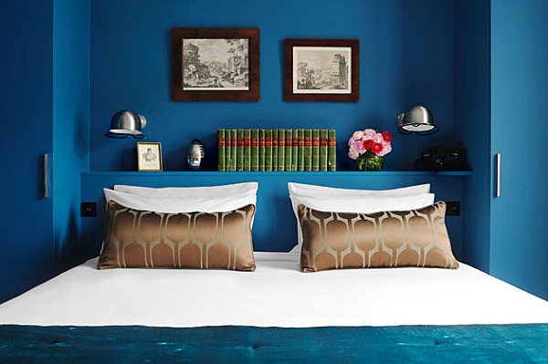
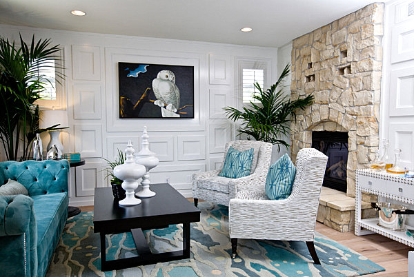
Look at this next gorgeous living area, which features a shade of blue that’s a bit royal, a bit teal, and a bit peacock. In fact, there’s something about a srong shade of blue that’s, well…. interesting. Call it decadent or enticing. Rich shades of blue definitely take things up a notch in a way that is both calming and evocative. And when your space demands a second look, it’s definitely a winner! [from Vanessa DeLeon Associates via Zillow]

Flowing water is relaxing and heavenly, isn’t it? And there’s just something heavenly about the Angela Adams rug below. Like a fairy tale land where bubbling ponds hold scores of happy fish, this rug has a blissfully natural look that also channels the waves and foam of the ocean. Maybe that’s why the rug is called “Ocean“! Undeniably calming, it also invites you to escape, and that’s just the kind of vibe you can’t help but desire in the living room… [from Lulu Designs Online]

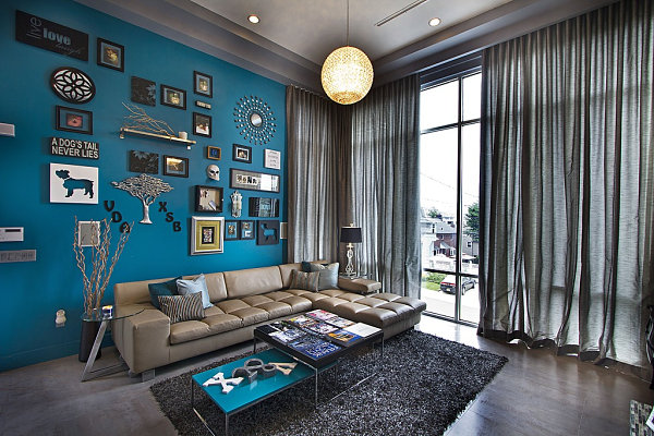
We now head into blue-meets-green territory, beginning with the deep teal living space in the next image. Once again, we have a rich, extravagant look that is also calming, thanks to its understated yet powerful feel. Note how furniture in shades of cream is the perfect counterpart to the shade on the wall. Also note the lovely way gold accents blend with this space. [from Design Crisis]


From Teal to Jade
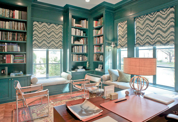
Remember the teal room above? It’s time to take that teal into the land of the green. We start with a blue-green shade, then head into strictly green territory as we explore the verdant power of this shade from nature. The home office below combines a traditional rug with bold window coverings for a warm-meets-cool effect. [from J. Wilson Fuqua & Associates Architects]

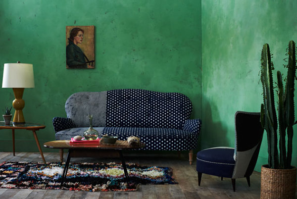
One color that always gets a second look is jade green. Not kelly green, not emerald green, not olive green. Jade green is bit rare, which makes it as intriguing as it is refreshing. And it looks dynamite when enhanced by shades of navy, as shown below. [from Easy Living]

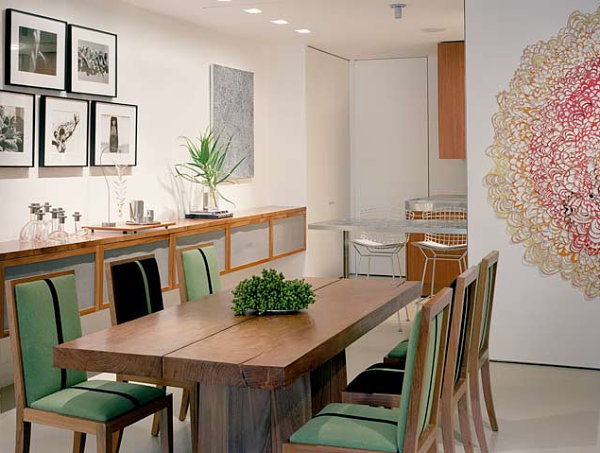
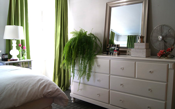
Green is a popular accent color for all-white rooms. There’s something about the combination of crisp, refreshing white and natural, refreshing green. Simple. Organic. Rejuvenating. Perfection! [from S.B. Long Interiors]

Green has the power to make us feel peaceful and safe, as well as connected to nature. That’s why it never hurts to embellish a green color scheme with houseplants. Not only do plants add oxygen to the room, they remind us that just outside is a natural world ready to explore. [from Edyta & Co. Interior Design]

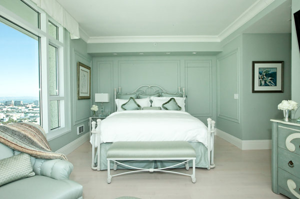
Oh, the minty look of the layered space below! It’s monochromatic, and it’s undeniably soothing. Check out the refreshing hue that appears on the furniture, walls and bedding… As if it needed an introduction! [from Sophisticate Interiors]

The Power of Neutrals
We now shine the spotlight on neutral tones, such as gray and taupe. If you’re trying to make a statement with color, why go neutral? Because it is calm, steady and quiet, and it can tone down other vibrant shades. Which keeps things from getting out of hand! Then again, if you want a space that knocks you over with color, this hue is not for you. But isn’t it perfect for an elegant bedroom designed to inspire peaceful sleep?! [from New Perspective Design, Inc.]

And gray is the perfect backdrop to the colors you DO want to highlight. Colors like blue and turquoise, which we just can’t seem to get away from in today’s post… [from CWB Architects]

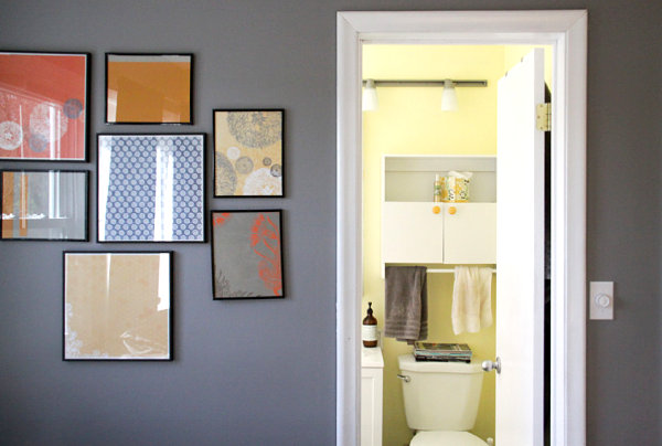
Gray can make a collection of bright artwork stand out. Not to mention, any room branching off from a gray space will instantly pop, as shown by the bathroom below. [from A Sunshine Moment]

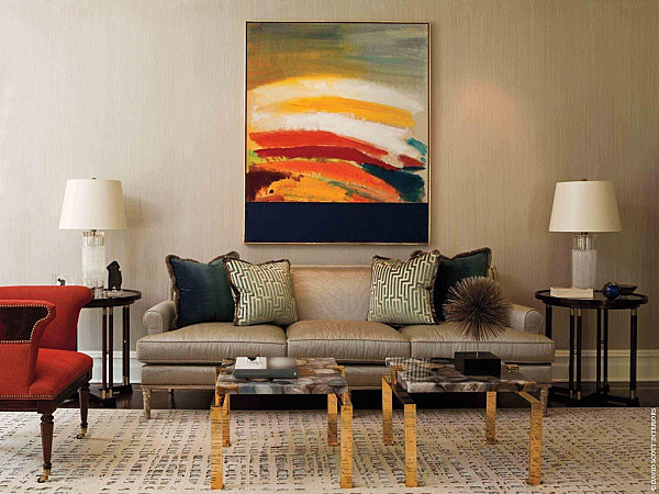
We end with a beige room that is undeniably elegant. But what we love most is the way the modern painting over the sofa truly takes center stage. Without overpowering the room, thanks to the strategic use of neutral shades! [from David Scott Interiors via Zillow]

In today’s color post, we focused on interesting shades such as coral, teal and jade. Because not only does the strategic use of color result in the interior mood of your choice, it can showcase some truly intriguing hues that make your interior an enticing one. And when you create visual complexity, your home is a work of art. Which can be truly inspiring and invigorating!


