Oh, red. It’s such a tricky color to work with in the design world. Too much red can be overwhelming, and it’s even said that it can raise the heart rate. But red most certainly does have a place in the home when done correctly. The key to working with red is to pair it with other colors that are complementary.
The color red means business. This fiery hue bleeds excitement and demands your attention. Bridge the gap between subtle and statement by pairing red with another color. Yes, it’s official: these are the best colors that go with red.
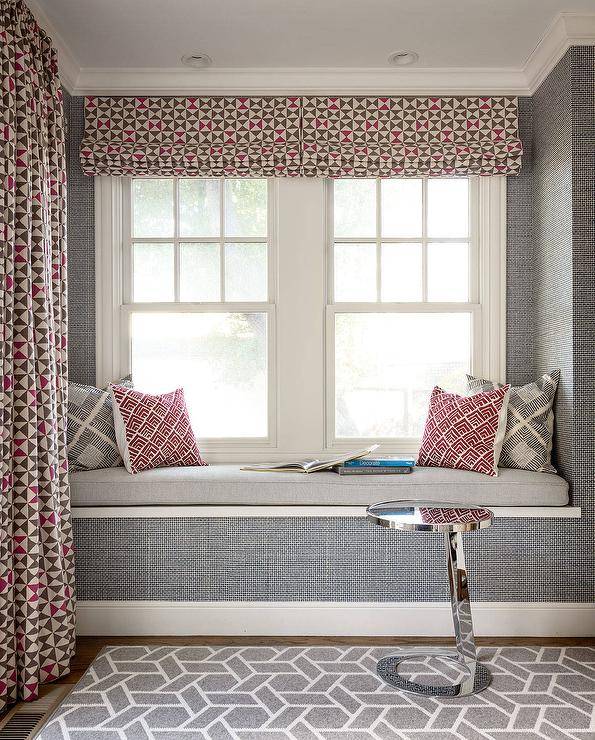
Red + Gray
Red and gray are stylish, classic, and sophisticated colors, so when paired together, you get a combination that is ultimate elegance. Using gray on the walls and pairing it with a bold red pattern will be sure to achieve the wow factor you are after.

Add in different textures and patterns to complete a look that is a statement. The gray textured wallpaper paired with this bold geometric pattern containing hints of deep red make this area fun and funky.

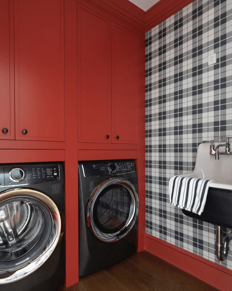
Red + Black
Red and black paired together are a retro classic. The black and white check wallpaper gives this laundry room a totally retro vibe and complements nicely with the classic red cabinetry. The free-standing black vintage-style sink adds a nice touch, too.

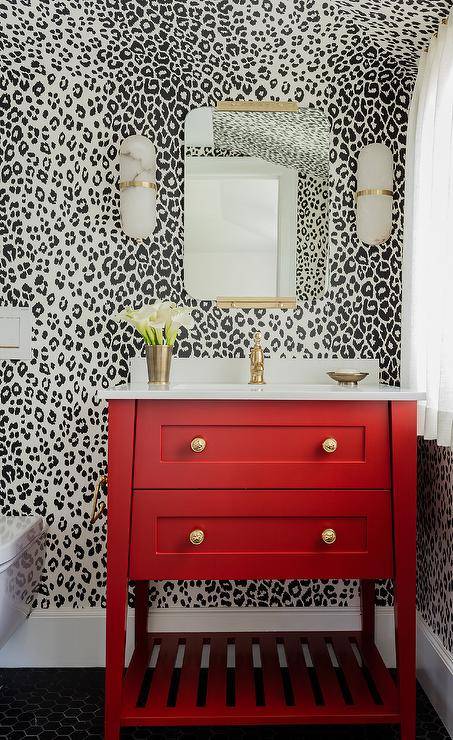
Go bold with patterns when using red. The black and white leopard spot wallpaper is an aggressive choice—but up against a bright red and bold washstand it totally suits. The gold finishes add a lighter touch so as to not outdo anything in the room.

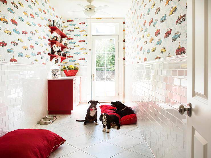
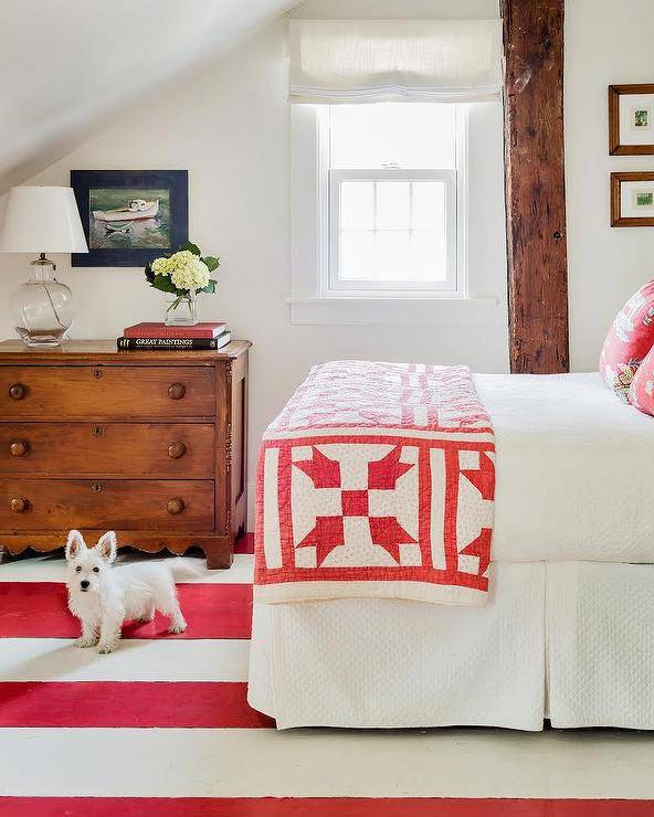
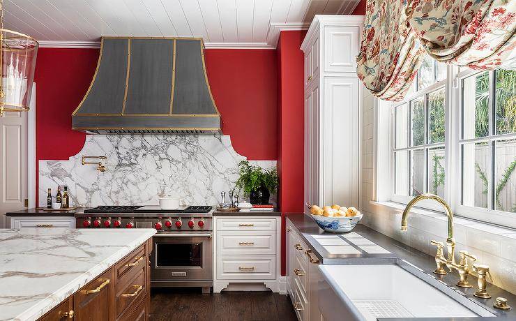
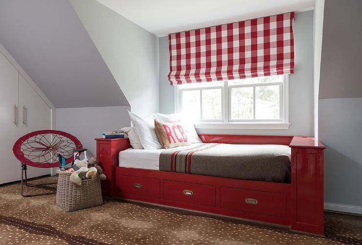
Red + White
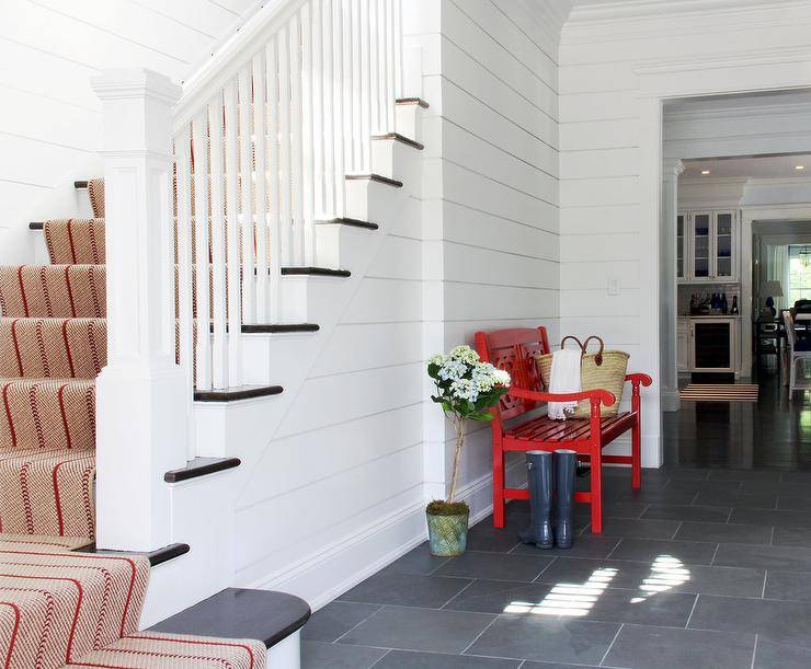
With red and white, you can’t go wrong. Any shade of red looks good with white but especially a deep shade of red. Using white subway tile going halfway up the wall provides a simplistic finish and allows for the red cabinetry and dog pillows in the mudroom to really stand out.

The cottage country vibe in this bedroom is simplistic, vintage, and charming. The red and white striped rug adds just the right amount of color without being too overwhelming.

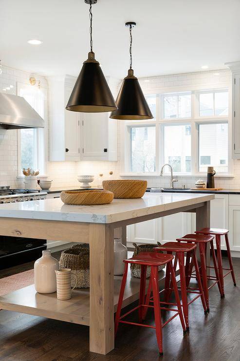
When working red into your kitchen, add little pops here and there. Red can be so striking up against bright white cabinetry. A little red accent wall around this oven range hood and marble backsplash provide just the right amount of focal-point red.

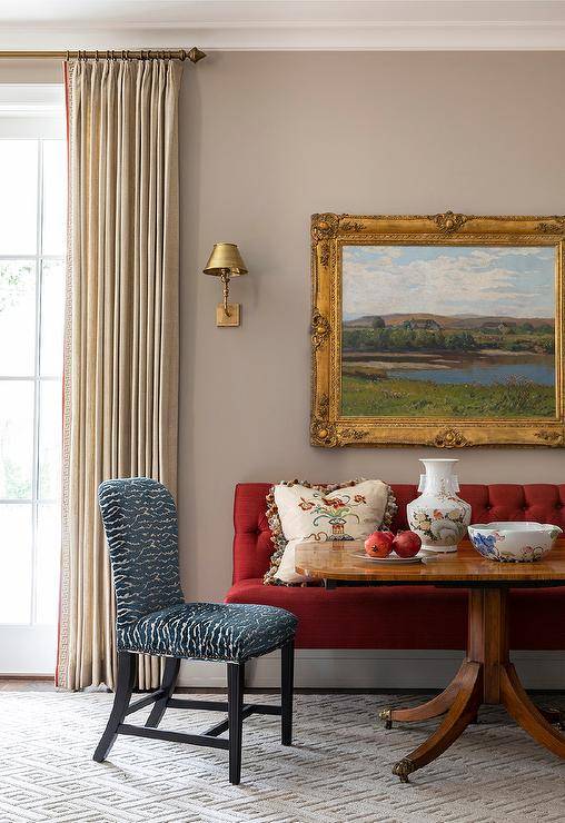
Red + Tan
For a more muted and calm room, try the pairing of red and tan. Tan is a calming color and looks great on walls. It gives you that neutral vibe, but if you want just a hint of color, throw in little pops of red here and there.

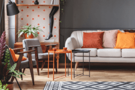
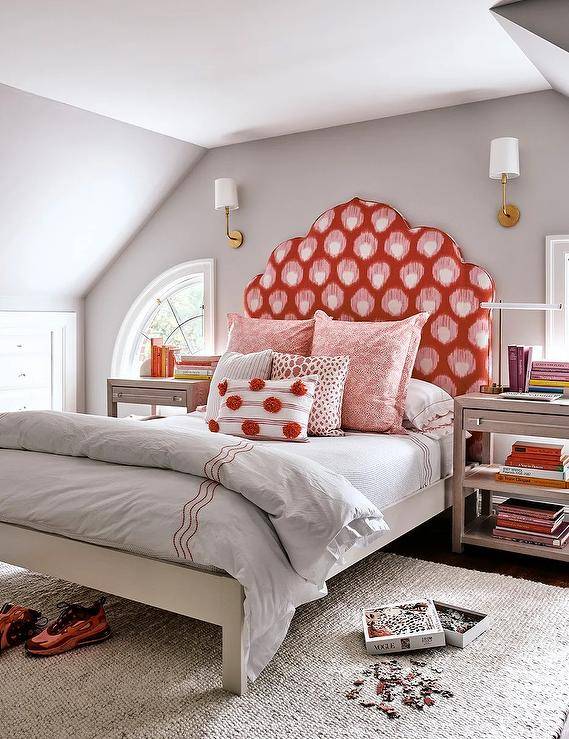
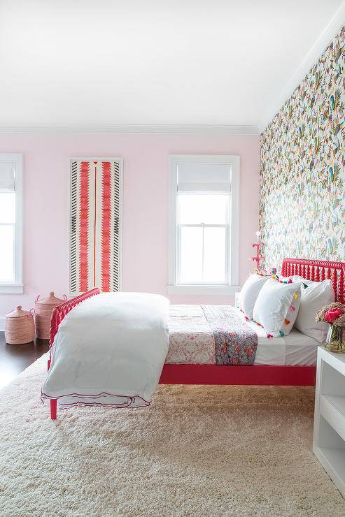
Red + Pink
Many think that red and pink don’t go well together, but it’s all in the shades that you use. When working with pink, try pairing it with a deep red like a wine or burgundy color, and you will find that they are quite complementary.

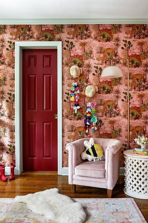
The other trick to working with pink and red is to let the pink be the star of the show. Add in just a pop of red and you can really make a wow effect. Something as simple as a piece of modern art on the wall or a little pop of red in a blanket or pillow.

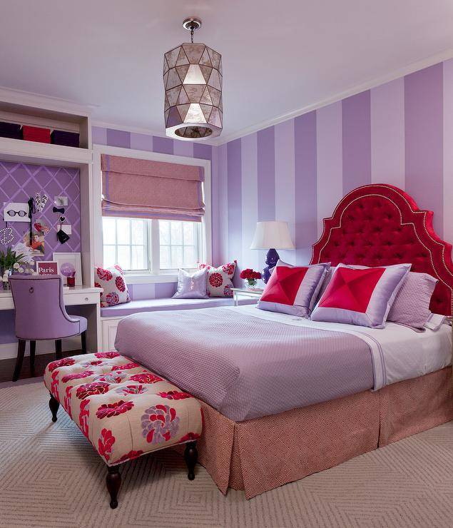
Red + Purple
Red and purple aren’t usually the first two colors you would think to pair together given that they are located on opposite ends of the spectrum—but they can deliver quite the punch. It really all comes down to picking the right hues. You will want to make sure that the colors you choose are in the same tone range.

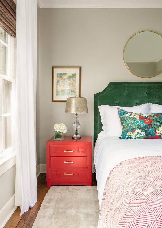
Red + Green
Forget thinking about only Christmas when dealing with red and green. When it comes to decorating your home, you can totally use red and green and it doesn’t have to be December. The trick is to make sure you choose more muted shades of both colors.

A burnt red color paired with a neutral muted green pairs nicely and no one would be thinking of Santa Claus.
You can go with bright reds as well, just make sure to pair them with an olive or deep green to avoid any Christmas-like vibes.

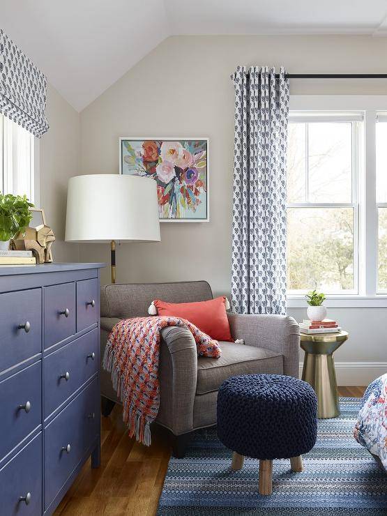
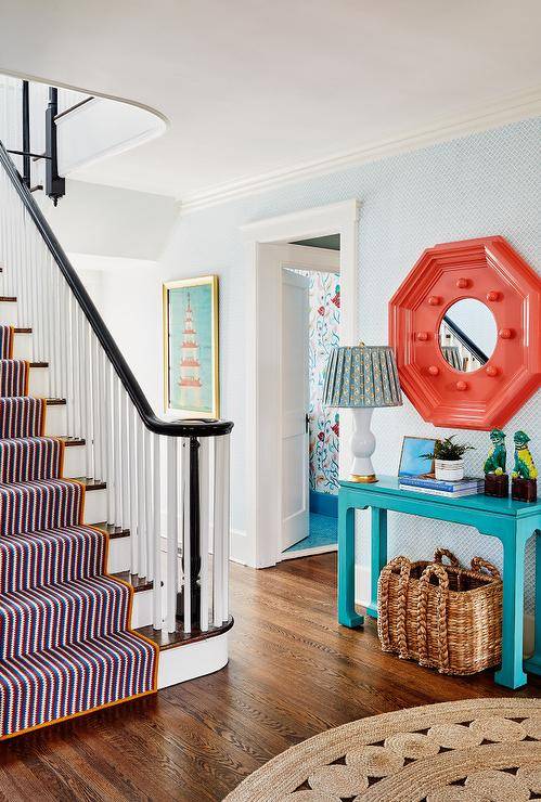
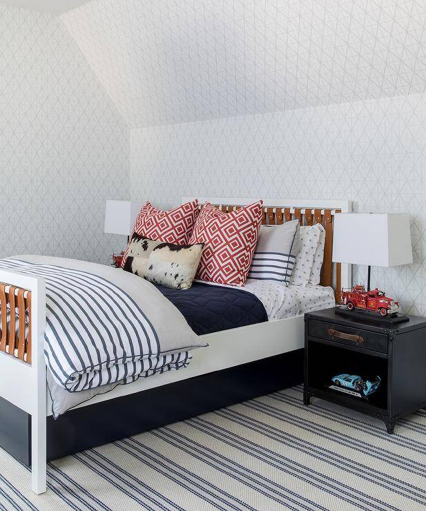
Red + Blue
Red and blue are a combo that just works: think of all the flags, so many are red, white, and blue. Red looks particularly striking with a dark, deep, or navy blue.

If you’re looking to add just pops of red and the color scheme in your house is blue, add in things like pillows or throws.

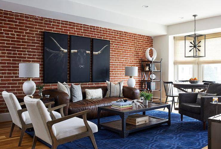
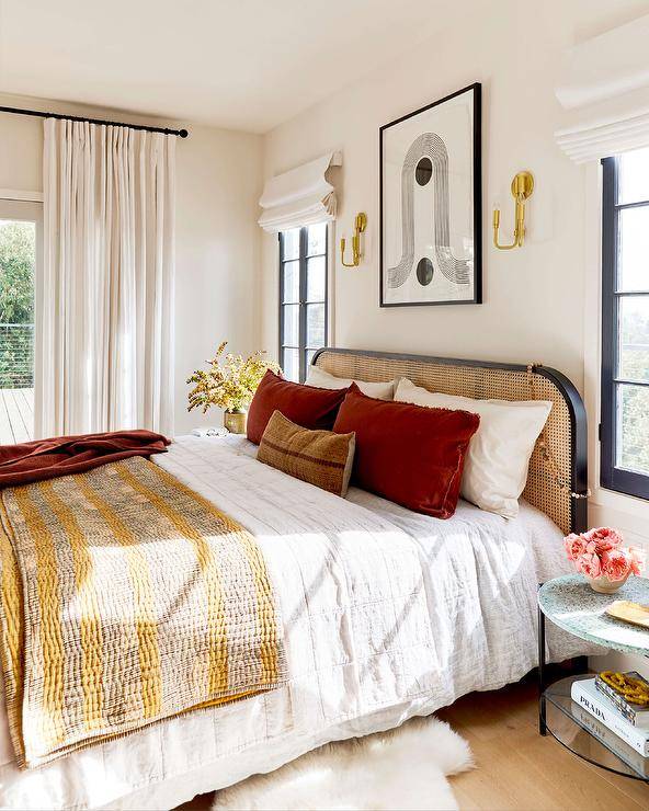
Red + Brown
Adding in a bit of brown with your red decor can soften and neutralize your look. The vibrancy of red brings out the warm undertones in lighter browns and gives them a chance to make a statement rather than act on their own as neutral.

Don’t forget about adding in red textures. It doesn’t all have to be paint, furniture, and accent pieces. A textured red brick wall adds in a subtle red and gives a room a feature wall, plus it pairs so nicely with a rich chocolate brown like this leather sofa.

Red + Turquoise
If you’re looking to embrace a bold streak, red and turquoise may be the color combo for you. These two shades are very loud on their own, and when you pair them together, you can create a fun vibrant room full of life.

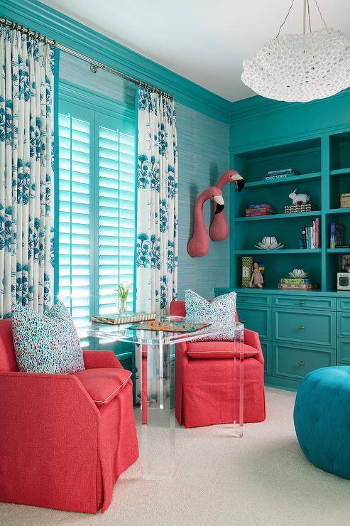
Unlike the above room, you don’t need to make an all-over bold statement, though. Adding in just two pieces of red and turquoise furniture or accent pieces can make a bold enough statement on their own.

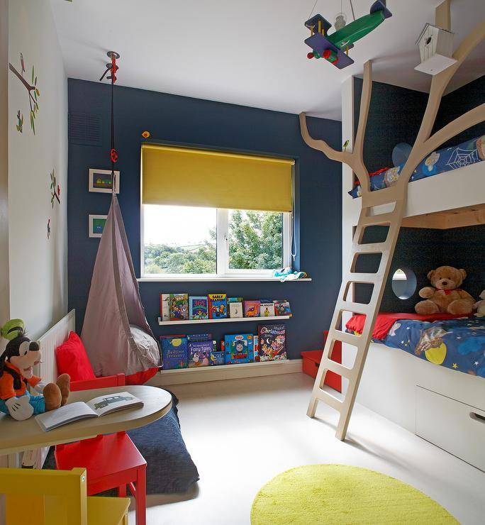
Red + Yellow
Pair deep or wine reds with mustard yellows for a boho laid back look. If you’re after a calm space, make sure you don’t overdo the red. Crushed velvet textures soften the space as well.

Red and yellow are easy to pair especially for children’s spaces. Given that they make up two-thirds of the primary colors, throw in the third color (blue) and you will have a fun and cheery space.

Classic Trio Pairings
Now that we have given you some double pairings of colors that go with red, there are a few classic trios that are always trendy and in style that you can’t go wrong with.
Red, Black, and White
The classic trio of all color combinations has to be red, black, and white. In this trio, the white and black are more of a background and really allow the red to pop.

The key to using this trio is a lot of white and black and a little pop of red. This allows the red to be the focal point and keeps the room simplistic without going overboard.

Red, Navy, and Brown
This is a trio that is not often thought of, but it should be. We all know that red and navy go so well together, but throw in a little bit of brown in a texture like leather or suede, and you take your room from a nice pairing to a trio that elevates and sophisticates.

Best Tips for Decorating with Red
- Tone it down – if you’re struggling to find the exact right shade of red, remember in most cases that less is more. Also, you won’t commit yourself to a shade that you will tire of quickly.
- Commitment is a scary thing – if you’re just starting out and want to add red but are a little leary, don’t go too big. Try adding in a red book, blanket, or a few pillows.
- Try foliage – on that same note, you can add in red foliage as a non-committal way to see if you will like red. Something like a little red eucalyptus in a vase is a great start.
- Test swatches – if painting your walls red, always do test swatches. You want to make sure you get the right shade you are after.
- Go with your gut – at the end of the day, it’s your house and you’re the one that has to live in it. If you like it, keep it!
Find the Right Hue of Red Based on Your Style
Choosing the right hue of red may sound like a tricky task, but it’s quite easy once your narrow down the style of your home. Here are some tips that may help:
Farmhouse or Country Home: softer and chalkier reds with pink or purplish hues. Think barn red.
Traditional Homes: deep burgundies or black tones—stay away from primary reds. Think oriental rugs with dark reds.
Modern Homes: pretty much any shade of red will do. Classic shades to deep and dark shades and everything in between. Think modern art with bright shades of red.
Contemporary Homes: pops of bold red. Most often neutral elements throughout the home with pops of red here and there. Think bright red lamp shades or curtains.
Frequently Asked QuestionsFAQ
What does the color red mean?
Red is the color of heightened emotion, strength, and power. It exudes passion and is never boring. Red is even said to speed up the heart rate, blood flow, and temperature so when working it into decor it should be given careful consideration and used effectively. Red can also energize, so it can give a space an upbeat feel and vibe.
Should I stick with one shade of red?
Working with only one shade of any color can become quickly overstimulating for guests or even yourself. Consider a variety of different shades when decorating with red, from calming and subtle shades to bold and bright. Using several different shades will give your room depth.
What is the safest way to add red to my home if I am unsure?
Going red is not a task to be taken lightly. Red is not neutral and it does make a statement, so if you don't want to go full commitment, start with just pops of red.
How can I add just pops of red?
There are several ways to add just pops of red. In many cases, if you want to decorate with red but want to be timid about it, adding just a few pieces of red may be the best way to go. Here are some common ways to add just a bit of red without going overboard:
- Paint a red accent wall
- Pop of red on a kitchen island
- Accent pieces like pillows, throws, and books
- Statement furniture - chairs, couches, ottomans
- Pops of red in art
- Flowers - faux or real
Can I go overboard with red?
Decorating is all really about your style and preference. You can go overboard, yes. But if it's a bold and dramatic statement you are after, a lot of red will achieve that. In controlled doses, red can add sophistication and elegance. Bright pops can add a fun and cheery vibe. Think about what you want to achieve with red in your decor and that will be your gauge for how much to add.
Is there any room where I should not use red?
Red is a common choice for dining rooms given its ability to stimulate our appetites and conversation. Given that it's also an energizing color, it's not a top choice for bedrooms or bathrooms but can be used in small doses or in more muted hues.
Should I do a test swatch before painting my walls red?
Yes, yes, yes! A hundred times, yes. When it comes to painting your walls any color, you should always do a test swatch, but especially when you want to paint your walls red. Red paint is very hard to cover up, so you want to make sure that you go with the right hue the first time.
It's a good idea to paint on your swatch and leave it for a few days before making your decision.
Further Reading:
How to Create a Sensational Dining Room with Red Panache
The Right Way To Add Color to Your Kitchen
Colors the Go With Green; 21 Designer Approved Pairings
Beyond Usual: 5 Rarely Used Gorgeous Colors in the Kids’ Room