Designers and devotees are eager to know which color will prevail in the upcoming year. Pantone announced the color of the year for 2022, and it reflects the global transformation that’s taken place. The experts take several factors into consideration, such as upcoming events, innovations, and socio-economic factors.
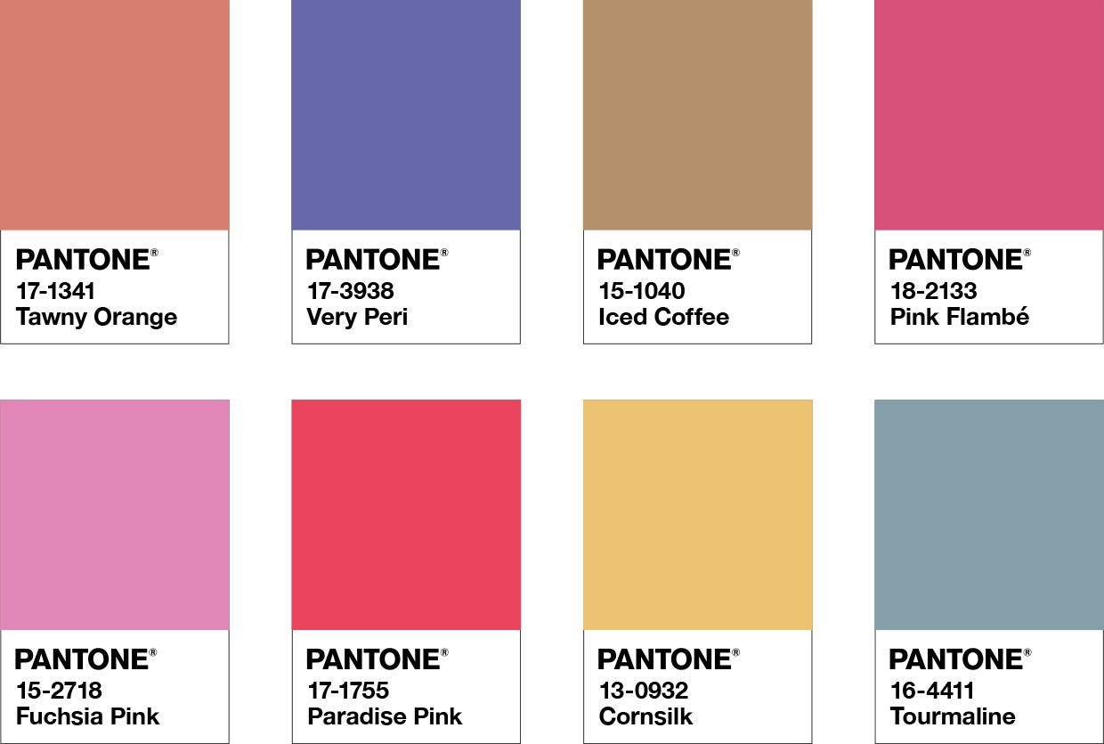
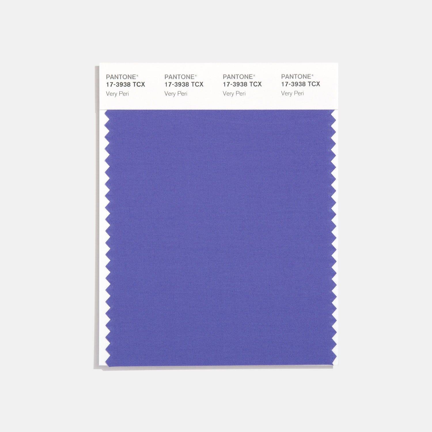
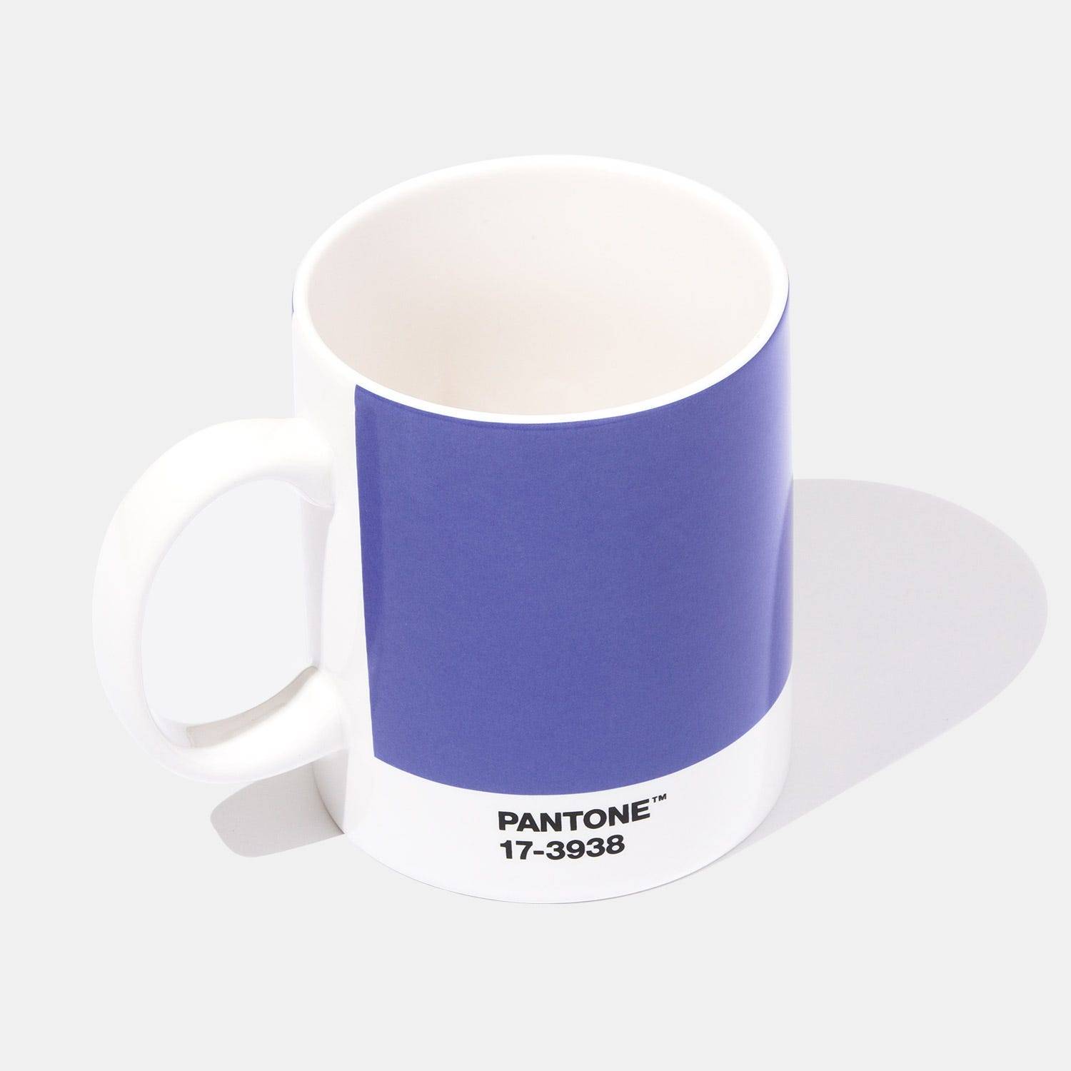
PANTONE 17-3938 ‘Very Peri’ is the color of the year for 2022. The color belongs to the blue family, containing a violet red undertone. The lovely violet-infused blue tone is already present in nature, in the form of vivid plumage and graceful lavender flowers. Pantone’s executive stated that the color is meant to enhance creativity and show off a lively attitude.

Pantone is a color authority, setting the standard in many industries worldwide. In 2021, its team of experts initially announced gray as the color of the year. However, this color choice was perceived as too depressing. Therefore, Pantone released two colors of the year for 2021. A vibrant yellow complemented the gray tone, reminiscent of optimism and enlightenment to help the world cope with the pandemic.
The vision
This year’s selection process differed from the others in two aspects. Until now, Pantone’s team of experts drew a color from their existing color catalog. This year, the color authorities decided that it was time to create a new shade. The current tones didn’t reflect the dynamic world changes, so they recognized the need for a fresh and updated tone.
Pantone’s color prediction was based on global events for the first time in history. After a prolonged period of isolation, the industry standards are changing. Very Peri is reminiscent of the transition going on worldwide while showing off the endless possibilities of digital technology.
Pantone color of the year 2022 implementation
Pantone’s color system provides predictions for many global industries. The experts provide direction for product development in fashion, interior design, graphic design, and product packaging.

These forecasts significantly impact color-conscious companies, whose goal is to make sure their products respond to customers’ changing needs. Upon the announcement, companies have already found ways to implement the color of the year into their products. The fashion industry embraced Very Peri in their spring 2022 collections, exploring all possibilities of this bold tone.
The violet-infused blue shade will shake up the design world, providing many lively color combinations. Interior designers will have plenty of options available to achieve the desired mood. The integration of Very Peri into color palettes is relatively smooth and straightforward. The experts curated fresh and vivid color palettes that integrate the color in a harmonious way.
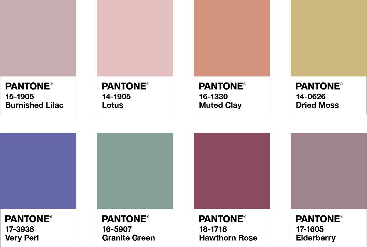
A balancing act
This color palette is perfect for creating cheerful and vibrant spaces with a dose of personality. The muted tones perfectly complement Very Peri. This color will delight designers with its versatility, making it easy to combine with both warm and cool tones.

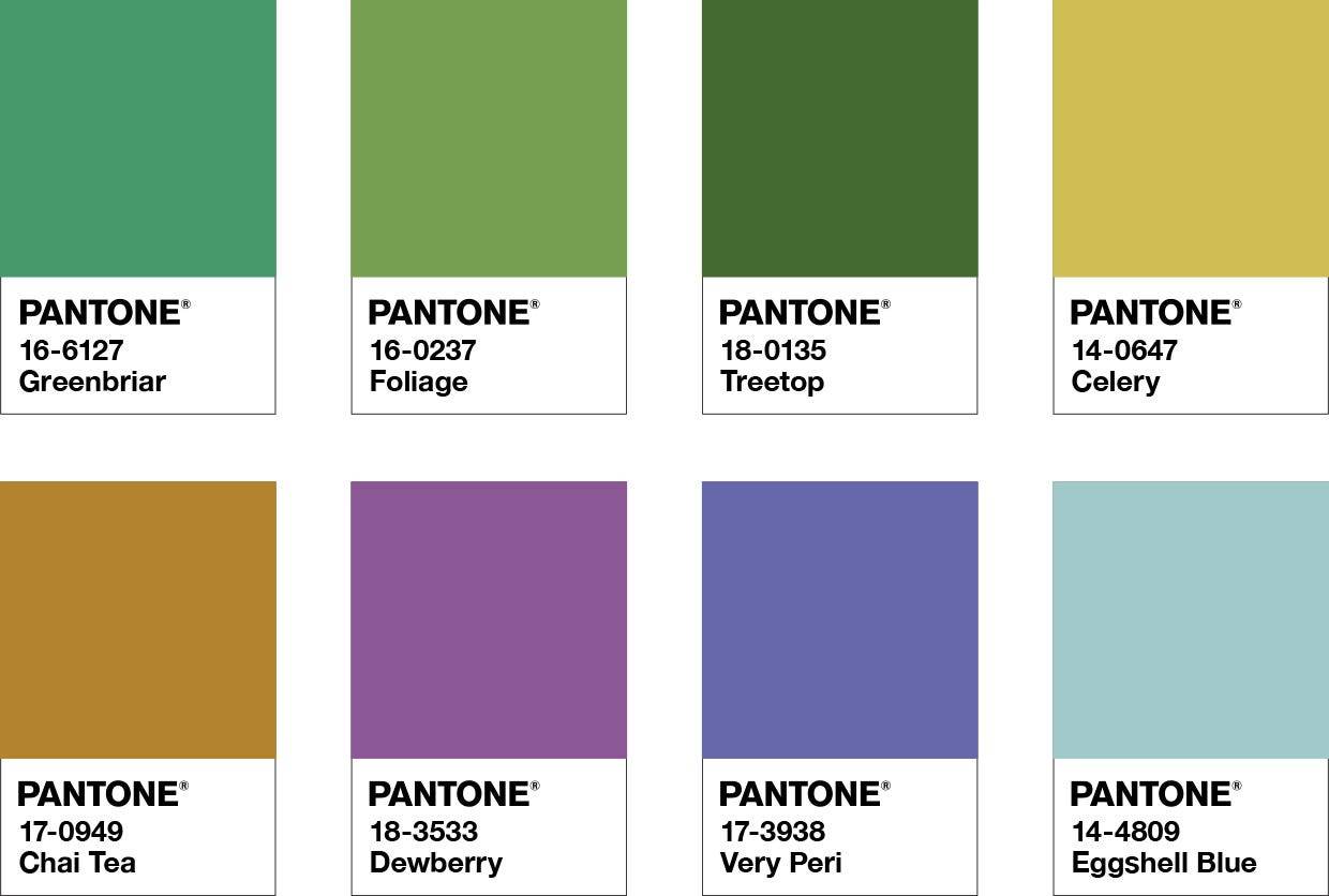
Wellspring
The integration of Very Peri in nature-inspired color palettes is meant to create a serene environment. The fresh color combinations feature a pleasant mix of Veri Peri, greens, and mustard tones. This palette is perfect for creating relaxed spaces with holistic vibes.

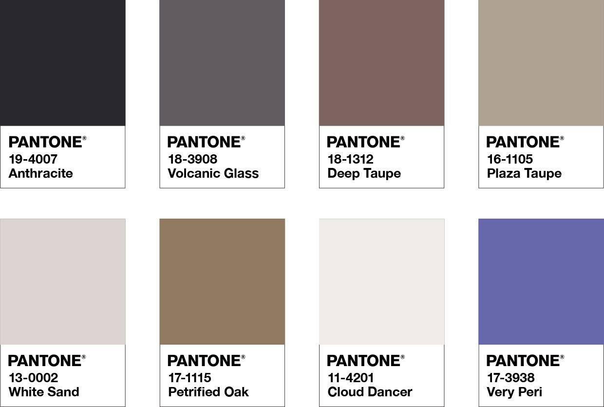
The star of the show
This color palette allows Very Peri to serve as a bold accent among a carefully curated combination of neutrals. The colors promote sophistication and elegance while highlighting timeless beauty.

Amusements
Amusements is a playful color palette that creates the perfect balance between Very Peri and the lovely pink tones. The integration is brave and spontaneous, meant to lift the energy with dynamic combinations.