Pastel color schemes can be used with a variety of decorating styles. The most creative pastel palette ideas usher in summer and spring goodness. You can combine pastels with gentle whites or sophisticated grays and every combination looks absolutely stunning. Match the elegance and soothing charm of pastel hues with our guide below.
Whether you offset gentle shades with crisp white, combine them with more vivid colors, go subtle with a touch of pastel style, or saturate your space with these irresistible hues, you’re sure to have a winning interior! Check out the images below and see which ones inspire you to paint your space with delicate tones. And add a dash of the unexpected, of course…
Pair Pastels with White
We begin with a tried and true strategy for heightening the effect of pastels: pairing them with crisp white! In fact, many prefer to let soft hues speak for themselves simply by NOT covering the room with them. For example, an accent wall gets the job done, especially when complemented by a pendant light in the same hue. [from The Yvestown Blog]

In fact, pastels can really pop in a completely white room. The secret: save the pastels for accent pieces, such as lighting, textiles and artwork. [from SF Girl by the Bay]

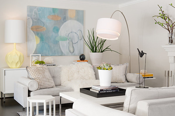
In the San Francisco living room below, white is the color of choice. But it’s the pastels that really stand out! Modern artwork and a rippled lamp steal the show, while greenery comes in at a close second. [from Laura Martin Bovard Interiors]

Pastels can be used to create a soft glow, as shown in this next space from Jerry Jacobs Design. For example, light pink roses combine with a cream and gold palette to create a heavenly haze of warmth and softness…

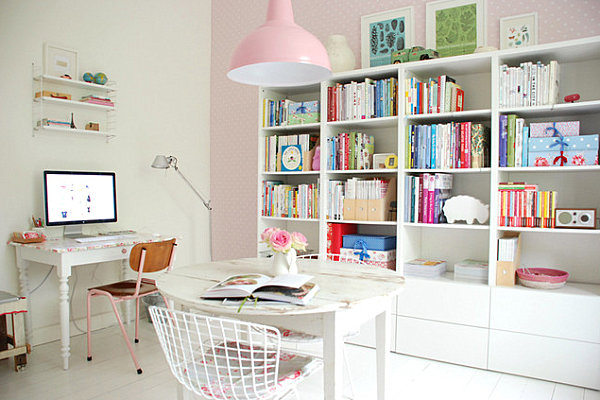
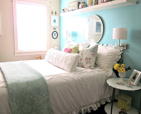
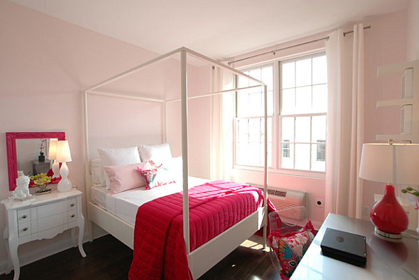
When the walls are pastel shades, going with white furnishings and textiles can be a powerful choice. Especially when pastel accents (like pillows and a throw) tie it all together. Below we see a charming pastel girls’ bedroom from La Borda Bleu.

Combine Pastels with Unexpected Bright Colors
If pastels + white = crisp, then pastels + vivid colors = WOW! One of today’s biggest design trends involves playing up pastel shades with doses of bright hues, such as neon hues. In the next image, we see a picture from the book Pretty Pastel Stylefrom Serena Lake. Note how radiant doses of neon pink tape are just the punctuation mark this lovely space needs… [Photography by Catherine Gratwicke via Decor8]

The pastel blue room below is heightened by rich tones such as bright orange and lime green. A grayer, greener version of the shade can be seen on the dining room chairs. This color echoes the hue of the wall, yet it adds a unique twist rather than simply repeating it. [from Mark English Architects]


Check out the pastels on the sofa in the next image. Pale green, lavender and light chartreuse are irresistible, especially when placed next to hot coral-pink! Would the vignette be the same without that vibrant end piece? We think not! [from Segev Photography]

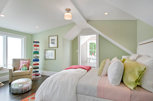
The next room features the lightest of green walls and peachy sheets. Yet a modern shelf houses books in bright colors like orange, teal and royal blue. Throw in a hot pink throw and a rug with fiery details, and you have a bedroom that is anything but sleepy! [from Cardea Building Co.]

Why is the combination of pastels and brights so alluring? Because next to the brights, the pastels somehow pop even more! You can see the effect in this girls’ from 3 Doors Down Home Staging & Interior Redesign. Hot pink is the color of choice, and it appears on bed, mirror, pillows and lamp…

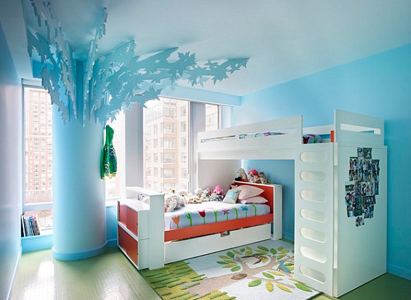
In another girls’ room, we see powder blue walls, but this shade is infused with an extra jolt of color. Add a bright orange bed and a comforter with shades such as red and magenta, and the space comes alive. Of course, the sculptural 3-D tree doesn’t hurt, either! [from Incorporated Architects and Designers]

Go Subtle
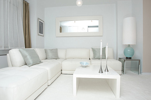
Another approach to pastel interior design involves keeping it subtle. Really subtle. Below we see a room with a white and silver color motif. A lamp and a bowl showcase the lightest of blues. The result: an undeniably modern room that celebrates a pastel shade without going overboard. [from Marie Burgos Design]

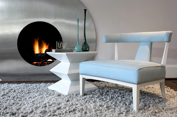
In fact, combining gray with pastels creates a contemporary look that is sleek and soothing. Cool tones reign in this next space from Pulp Design Studios. Which says a lot, given the warm glow of the nearby fire…

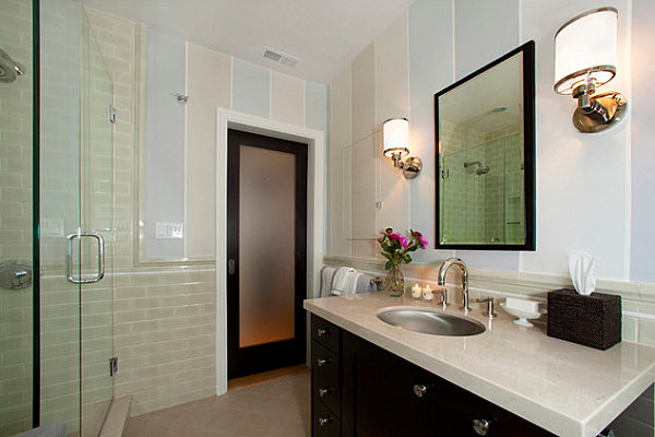
Pastel blue stripes combine with taupe, gray and beige in the bathroom below. The effect: subtlety at its finest. Note how the vertical stripes are a refreshing counterpart to the horizontally-oriented subway tile of the shower. [from Faiella Design]

Go All Out
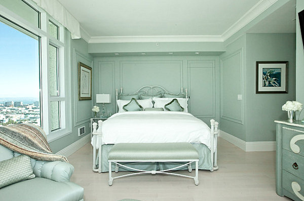
We end with a final approach to true pastel paradise. Go all out. Really. The room below uses the strategy of monochromatic saturation to create a powerful statement. Minty gray-green walls are reinforced by upholstery, furniture and pillows in the same hue. The effect is refreshing and clean. [from Sophisticate Interiors]

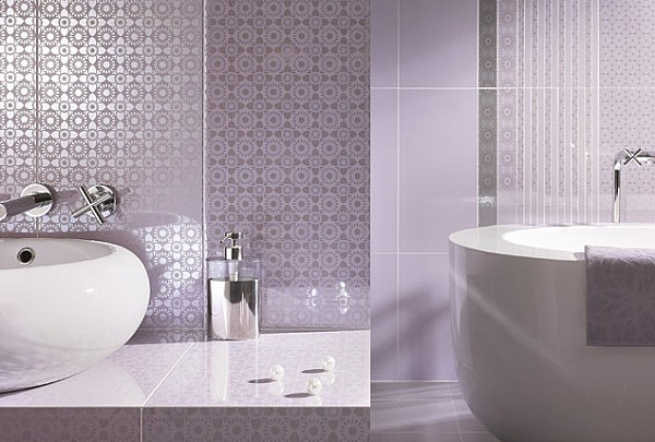
We see a similar effect in the powder room below, which is bathed in lavender. Wallpaper, tile, flowers, accessories and towels all match, creating a unified look that is anything but sickly-sweet. [from Polmaster Tile Center + 3D Design Studio]

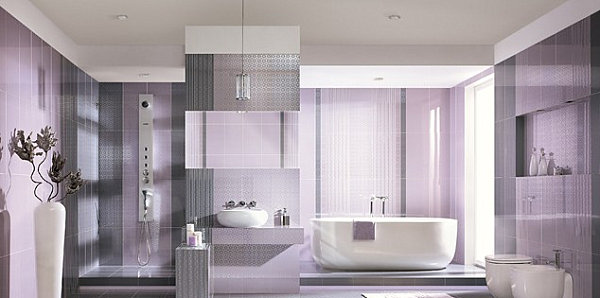
Next we see a close-up of the same room, which reveals how variety is achieved in a space that boasts one main color. Through patterned wallpaper, sleek tiles and textured towels, diversity of the decorative surfaces is key, even under the umbrella of lavender.

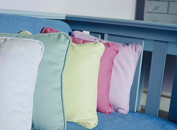
If you desire more than one pastel hue in your room of choice, try putting it all together in a concentrated display. The space below is enhanced by a row of pastel pillows featuring shades such as mint green, lemon yellow, dark pink, and once again, lavender. [from Lonny]

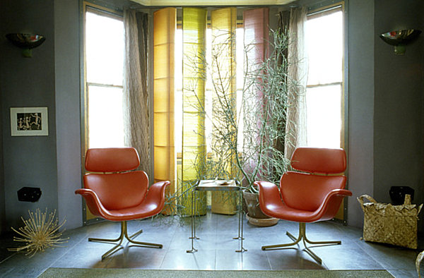
For a similar effect, try combining window treatments of various shades. For example, the seating area below features a display of window treatments in pastel hues. Color can’t help but take center stage, especially when the sun shines through the glass panes… [from Lonny]

What do you get when you blend saturated pastels in equally powerful shades? One bold statement! Even though the room below is white, all we see is radiant color… [from Digs Design Company]

Would you decorate with pastels in your home? Perhaps you already have! Do you prefer to stay in more traditional territory or add a touch of unexpected style? Are you a fan of complementing pastel shades with neon or vivid hues? Or perhaps you enjoy a monochromatic approach! Share your thoughts by leaving a comment below…


