When you see orange you can’t help but think of bright and cheery thoughts — or pumpkins, you may think about pumpkins. But we are here to show you that you can use orange in your home and it doesn’t have to be fall or Halloween. The trick to working in orange in the home is to pair it with the right color.
When paired correctly, orange can add a stunning and vibrant touch to your home, making rooms feel energized and enthusiastic. So, ditch your preconceived notions and follow this guide for pairing the proper colors with orange.
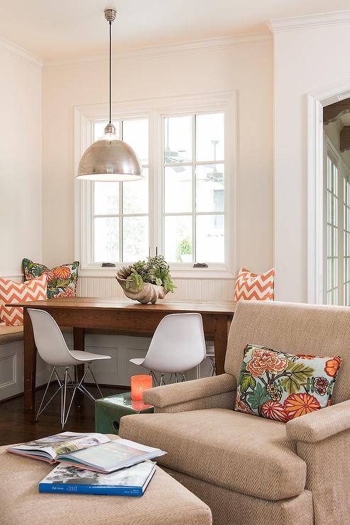
Orange + Neutrals
Bright pops of orange surrounded by neutrals add a bit of warmth and cheer to a room. Working in a pattern makes the orange feel less pumpkin-like and makes it workable all year-round instead of just fall or autumn.

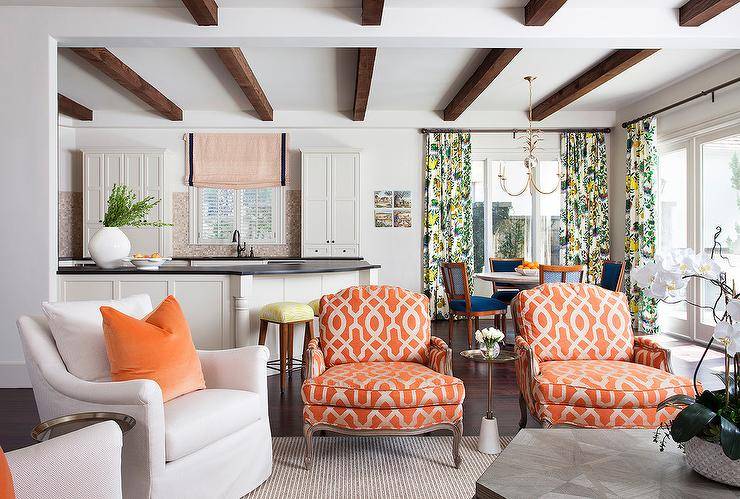
Play up orange in your pillows and accents with a mix of floral patterns and geometrics. On these pillows here using both a chevron pattern and floral patterns give this room a modern Mediterranean feel.

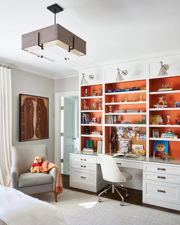
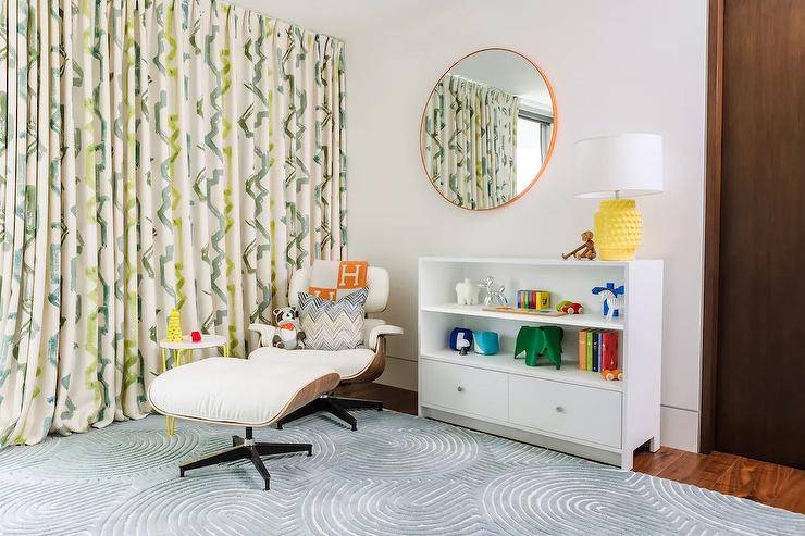
Orange + White
Using the softness of white helps to calm a bright orange. Painting the backs of this bookshelf with a pop of orange adds fun to this space without overwhelming it. Adding in a bit of grey as well in the light fixture, carpet, and accent chair throws in another neutral element allowing the orange to pop and be the focal point of this room.
The grey and white together do help to soften the bright orange a little bit, though so it’s not too overpowering.

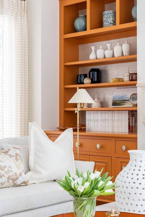
White also looks stunning as a backdrop for an orange that is a little more burnt and not quite so bright. This bookshelf is painted in a more nutmeg-style orange that is a little more toned down and cool.

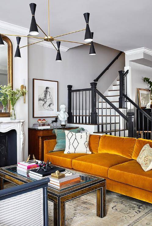
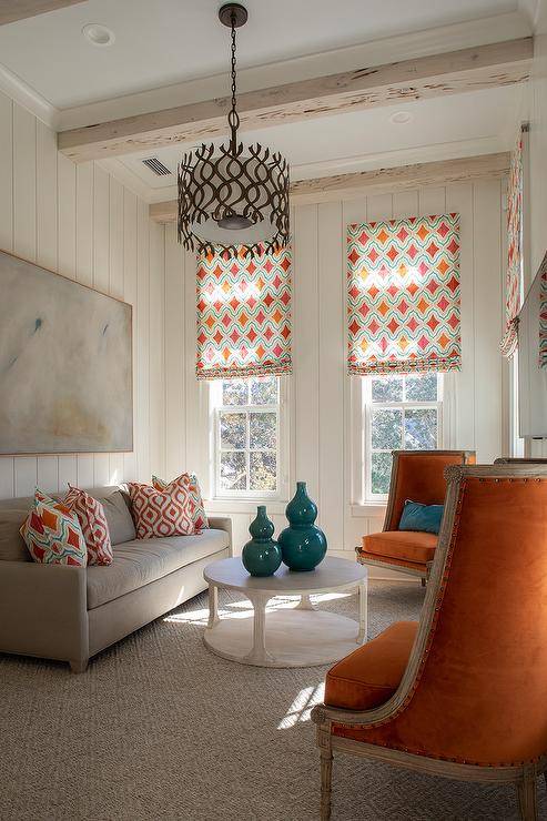
Orange + Black
Forget Halloween — orange and black are stylish and elegant and not just in October. When pairing orange with black, go with a crushed burnt orange velvet in your furniture pieces like this sofa pictured here. This softens the orange and takes it from tacky to tasteful.
Using black on the staircase and in a modern light fixture adds depth and magnificence to this space.

Orange + Grey
Come fall we are overdone with images of orange, but when considering orange for the home, take it to a high level of sophistication by working in some grey. Keep your shades of orange more muted and be sure to work in small detailed patterns in pillows and throws.

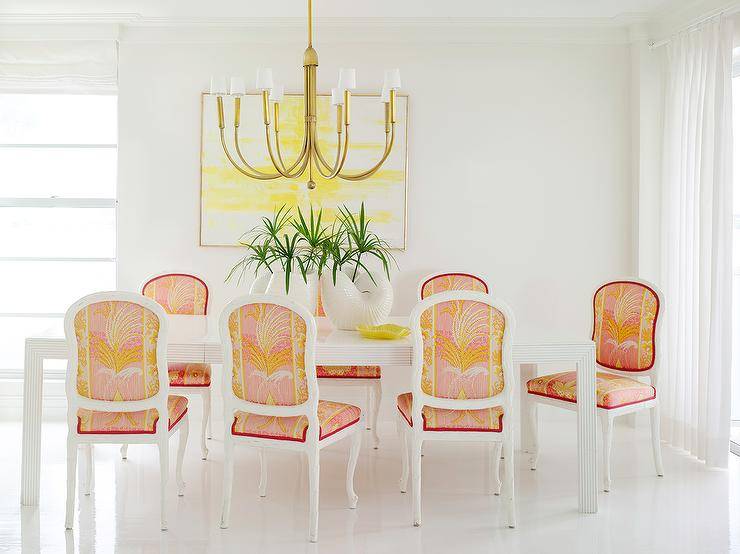
Orange + Yellow
To create a cheerful and bright atmosphere, orange and yellow are your go-to. These two colors together are great for kid’s spaces, nurseries, and anywhere else if your home where you want to add a punch of fun.

Dress up yellow and orange in a classy and sophisticated style for a dining room. Balance these two colors out with white. For light fixtures and accents add in some gold for elegance.

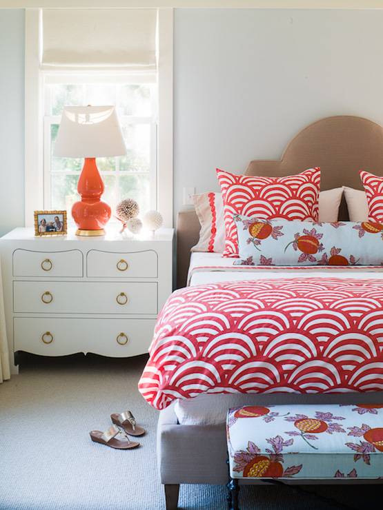
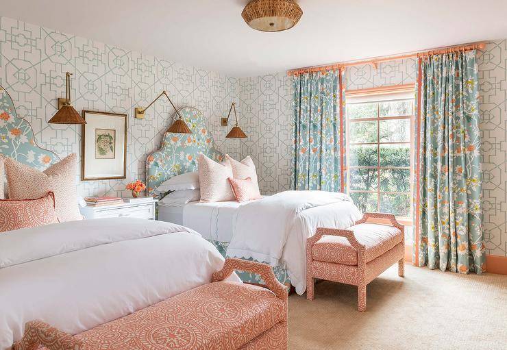
Orange + Red
Orange and red are two colors that most say clash but that’s not entirely true. It’s all in the shades you choose. Burnt orange with a more subdued red can bring balance, warmth, and energy to a room. Orange plays exquisitely with red, especially in heavily patterned textiles like Moroccan rugs or throw blankets.

For a brighter punch, you can go with more brilliant shades of orange and red. Shake up the pattern and designs between the two colors. A scallop design comfort carries the red while the orange is subtle worked in in the fruit design on the patterned pillow and ottoman.
A bright pop of orange in the tableside lamp brings it all together.

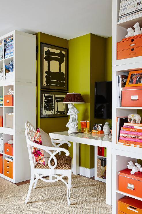
Orange + Green
Avocado green with a vibrant punch of orange adds enthusiasm to any space but looks particularly nice in an office. You will feel energized and ready to work in a space like this.

If you love orange but prefer a more casual and laid-back look, try pairing orange with olive green. Go for a muted orange sofa and olive green walls. These two colors also complement nicely with brown and wood tones.

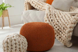
Orange + Purple
When working with orange and purple the key is to not overdo it. These colors are both vibrant and bright on their own, so when pairing them together, little pops here and there is the way to go.

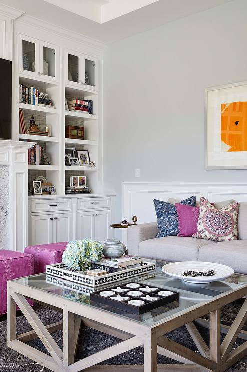
Working in just one statement piece of orange is sometimes all it takes to elevate the energy in a room. There is a lot of vibrancy in this space, but all the colors work together and not one outshines the other, completing this balanced space.

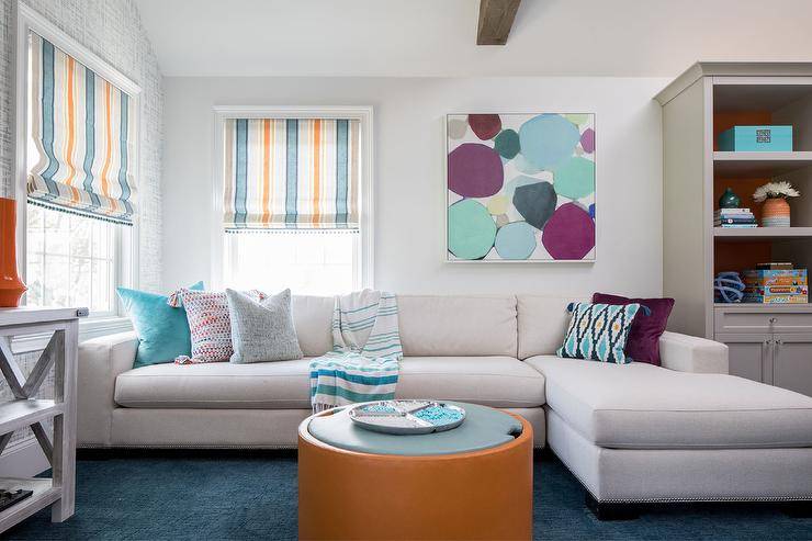
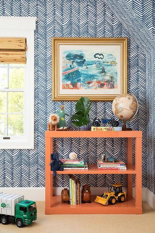
Orange + Blue
Since blue is a direct opposite on the color wheel it’s not hard to work blue in with orange. These complementary colors are a natural fit.
There are so many different shades of blue that will work with orange, it’s hard to pick just one. If working with a lighter shade of blue, try also a lighter shade of orange.

A busy and vibrant chevron blue wallpaper deserves an equally bright and vibrant orange. This bookshelf is the perfect pairing for this wallpaper.

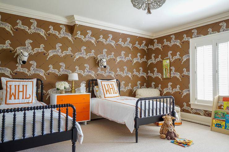
Orange + Brown
Since orange is such a warm color, it works perfectly with brown tones. When using a brighter orange, it really pops from the warm brown background and sets a lively tone for the space.

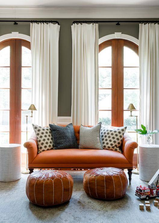
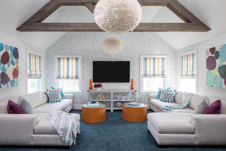
Orange + Teal
The deep blueish-green of teal is a great color to work with orange. As mentioned before, since blue is directly opposite orange on the color wheel, any shade of blue works so well with orange, but I think teal might be our favorite.

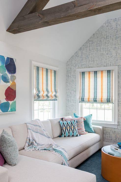
The deep teal shade in this carpet brings complete balance to this room giving each color an equal opportunity to shine. The symmetrical placement of the furniture and accents draws the eye to the two vibrant orange ottomans and how they pop off the deep carpet.

Best Tips for Decorating With Orange
- Muted hues on the wall – if you’re going to paint your walls orange, go with a muted or toned-down shade. Orange is very energized and a brightly painted orange room can quickly become overstimulating.
- Test your colors first – also when it comes to painting always test your colors first and live with the swatches on your wall for a few weeks before committing.
- Start small – if you’re unsure of orange, start with a few small accent pieces — some accent pillows, a throw blanket, or some wall art to see if you can really envision the color in your space.
- Safest bet – your safest bet with orange is blue since they are directly opposite on the color wheel.
- Avoid too much black – a little bit of black adds a great contrast to orange, but too much and your house may look a little too Halloweenish.
- Start outside – if bringing orange in is a little scary, try starting outdoors. An outdoor rug or some orange patio cushions can brighten up a patio and give you time to decide if you want to work orange into your interiors.
- Florals are a great start – also since we are talking about outside — adding orange to your home by using orange flowers such as chrysanthemums in outdoor planters is a great way to add an enthusiastic and energetic look to your home.
Frequently Asked QuestionsFAQ
How many shades of orange are there?
While it's hard to know an exact number, there are roughly 240 shades of orange. Although, when it comes to the design world and designing your home, you can usually categorize orange into two different hues, bright orange or muted/burnt orange.
Bright oranges are common for kid's rooms and living spaces whereas more muted and burnt shades are common in adult bedrooms, kitchens, and dining rooms.
Can I do multiple hues of orange together?
Combining different shades of orange together can give your space a multidimensional look and can most certainly be done. Try pairing pastels and bright oranges together or pastels with burnt orange for a boho vibe. Work in patterns and textures as well in different shades to give off a bold contrast.
Be careful not to get too carried away with too many different shades and too much orange, though. Go too far and it may look a little clownish.
Are there any colors that are an absolute no with orange?
It is said often that red and orange are too much together but that being said, I have seen some fabulous interior designs that pair red and orange quite well together.
If you do want to try orange and red together just be picky about your tones and shades. Try a burnt orange with red this will tone down the orange and make it more complementary to the red.
Orange's complementary color on the color wheel is blue so if you want a perfect pairing stick within the blue color family.
What does the color orange do for the overall feel of the home?
In color psychology, orange is energizing, warm and enthusiastic. Orange is a color of the rainbow that is a component of sunlight which is why this color gives us vibes of cheeriness and happiness. Orange is a common color in nature as we can witness the sky turn orange at sunset and sunrise.
Can orange be used as a neutral?
If using a less saturated hue of orange and then you tint it with white you can most certainly use orange as a neutral and in most cases, this comes across simply and subtlety.
If a bright cheery orange is too much for your space, you can get a beige with an orange undertone. Beiges such as a warm nutmeg color will give you just the hint of orange without going too overboard. This allows you to add subtle color without overpowering the room with a bright orange-like tangerine shade.
What is the most popular shade of orange?
When it comes to home interior design, the most popular shade or orange that is trendy right now is an earthy burnt orange. Minimalist bohemian vibes are big right now and burnt orange suits but that's not to say that bright oranges aren't aesthetically pleasing or not popular either.
When thinking about adding orange into your space, throw what's popular to the wind and think about how you want your space to feel. A bright pop of orange brings energy and enthusiasm to a space where a more muted earthy orange will calm.
Is there a style that orange works particularly well with?
While you can use orange in most any style of home, it's more common in Old-World influenced styles such as Tuscan, French Country, and Southwestern.
What's the safest option if I want to add orange to my home?
If you're still unsure of adding orange to your home, start out small. We suggest starting with a grey or white base and then adding in small accent pieces of orange. Some muted orange accent pillows look lovely on a grey or cream sofa or if you have white walls try switching out your curtains for some patterned sophisticated orange ones. This will give you a feel for your space and how the orange will look without going full commitment.
Whether you want to add in a bold pop or just a subtle hue, orange can be a welcomed addition to any home when executed correctly. You can throw away the feelings of pumpkins, fall, and Halloween when considering decorating with orange because I think these pictures have more than proved that orange has a spot in our homes all year round.