As the cooler weather sets in, you may find yourself spending more and more time outdoors. After all, it’s only a matter of weeks before it’s too cold to enjoy an evening on the patio–soak up the outside time while it lasts! As you look around, are you getting the sense that your yard needs a refresher? Kate here, and my patio could use some TLC. The chairs need to be recovered, and since the summer flowers are long gone, things look, well…drab. I’m on the hunt for a new color palette for my outdoor space. I plan on making some changes this fall, then finishing them up in the spring. In case you’re also looking to make a change, today’s post is dedicated to color schemes for the outdoors. Here are three of my current favorites:
Punches of Red-Orange
Those of you who have read my Decoist posts on outdoor makeover ideas know that I tend to prefer neutral tones in my yard. Since the backyard is surrounded by the beige outdoor walls of my home (and the tan outdoor walls of my neighbor’s’ house), I often stick with accent tones in deep browns and grays, with the main pops of color coming from the plants and flowers themselves. If you can’t fight the neutrals, why not play them up, right?!

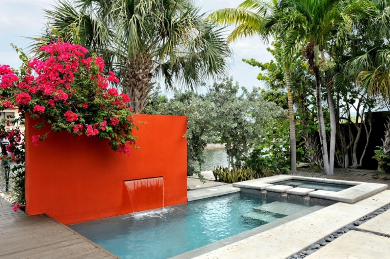
But lately I’ve started noticing that at times when there aren’t flowers in bloom, the overall look and feel of my yard is a little plain–to say the least! I’ve never before considered ultra-bright hues for my outdoor space. Until now! Check out the red chairs in the image above from M.J. Lanphier Interior Design. Below we see a truly captivating accent wall in a vivid shade of tomato red. Against the cool blue of the pool, it’s design perfection! [from Burle Yates Design]

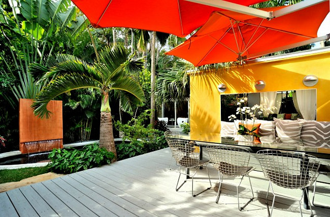
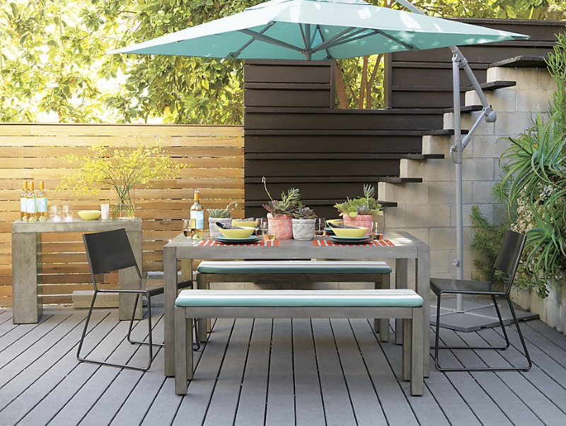
I’ve often wondered if bright yellow would be a good accent shade for my backyard, but ultimately I thought it might look a little strange with the prevalence of tan tones already in place. Until I saw this image (also from Burle Yates Design). Red-orange makes everything better, even the concept of vibrant color combinations! While I likely won’t be purchasing sun umbrellas, I’m tempted to find ways to integrate both red and yellow into my outdoor space:

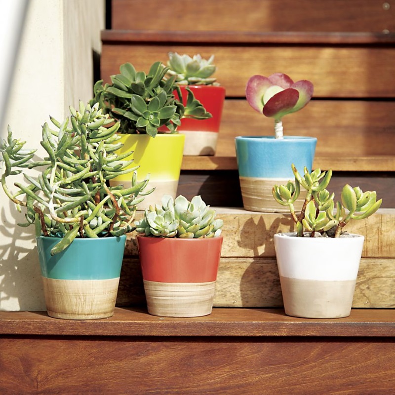
Even the addition of small pots and planters can make a big statement. These Carnivale Mini Planters from Crate & Barrel are on clearance as we speak, and they’re a great way to inject a big dose of color:

Nature’s Colors with a Twist
See the gorgeous yard and pool house below? What are the dominant colors? Blue and green, of course! Regardless of your yard’s color scheme, it never hurts to take your cues from nature when it comes to accents, then play them up for the ultimate punch of color. I’m talking about lime green and turquoise! [from Maienza Wilson]

How can you add these colors to your yard? Through accessories such as cushions, planters, outdoor dishware and more. Below we see the Eclipse Aqua Umbrella Shade from CB2:

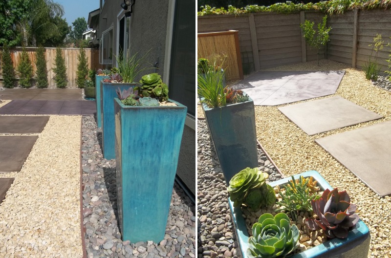
Since I already have outdoor side tables in shades of lime green, I’m considering adding a couple of turquoise planters, much like the large selections below. Filling them with succulents plays up their modern form. [from Alan Dunn Landscape Design]

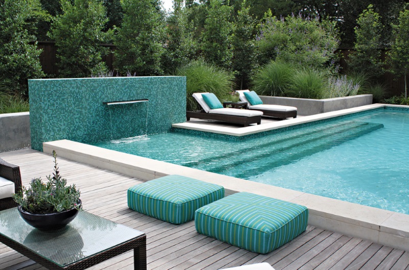
There’s nothing more refreshing than a swimming pool. If you don’t have a pool or water feature in your yard, consider adding a cool splash of color with a soothing shade of turquoise. Cushions are the perfect way to enhance your outdoor space, or you could even tile an outdoor wall in this hue! Add a lime green planter or two, and you’re set. [from Bonick Landscaping]

Peach and Blue
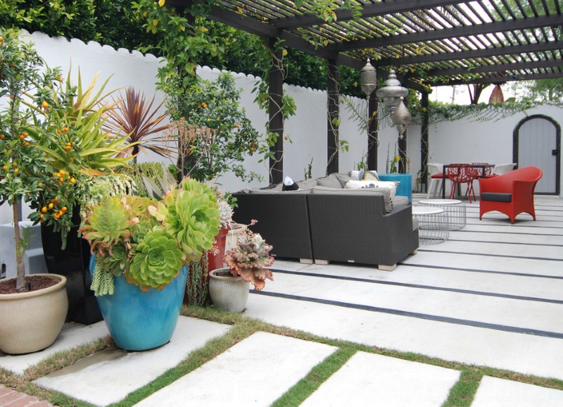
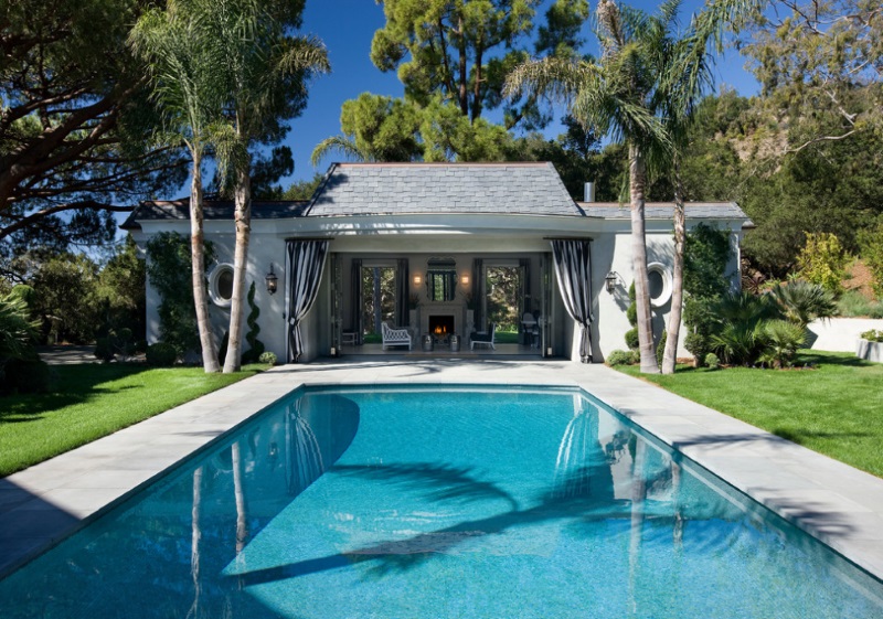
Here’s one more color scheme to ponder: swimming pool blue coupled with peach and white stripes. I have to admit–it would never have occurred to me to consider this color scheme…until I came across the image below! There’s something so peaceful and fresh about this pairing, don’t you think?!

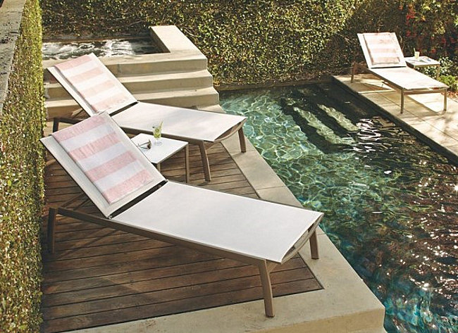
And if you’re still craving a bold dose of color, try making the turquoise extra vibrant, or add a dash of cobalt blue for a more powerful contrast to the peach and white stripes. [from Studio William Hefner]

After viewing the color schemes above, is there one that’s caught your eye? Do you favor a bold dash of red-orange, a celebration of turquoise and lime, or the understated yet dashing combination of peach and white stripes with blue tones? Whatever you decide, there’s plenty of time to translate your dream into reality! And it never hurts to get a jump start this fall!


