Don’t be fooled by the back-to-school ads–it’s still summer! And what better way to bring summer into your home than with shades of coral? This beloved color is a combination of hues like orange, red and pink. Sometimes more salmon, sometimes more rust, coral brings a touch of warmth to a room, yet it can also be the perfect bold statement.


Whether you’re looking to infuse neutral shades with a pop of color or you’re hoping to paint the entire room coral, we present a collection of images that show this vibrant hue at its best. From coral accents to coral walls, take note of the design strategies you see below, and remember that this stunning shades wears well all year round…
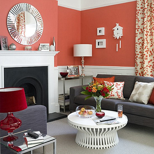
Coral and Gray
There’s something special about the combination of coral and gray, especially when white trim is involved! In this first room, we see how gray seating can temper bright coral walls, while white molding and furniture add crisp detail. Also of interest are the deep red accents that bring a rich feel to the space. [from Housetohome]

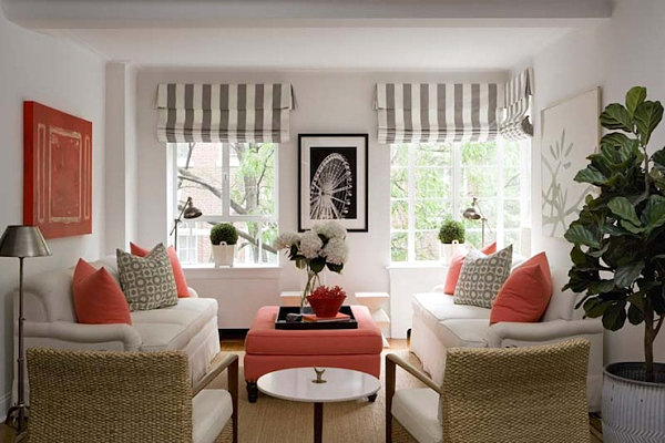
The white walls of the room below give the space a fresh look and set the stage for striking details like striped custom Roman shades and a coral storage ottoman. Coral artwork and pillows establish the color as the dominant accent hue. [from Lynn Morgan Design on decorpad]

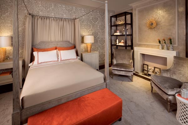
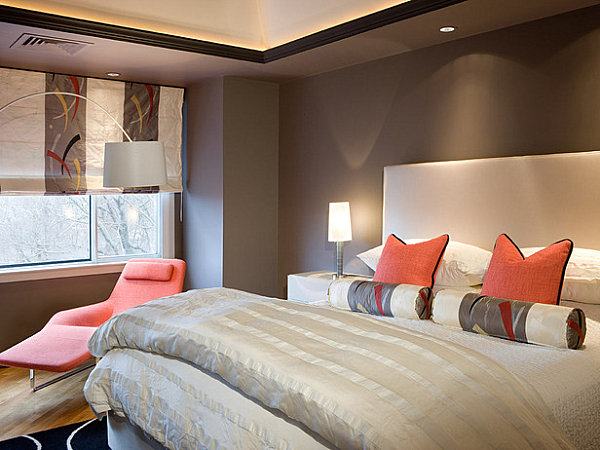
Gray reigns in this next space, a bedroom designed by Jeannie Balsam. The minimal use of today’s featured color ensures that each coral piece truly counts! [from Jeannie Balsam via Chicago Home + Garden]

Instead of bright white, the room below makes use of cream to soften the coral and gray combination. While many coral rooms feature beachy accents like seashells, this space is a contemporary haven with no references to the ocean. And its modern motifs are perfect for the space! [from HGTV.com]

Coral and Beige
If you think gray is the only neutral shade to benefit from a touch of coral, think again! Perhaps because it evokes the sand while coral evokes sea life, beige is a common coral counterpart. And why wouldn’t it be? Coral really pops against shades of beige, taupe and tan, as shown in a window display by Connie McCreight Interior Design.
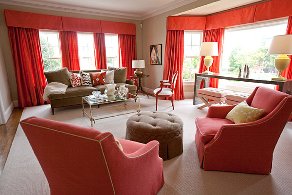
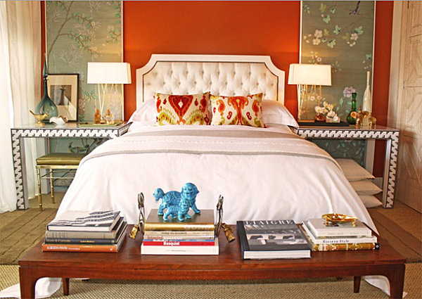
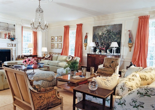
Beige and cream are the perfect backdrop to the coral drapes, pillows and seating in the room below. The result: a warm space that seems to glow! For full details, including where to purchase the decor, check out Traditional Home. [from Traditional Home via The Lenoxx]

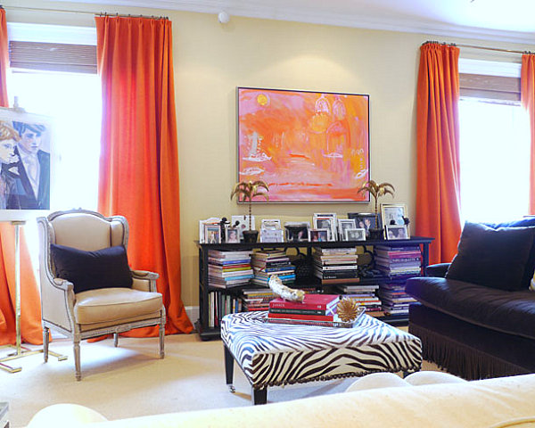
A similar warmth is achieved in the living room of designer Amanda Nisbet, especially since a coral, orange and pink painting is strategically placed between the draperies to enhance the vibrant effect. [from New York Social Diary via The Lennoxx]

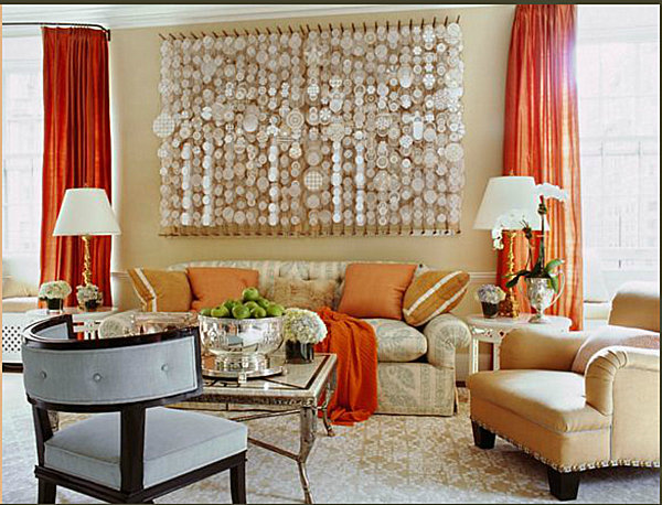
The scene-stealing feature of this next room designed by Jeffrey Bilhuber is the 3-D artwork over the sofa. A small-scale beige geometric rug and light print on the sofa keep the palette calm so the art can really shine. But when it comes to the perfect accent color to give the room a dimension that matches the complexity of the art piece, coral is the hue of choice! We can see why… [image from Asmare, courtesy of Jeffrey Bilhuber]

Coral and Blue
Looking to accent coral with a non-neutral shade? Try blue! Not only does blue remind us of the sea (as does coral), it’s the complementary color of orange. Which makes it an ideal partner for orangy shades of coral, as shown below. The gray-blue panels are true standouts against the rusty coral walls. [from Houzz]
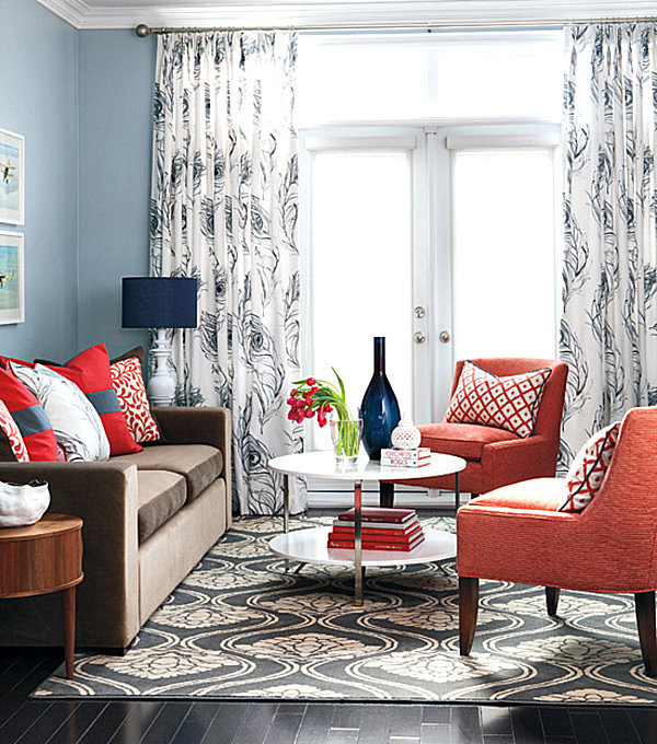
Ooh-la-la! Or should we say blue-la-la?! Light blue is the wall color of choice for this next room, which features coral seating, pillows and books. But perhaps the most enticing accent is the dark blue trim. Would this room be the same without the navy lamp shade, vase and pillow details? We don’t think so! [photo by Virginia Macdonald via styleathome.com]

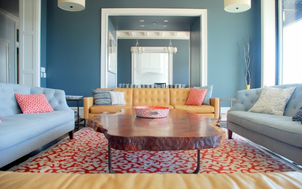
We applaud the use of the large coral and white rug in this all-blue living room. In addition, coral accents on seating and tabletop are truly eye-catching! The pillows and coffee table bowl are wonderful complements to the wall-to-wall powder blue color scheme. [image from Stay at Home-ista via Remodelaholic]

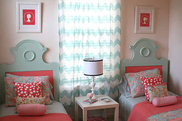
In keeping with the tradition of our recent post on kids’ shared bedroom ideas, we once again profile a space meant for two! This amazing DIY girls’ room from Simply Design uses blue and coral to anchor the space. We love how both shades meet on the unique headboards shown below. For full details, check out Simply Design.

Layers of Coral
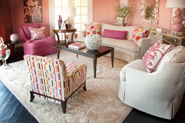
Sometimes the best way to celebrate coral is to layer it with shades of similar tones! When it comes to interior design, we often see coral combined with pink hues. In the next room, a rosy space designed by Eric Guenther, shades of pink and salmon overlap to create a coral effect, as mirrored in the drapes at the far left. [from Asmara]

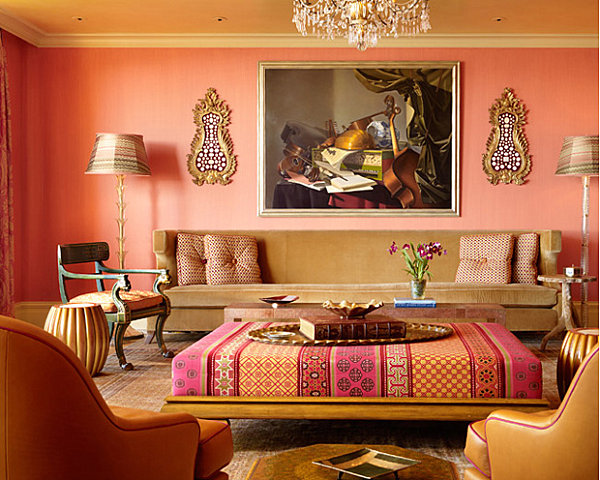
Bring on the coral! In the coral pink living room below, touches of Moroccan style make the space unique! Check out the large ottoman, which features shades of rose, coral and deep red. The hues combine to intensify the color of the walls. [from Spark Stack]

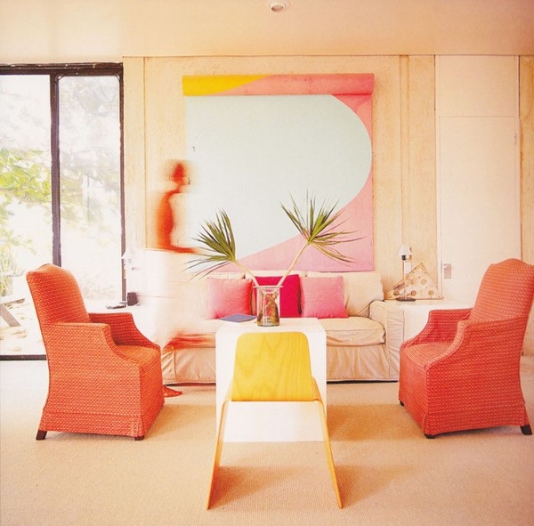
Sometimes neutral walls are the way to go! When it comes to the next space, would the pink and coral tones stand out as much in a room painted a darker color? Possibly not. Not to mention, including coral with shades of pink compounds the vibrancy. [from Arcadian Home Blog]

The elegant sitting area below combines hues like red and pink for a ruddy coral glow. Glimmering walls and lighting give the space a glamorous twist. [from Luxury Home Decorating]
Coral Accents
Sometimes a dash of coral is just as striking as a coral-painted space! For design enthusiasts not wanting to commit to painting the entire room (such as renters unable to change the color of the walls), coral accents are effectively powerful. In the space below, the living room of Tory Burch’s Southhampton retreat, coral draperies are the perfect dose of color. [from Vogue via RW Interior Design]

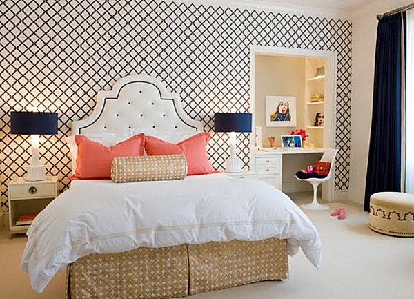
For a nautical effect, combine a navy and white palette with touches of coral. Lattice-print wallpaper gives this next space a light and airy feel, as does crisp white bedding. But where do our eyes travel first? To those fluffy coral pillows! [from Massucco Warner Miller via Love of Family and Home]

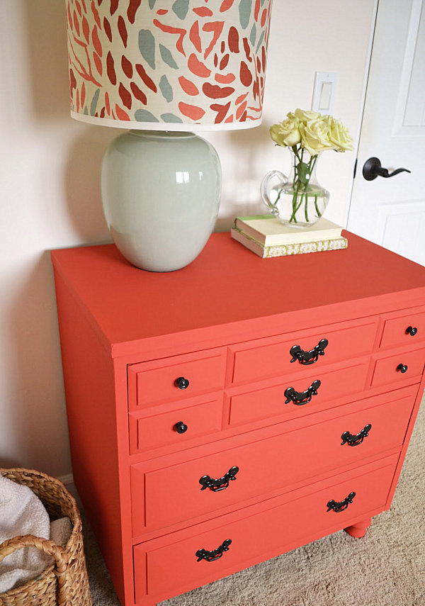
Va-va-voom! A coral dresser breathes life into this next white room. A light gray-blue lamp with coral tones on the shade completes the look. For more details, including the custom mix of paint used in this DIY paint job, check out Sarah M. Dorsey Designs.

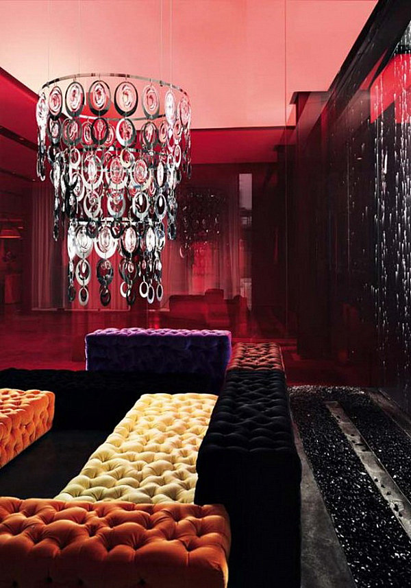
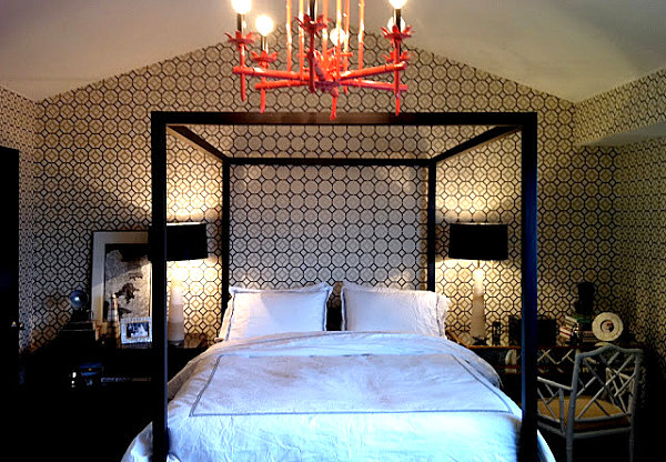
We end with a picture that exemplifies the strategic use of accent pieces. The chandelier below gets noticed precisely because it’s the only coral item in the room! We would expect no less of a setup for a showpiece like this… [from Stiles Fischer Interior Design]

Remember that coral isn’t just for summer! This hue transitions well into the fall, as it nicely combines with autumnal shades like gold and olive green for a warm effect. Even cooler shades of coral are pleasantly powerful, offering vivid color every season of the year. Who doesn’t love a bold dose of coral in the middle of the frigid winter? But for now…since it IS still summer, have fun accenting coral spaces with beachy accessories, like sea life botanical prints and white ceramic sea urchin vases!