We’re getting into that transition phase between summer and fall… Are you starting to think about ways to update your interior? If you’re like me, a new season is an excuse for a new take on decor. Today we bring you three exciting color palettes that will help you rethink your space. In fact, today’s featured color combinations get progressively brighter, proving that there’s no one right way to outfit your interior.

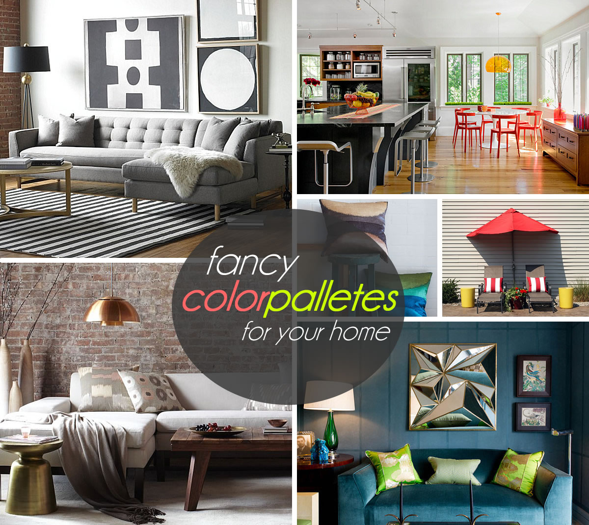
One thing all three palettes have in common: a big “wow” factor. It’s kind of fun when an interior instantly gets noticed! Through unexpected touches, vivid combos and vibrant pairings, you can elevate the look of your room. And it can be as easy as adding a throw pillow or a new collectible. Check out the color palettes below, then leave us a comment at the end of the post to let us know your favorite!
Color Palette #1: Gray and Gold
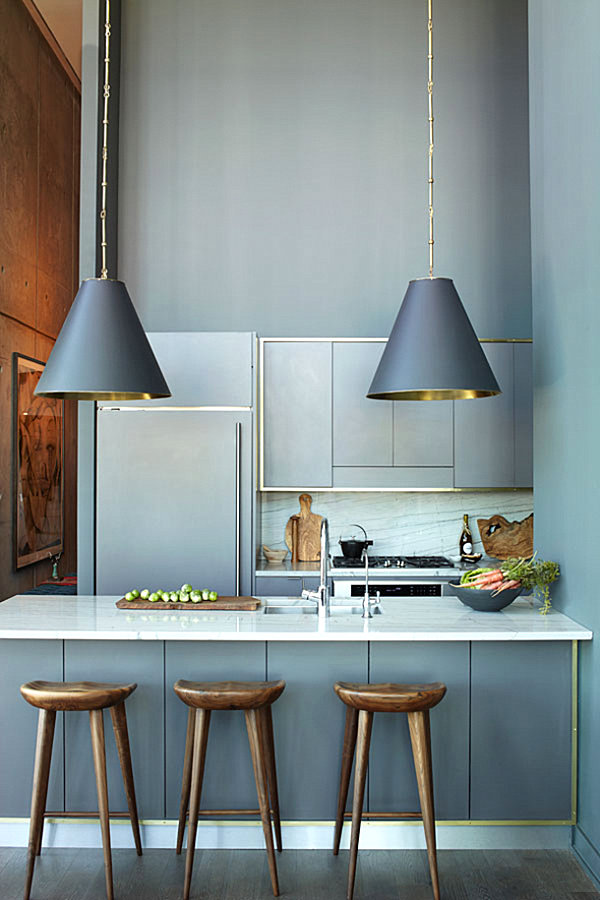
I’ll be honest… Our first featured color palette was totally inspired by the Brooklyn penthouse kitchen of interior designer Athena Calderone, featured by blogger Cristina Cleveland for Camille Styles! I was instantly drawn to the combination of cool gray and warm gold. It’s unexpected, isn’t it? And it’s quite refreshing how the gold tones appear as trim and detailing, adding a rich look to this space…

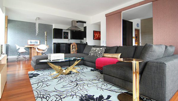
But the gray/gold combo can transcend the walls of the kitchen. In the next living space, we see how a gold-toned vintage coffee table and side table beautifully blend with a large gray sofa from Minotti. As a bonus, we’re loving that dusty rose wall behind the couch, which bridges the gap between cool and warm. [from M.J. Lanphier]

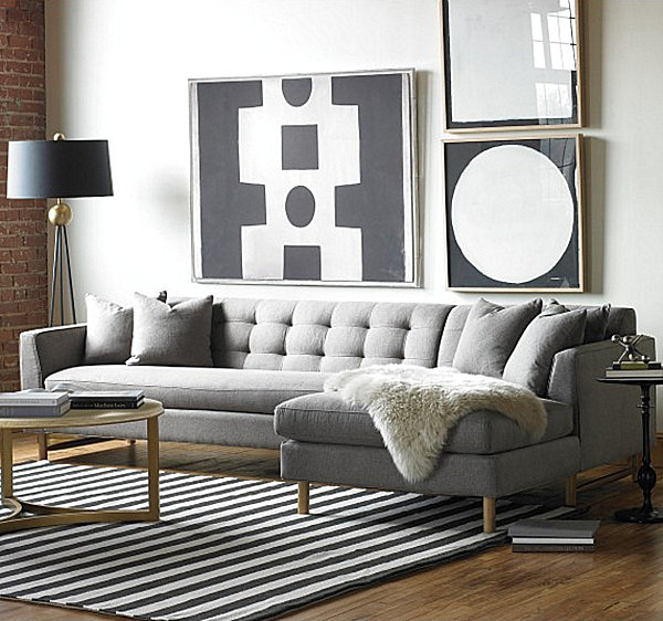
With the return of brass, we’ve seen a large number of furnishings and smalls with a golden glow. If you look at the space below (which features the Edward L-Shaped Sectional from Dwell Studio), you’ll notice a hint of gold on the coffee table and lamp. We love how these flourishes are surrounded by large doses of sleek gray…

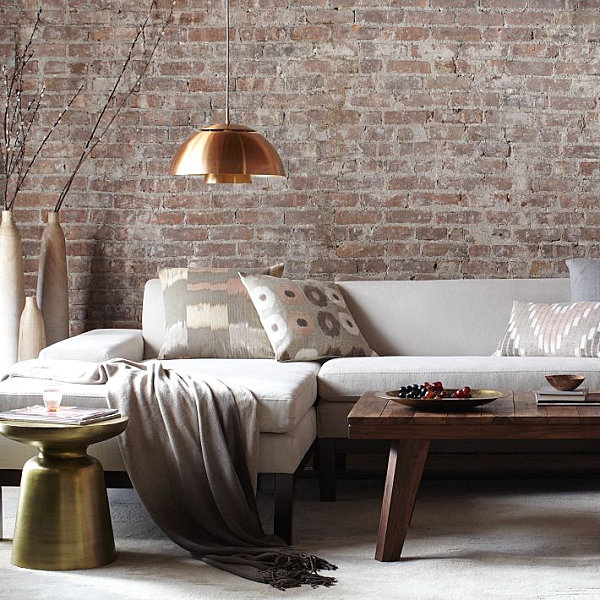
Perhaps this first palette’s success can be traced to the power of metallics! After all, gray evokes silver. Is it that strange to pair it with gold? Don’t hesitate to mix a variety of silvery gray and gold hues, as shown below with these stylish finds from West Elm, such as the Martini Side Table. Those throw pillows say it all, don’t they? Each one integrates warm and cool tones in a chic combination. And we can’t take our eyes off that pendant light…

Color Palette #2: Green and Teal Blue
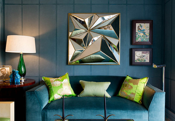
Our next featured color palette celebrates the allure of jewel tones. Teal blue and shades of green are very complementary, and they tend to work together in spectrum-style fashion. Use them to celebrate the soothing range of greens and blues. Below we see an emerald green lamp and lime green pillows in a teal space. [from Rikki Snyder]

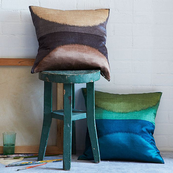
We now zoom in on a decorative find that combines blue and green in the most alluring of ways. At the bottom right of the image below, we see the Ikat Moon Silk Pillow Cover in Dragonfly from West Elm, which includes shades of olive, emerald, sapphire and teal blue. Doesn’t it look fetching next to that teal stool?

Ooh la la! Teal, green and a host of other bright shades combine in the vintage painting below, featured in an elegant Chelsea apartment in New York City. A blue-green rug anchors the space and ties it all together… [from Shagreene]


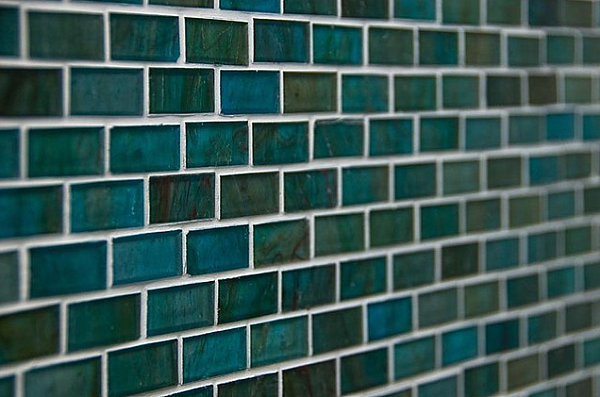
Blue, green and everything in between! A slew of hues combine to create the teal blue tile below, featured in a contemporary bathroom from Amoroso Design. The deepest of waters, the richest of jewels… What else does this color combo evoke in your mind?

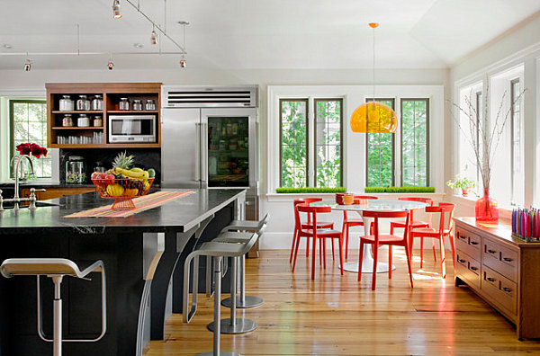
Color Palette #3: Red and Yellow
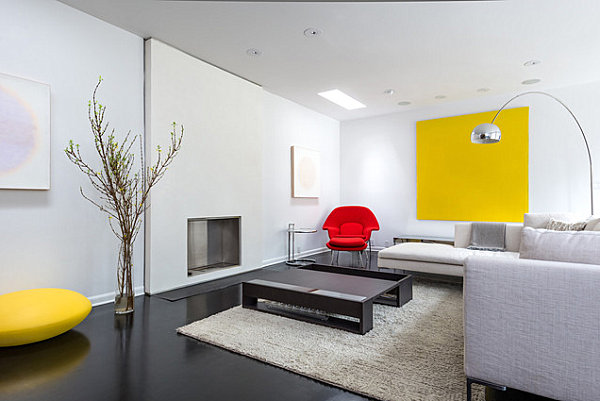
Our final color palette is the classic combo of red and yellow. But we’re not talking about mustard and rust. This duo features the brightest of primary hues. And a little goes a long way… Which is why this living space is design perfection, thanks to yellow artwork and a fire red chair. [photo by Peter Molick for C O N T E N T Architecture]

Lighting and seating in bold yellow and red make this space from LDA Architecture & Interiors come alive. Can you spot other yellow and red accents in the room? It’s hard to imagine this interior without these bright shades, isn’t it?!

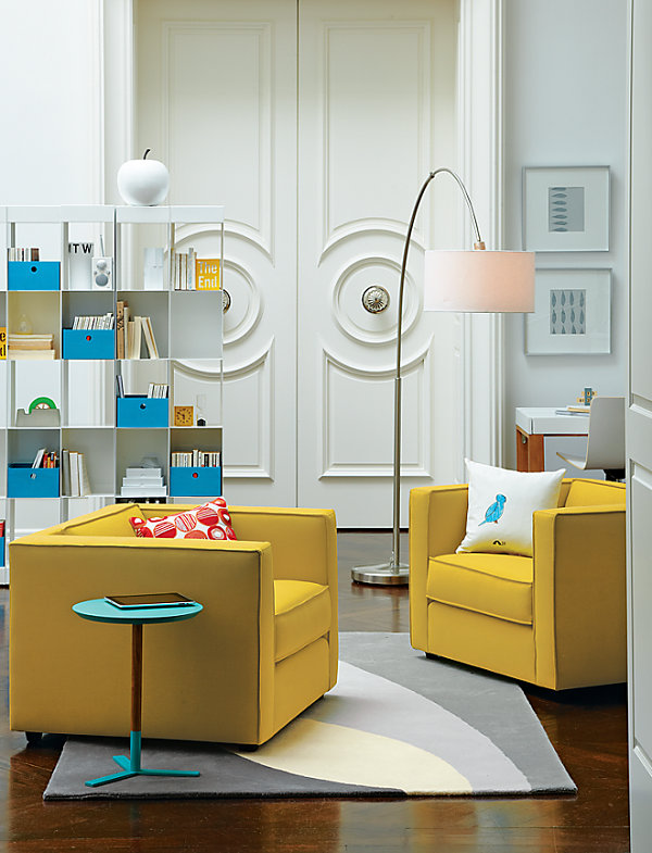
Next we show the power of yellow seating paired with two accent colors: red and blue! In fact, blue is a wonderful way to round out the primary color theme established by yellow and red, especially when the blue accent arrives in the form of the Discus Aqua Side Table from CB2, as shown below. Another common theme in this last set of images: white walls.

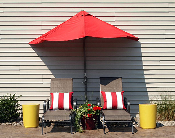
Finally, we just had to spotlight this outdoor area, especially since it illustrates the crisp, refreshing power of red and yellow when combined with white. While this is clearly a summery look, the color palette can work in any season. Do you tend to feel a bit gloomy in the winter and fall? Outfit your interior with red and yellow (and white)! Nothing could be more uplifting… [from Designs by Shoshana]

Which of today’s color palettes is your favorite? Are you a fan of gray and gold? Do you enjoy the rich combination of teal and green? Or perhaps you prefer shades of red and yellow. Share your thoughts by leaving a comment below…