If you’re pondering paint possibilities for your space, look no further! Today Decoist delves into the world of color–paint color! When it comes to choosing the right shade for your interior, there are no hard and fast rules. Many factors will play into your decision, including the amount of light in the room, the colors of your furnishings, and the overall effect you desire.
Rather than giving you a list of definite steps for choosing a memorable hue, we present you with some points to consider. After all, the more you think about the possibilities and results, the clearer you will be about what you want and how you will get there. In fact, you may find that rather than selecting one color for the whole room, it may be interesting to try one accent wall, or even a creative painting strategy involving stripes or another standout technique. Enjoy browsing the images below. May they inspire you with a rainbow of possibilities…
Paint Color Possibilities
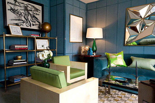
We begin by pointing out a few strategies that can lead to the paint color of your dreams. One possibility is to match the wall color to your seating. The gorgeous blue sofa below looks even more striking against walls of a similar color in this study designed by Brian Del Toro Incorporated. The result: a rich, saturated look. [from Rikki Snyder Photography]

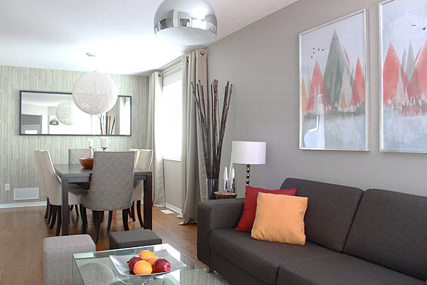
Another technique: Go a few shades lighter than your seating. The gray-on-gray effect is stunning in this next featured space, especially since the sofa is several shades darker than the wall paint. This varied yet monochromatic look sets the stage for pops of color in shades like rosy red and peach! [from Leclair Decor + Design]

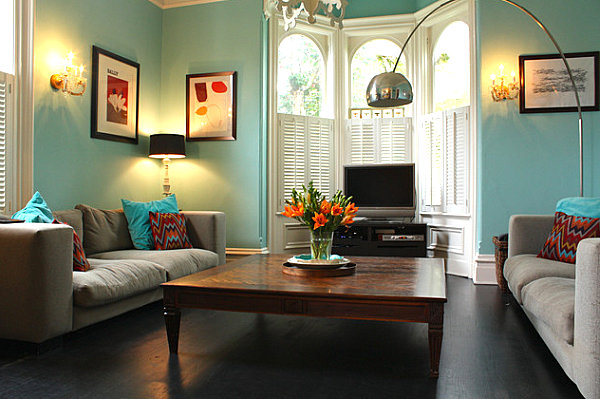
Not sure how to tie together a vibrant wall color and neutral furniture tones? Accentuate the wall paint with throw pillows in similar shades. In the space below, vivid blue walls are emphasized by throw pillows a shade or two darker, along with patterned pillows that feature the hue in their pattern. [from Houzz user Shannon Malone]

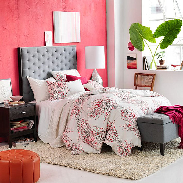
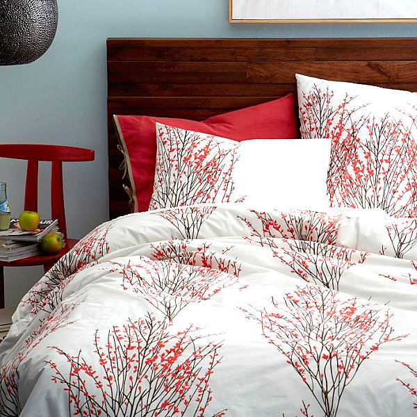
Try picking out one color from your patterned textile and covering your wall in that shade. Below we see the Organic Cotton Sakura Duvet Cover + Shams in Desert Sunset from West Elm. Note how the red of the blossoms in the duvet is present on the wall behind the bed. A perfect fit for the space, don’t you think?!

Or go with a contrasting color! We now present an image of the duvet above, this time set against a blue backdrop for a striking contrast. Sometimes an unexpected hue is just what the space needs. Which do you prefer with this bedding–the red wall or the blue?

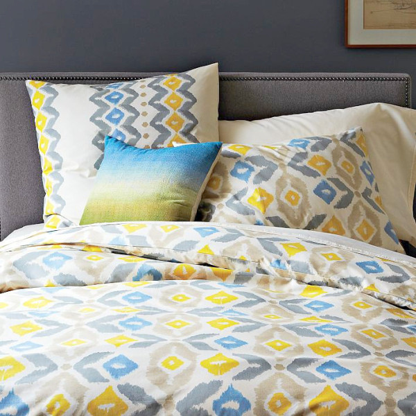
We’ve chosen another pair of pics featuring the same duvet cover to make a painterly point. Yes, changing a paint color can give your decor an entirely different look! Below we see the Organic Winter Ikat Duvet Cover from West Elm, set against the backdrop of a blue-gray wall. The effect is crisp and modern…

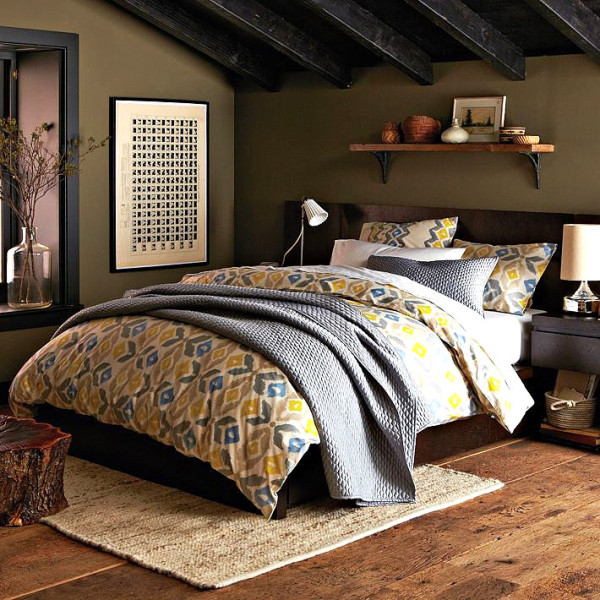
In the next image, we see the same duvet, this time in a taupe space with black trim. Notice how this setting gives the duvet a much earthier look. Think paint color doesn’t make a big difference? Think again!

Accent Walls
If you’re not interested in painting the whole space, don’t forget about the power of an accent wall. In fact, many people enjoy using colorful accents in areas such as the wall behind the bed. A little bit of color can make a big difference! In the room below, a vivid shade of blue adds a pop of radiance to an otherwise white space. [from Forum Phi]

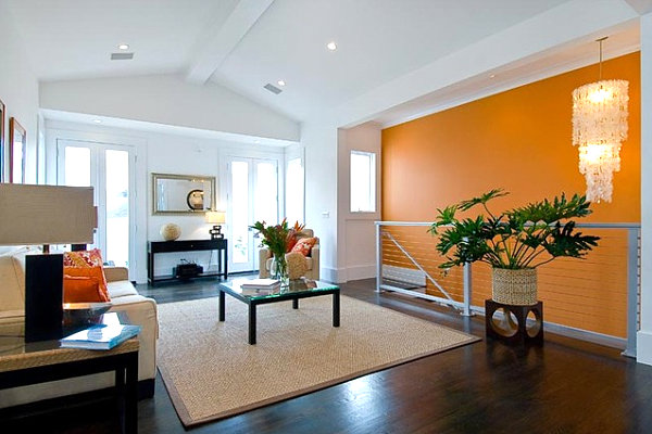
In fact, an accent wall is a great way to introduce a vibrant color that is perfect in small doses, such as the orange tone below. Note how the use of an accent wall beside the staircase adds personality and punch to this living space. [from Amorso Design]

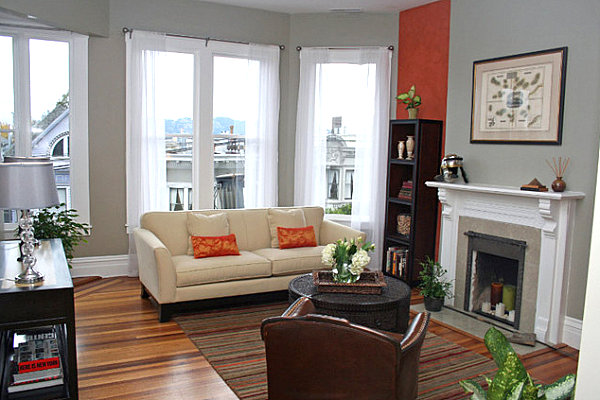
If you have a wall that houses a special feature such as a fireplace, try making it the accented wall of the room. It may be the natural choice, as the eye will already be drawn to this wall, and the addition of color will emphasize the special feature it holds. [from Atmosphere Interior Design]

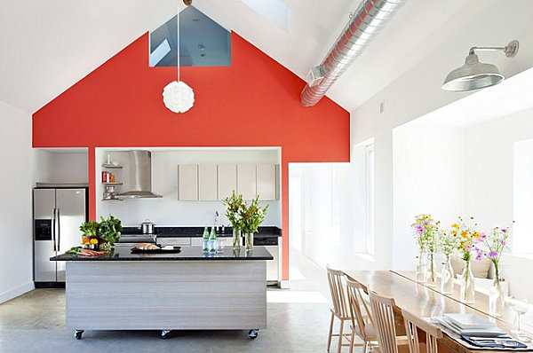
Try a fiery shade of red in the kitchen, the perfect space for a dynamic color. In the culinary space below, a red hue is an ideal match for neutral cabinetry and countertops in shades of black and white. [from ZeroEnergy Design]

Specialty Painting Techniques
We end with a series of specialty painting techniques. Because sometimes double the color means double the fun! Try painting the top half of the wall one shade and the bottom half another. White and olive make a modern statement in the room below, which features the Chester Tufted Upholstered Sofa from West Elm:

Or add one wide vertical stripe behind a tall piece of furniture, such as a bookcase, creating a bright backdrop that showcases your furnishing with a strip of color… [from Valerie Wills Interiors]

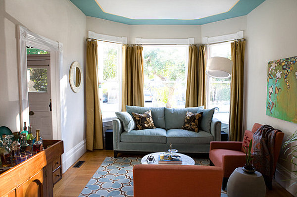
Don’t forget that you can add a dose of vibrancy to the ceiling by painting it! In fact, if your room has an unconventional shape (such as the octagonal room below), painting a border along the edge of the ceiling can help emphasize the form of the space in a truly unique way. [from Sunny K. Merry Interiors]

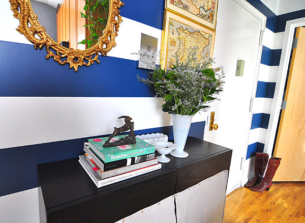
Let’s hear it for stripes! Painting vertical lines in a room makes the space look taller, while horizontal lines make the space appear wider and longer. Below we see alternating shades of white and cobalt blue, thanks to the use of decorative stripes. Note how these shades are the perfect complement to the room’s golden wooden tones. [from Frisson Interior Designers & Decorators]

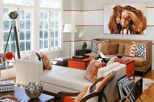
Your stripes don’t have to be the same! In fact, varying the width of your stripes can add intrigue, as well as define the clean lines of the room. Note how the thin orange stripes in the next featured space help create a border between the room’s wider bands. [from Artistic Designs for Living]

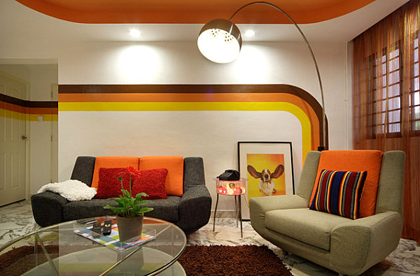
We end with a specialty painting job that has a distinct retro vibe. Don’t be afraid to get creative and give your space a distinct look. The curves and colors of the paint stripes below result in a vintage look that is perfect for the room’s earth tones and orange accents. Don’t forget to check out that ceiling! [from uberdesignhouse]

When it comes to painting your space, do you prefer to stick with one color for the whole room, are you a fan of the accent wall, or do you enjoy an unconventional approach, such as painting the ceiling or creating a design with stripes? Share your thoughts by leaving a comment below…


