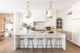
Spring is a time for starting anew! Whether you prefer a good spring cleaning regimen or a slew of redecorating projects, it’s hard to argue with the refreshing power of a new color palette. While current trends shouldn’t be the only factor as you make your choices, this year’s spring color palette possibilities are particularly fetching. Dusty pinks and peaches combine with a range of blues and greens for a soothing array of hues that can easily transition to summer. Keep reading for design details and plenty of visual inspiration… [vases below from Crate & Barrel]

Peachy Possibilities
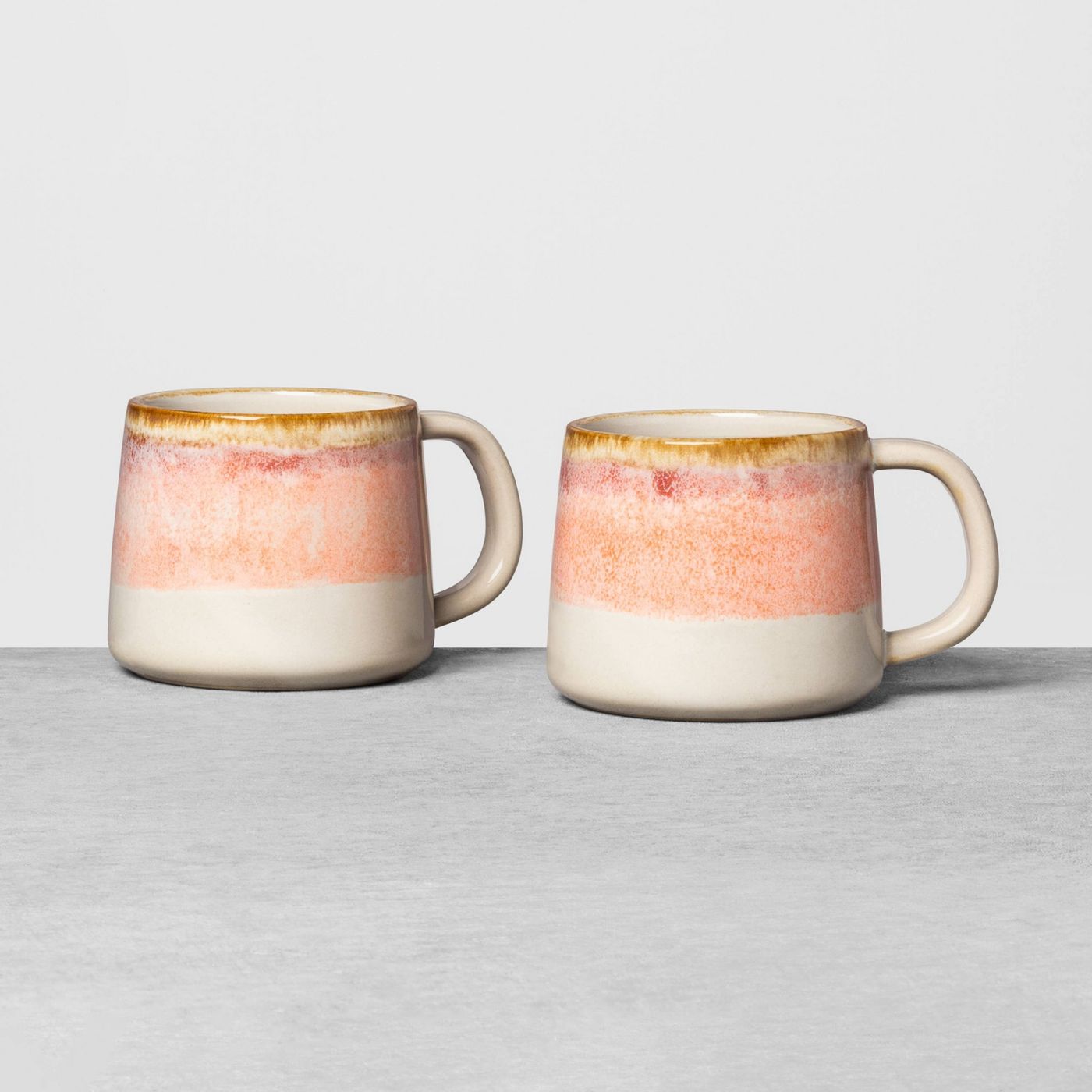
Corals, peaches and pinks headline this spring’s top colors. While brighter pinks dominated the scene for a few seasons, a recent turn toward dustier, duskier shades has taken soothing style to a whole new level. Rather than picking from a set of “it” colors, you can use one or more of today’s featured shades as a jumping off point to explore a spectrum of rosy tones. Below we see Hearth & Hand’s Ombre Pink Mug Set, available at Target:

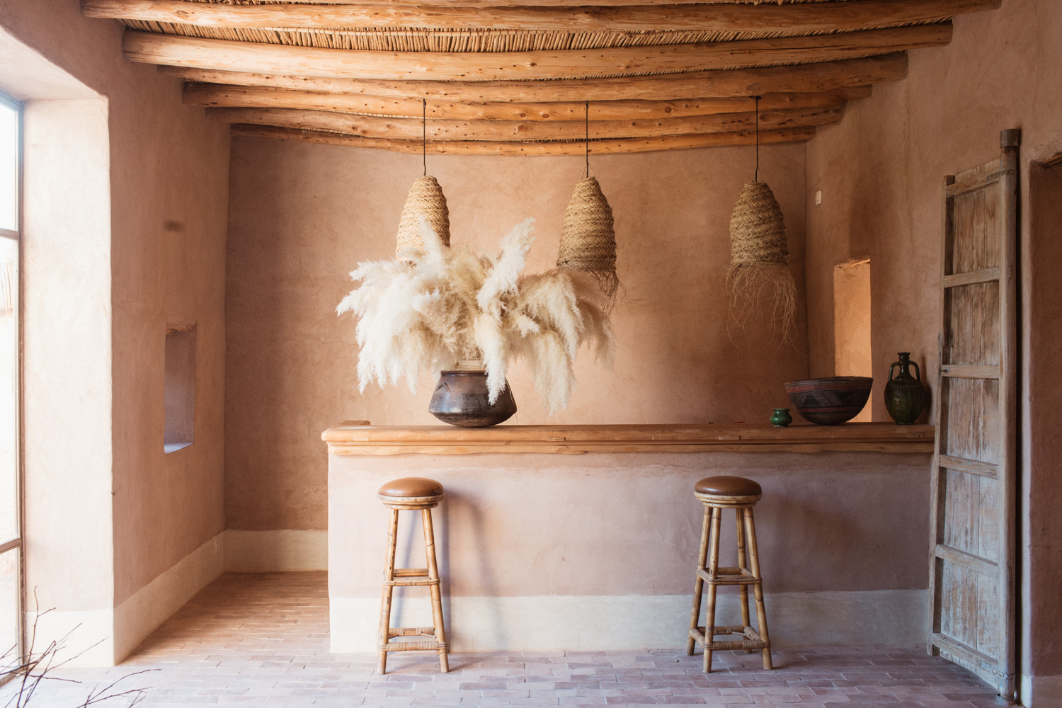
This Moroccan bar featured at Camille Styles shows the neutral side of warm tones. Note how a peachy glow emerges, even in a space filled with sandy hues. Don’t be afraid to mix pink and peach with natural elements such as woven pendant light, pampas grass florals and wooden beams. [photo by Kate Zimmerman Turpin]

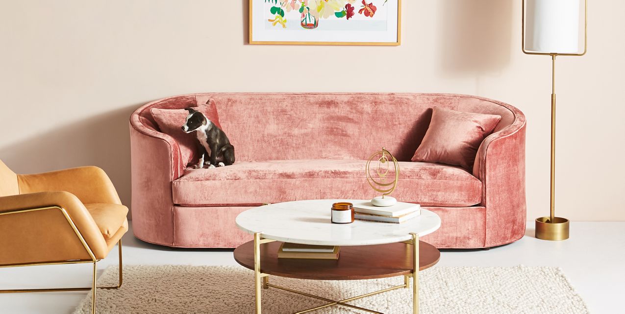
A velvety touch is one of many things to love about Anthropologie’s Vera Sofa. Rounded arms create a soft look, while a nearby leather chair reminds us that tans, browns, golds and mustards are the perfect complements to peaches and pinks. Design bloggers seem to think so too, as mustard and tan frequently show up alongside blush tones in room makeovers.

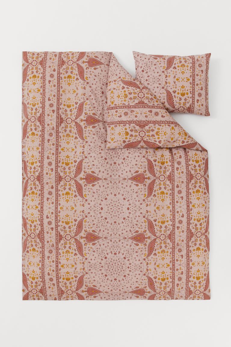
H&M Home’s Cotton Duvet Cover Set in Dusty Pink features a pattern of soft pink, dark rusty pink, and just the right dash of mustard. Design perfection:

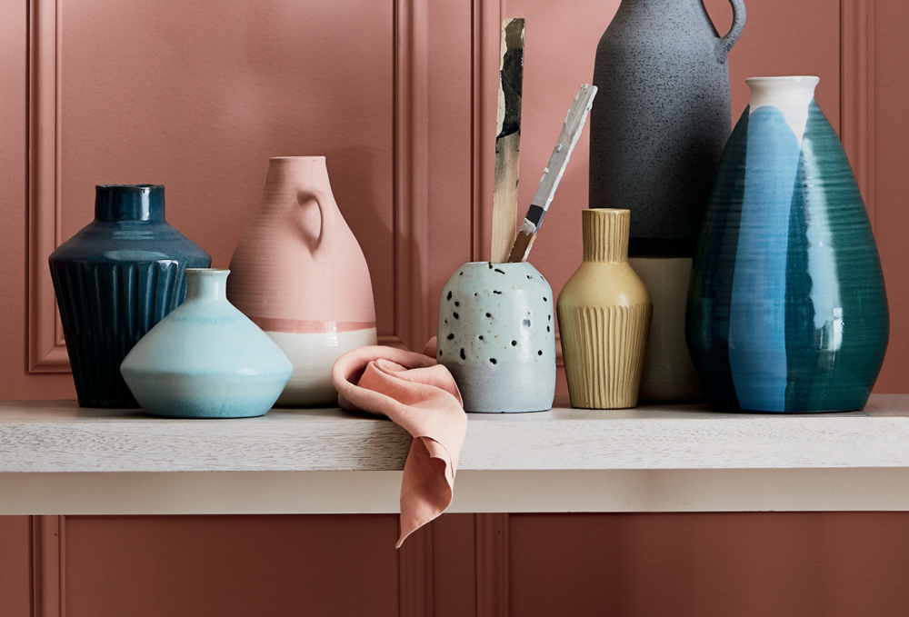
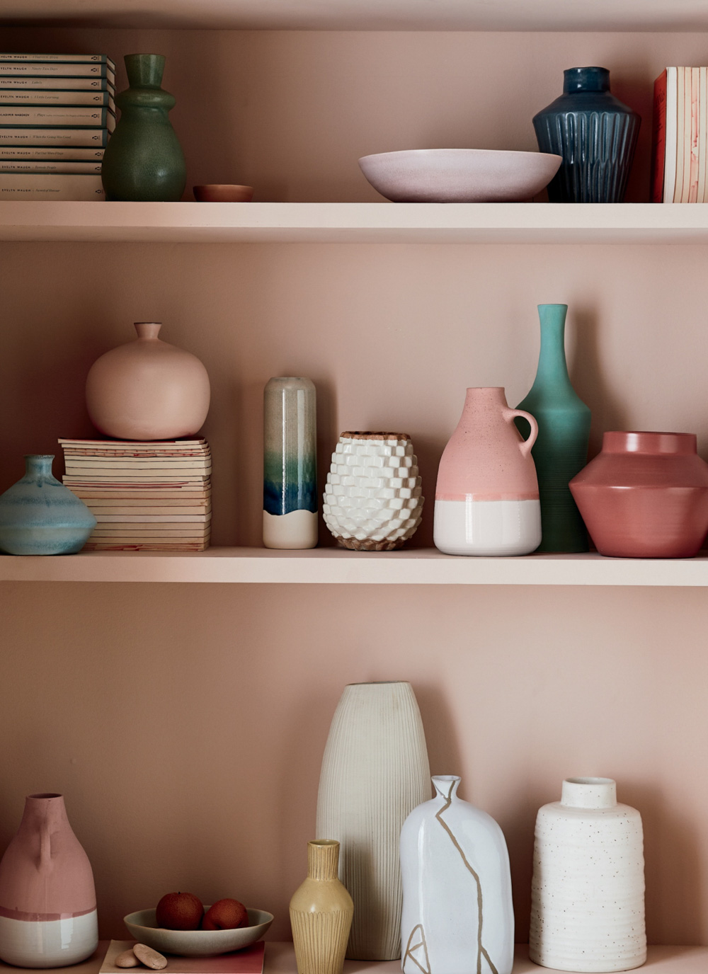
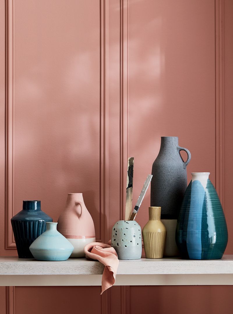
Don’t forget that dusty pink makes the perfect backdrop for displaying collections! Below we see a grouping of vases from Crate & Barrel. The display showcases everything we love about this spring’s palette. The pinks are dustier and there are more blues to enjoy, from the deepest royal to vivid aqua and teals. A shelving display is a great way to tell a color story, whether it’s your own spring color palette or a mini version of the larger color displays throughout your home.

An Array of Blues and Greens
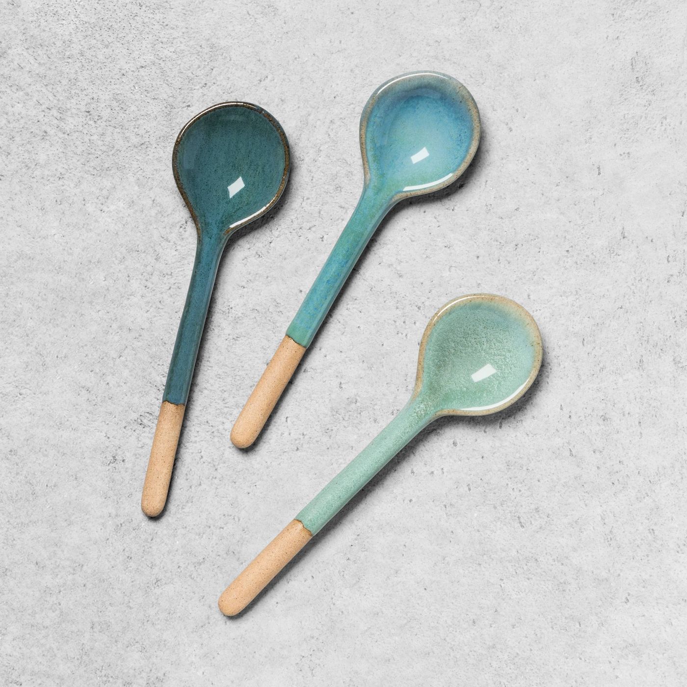
From aqua teal to deep azure, blues and greens are the perfect complement to this season’s peachiest hues. Which cool tones are right for you? Go with what you love. The possibilities are as endless as the colors of the sea. Once again we see a gradient of color from Hearth & Hand, this time in a set of stoneware appetizer spoons:

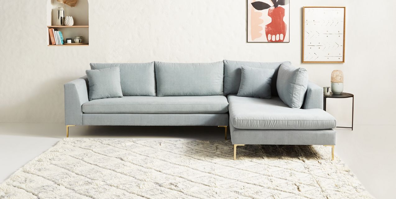
Anthropologie’s Edlyn Chaise Sectional showcases the modern possibilities involved when icy blue meets an Italian form. Note how keeping the rest of the room white allows the subtle tone of the sofa to pop. Artwork in terracotta and light peach creates the perfect contrast:

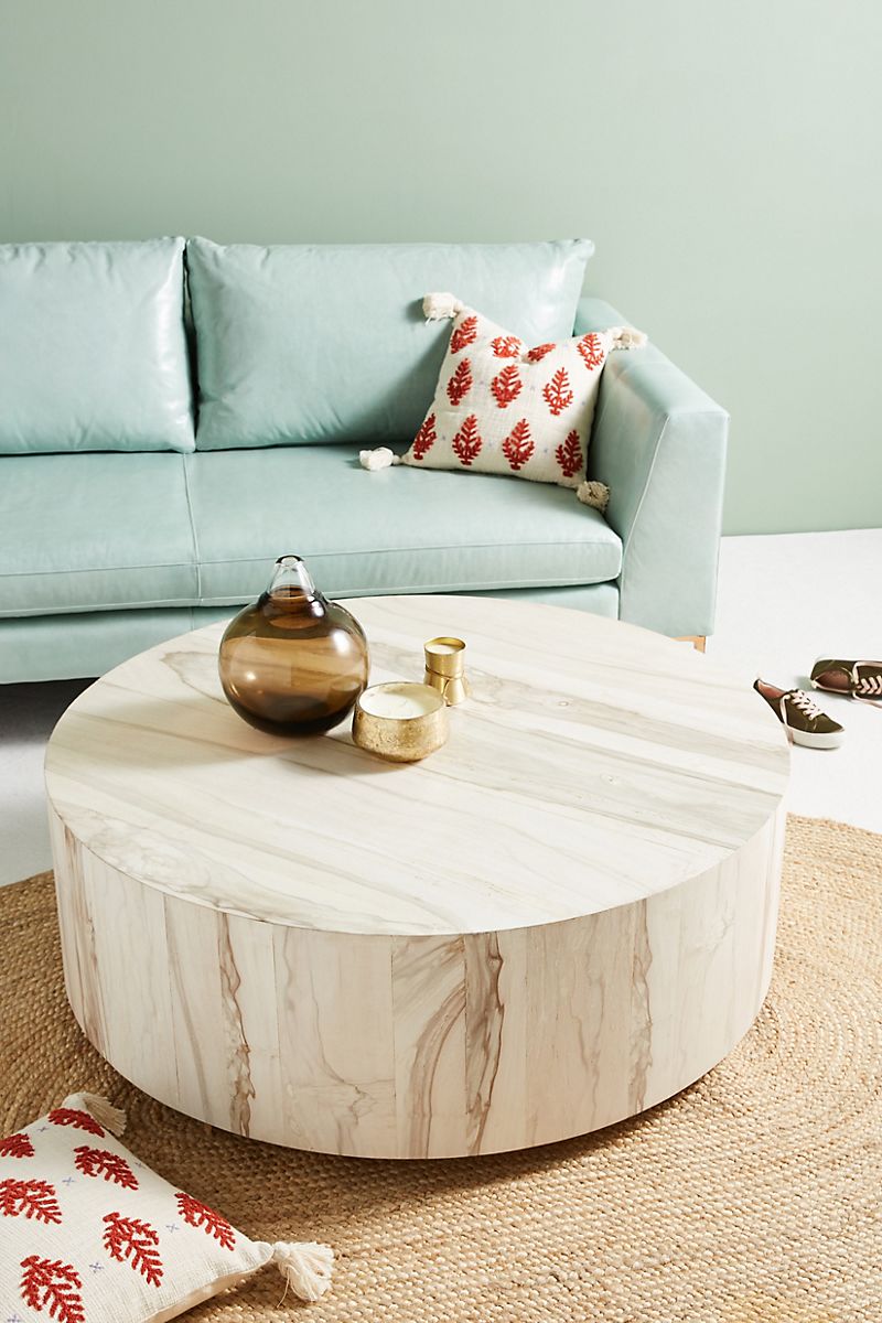
Then again, layering blue tones can also be exciting. Minty blue takes center stage in this room featuring Anthropologie’s Swirled Drum Coffee Table. A mint wall compounds the blue magic of the sofa, while deep rust accents on the throw pillows immediately stand out:

Just as shades of peachy pink mix beautifully with neutrals, shades of blue instantly take on a laid-back feel when paired with earthy decor. The vignette below from Zara Home exudes summer style, illustrating how strategic spring purchases can carry through to the warmest months of the year:

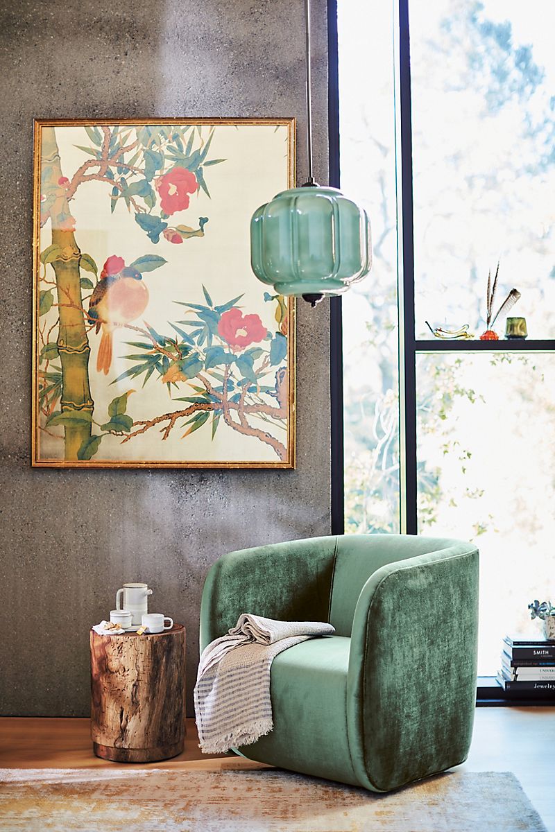
Teal has been making waves in the realms of both fashion and interior design. This season, a brighter, more aqua version of the color is turning heads on the runway, and clearly interiors can benefit from a splash of teal as well. Whether you add a teal textile, a pendant light or an accent chair, the results are energizing and soothing at the same time. [photo from Anthropologie]

Putting It All Together
You probably noticed that many of the photos above featured both pink and blue tones. That’s because together the two color families make magic! Below we’ll explore a few ways to mix and match them. For starters, a bold accent wall behind an even bolder collection! [photo below from Crate & Barrel]

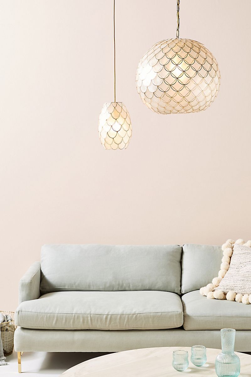
You can also keep things extremely muted for an alluring mix of faint blush and ice blue. The photo below features Anthropologie’s Phillipa Globe Capiz Pendant. Even if the wall were a few shades peachier, the result would still be subtle yet striking.

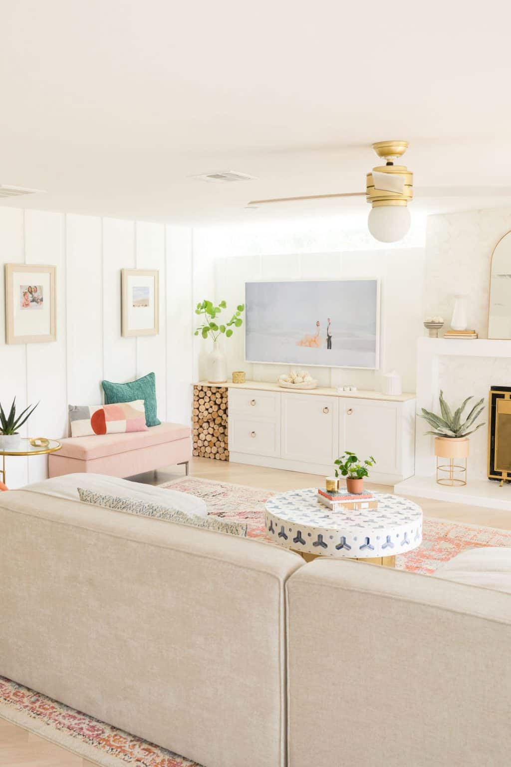
Another strategy involves keeping the backdrop white and letting a range of pink and blue tones take center stage. Below we see the lakeside modern living room of Sugar & Cloth’s Ashley Rose and Jared Smith. Navy blue, teal, pink and rust are just a few of the many colors on display in the classic-meets-modern space. The white walls make everything pop, yet they also create a crisp softness.

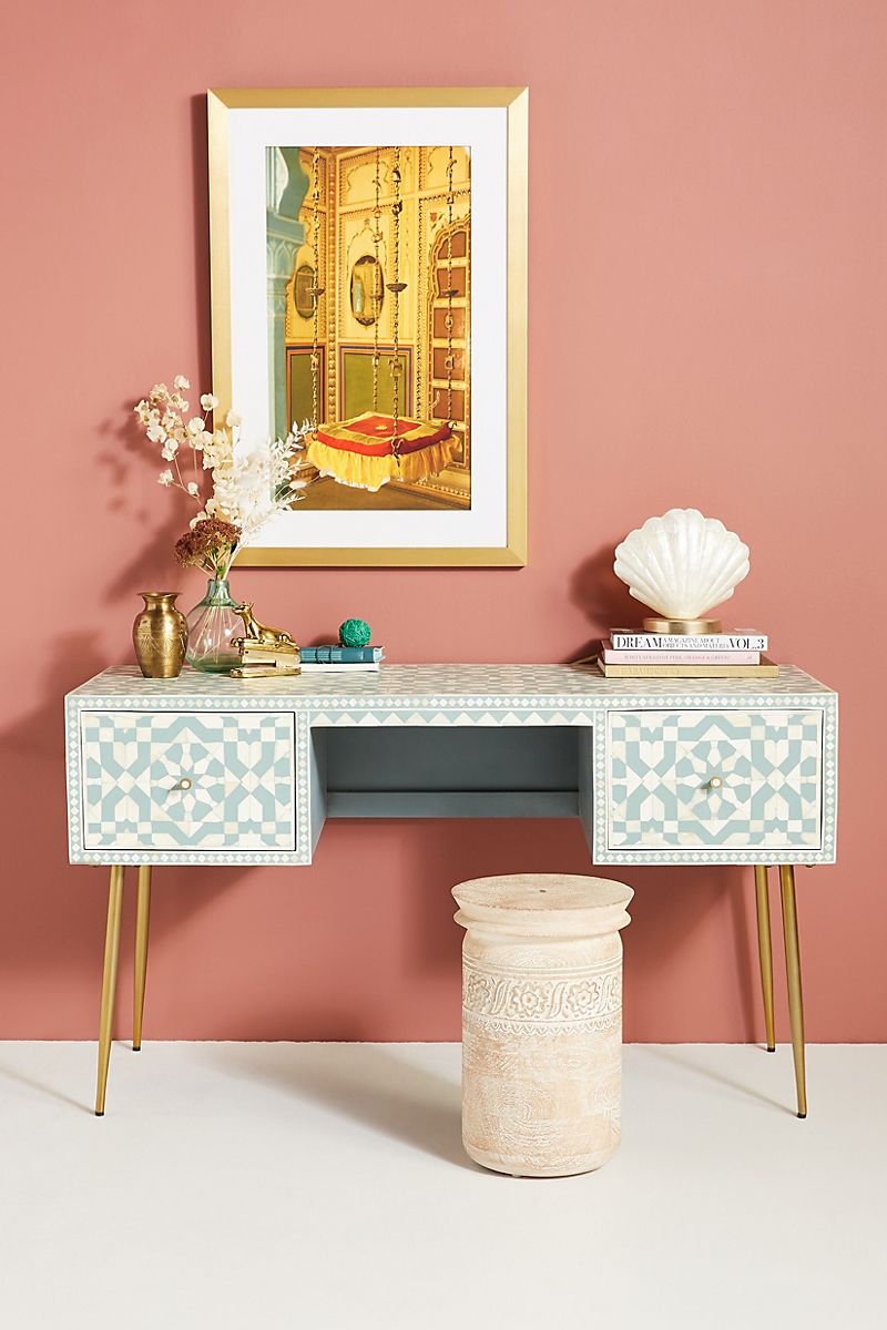
A standout piece of furniture against an accent wall is another way to celebrate your spring color palette. For example, a tiled table or patterned desk that’s a mix of blue and white really comes to life against a dusty coral wall. Gold-toned accents punctuate the furnishing below and give the vignette polish. [desk from Anthropologie]

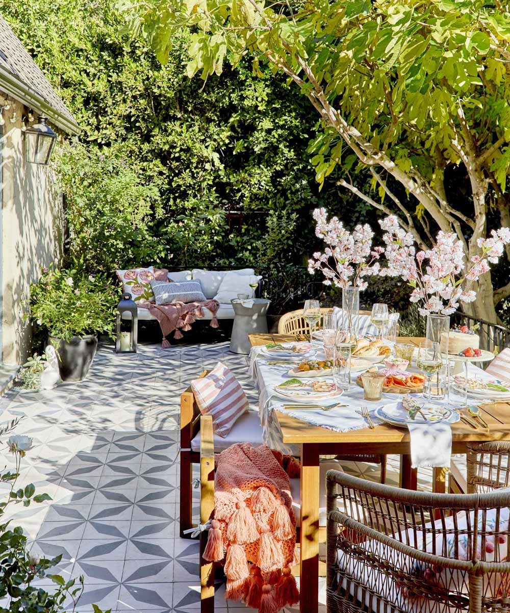
Last but not least, don’t forget that you can use your spring color palette to set the tone for any seasonal event that you host. In this next featured image, we see a beautiful gathering featuring products from Target, all styled by Emily Henderson. Pastels reign, but the look is powerful, thanks to an array of patterns and textures. A photo like this one can really inspire a patio makeover, don’t you think?!

We at Decoist wish you a colorful spring, filled with design inspiration. Thanks for reading.


![Backyard Landscaping Trends [10 Inspiring Ideas!]](https://cdn.decoist.com/wp-content/uploads/2021/04/Fire-Pit-in-Backyard-28968-270x180.jpg)