It’s easy to love Scandinavian style. There’s a purity about it, as well as a refreshing simplicity. As our lives get more complicated, we seek to simplify. The clean lines and fresh palette that Scandinavian design celebrates are a truly perfect fit for our modern way of life. Today we showcase the new autumn/winter 2016 collections of two Scandinavian brands: ferm LIVING and Broste Copenhagen. They are filled with beautifully designed furniture and decor in this year’s most interesting fall colors…
ferm LIVING’s AW16 Collection
It’s possible that we’ve been checking ferm LIVING’s website daily for an official announcement of their new Autumn/Winter 2016 Collection! You can imagine our excitement when we discovered a series of stunning new finds this week. The first thing that caught our eye: a palette of wine, dusty blue, deep green and earthy ochre.

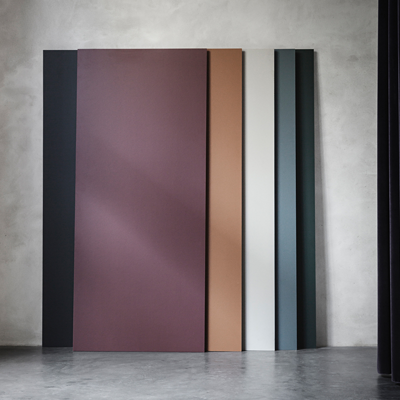
The beauty of these colors is the way they can easily be mixed with lighter shades such as peach, rose and mint. Above and below we see the Mingle Table Top, available in a range of hues. Lined with a layer of sustainable linoleum, each table top can be combined with trestles in a range of colors.


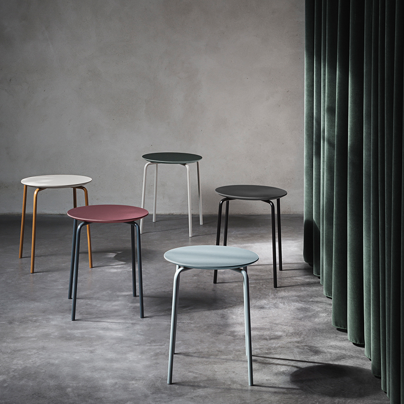
Similarly, the brand’s Herman Stool is available in an array of fall-perfect hues. We’re also loving the interesting shades of the powdercoated metal bases:

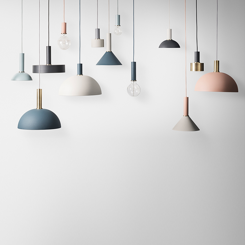
When the lines and forms are simple, you might as well have some fun with color. The modern lighting below includes Socket Pendants, as well as a range of shades in soothing hues so you can build your own perfect pendant:

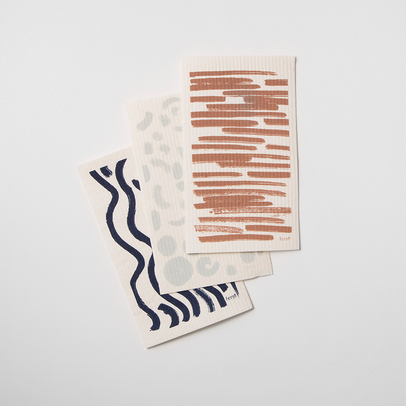
There’s a fluid quality to the textile design this season at ferm LIVING. Brushtroke-style patterns emerge in swirls, lines and waves on the Brush Dish Cloths, shown below:

There’s also an abstract, overlapping quality to pillow designs such as the Colour Block Cushion L 4, shown at the front/right of the next vignette:

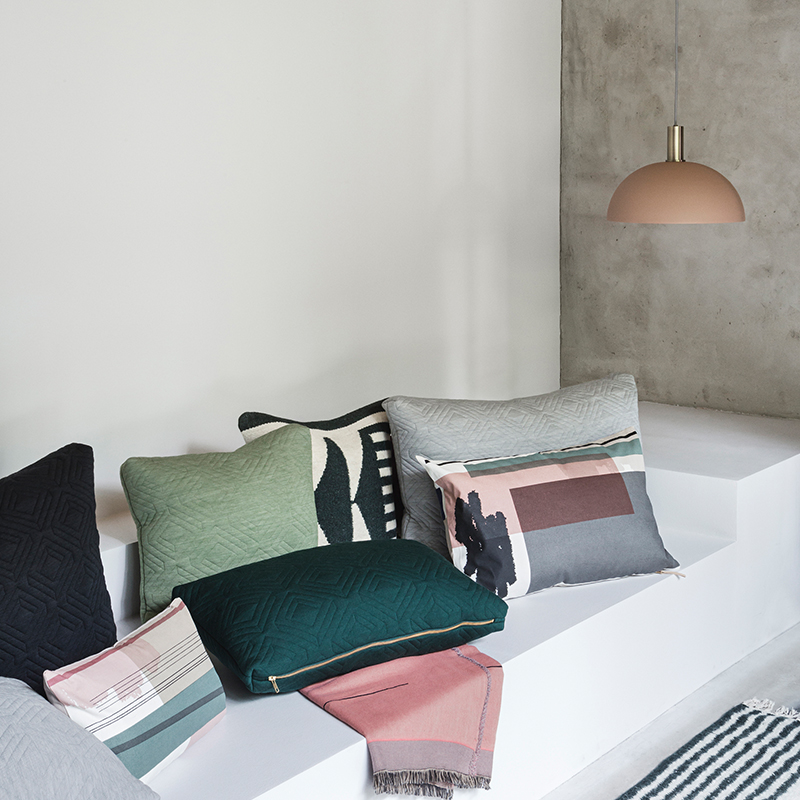
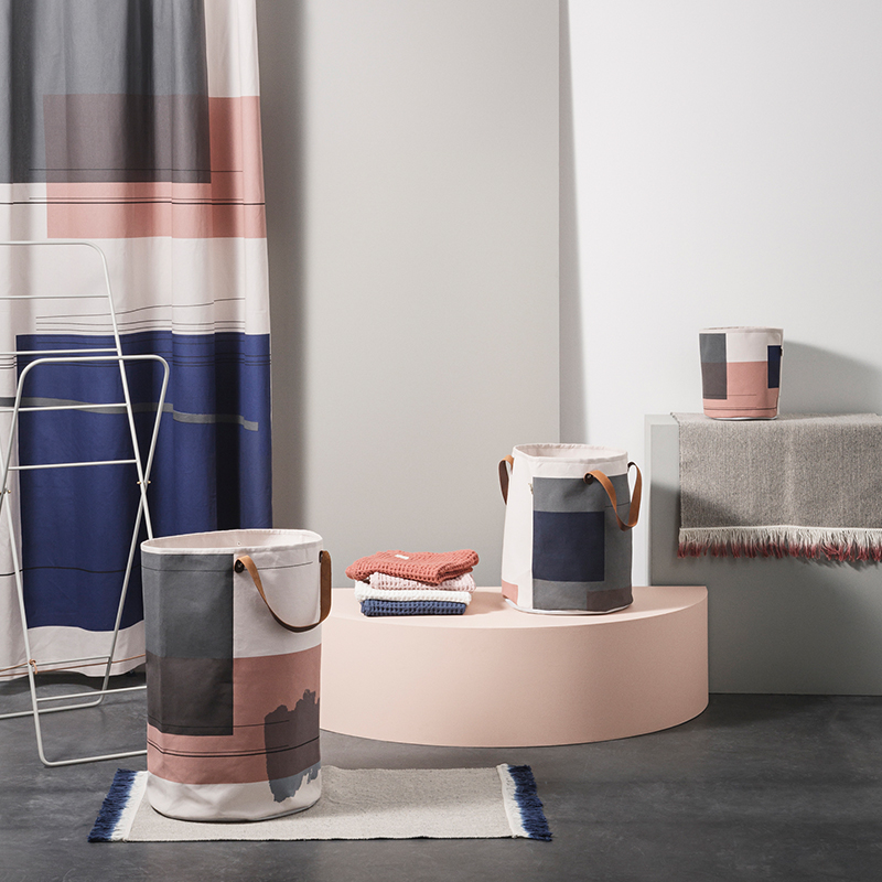
The colour block motifs carry over to items ranging from a shower curtain to laundry baskets. Note the striking palette of grey, rosy peach and deep blue:

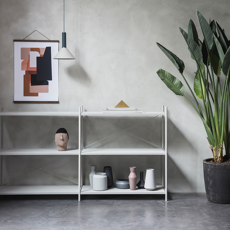
If you’re a fan of Scandinavian design, don’t forget that you can accent this season’s new wave of unique colors with metallic pieces, grey tones and tropical greenery. A clean-lined collection of vases never hurts either. Modern design at its finest:

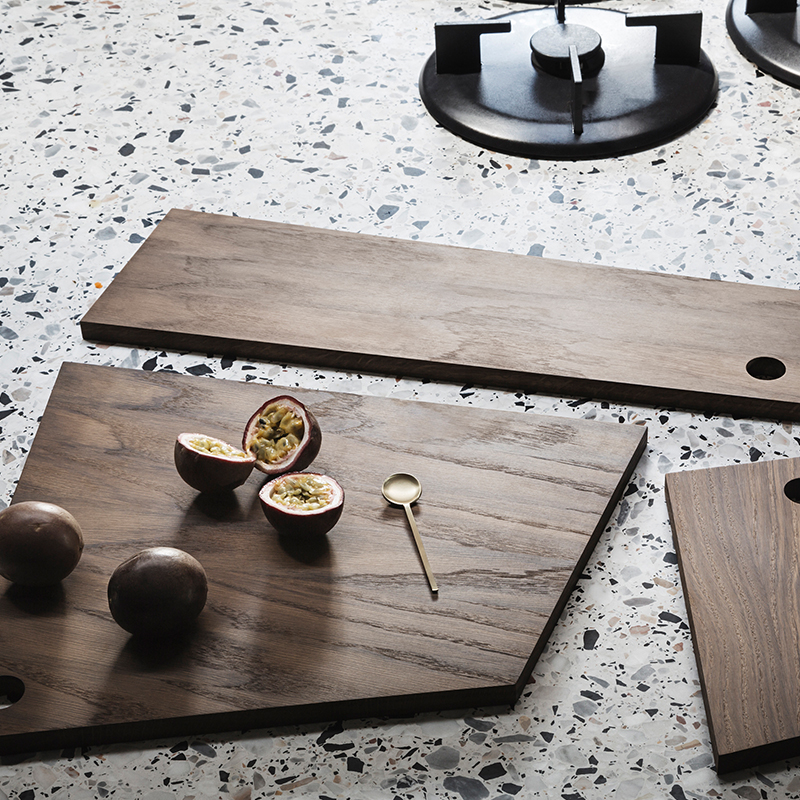
As you can see by the vases above and the Asymmetric Cutting Boards below, geo style is alive and well at ferm LIVING. The look is minimal and uncluttered, with an emphasis on craftsmanship, as well as the beauty of the materials themselves. In this case, smoked oak takes center stage:

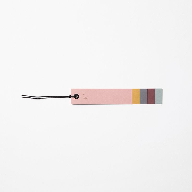
If you had any doubt that ferm LIVING’s latest color palette is thoughtfully planned, the lovely tones can even be found on the smallest of items, like this gift tag:

Browse the new collection now, and note that items will officially be available for purchase on October 13th. Don’t worry – you can sign up to be notified when your favorite products are in stock!
Autumn/Winter 2016 at Broste Copenhagen
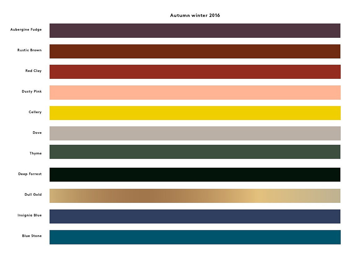
Midnight blue. Eggplant. Dusty mint. Soft peach. These are just a few of the stunning colors in the fall palette of Broste Copenhagen. In fact, the brand’s Autumn/Winter 2016 Collection is filled with a mix of warm and cool tones, with an emphasis on understated shades that seamlessly fit together. When it comes to the design itself, Nordic living meets bohemian style.

If you’re curious about some of those gorgeous colors, here’s a closer look:

Do yourself a favor and browse the entire Autumn/Winter 2016 Catalog. You will find sleek forms, yet not so sleek and stark that the look is devoid of warmth. Quite the contrary! Shaggy textures and earthy elements await you.

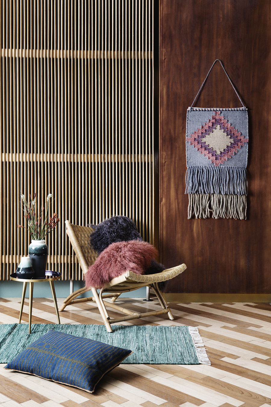
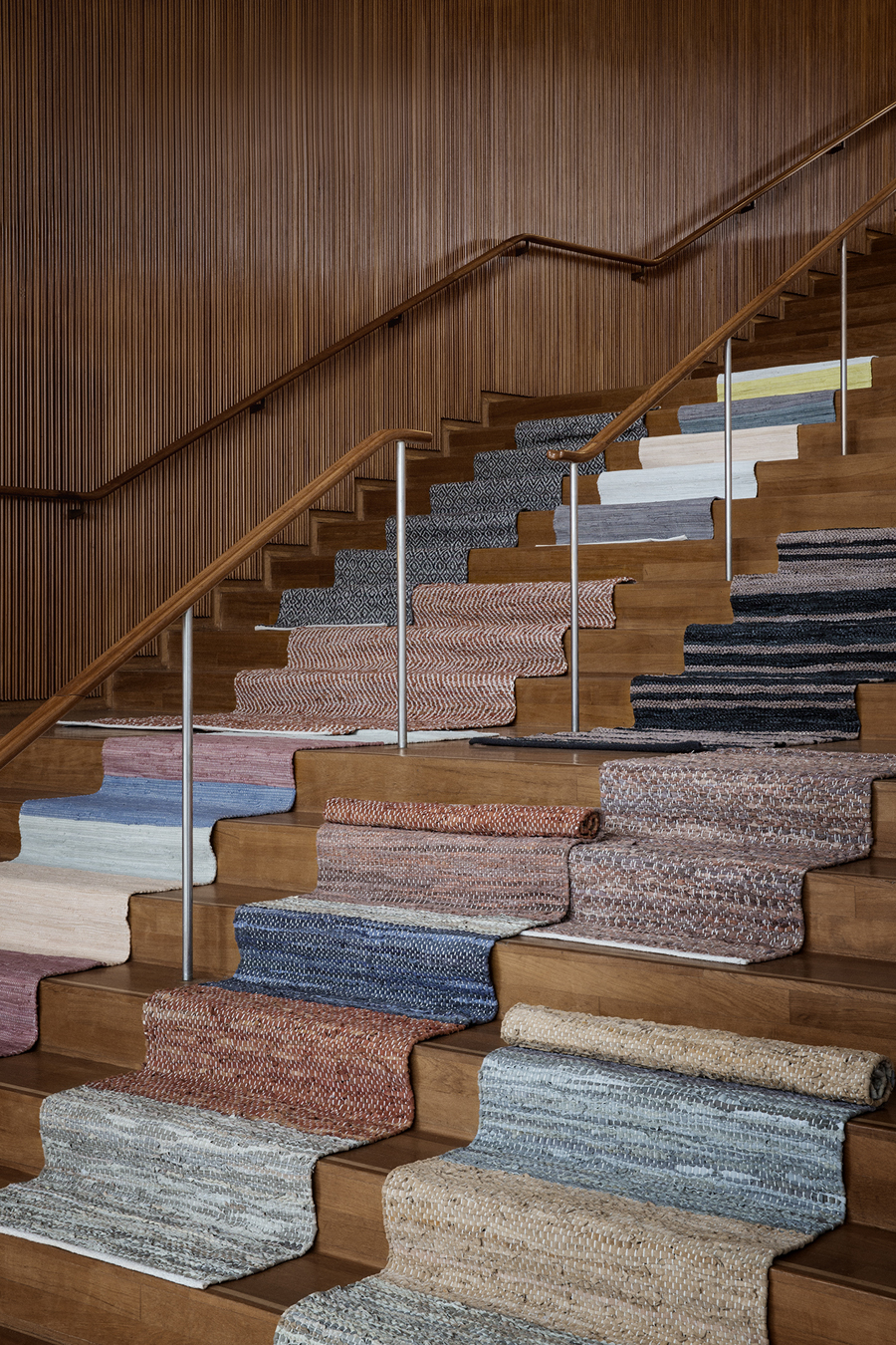
So do a variety of patterns on rugs and textiles. Here we see how the Broste Copenhagen fall palette blends beautifully with the warmth of wood:

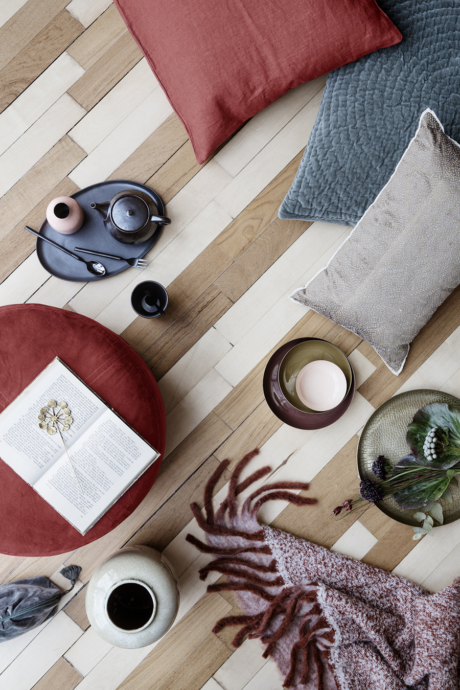
Fall and winter bring out our desire to be warm and cozy. The tendency is to pile on, yet the beauty of Broste Copenhagen’s collection is the way that even in the richest of vignettes, there’s a clean look. After all, clutter can get in the way of a clear head. And we know that autumn and winter are as much about contemplation as they are about decorating.

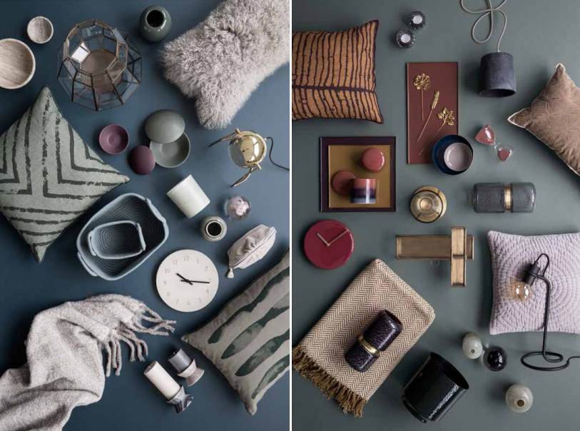
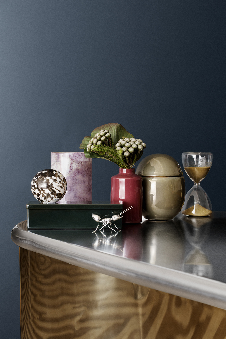
Rich tones prevail in the objets d’art below:

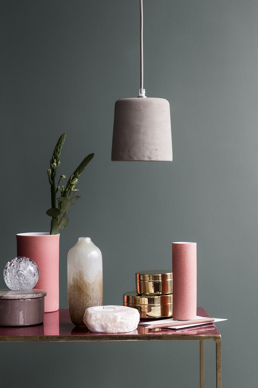
Yet there’s always room for sunny accents. It’s comforting to have a bright spot or two in our lives when the sky is covered with clouds. Dusty Pink is a welcoming hue in this next vignette:

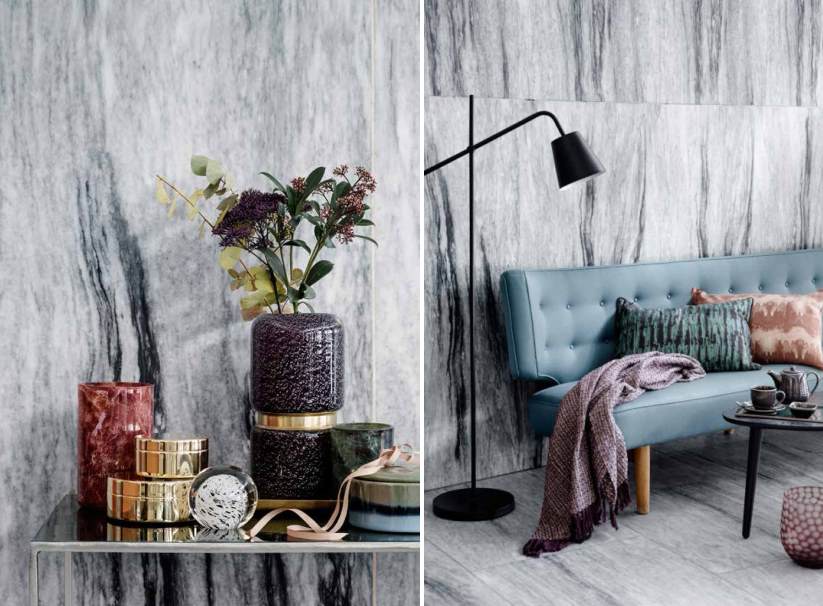
Last but not least, let’s admire the way Broste Copenhagen’s berry tones beautifully offset the marble walls below. And with a modern floor lamp, metallic accents and other key pieces of decor, keeping the lines simple lets us appreciate each design element:

May fall’s new designs and colors bring out your creativity in the cooler months ahead…