There are many wonderful elements that fall brings to the table. For some of us here at Decoist, the magic happens when the season’s top color palettes begin to emerge. With the new collections comes an array of beautiful product photos to peruse, and it’s easy to see some definite palettes emerging. In today’s post, our inspiration comes mainly from Scandinavian design, where interesting color combinations are in no short supply. For example, who would have thought that mixing rust with berry tones could be perfection? Keep reading for five different fall color palettes that will bring meaningful style home this season.
A Base of Blush
While some consider the revival of pink to be a bit trendy, this blushing hue is still going strong in the design realm! It’s always refreshing when juxtaposed with colors such as mint and white, but try combining blush with jewel tones for an unexpected twist. [photo from ferm LIVING]

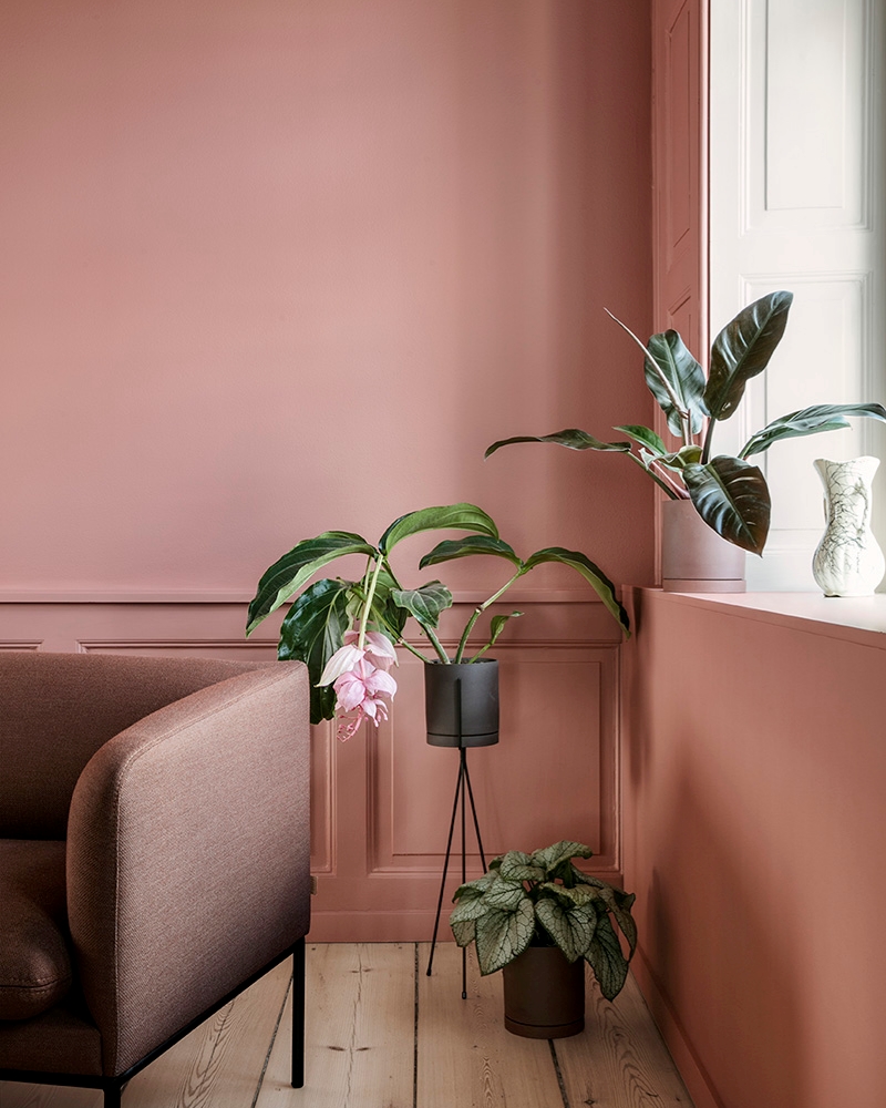
Peachy-pink brings a big dose of autumn indoors, and it makes the perfect backdrop to rich greenery, especially as the holidays approach. [photo from ferm LIVING]

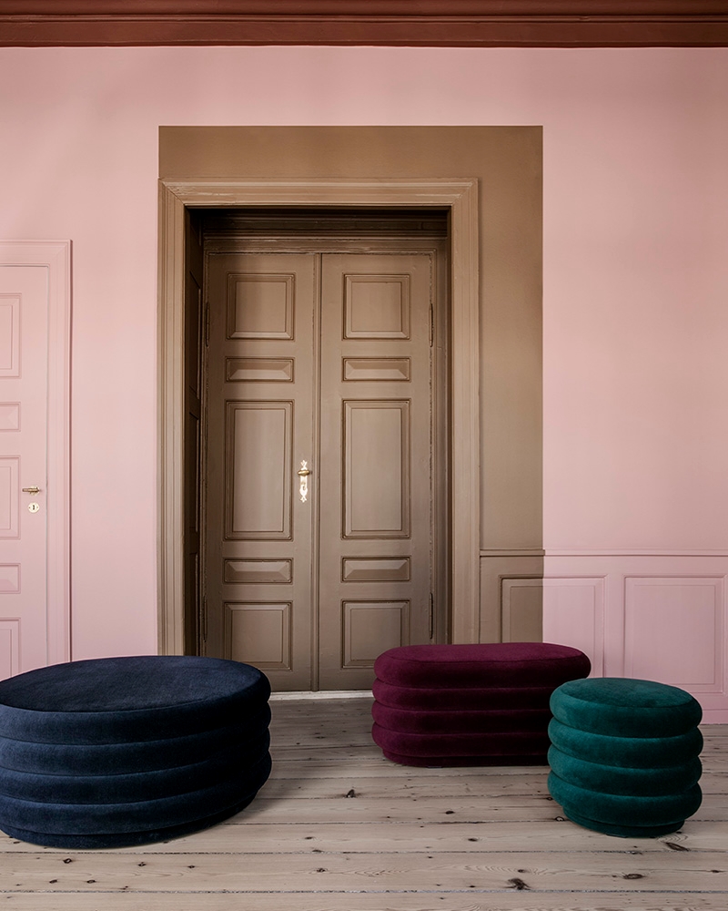
Use pink as your base (such as a wall color), or make it a powerful accent color against a richer hue such as reddish brown. Pink can really pop in an unusual way when combined with darker shades. [photo from ferm LIVING]

Berry Tones
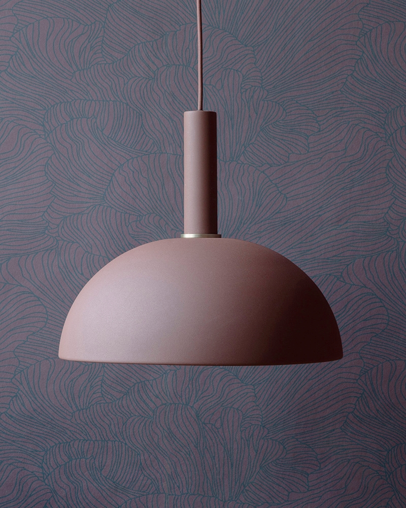
There’s something powerful about the use of berry tones, especially when they come together to create a sense of drama for fall and winter. This berry-hued Coral Wallpaper from ferm LIVING is an intriguing backdrop for modern lighting.

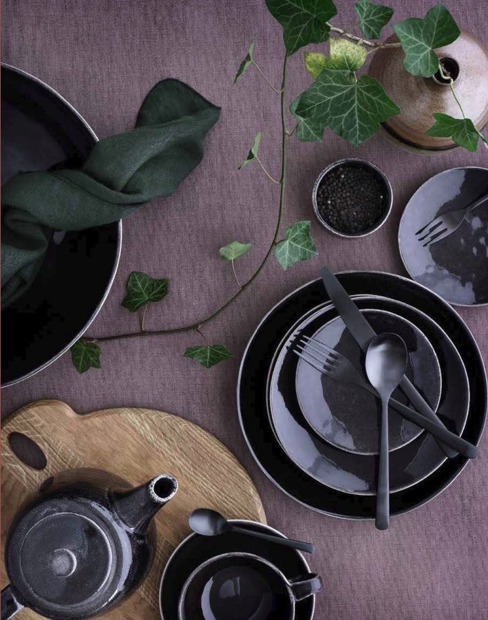
Use a rich eggplant tablecloth as a canvas for decadent dishes at your dining table. Hint: black dinnerware and flatware come to life against blackberry-purple backdrops, and when you throw in fall- and winter-perfect foods such as cranberries and pomegranates, you have an unforgettable display of culinary delights!

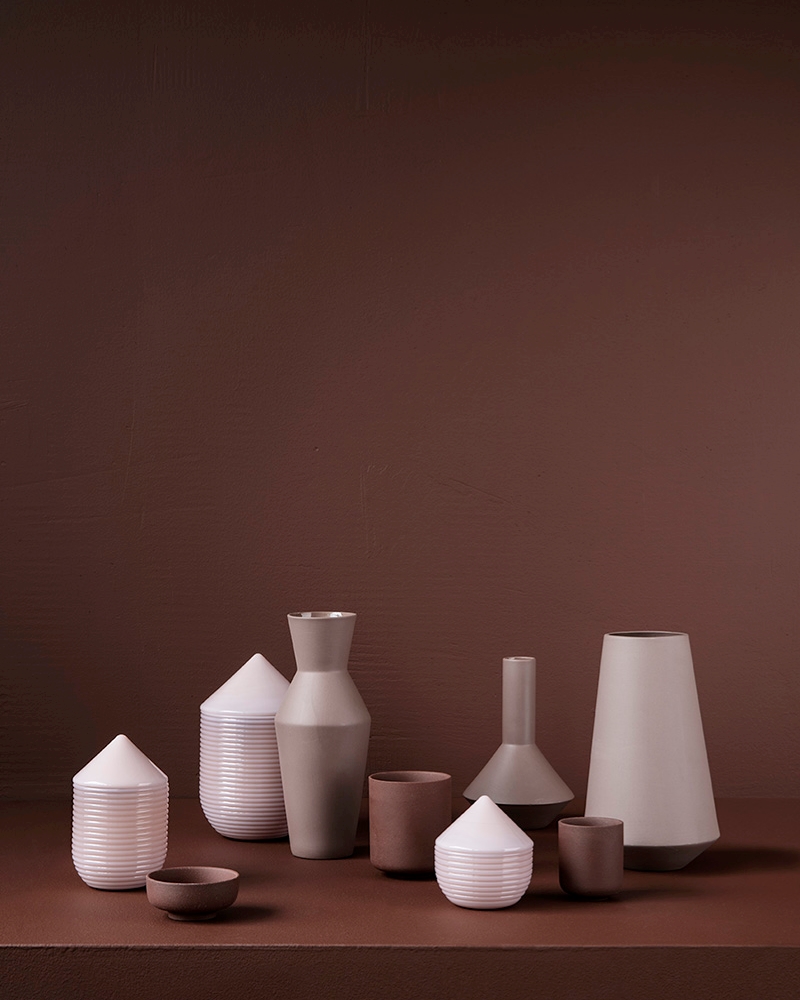
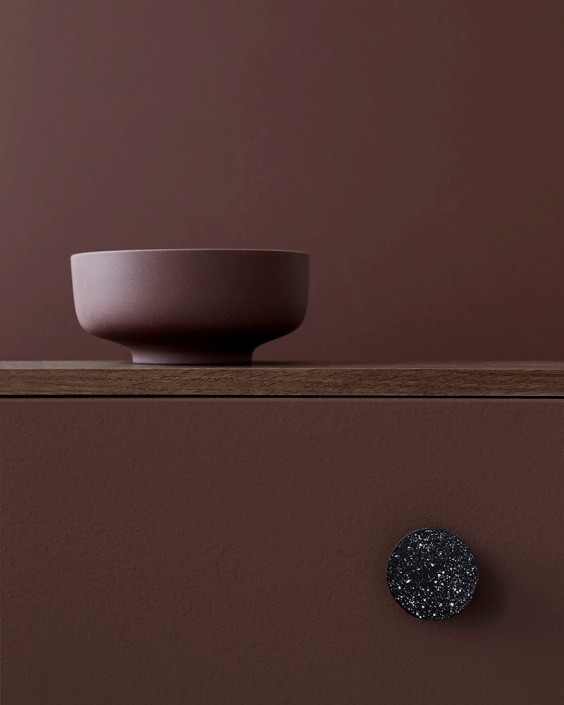
Berry tones can even head into warm territory, as shown by this reddish-brown hue from ferm LIVING. Don’t be afraid to use layering to create a monochromatic look:

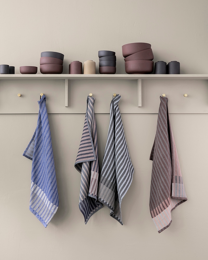
Then again, a light backdrop can make berry tones truly stand out, especially if your paint color is neutral. Oatmeal walls accent the subtle shades of these Grain Jacquard Tea Towels from ferm LIVING:

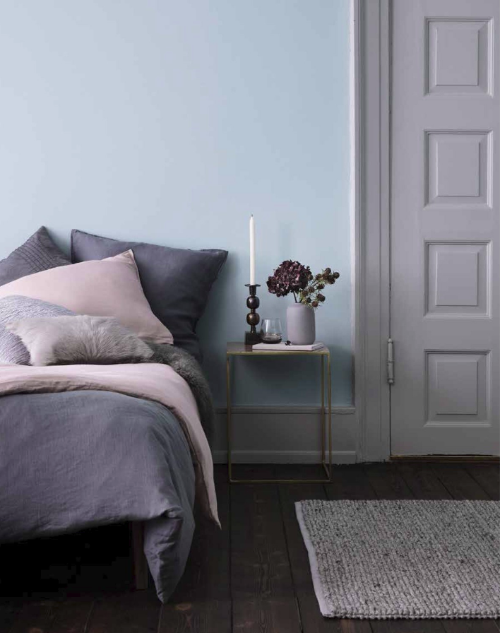
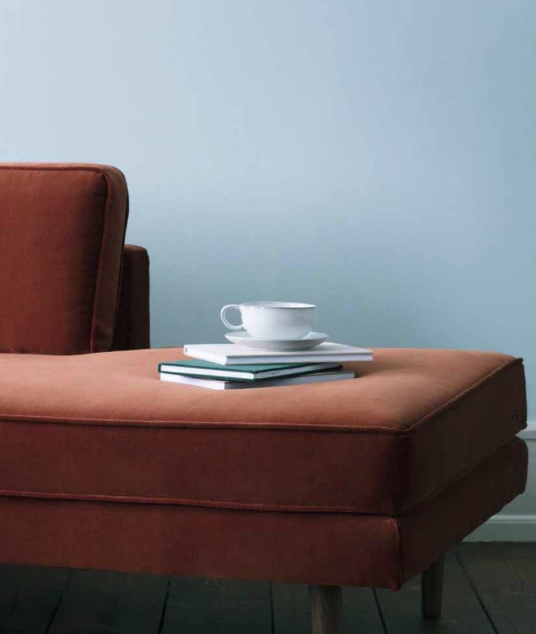
Light shades of berry are soothing and elegant. Lavender, grey-blue and powder blue come to life in this bedroom by Broste Copenhagen:

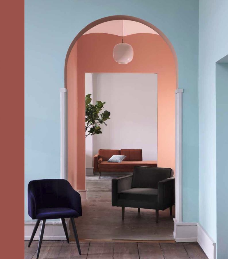
Rust Meets Blue
One of our favorite color palettes this fall is the combination of rust and blue tones. And nobody brings it home quite like Broste Copenhagen! The pages of their Autmn/Winter 2017 Catalogue is filled with enticing images like the one below. Note the use of midnight blue, rust, powder blue and peach, which live in perfect harmony:

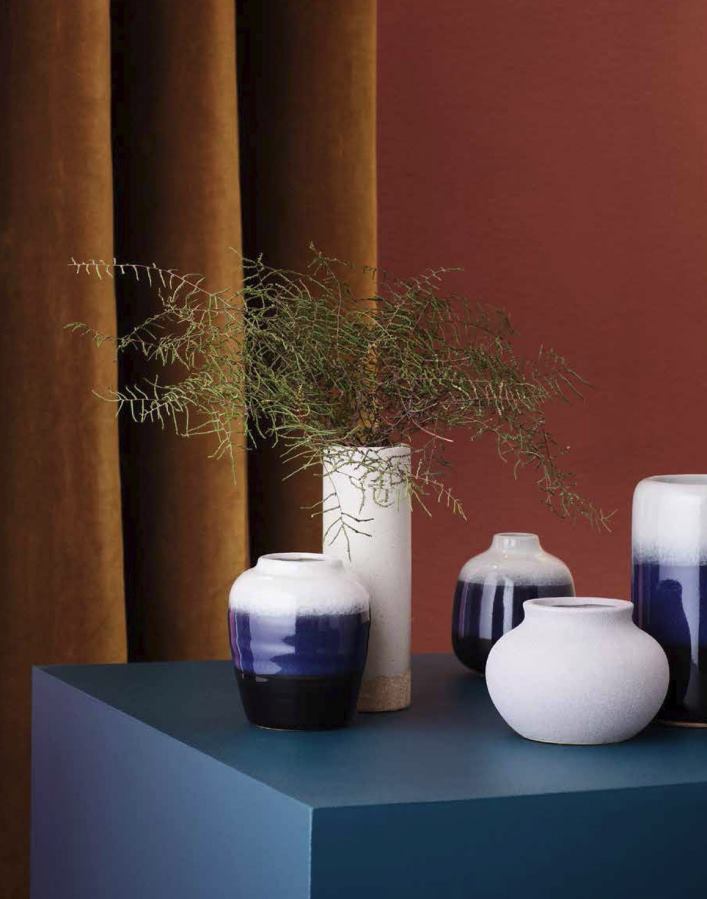
Rust and gold meet rich shades of blue in the vignette below. By incorporating hues in similar shades (red-rust and golden rust, navy blue and cobalt blue), a unique display is achieved:

Why does this palette work? Perhaps it’s the fact that blue and orange are complementary colors! By toning it down with subtle shades of each, you can get a classy yet striking combination. For example, bright orange can give way to rust, while powder blue can take precedence over bright royal blue:

Muted Magic
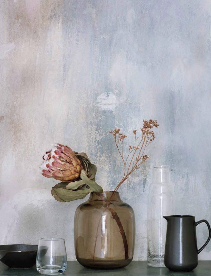
When it comes to fall palettes, sometimes less is more. This stunning photo from Broste Copenhagen says it all (see below). A watercolor-style wall in muted tones beautifully offsets fall accents, including brown glassware and eye-catching foliage:

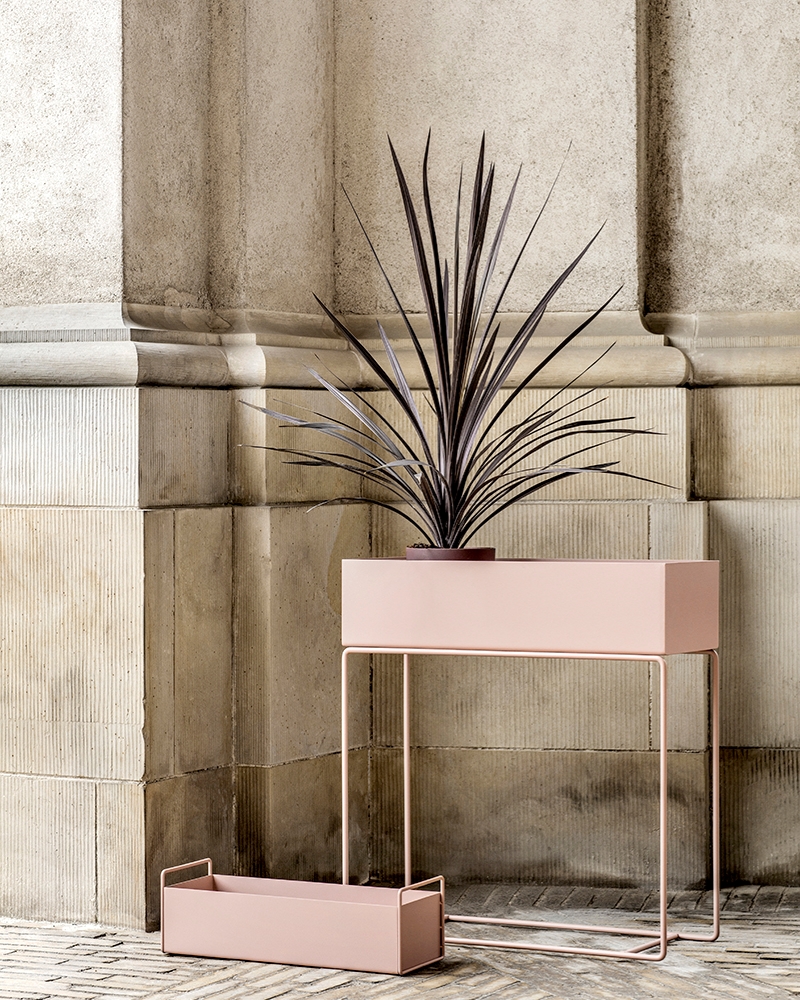
At first glance, ferm LIVING’s Plant Box in rose may not seem like the picture of fall, but rich-toned greenery and creamy architectural walls give it an unmistakable autumnal feel. Try using flowers and plants to your advantage this season, as they will pop against neutral walls:

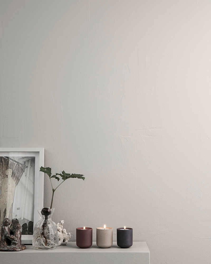
There’s power in numbers. When it comes to pale walls, sometimes all it takes is a small grouping of decorative items in shades such as red-brown, oatmeal and black. These Soy Candles from ferm LIVING are the epitome of autumnal style:

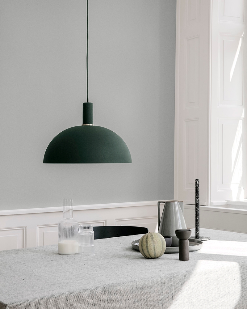
Sometimes the muted look can be accented with one richly toned piece. This Dome Shade in Dark Green brings the dining room below to life. Soft greys dominate, but one accent ties it all together in a powerful way!

Rich Greens
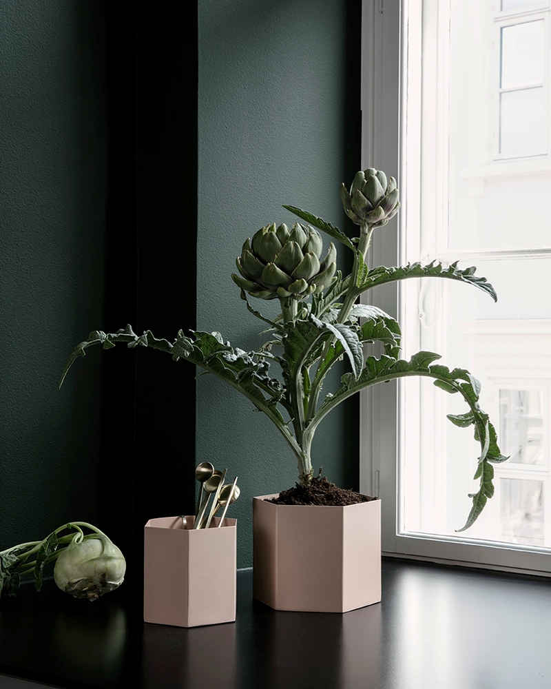
One big reason we love deep green for the fall palette: it easily transitions to the holiday season! Green is full of life, and it pairs beautifully with other greens, as well as rust and blush tones. ferm LIVING’s Hexagon Pot in Rose is beautifully offset by interesting greenery and the greyest of dark green walls:

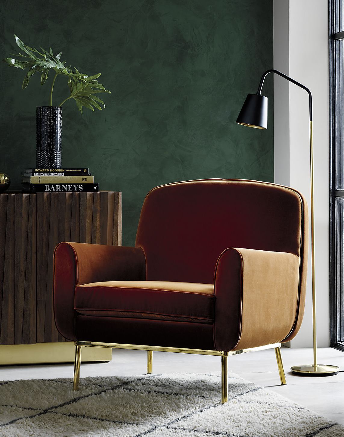
Using green as a wall color instantly gives the room a rich feel. The Halo Copper Velvet Armchair from CB2 looks right at home in the modern space below:

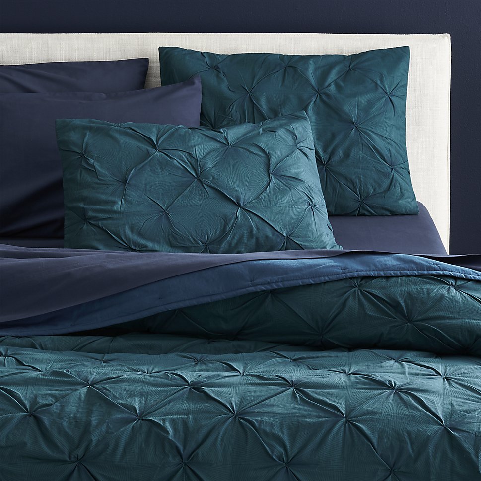
You can also pair dark greens with rich blues for a beautiful combination of elegant hues. Navy walls are the perfect backdrop to blue-green tones. Below we see the Prisma Blue-Green Quilt from CB2:

You’ll be seeing more of our favorite color palettes in upcoming fall and winter posts. Stay tuned, and happy decorating as you welcome autumn into your home!


