
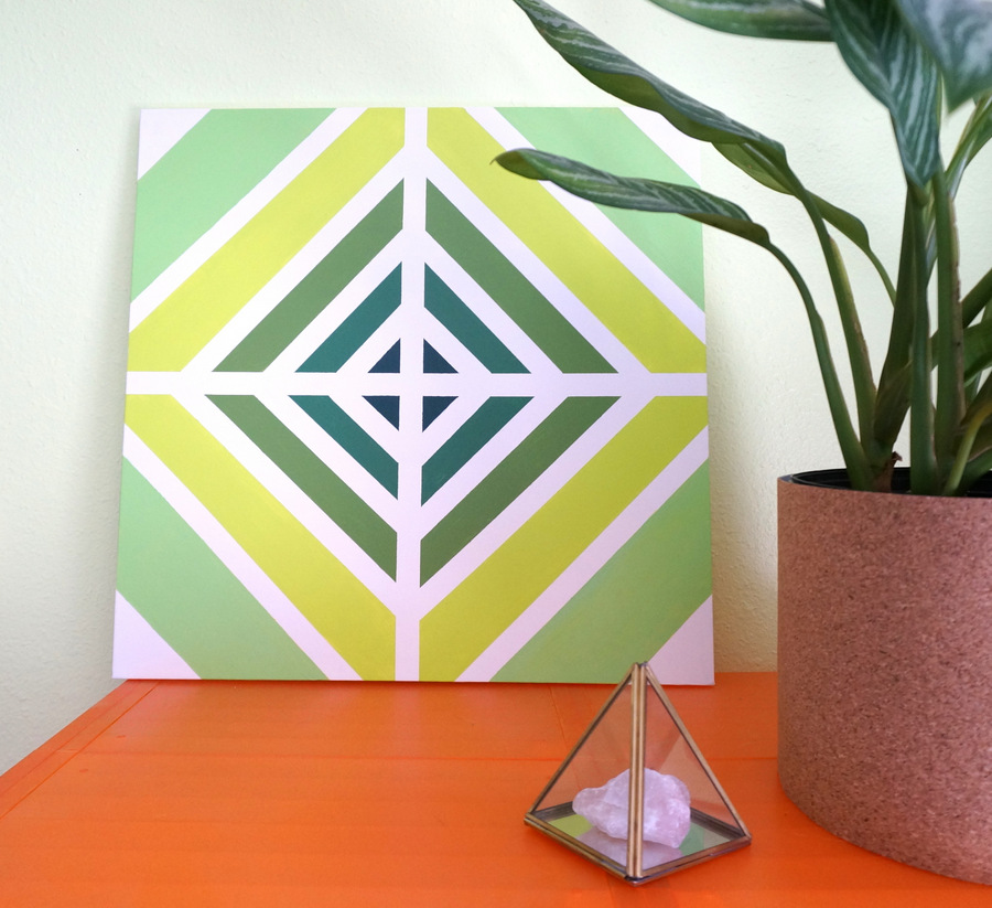
Looking for an affordable DIY wall art solution? This retro-style painting is perfect for modern spaces that incorporate a bit of the past. Kate here, and this weekend I created the painting above after one of my 1980s prints fell from the wall (the glass of the frame was shattered). The design for the project was inspired by ’70s and ’80s geometric motifs. Read on for details on how to create your own DIY painting with retro flair…
Supplies

Here’s what you’ll need to get started:
- a canvas
- acrylic craft paint in white, plus the colors of your choice
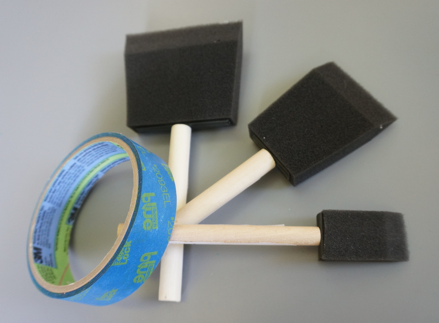
- painter’s tape
- foam brushes
- one small paintbrush
- a container for the paint
- a ruler

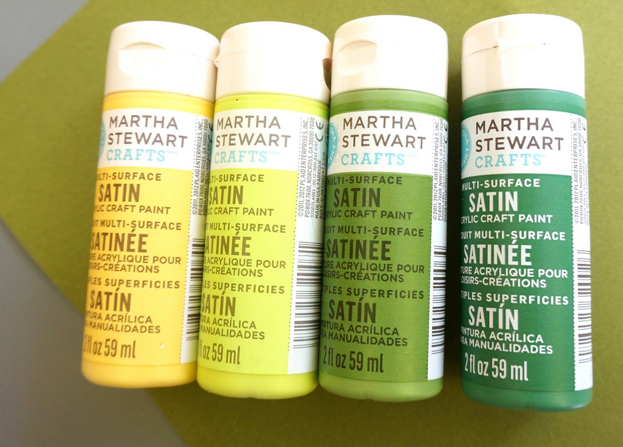
I was lucky to purchase the canvas with a 40% off coupon, so I got it for around $10! The Martha Stewart craft paint was also on sale, which was a bonus. I love the way Martha’s paints are so thick. That means fewer coats are required to get the job done! This project has the potential to be a very affordable one. Ready to get started?…

Project Steps

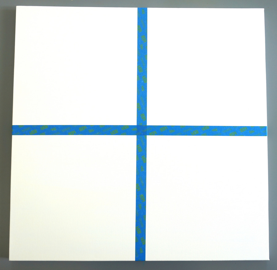
Step 1: Paint the canvas white
This step is optional. I knew I wanted a white background, and I didn’t want it to look like I just painted stripes onto a white canvas. Plus, I went with a slightly off-white shade for added richness. A large foam brush was the perfect tool for accomplishing this step.

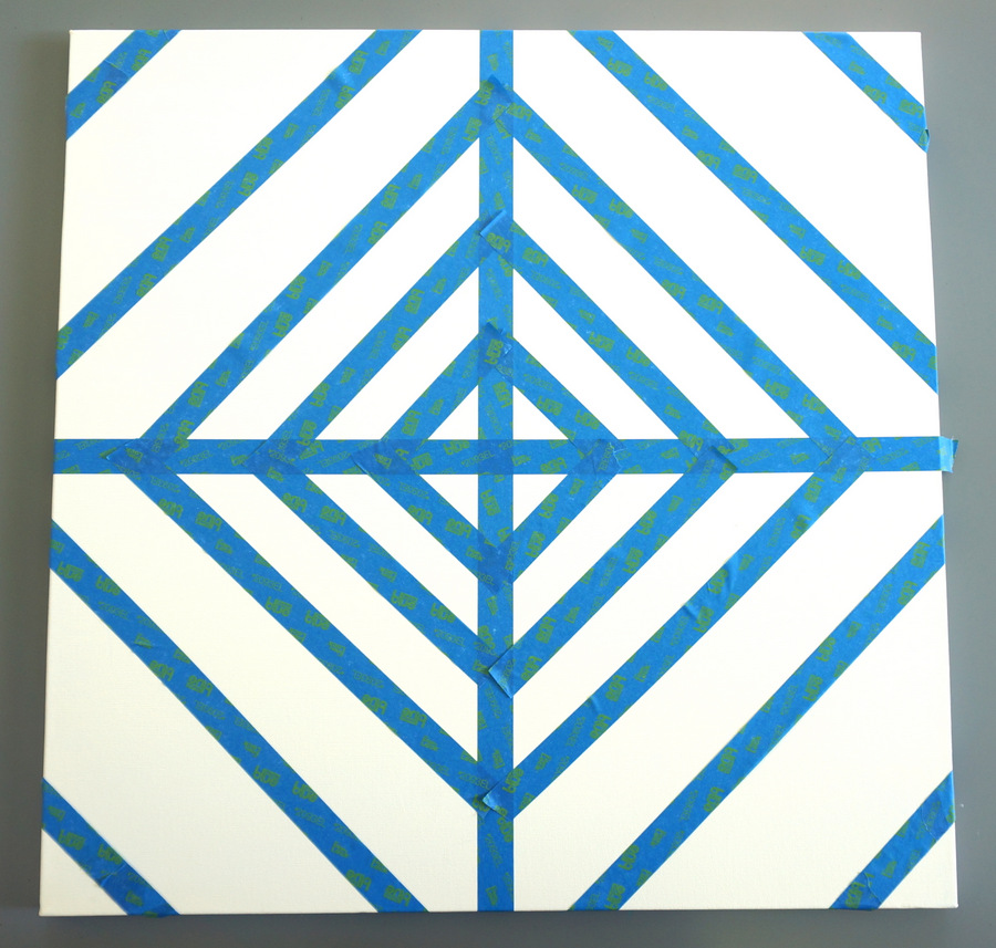
Step 2: Use painter’s tape to create the design of your choice.
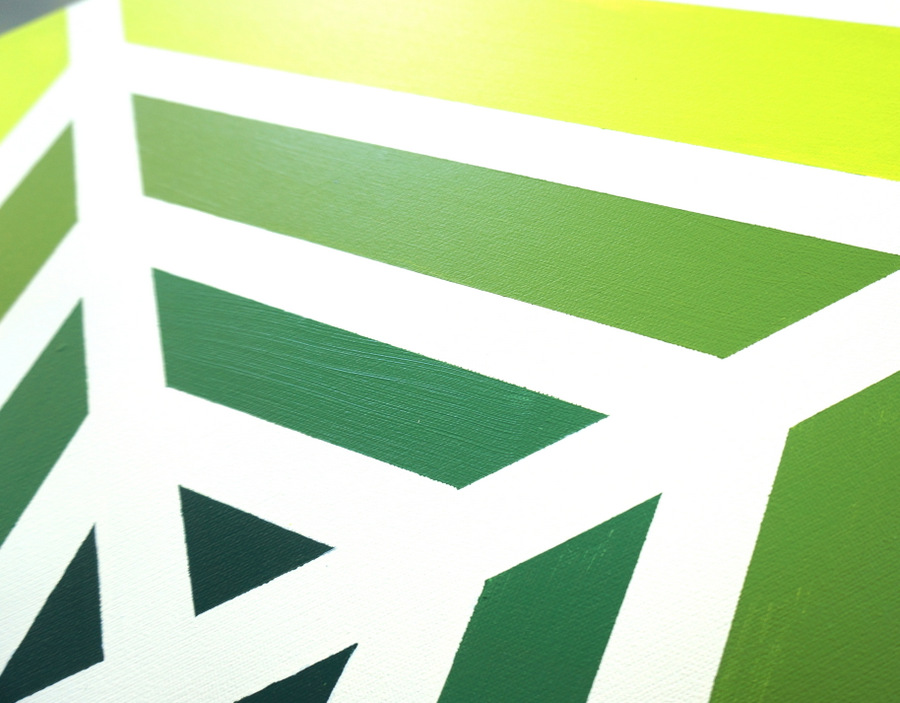
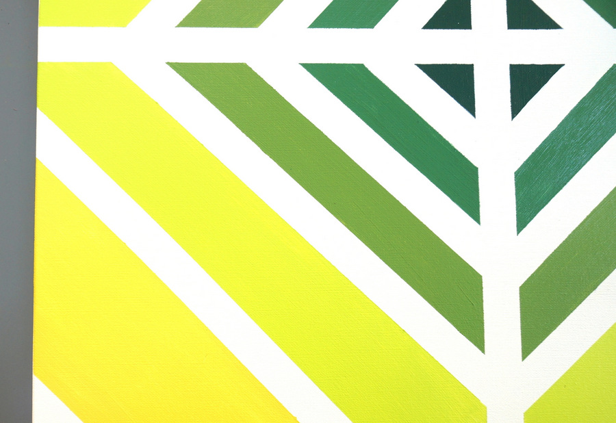
As mentioned, I was inspired by ’70s/’80s design motifs. In fact, I find a great deal of inspiration on the Tumblr Supreme Interiors. So many amazing visuals here! I began by dividing the canvas into four sections with one vertical line and one horizontal line. I then created a series of diagonals, intentionally making the white stripes larger and larger as I moved toward the edges of the canvas. Don’t forget to run your fingernail along the edges of the tape before you start painting to prevent bleeding.
I used a ruler to ensure that the painter’s tape was evenly spaced overall, but I didn’t agonize over making this project perfect. You’ve gotta have a little bit of fun, right?!

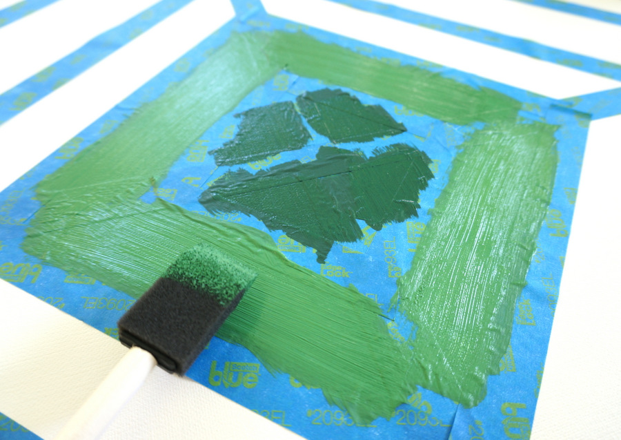
Step 3: Apply paint in shifts, removing the painter’s tape as you go.
I started at the inside of the canvas and gradually moved toward the outside. I used two coats of paint for each section, and for the most part, I removed the painter’s tape while the paint was still wet. In fact, I removed the tape as I went (instead of waiting until the very end). This was easier, because there was unpainted canvas for me to rest my hand on while I worked on pulling the tape off. I know much smudging was prevented by this technique!

Let’s talk more about painter’s tape! As mentioned, many crafting experts say you should remove the tape while the paint is still wet to prevent peeling, and it’s a good idea to pull at a 45-degree angle as you go. However, some of the paint was nearly dry when I took the tape off (due to the nature of the painting’s design), and that didn’t present any problems.

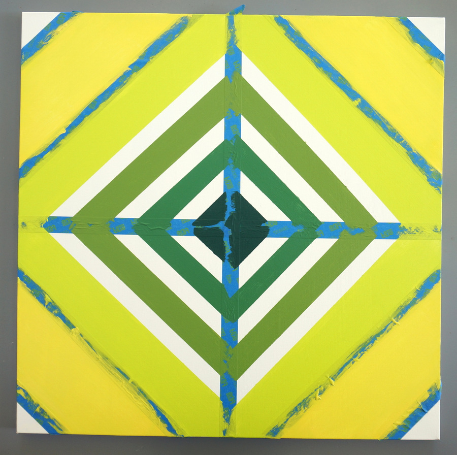
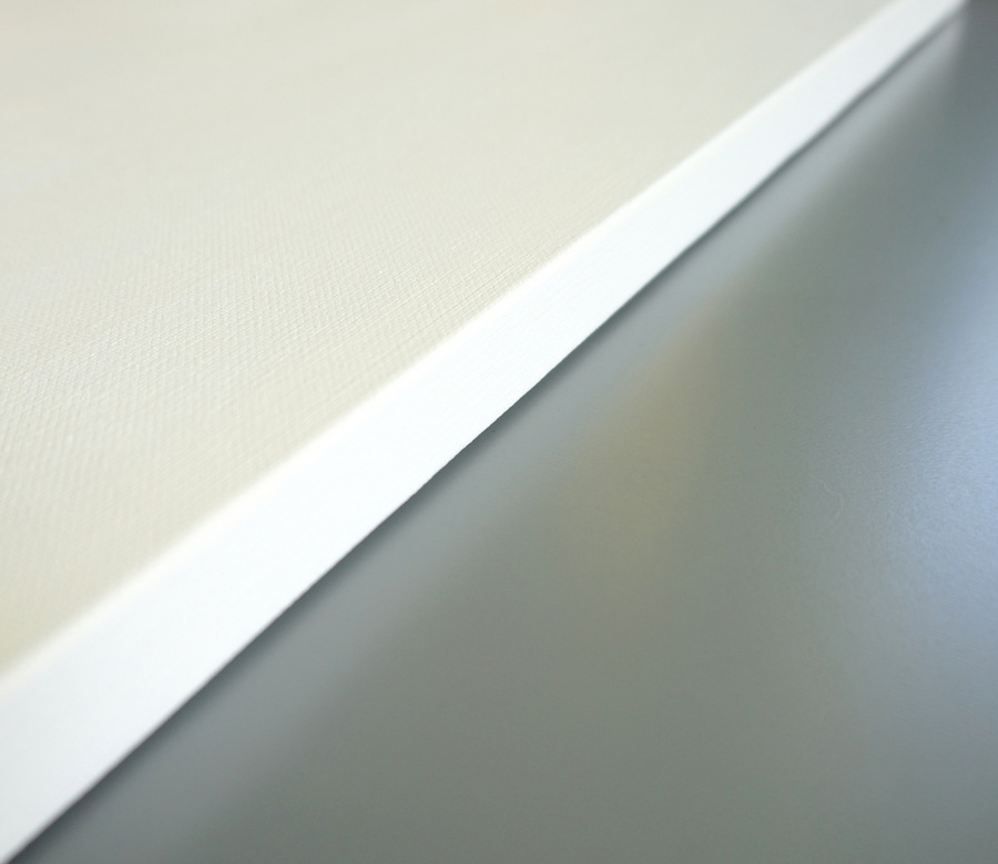
Here’s what the design looked like once all of the tape was removed:

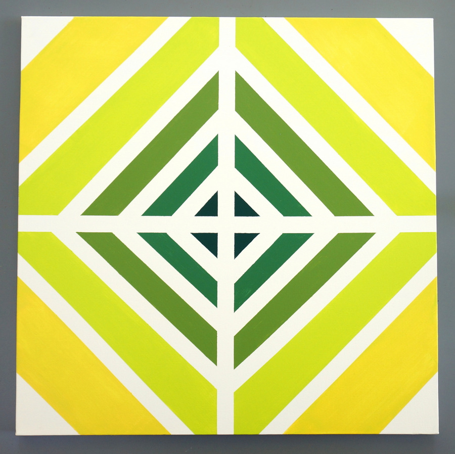
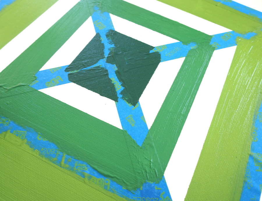
Step 4: Correct splotches and unevenness with white paint.
No matter how careful you are with the painter’s tape, chances are there will be smudges and other inconsistencies when you pull the tape off. Don’t fret! Simply take a paintbrush to the artwork and paint over unwanted markings in white!

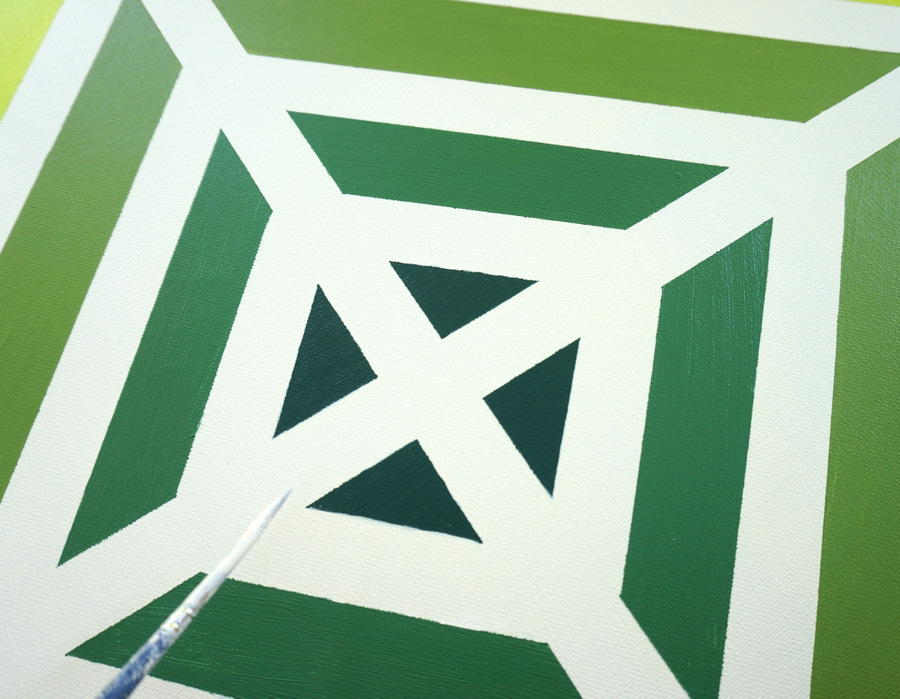
The lines may not be 100% perfect when you finish, but a look of overall smoothness will result if you take the time to fix any obvious blobs:

Lessons Learned


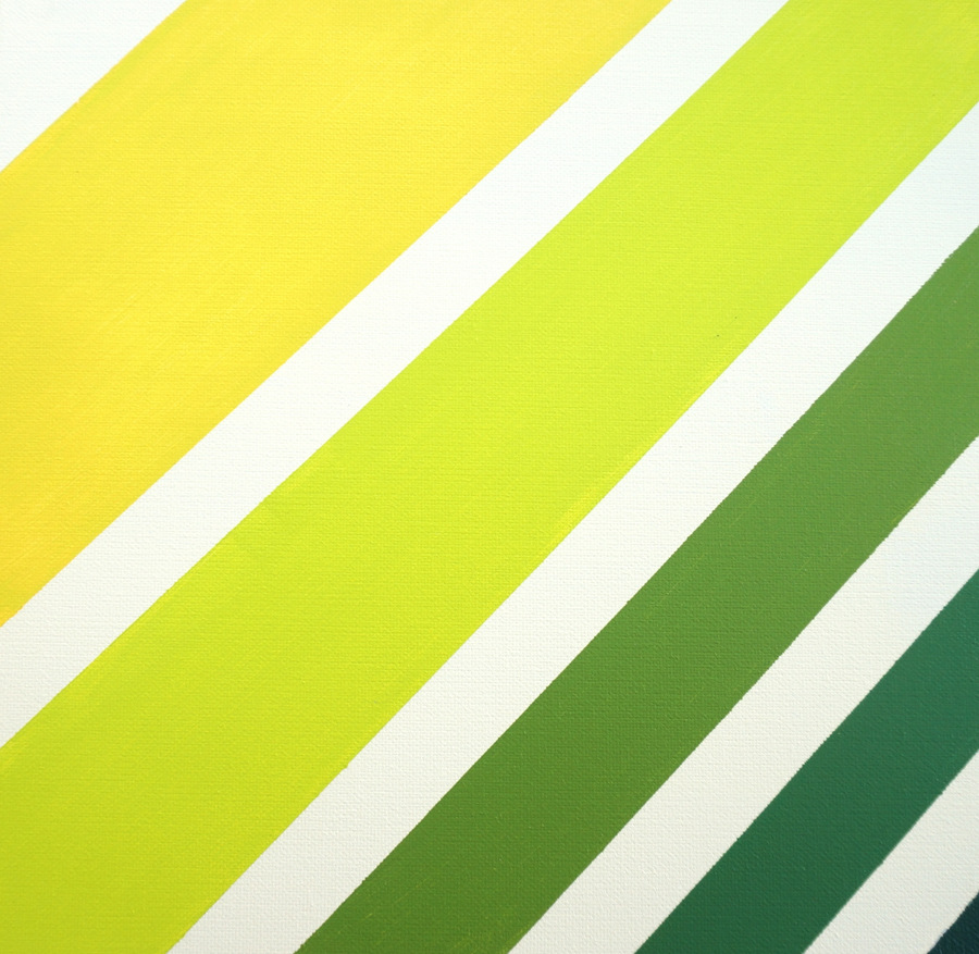
I learned many lessons from this project! For starters, a painting involving bright colors and geometric forms will make a powerful statement in your interior. If you’re not wanting an attention-grabbing painting, go with a more simple design (perhaps one that doesn’t cover the whole canvas), and use paint in lighter colors.

Also, this project is easy but takes patience. Being careful with the arrangement of the painter’s tape is key, as is taking the time to do more than one coat for good coverage.

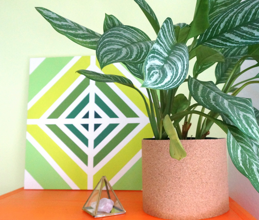
Finally, give yourself permission to change your mind about the end result! For example, above we see that the outer stripe of the painting was originally bright yellow. But then I decided that the yellow was a little bit too bold for my interior, so I painted over the large outer stripes with a shade of green, as shown below:

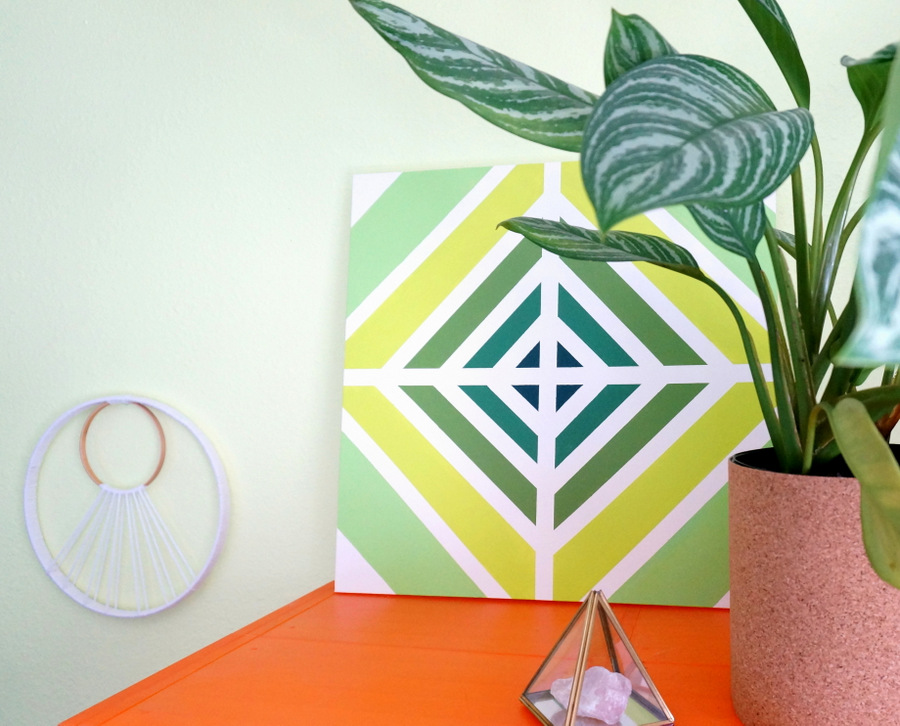
Also, the painting was originally intended for my dining room, but I found it to be a much better fit for the office. I’m currently working on two more of these paintings for my dining space, and I will be using thinner painter’s tape, as well as very light colors (in minty shades) for a subtle effect.

If you try this project at home, enjoy the process. And let your creativity unfold as you go! Thanks for letting me share my latest DIY endeavor with you. Stay tuned for more crafty fun this fall at Decoist…


