
We obsess over mattresses, blackout curtains, and white noise machines—but what about the color of the walls?
While a fresh coat of paint won’t act like a sedative, research in sleep science and environmental psychology suggests that your visual surroundings act as a “silent signal” to your nervous system. Certain tones help the brain transition into a parasympathetic (rest) state, while others keep your heart rate subtly elevated.
The Biology of Color: Why Your Brain Cares About the Walls

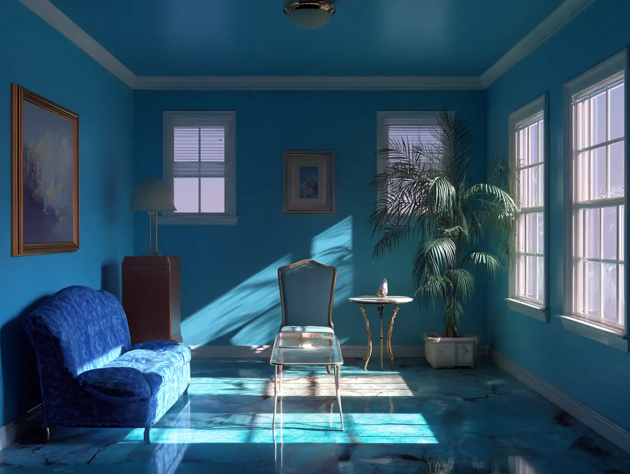
Color isn’t just an aesthetic choice; it’s a physiological trigger. Soft blues and muted greens are consistently linked to lowered blood pressure and heart rate. A 2024–2025 survey of over 2,600 Americans found that 38% of respondents reported improved sleep quality specifically after changing their bedroom to a more calming hue.
The 2026 Shift: Beyond Cool Blue
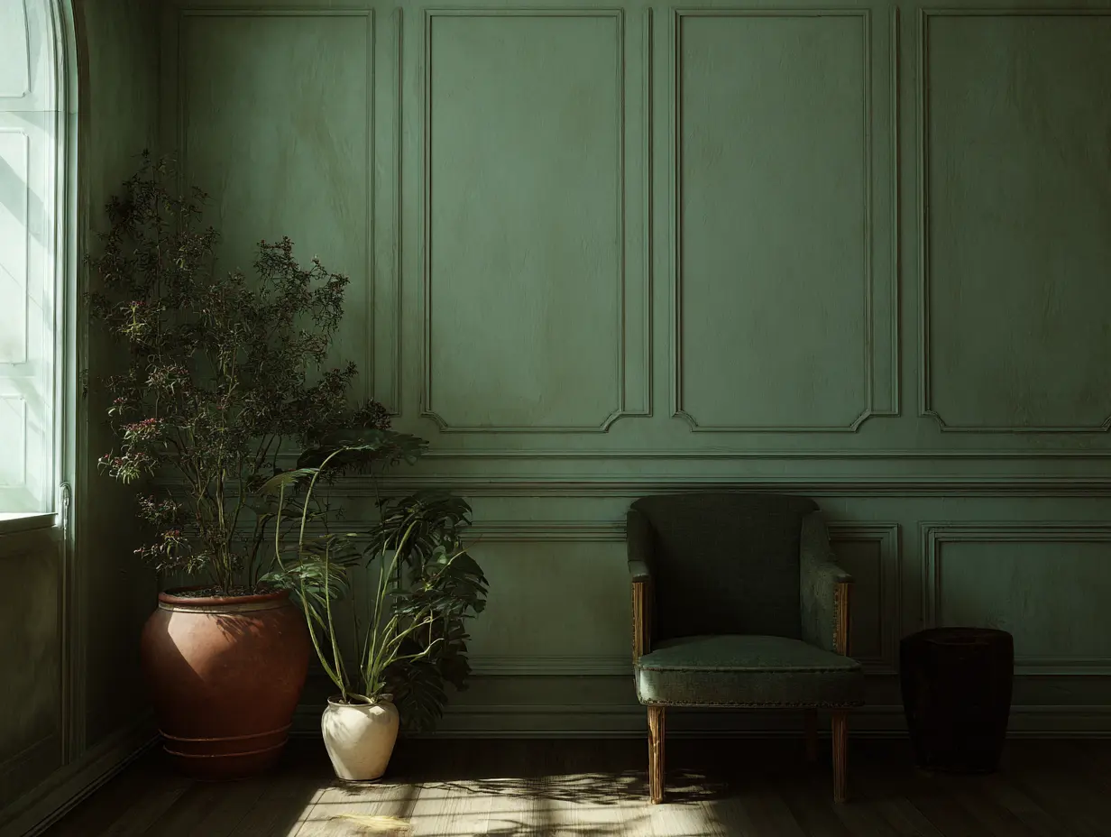
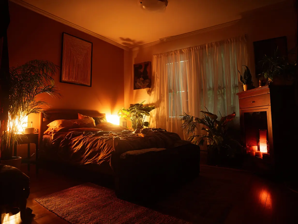
While blue remains the “king of snooze” due to its association with tranquility, 2026 trends are leaning into “Grounded Earth Tones.”
- Blue & Green: Still top performers for lowering stress.
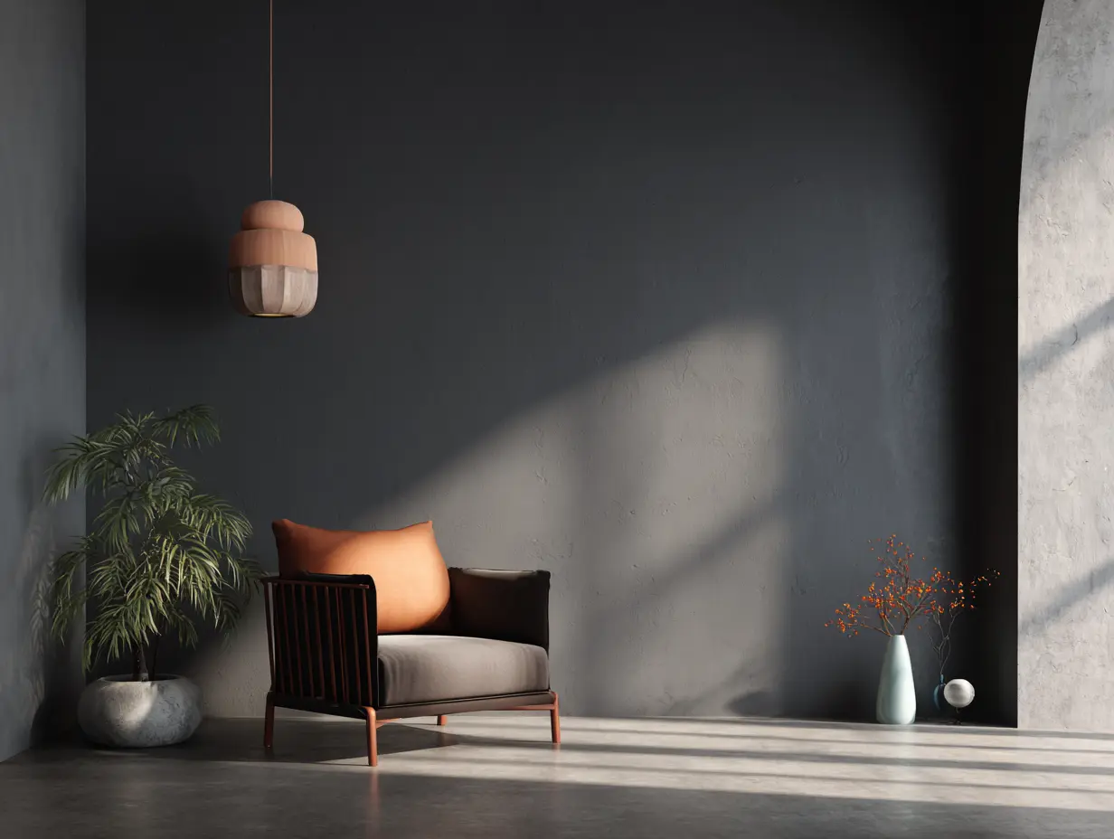
- Terracotta & Warm Stone: These “cocooning” colors are gaining traction for creating a sense of safety and “visual warmth” that stark, cool grays lack.
- The “Envelope” Method: Designers now recommend “color drenching“—painting walls, ceilings, and baseboards the same muted shade—to eliminate high-contrast lines that keep the eyes “scanning” the room at night.
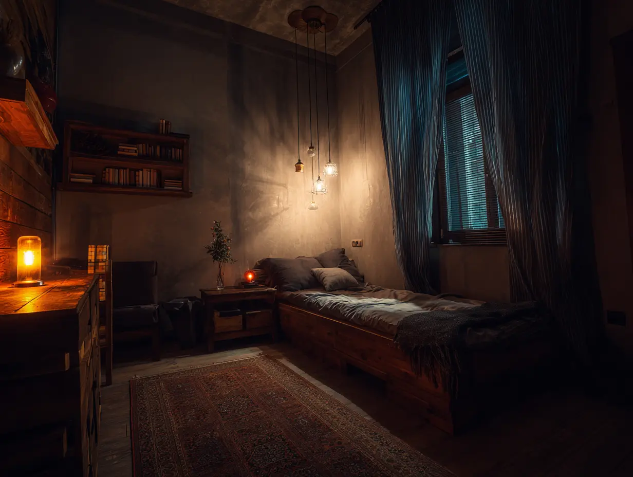
The Lighting Trap: Why Your Perfect Paint Job Needs 2700K Bulbs

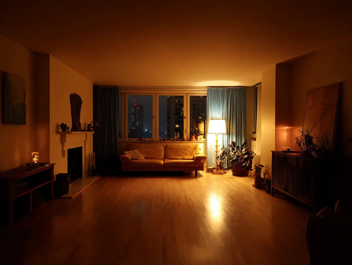
Sleep researchers at institutions like Harvard Medical School consistently emphasize that light exposure is the primary driver of melatonin production.
- The Blue Light Conflict: Your eyes contain melanopsin-expressing cells that are particularly sensitive to blue wavelengths. Even if your walls are a perfect “Midnight Navy,” if you use 4000K (Cool White) LED bulbs, those cells signal your brain to stay alert.
- The 2026 Fix: Designers now advocate for layered lighting with a color temperature of 2700K (Warm White). This mimics the low-angle, warm light of a sunset, which supports the natural rise of melatonin.
Common Mistakes: What to Avoid for Better Rest

To ensure your bedroom works for your sleep cycle, avoid these common design pitfalls:
- High-Gloss Finishes: Glossy paint reflects light sharply. Opt for Matte or Eggshell finishes to diffuse light and create a “soft focus” effect.
- Vibrant Reds and Purples: High-energy wavelengths like red can stimulate brain waves.
- Visual Clutter on Walls: Too many high-contrast patterns or “busy” gallery walls provide too much “visual noise” for a brain trying to power down.
The 60-Second Bedroom Reset

If you aren’t ready for a full repainting project, start with these environmental cues:
- Switch the Bulbs: Swap overhead “daylight” bulbs for warm-toned smart bulbs or 2700K LEDs.
- Mute the Bedding: If your walls are bright, choose desaturated, earthy bedding (like linen or bamboo in taupe or sage) to “anchor” the room.
- Control the Contrast: Use curtains that match the wall color to create a seamless, non-stimulating visual plane.
The Takeaway

Your bedroom should visually support the same goal as your bedtime routine: lower stimulation. By pairing low-saturation, calming colors with warm, diffused lighting, you create an environmental “cue” that tells your body it is safe to let go of the day.


