Color is an essential interior design element that helps to set the mood. Your color choice can establish a serene space for relaxation. Conversely, certain colors can also boost your energy levels. Interior designers work closely with their clients to learn more about the purpose of a space so they can set the proper ambiance with color.
Color psychology explains how colors affect our mood, cognitive functions, and creativity. Here, we explain more about how different colors impact us. You can use this information to achieve your desired design goal.
Red
Red is a bold color that conveys love and injects energy into the space. When used in a living room as an accent, red can help initiate conversation and promote friendship. In the bedroom, red creates a romantic atmosphere.
Fiery red is an ideal color for a home office, where it uplifts energy levels and boosts productivity.
However, red can be too stimulating if overused. Pair it with subtle colors and use it moderately to keep a balance.

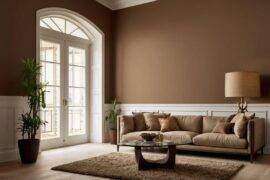
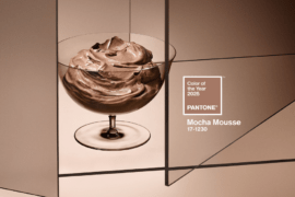
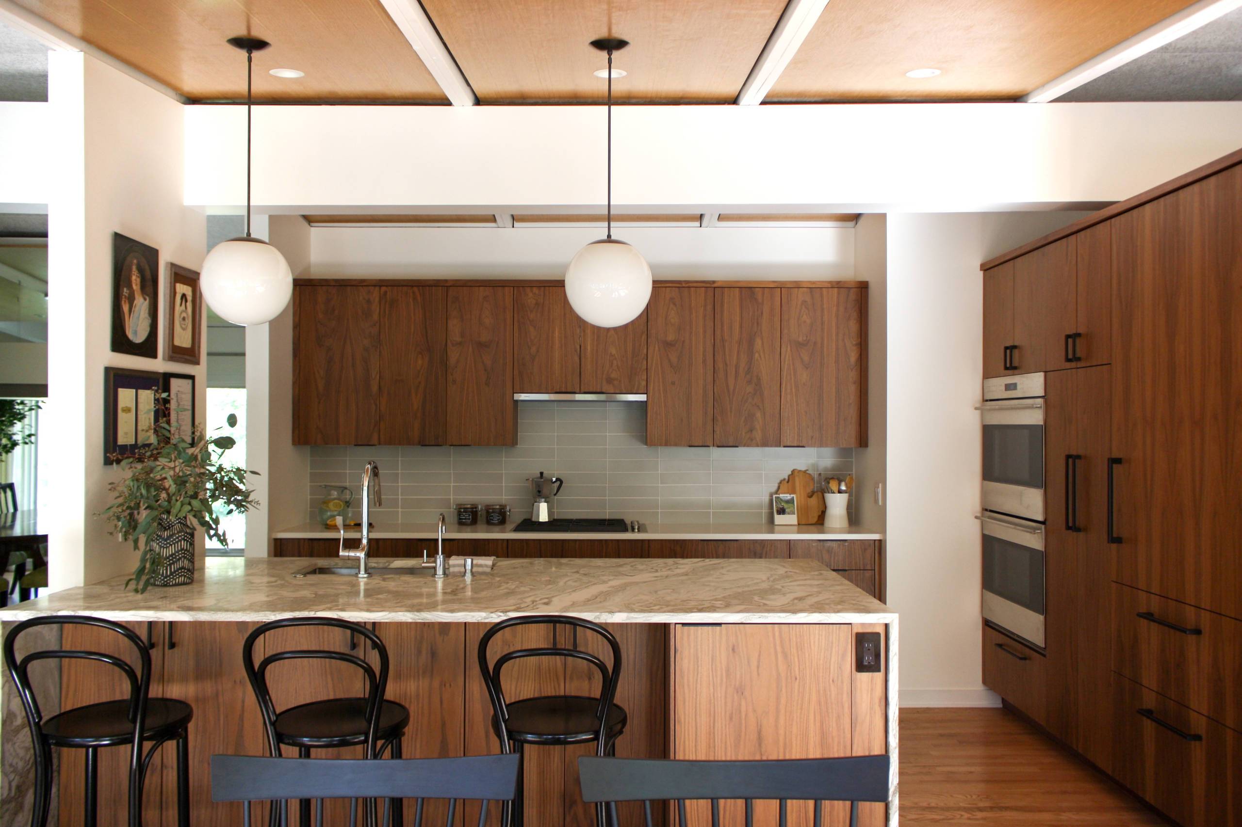
Brown
Brown is a neutral tone that transforms a space into a relaxing retreat. It creates a sense of comfort and coziness. Therefore, it is a preferred color for complementing rustic styles.
While brown looks welcoming, it can do too much to relax the senses which can lead to a lack of motivation. In spaces that require a boost of energy and productivity, it would be best to break down any brown with some fresh accent colors.

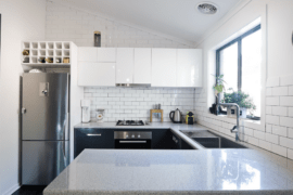
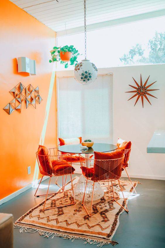
Orange
Orange is a bright color that stimulates creativity. It is a warm, welcoming hue that interior designers like to use in bathrooms and living rooms.
In addition, orange tones are known to increase appetite, which makes it a perfect choice for kitchens.

Green
Green is reminiscent of nature, bringing the outdoors inside. The color feels comforting and evokes a feeling of safety. According to color psychology, green helps lower blood pressure and relaxes us.
Different shades of green have different meanings. Lighter colors remind us of nature, making us feel safe and secure. On the other hand, deep green tones can be associated with greed.

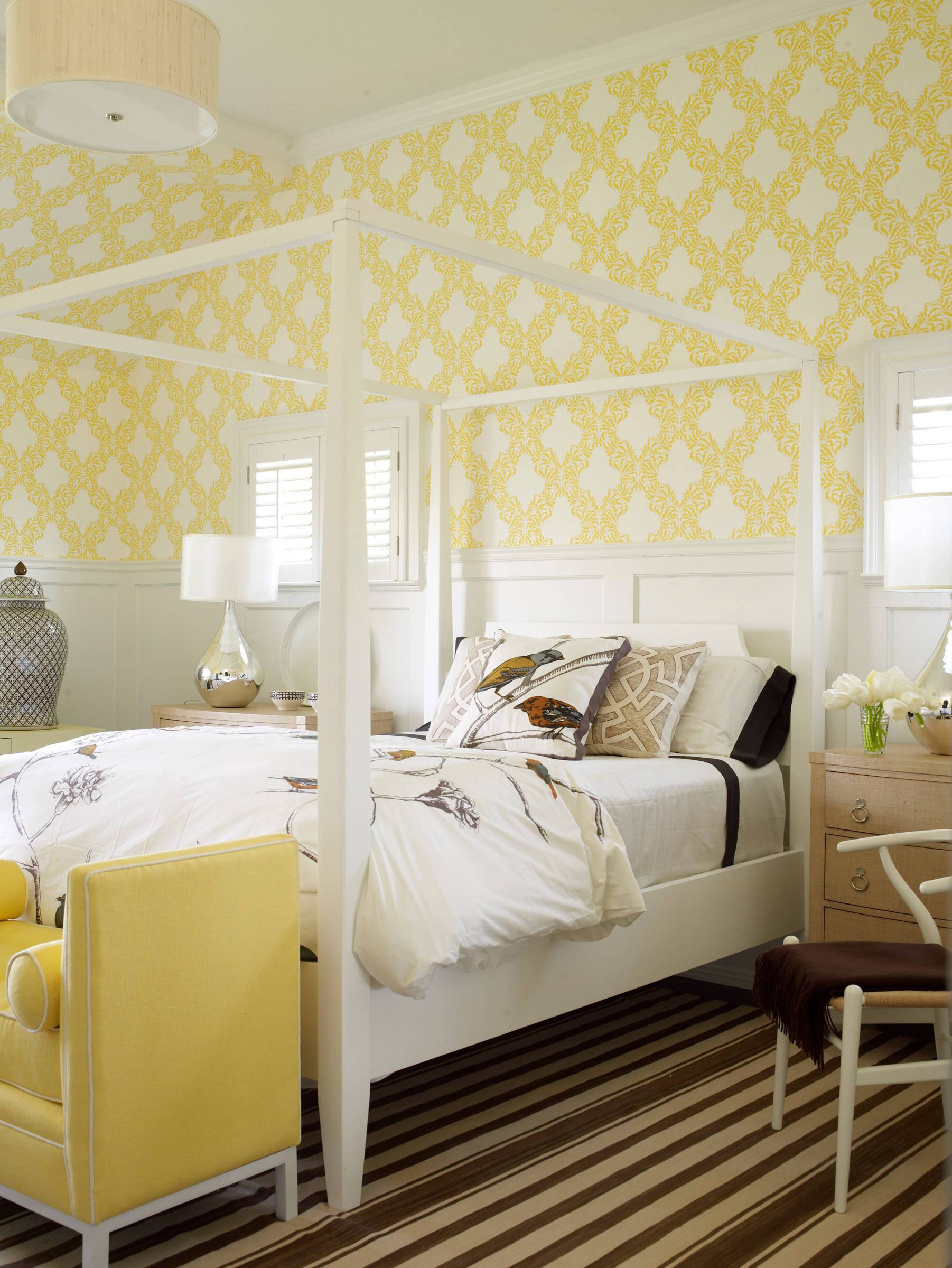
Yellow
Yellow adds sunshine and brings positive vibes to a space. However, it’s all about finding the right shade of yellow. Too-bright tones can feel overstimulating, so you’ll want to use more pleasant tones.
Yellow is ideal for an entryway, bathroom, dining room, and living room.

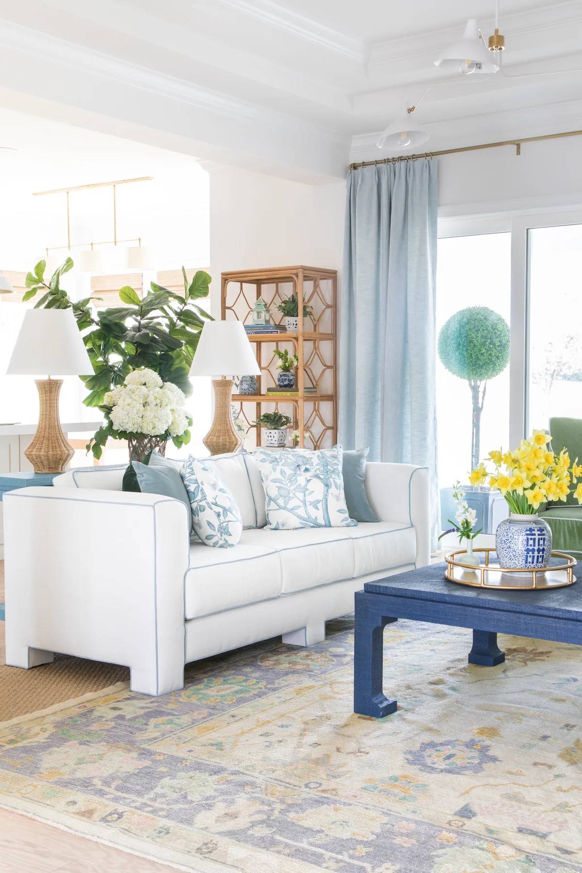
Blue
Blue is another color known for its relaxing properties. It lowers blood pressure and decreases stress levels. Lighter blues have an association with the sea, so they bring positive feelings. In corporate settings, blue is often used in decision-making rooms.
Deep blue tones are associated with luxury and elegance. The calming effect benefits the bedroom, as it promotes a good night’s sleep.

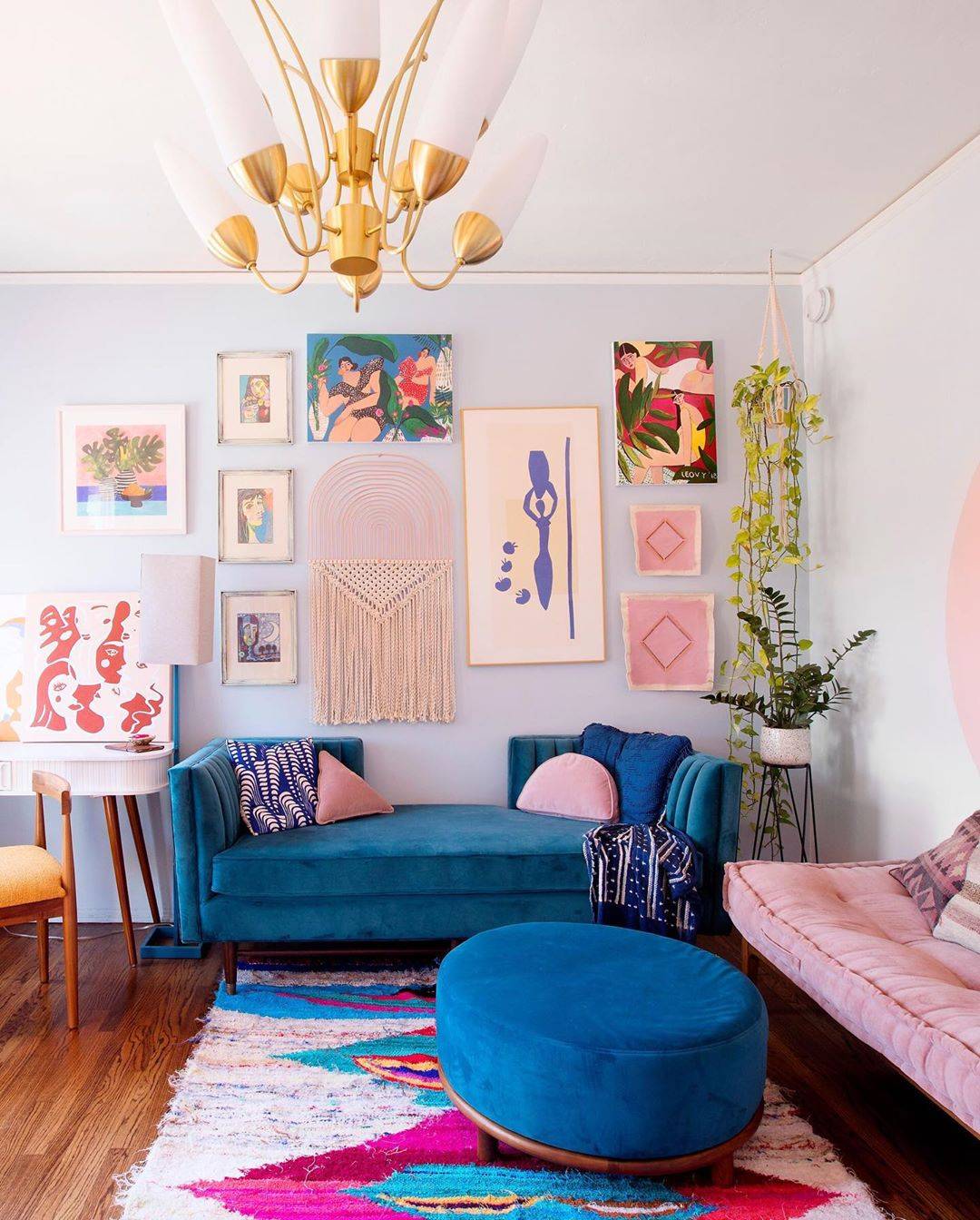

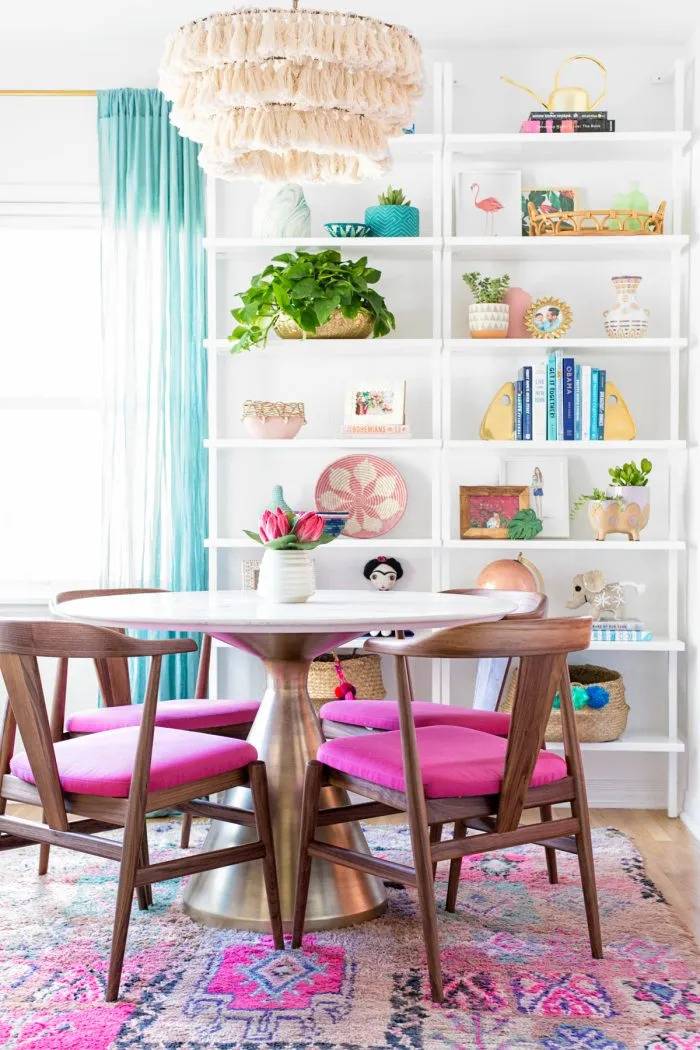
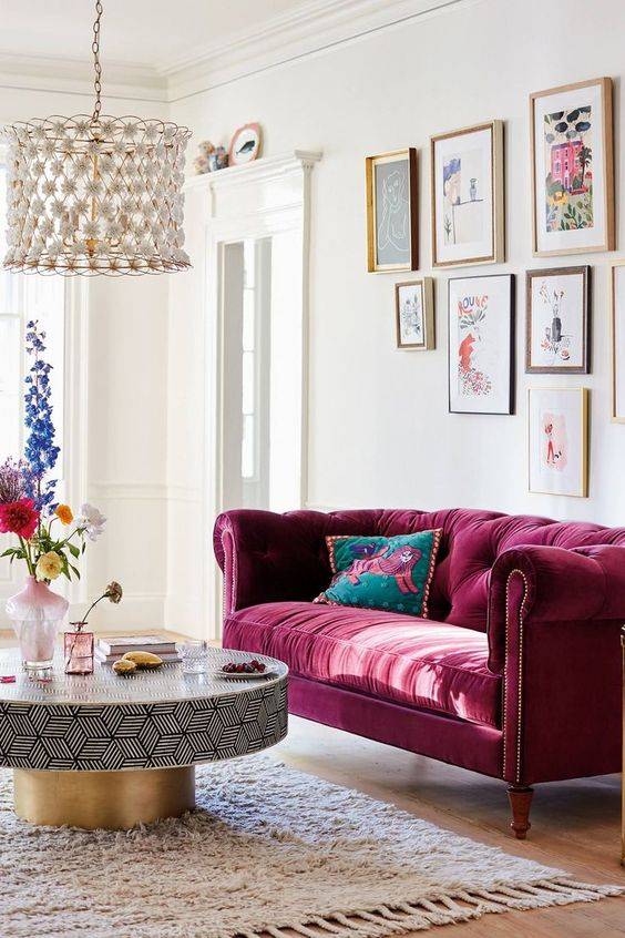
Purple
Purple is a color that reminds us of elegance and femininity. It boosts creativity and adds drama to a space. Home art studios often use this mystical tone to provide a calm ambiance that maximizes our creativity.
Purple is ideal for adding a touch of elegance to a living room. Deep tones like plum bring a luxury feel, while lavender hues create a serene ambiance.