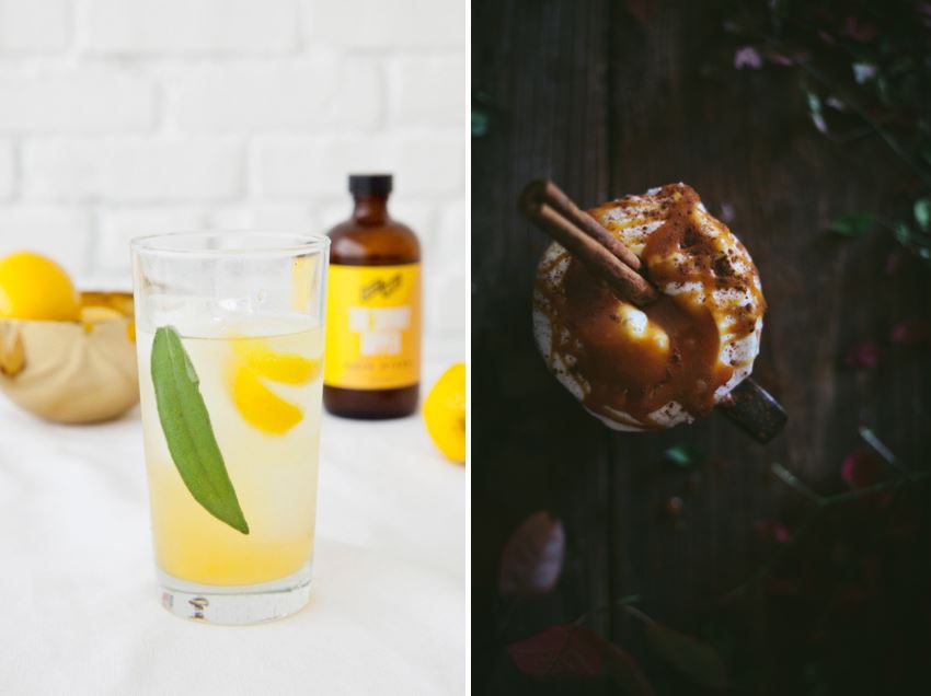
I love design–all types of design! One of my favorite ways to celebrate my enthusiasm for interior design is to follow product photography and art direction trends, and to see how these changes are influencing the realm of interiors. Today is dedicated to one such design trend: rich tones. Below we see two images from Design Love Fest. In the first image, vivid yellow accents pop against a white background in a mixed drink photo shoot. In the second image (below, left), rich tones take center stage, with a pumpkin chai latte at the forefront. Instead of saturated lighting, deep hues are every bit as important as the lighter ones here. This shift in style from light to dark is influencing interior design and product photography. In today’s post, we seek inspiration from rich-hued representations.

Foodie Fun
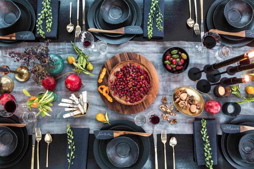
Let’s start with dining and entertaining. The latte photo above is by Eva Kosmas Flores of Adventures in Cooking. In the next featured image, we see a photograph by Chloe Crespi, capturing a holiday tabletop designed by Athena Calderone of Eye Swoon. Why go with rich tones instead of white backdrops such as marble countertops? There’s no doubt that surrounding food with deep hues helps to emphasize the decadence of the vignettes.

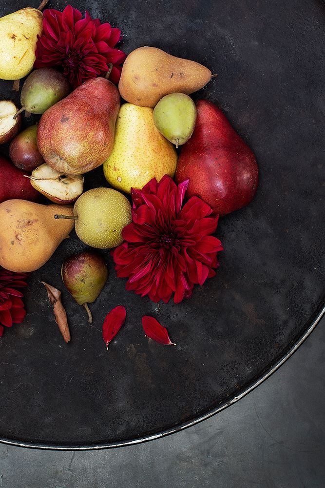
Not to mention, the featured items pop in a different way when set against a dark backdrop. It’s a unique look–one that can be difficult to duplicate outside of a studio. There’s something very special about it, almost high-end, yet a bit rustic at the same time. Below is a produce-filled image from the Eye Swoon Tumblr:

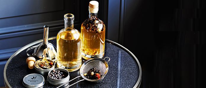
Deep hues and strategic lighting aren’t just for food blogs. Retailers are using this technique in their product photography, as shown in the image below from Williams-Sonoma:

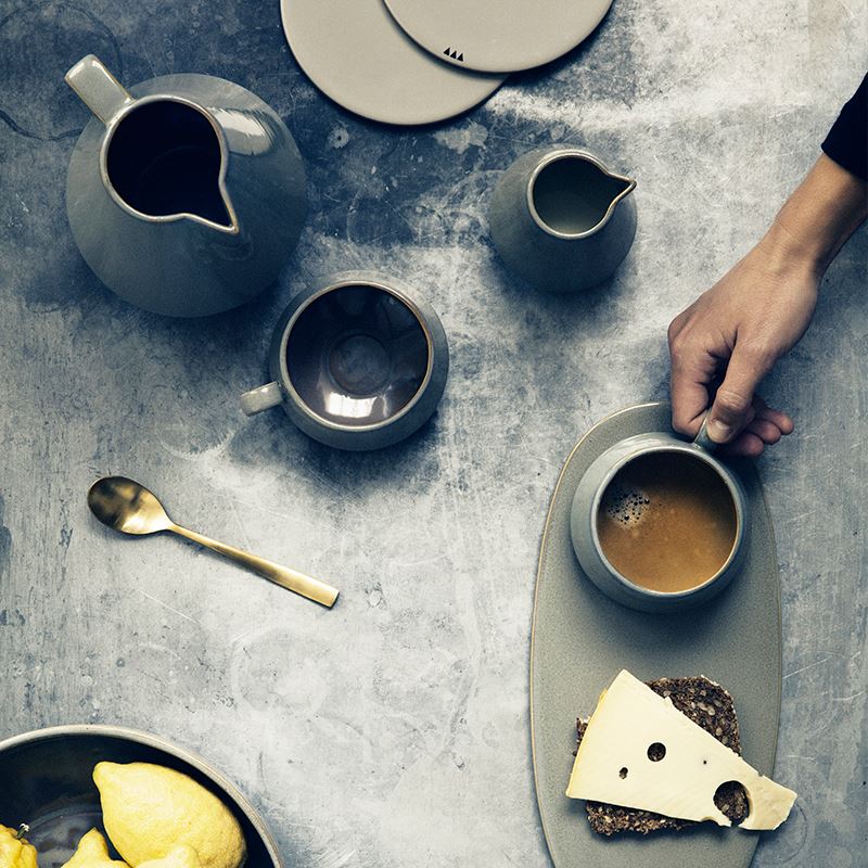
Gray backdrops are particularly fetching when it comes to one of today’s biggest design trends: mixed metals. In fact, when silvery grey tones meet gold, a certain magic results, as shown in this photo for the Neu Collection from Ferm Living:

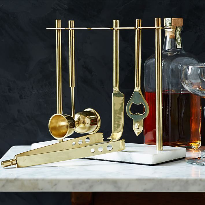
On a similar note, the Deco Barware Collection in Gold and Marble from West Elm is beautifully offset by a marbleized slate-toned backdrop in the photo below. The warm tones of the gold-finish stainless steel and the liquor truly shine in this arrangement:

Distinct Products
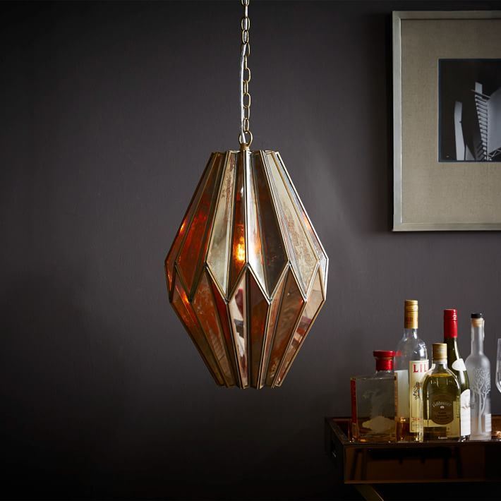
Let’s move away from the food and entertaining realm and head into interior decor territory. Not only are rich hues celebrated when it comes to all things edible, they are perfect for shining the spotlight on modern lighting. West Elm is one retailer that has embraced dark backdrops. In the next image, we see the faceted, brassy Notre Mond Mirrored Pendant:

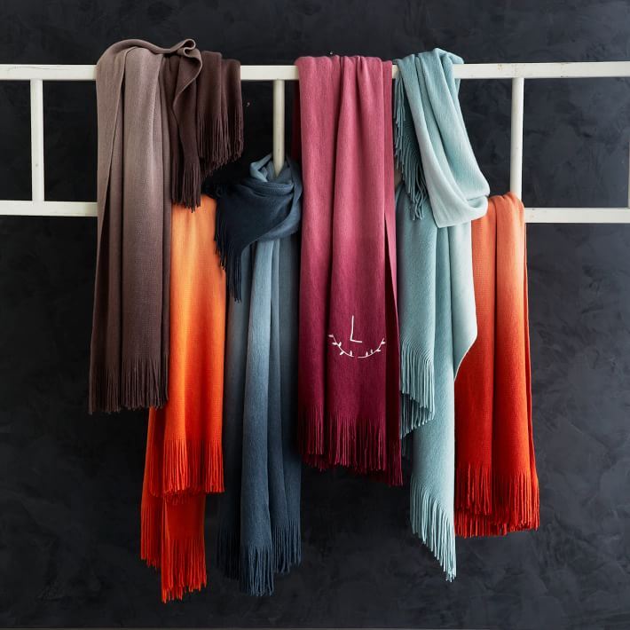
There’s something undeniably seasonable about this look as well. No, it’s not replacing brighter, more vibrant photography strategies featured in current trends such as the new still life movement. Yet it’s a nice alternative, as well as a great look for fall and winter, when richer tones enter our interiors. The Softest Throw in Ombre from West Elm is particularly alluring when set against a deep grey wall:

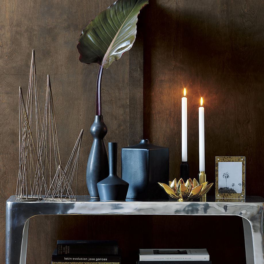
Grey isn’t the only shade that can offset today’s most interesting decor offerings. Warm, wooden tones work as well, as shown by this photograph featuring the Sterling Console and a range of tabletop decor finds from CB2:

Dark Tones in Interior Design
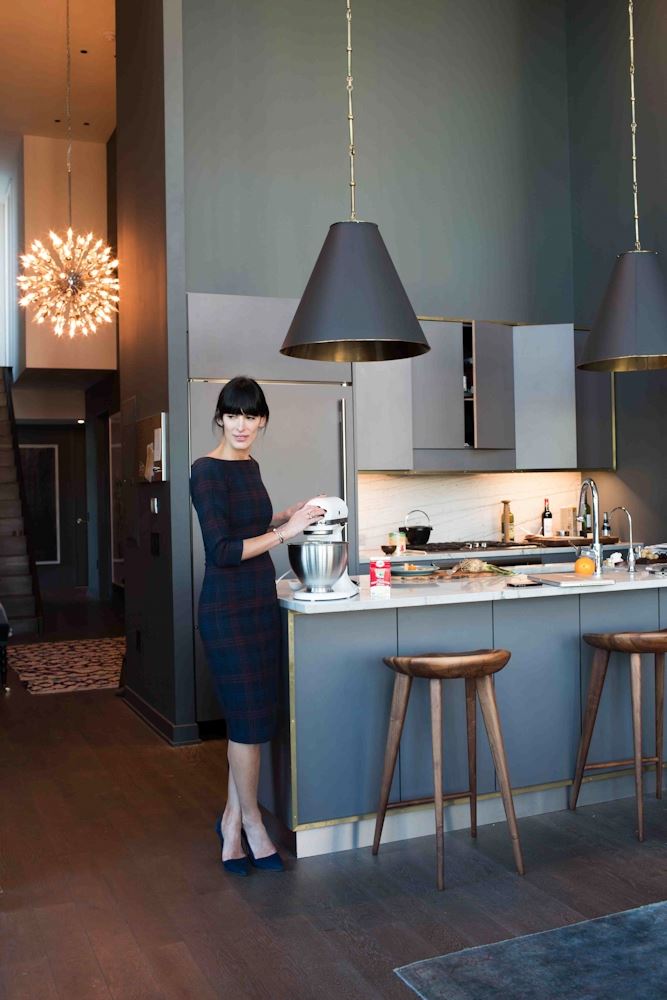
Let’s now shift from product photography to interior design. It’s hard to discuss the interplay of rich hues and metallic tones without showcasing the uber-elegant kitchen of interior designer and Eye Swoon lifestyle blogger Athena Calderone. Warm tones in gold and wood meet the chic coolness of grey and charcoal:

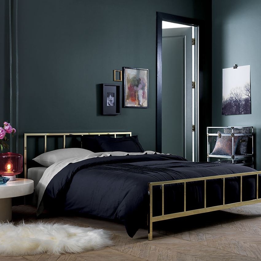
If decadent photography and art direction techniques are the strategies of choice for highlighting scrumptious food, doesn’t it make sense that they’d be employed to achieve a scrumptious, decadent feel in our interiors as well? This gorgeous image features the Alchemy Shiny Brass Bed from CB2. Note how artwork, flowers and dreamy textures come to life against the dark walls of this space:

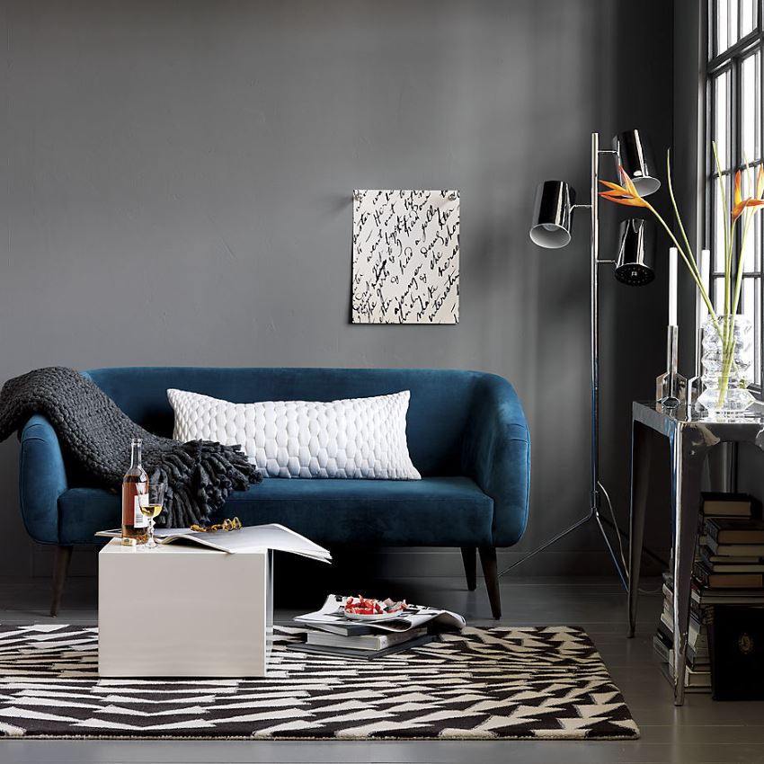
Even super modern interiors can benefit from this opulent color palette. Below we see the Rue Apartment Sofa from CB2, designed by Jannis Ellenberger. Micro-velvet poly fabric, fresh flowers, and delicious food pop in this richly painted room:

No wonder grey is such a hot color this season! Would you surround yourself (and your favorite pieces) with deep, rich tones? Are you a fan of this trending photography, art direction and design style?!


