When it comes to your outdoor space, how much color is too much? The answer: there are no hard and fast rules. Kate here, and if you read my posts from time to time, you likely know about my recent obsession with outdoor DIY projects. I’ve been especially interested in pots and planters this season, from the painted to the suspended. A LOT of color has been involved in these projects. And now I’m thinking about simplifying my outdoor space a bit, focusing on earthier tones with a few pops of color, rather than multiple bright statements.
However, you may prefer a more radiant approach to outdoor design. Today’s post is all about finding the right color scheme for you. No rules–just inspirational ideas! Check out the images that follow. No matter how vibrant they get, I promise to keep it chic…
An Ode to Neutral Tones
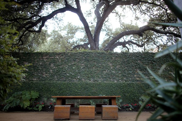
I’ll start with a series of images that remind us of neutral beauty–yes, the beauty of neutral tones. For one thing, the natural colors of the outdoors can have a powerful effect on your patio, deck, yard or garden. For example, deep, crisp greens create a cooling effect, as they are visually soothing. Perfect for those hot summer days! [from Hotel San Jose]

Not to mention, keeping outdoor landscaping and furniture tones simple allows the colors in your plants to take center stage. Note the many green and red hues in the Ville St. Laurent garden below. [from Montreal Outdoor Living]

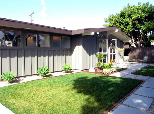
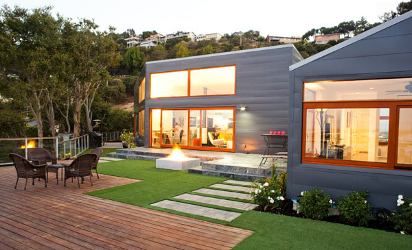
Got a house you want to show off? Interesting structures and forms should get noticed! Sometimes simplifying the materials and colors of your outdoor space can beautifully complement the architecture of your home–and help it to truly stand out! [from Garden Architecture]

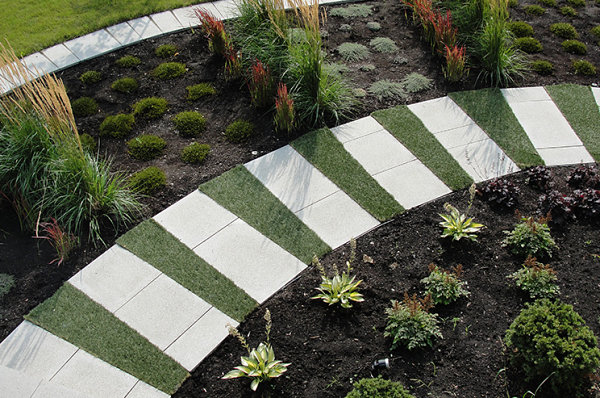
If you feel that neutral shades are nothing but dull, think again. A wide range of colors are available for your design enjoyment. Focusing on opposite shades of the neutral spectrum is an effective strategy for achieving balance in your yard. Light + dark = symmetry and dramatic interest! [from Exterior Worlds]

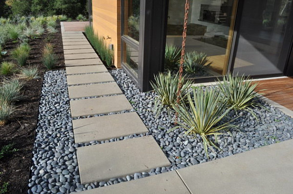
Light stone and gravel are ideal counterparts to medium gray and beige tones, such as the paint color of the home below. Also note the use of dark trim on house and flowerbed, which helps create an additional level of depth. [photo by Tara Bussema for Houzz]

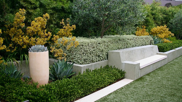
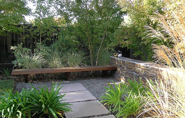
The stylish landscaping below reminds us that warm and cool neutral tones CAN combine in utter harmony. In fact, they help balance each other out while expanding the palette of your outdoor space. [Huettl Landscape Architecture]

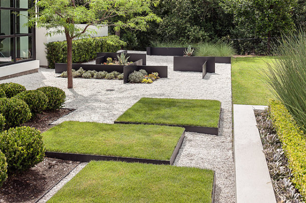
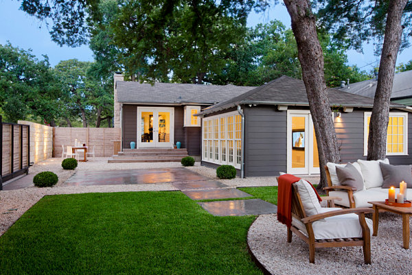
When I moved into my home last year, I struggled with the large amount of beige in the backyard–the beige paint on my neighbor’s house, the beige stone patio, the beige gravel. So I added a hefty dose of gray through patio furniture, walkway gravel and stepping stones. Yes, gray and beige can live in perfect harmony. The gorgeous modern yard below helps drive this point home. [from Huettl Landscape Architecture]

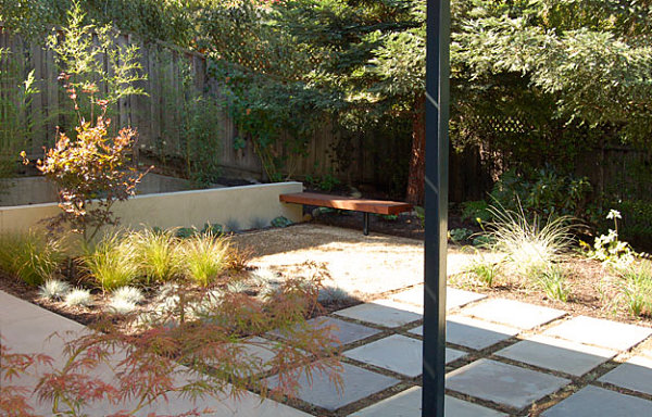
And don’t forget that your plant life will add a dose of color that can make a difference in your yard. This next featured outdoor space includes a range of warm tones, thanks to a variety of garden plants with gold and reddish leaves. [from Huettl Landscape Architecture]

Introducing Color
The images below show us that sticking with a neutral color palette is one surefire way to get a chic modern look. But what about bright doses of color? As you consider adding a bit more vibrancy to your outdoor space, there are a few things to note before beginning. Pay attention to the color of your home. Outdoor plants and accents should complement it, not detract from the overall look of your abode. [from Ross Knazs & Associates via Houzz]

Do you have a swimming pool? Pools typically add a distinct blue tone to your yard. Work with it, not against it, as you incorporate additional color. [from Hotel San Jose]

Also pay attention to the colors of the plants that are already in place. Sometimes we’re programmed to think of color as solely coming from man-made items (such as outdoor seating and garden pots). Not true! A yard filled with neutral-toned stones and furniture may boast a range of hues, from yellows and greens to vibrant pink blossoms. [photo by Rich Radford for The Garden Route]

If you’re not sure how much color to add, you can always start small. A couple of pots flanking your door and a rich-hued throw for the back of your outdoor sofa are easy to replace if you get tired of the tones. Plus, you can always add more color if you like what you see! [from Texas Construction Company]

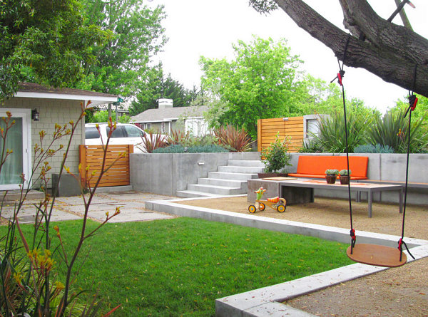
One standout furnishing or cushion set can make a huge impact! In the modern yard below, a vibrant orange seating statement is the perfect complement to the gray and green tones of the space. [from Shades of Green Landscape Architecture]

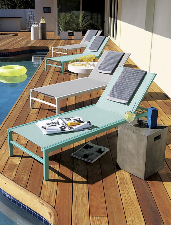
Blue is a popular color choice for modern yards. Not only does it play up the beauty of natural wonders such as water and the sky, it is refreshing and easy to accent with other tones such as lime and yellow! Below we see the aqua sun lounger from CB2:

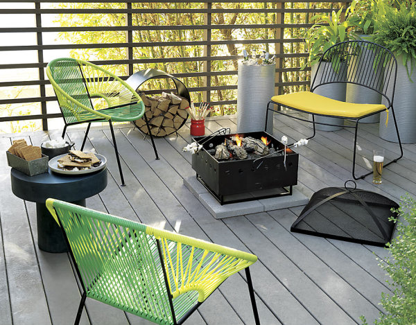
Greens and yellows are also eye-catching, especially when used in combination. We frequently see these shades in modern interiors, so it makes sense that we would note their citrus-toned festivity in outdoor spaces as well! Once again, we have a selection of seating from CB2:

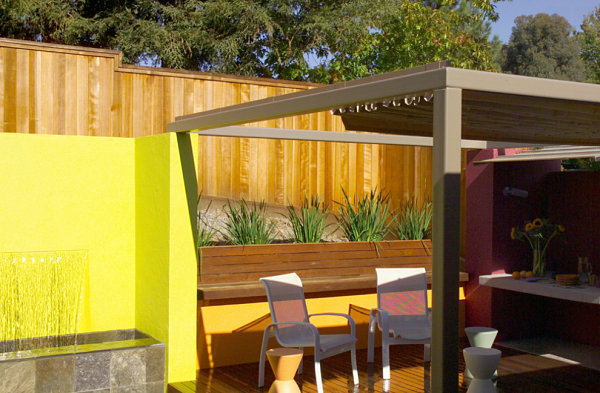
Ready to go bold? Really bold? Try a bright pop of yellow. I’ve seriously considered using this tone in my backyard, as it complements other warm shades such as brown and tan. It also provides a lovely contrast to gray hues. Painting a patio wall is a great place to start when it comes to adding color to your outdoor space! [from Mark English Architects]

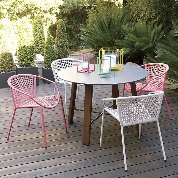
I’ll end today’s post with a photo featuring an array of bright colors that walk the line between pastels and saturated hues. If you love color, then don’t hold back. Your outdoor space should reflect your personality and style. [from CB2]

When it comes to your outdoor preferences, do you enjoy bright hues, neutral tones, or something in the middle? Share your thoughts by leaving a comment below…


