It’s still November, but now is the time to start planning your holiday palette! If you’re searching for a fresh look, you can pick up pieces here and there once you have a solid concept for your holiday decor. And developing your holiday palette is exactly what today’s post is all about! Are you looking to add some new pieces to your collection? I sure am! During the last couple of weeks, I’ve noticed some distinct new holiday colors take center stage. I wanted to share them with you, as they represent a fun, unexpected take on traditional holiday decorations.
When choosing holiday colors for your decor, consider the hues of your interior. You will want your holiday decorations to nicely complement the colors found on your walls and furniture. Also make sure to select colors that you truly love. Buying an entirely new set of decorations because they’re trendy is a good way to waste money. After all, once the trend fades, you don’t want to be stuck with pieces that really aren’t your style. Here are some ideas worth checking out…
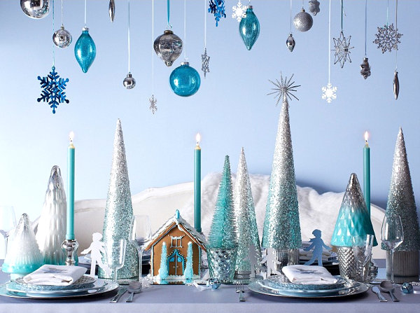
1. Aqua, White, Silver and Gold
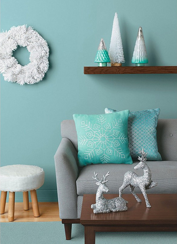
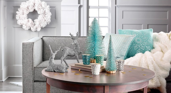
One palette I’ve encountered time and time again this season is a combination of aqua, white and metallic shades such as silver and gold. Crisp, refreshing and elegant, this palette is celebrated by retailers such as Target, which offers a range of selections in their Arctic Luster Trend Collection…

Not only is Target offering a range of glittering trees, this retailer has also manufactured gorgeous pillows in aqua and silver, such as the Threshold Foil Print Pillow shown below:

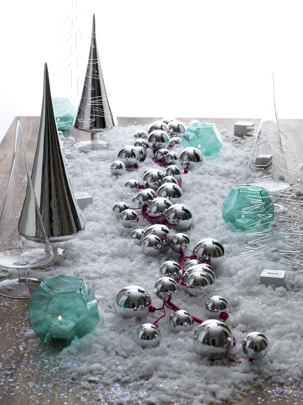
CB2 has also joined in on the fun, creating wintery vignettes in aqua, white and silver. Below we see the Silver Ball Garland and Aqua Glass Candleholders, which conjure images of snowy landscapes and chilly icicles:

We now introduce some gold into the palette with another festive arrangement from from Target. Gold adds depth to this palette by providing a warm contrast to cool winter tones. Plus, gold is one of this season’s biggest trends! Of course it would find its way into the latest holiday decor…

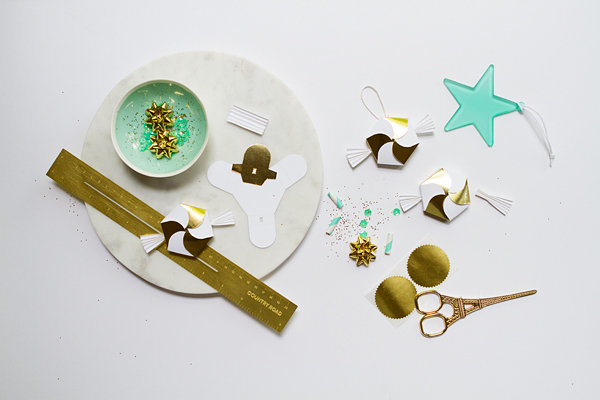
Speaking of gold, this next image is deliciously chic, thanks to aqua accents, gold embellishments and a contrasting glossy shade of white. It’s the Hexagon Candy Box DIY from Oh Happy Day, and it looks fabulous when juxtaposed with a minty blue…

The aqua, white and gold combo is also ideal for winter parties, as shown by this “Heavenly Holiday” photo shoot from Hostess with the Mostess via Design Indulgences:


2. Teal, Amethyst and Fuchsia
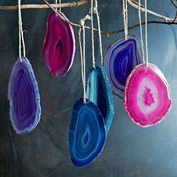
The palette above was crisp, refreshing and festive. The next featured palette I just can’t seem to get enough of is deep, rich and elegant. And retailers such as West Elm have truly brought it to life this season. These Agate Ornaments in jewel tones are sliced and polished to perfection…

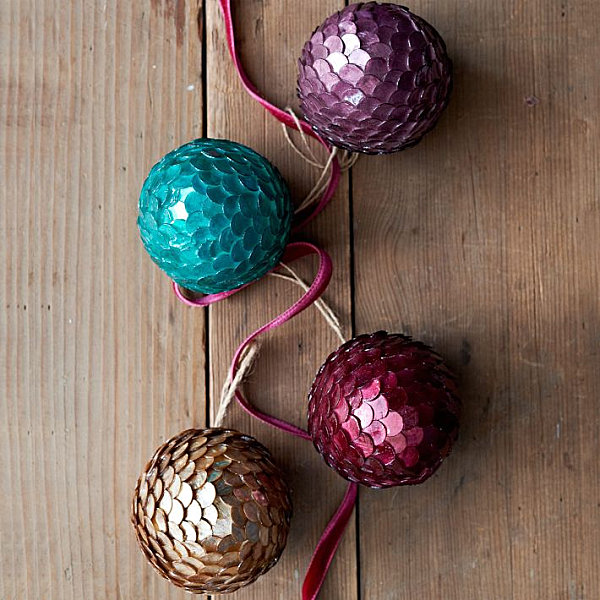
For a glitzier look, check out West Elm’s Capiz Paillette Ornaments, constructed of pressed capiz disks that shine like glitter when they catch the light. They really come to life when combined with gold, as shown in the arrangement below:

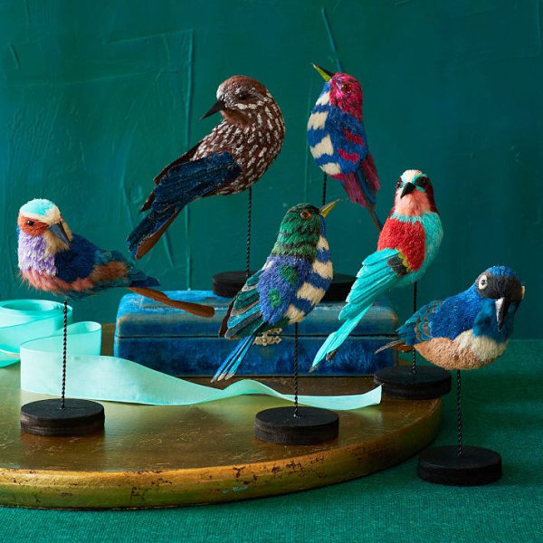
The retailer’s Handcrafted Sisal Birds can be used to embellish your holiday tablescapes, especially since they feature a range of rich shades. Inspired by forest birds, they also add some lighter tones, such as lavender and peach. The next featured image truly shows the depth to which you can take a jewel-toned palette by varying the colors. Don’t be afraid to combine rich hues with lighter shades:

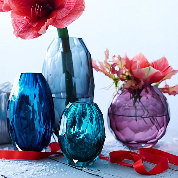
For a vignette that glistens like gemstones, check out West Elm’s Faceted Glass Vases, offered in a variety of hand-cut jewel-toned selections. Add flowers in red and fuchsia tones to heighten the effect of the purple and teal palette.

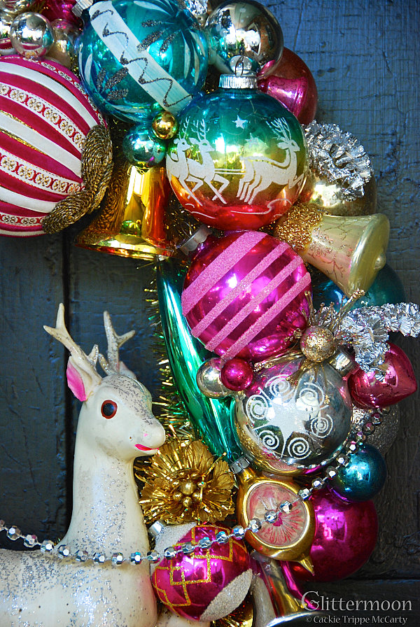
Jewel tones can also have a vintage effect, as shown by this gorgeous holiday wreath from Glittermoon Vintage Christmas. Shades of teal and magenta can be found throughout the design, creating a vibrant feel that welcomes guests when placed on the front door:

3. Red, Blue, Green and Gold
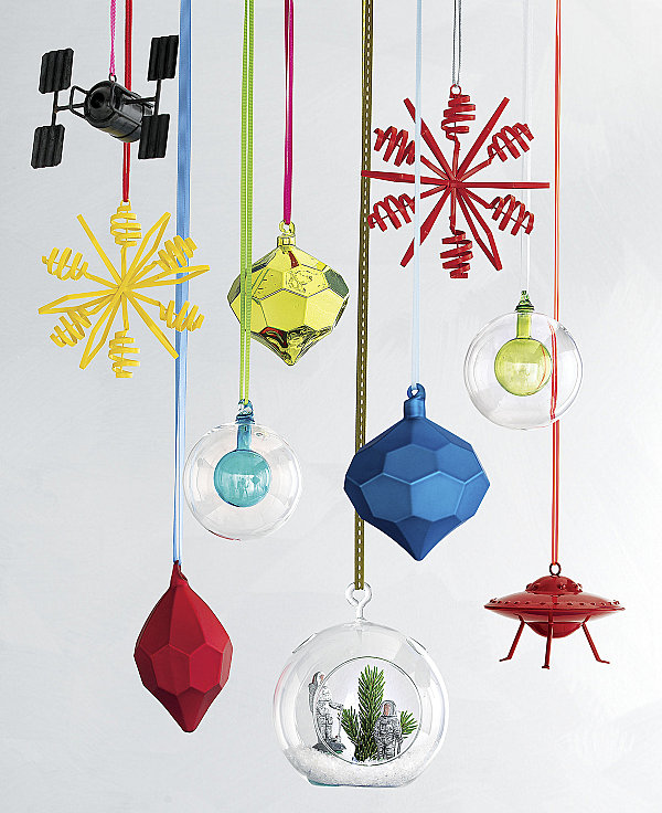
We end with a palette of primary colors that conjures images of radiant toys, whimsical vignettes, and true modern design. This next palette is all about primary colors, folks! The Facet Ornaments from CB2 shine with their hexagonal faces, blending beautifully with the retailer’s other featured selections.

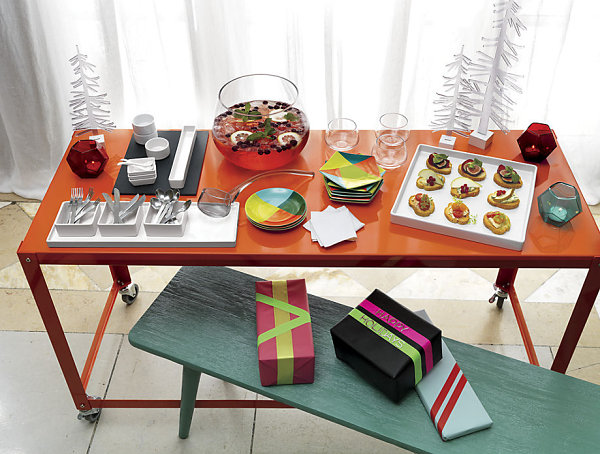
A palette of primary colors also works beautifully for holiday party tables, as shown in the next image from CB2. Recognize the glass candleholders featured earlier in the post?!

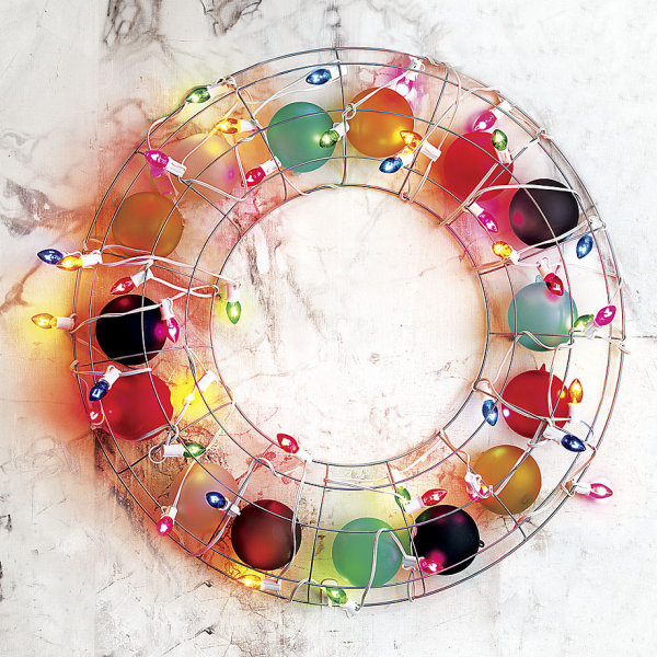
Need to make a vivid statement in matte? The Set of 6 Frosted Glass Ornaments from CB2 are perfect for the tree, or for a modern holiday wreath creation:

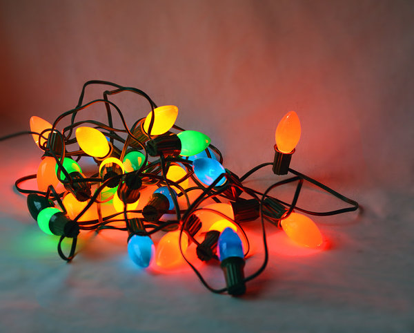
In addition to being wonderfully contemporary, a primary color palette also evokes the festivity of Christmases past. Yes, there’s just something nostalgic about this color combination. These Large Vintage Christmas Lights from Etsy shop Vintage Soup show us why…

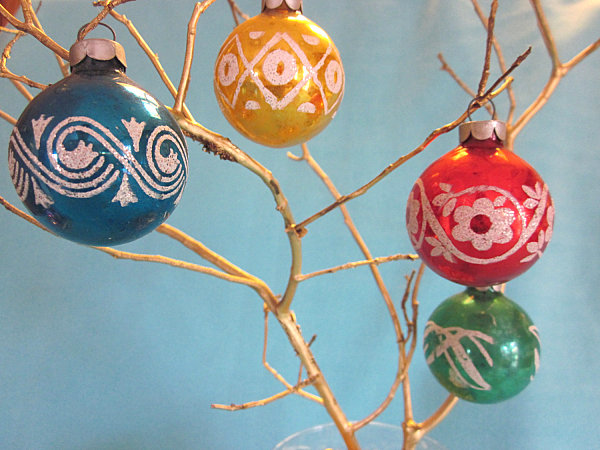
The retro vignette below features Vintage Christmas Ornaments in Primary Colors from Etsy shop Keep It Cottage. Showcasing selections from the 1950s, this arrangement illustrates the power of color, as these ornaments easily bring bare branches to life!

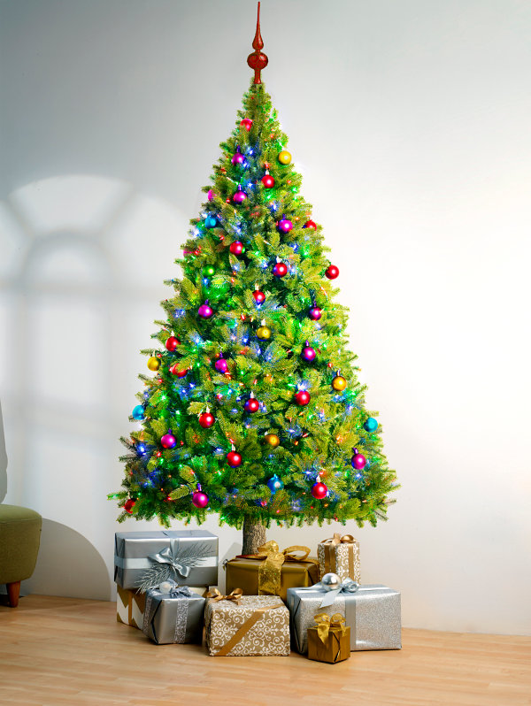
We end with a Christmas tree that brings the magic of the holidays to life. This Green Multi Colored Christmas Tree from Wallflower also reminds us that adding some jewel tones to your primary palette creates a multi-dimensional effect that’s well worth a second look:

I don’t know about you, but my head is spinning with holiday palette inspiration. In a good way! I’m also drawn to the simple combination of classic hues such as silver and gold, which are neutral yet sophisticated. Did any of the holiday colors above catch your eye? Share your thoughts by leaving a comment below…


