Who says an interior can’t be sweet enough to eat?! Today we draw inspiration from desserts! If your living room were a macaroon, what would it look like? How can you bring the appeal of a layer cake to your dining room? We’ve got answers, thanks to a collection of delicious pictures that reveal the magic of pastels when it comes to decor.


The resulting confections may surprise you! If you think pastels are reserved for the frilliest of spaces, think again. Soft hues can be refreshingly modern, or they can be strategically used to put a contemporary spin on an otherwise traditional space. Join us as we explore the sugary possibilities that complete the phrase “If a pastry were a design concept…”
Minty Green
We begin with a touch of mint…
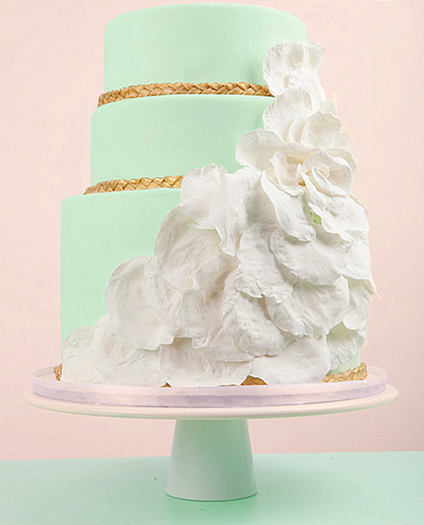
THE INSPIRATION: A mint green masterpiece by Jenna Rae Cakes

THE ROOMS:
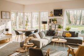
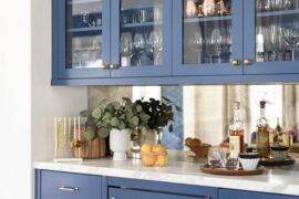
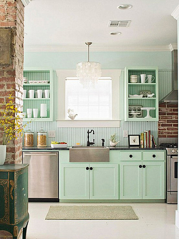
What could be more refreshing than a minty kitchen, especially when white trim is involved? Not to mention, an assortment of white dishes and collectibles, such as a lace-edge cake stand? Stainless steel appliances and a capiz shell chandelier keep the space contemporary.
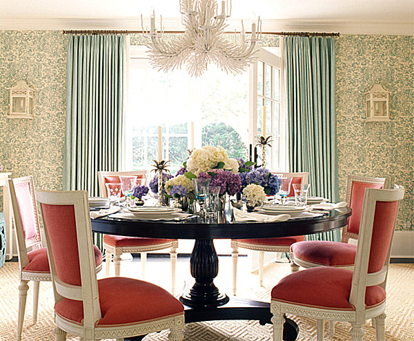
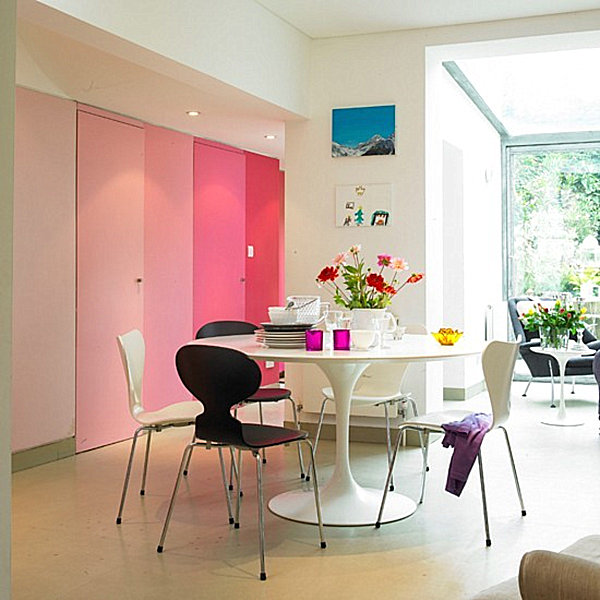
Speaking of chandeliers, the spiky piece below evokes the magic of ice crystals. Throw in minty wallpaper and drapes, and the dining room becomes utterly unforgettable. Just as a peach background offsets the mint green cake above, coral chairs take this space to the next level. [from Ashley Whittaker Design]
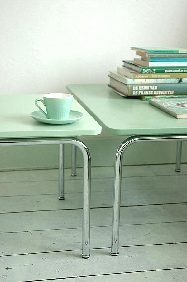
Mint can also be undeniably modern. Below we see two Shift Tables by Ontwerpduo. Somehow saturating them with green decor only heightens their appeal:

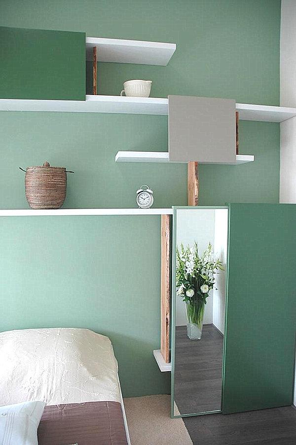
In another image from Ontwerpduo, contemporary shelving with adjustable panels looks extra fresh against the backdrop of spearmint walls:

A Touch of Paris
We now head to France for a bit of design magic…
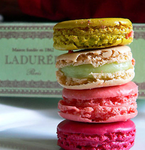
THE INSPIRATION: Vibrant macaroons from the legendary Parisian confectionery shop Ladurée

THE ROOMS:
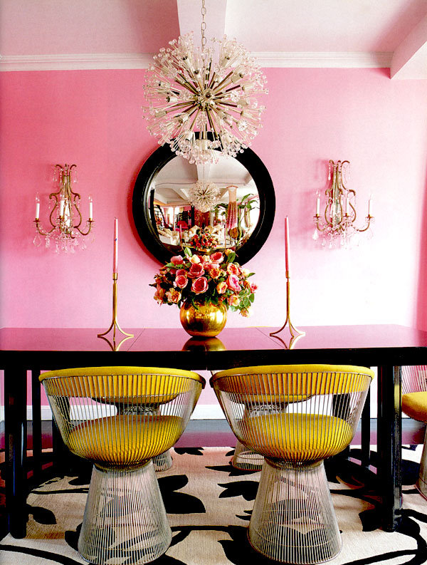
What the macaroons teach us goes far beyond the value of sweet decor. They remind us to mix a few bold splashes of color into our pastel palettes! Take the dining room of designer Betsey Johnson’s New York apartment. Sure, the walls are pastel pink, but bright gold seating and magenta-tone flowers wake up the space, as do modern touches like the prickly, spherical chandelier. Call it modern French! [photo by Ngoc Minh Ngo via This Is Glamorous]

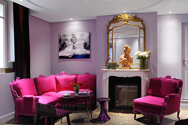
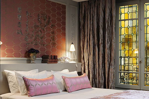
Speaking of modern French, nothing compares the the interior of Paris’ Hotel La Belle Juliette. The photos below (by Jerome d’Almeida) once again show that pastel walls benefit from saturated pops of color, like eggplant drapes and fuchsia seating:

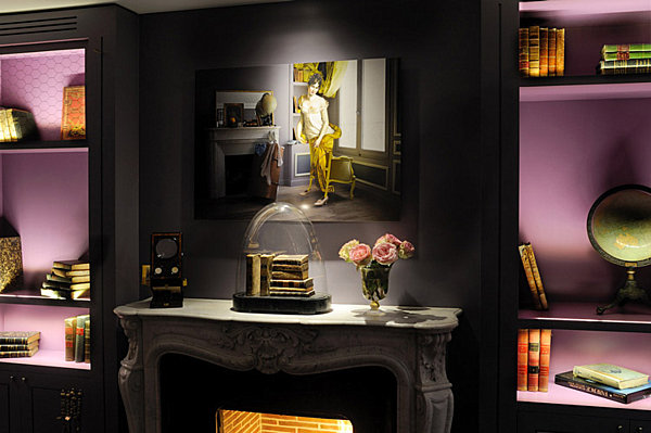
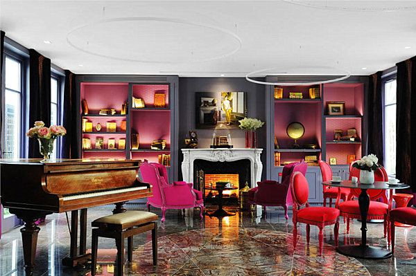
Give pastels an edge by back-lighting display areas, such as bookshelves. In the evening, these nooks will come alive with modern flair. The shelving below proves that lavender is no longer only for little girls’ rooms:

If sticking with soft hues, insert a dash of the unexpected, such as ultra modern wallpaper and crinkled drapes that lean toward the metallic:

Like the macaroons from Ladurée, this Hotel La Belle Juliette space is a feast for the eyes. We’ve seen the back-lit book cases above, but panning out reveals how ultra brites (even red?!) can shine on a pastel stage. [photo by Jerome d’Almeida via Desire to Inspire]

Modern Stripes
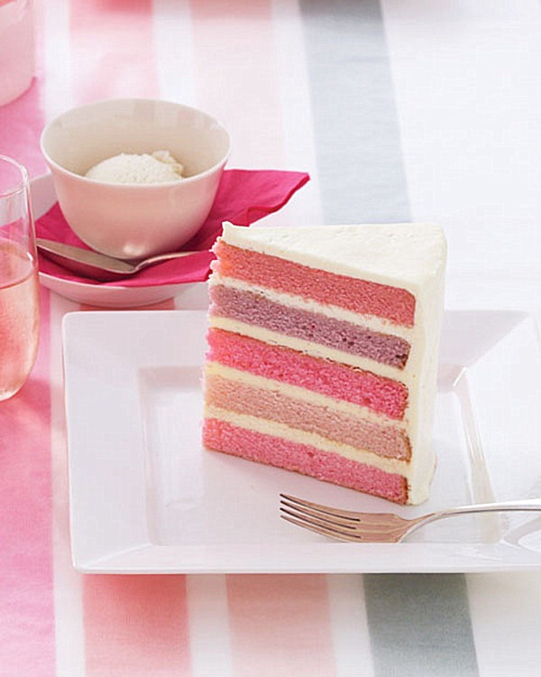
THE INSPIRATION: A pastel layer cake by Martha Stewart

THE ROOMS:
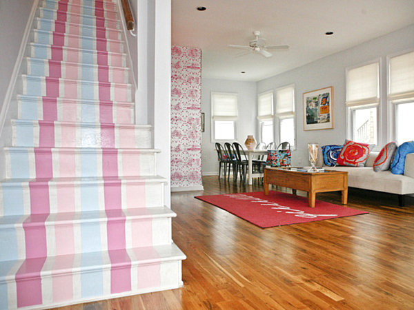
We can’t ignore the appeal of stripes! Could pastel stripes ever be…dare we say, modern?! We think so! Take the stairway below, created by designers Cortney and Bob Novogratz. The home’s interior is definitely contemporary. Even so, these stairs are wonderfully unexpected! [from HGTV.com]
Decoist recently profiled the ombre design trend in all of its glory. What is ombre, you might ask? It’s what happens when color is displayed on a gradient from lightest to darkest. Like the dining room wall below! Who would have thought that pink could be undeniably modern?!

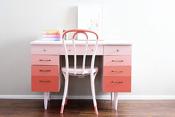
We all know that pink was used in Mid-Century modern design, but look at how this ’50s/’60s desk is updated with an ombre pink finish, then topped off with an ice cream parlor chair! That’s some powerful retro-modern goodness! [from Natty by Design]

Shades of Blue
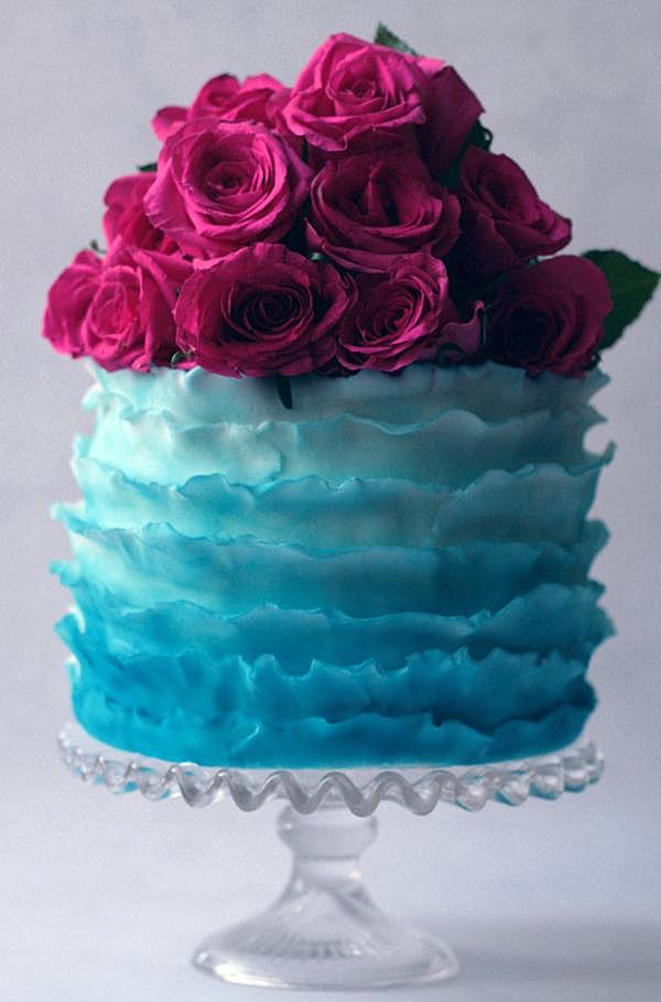
THE INSPIRATION: A blue ombre cake from Olofson Design

THE ROOMS:
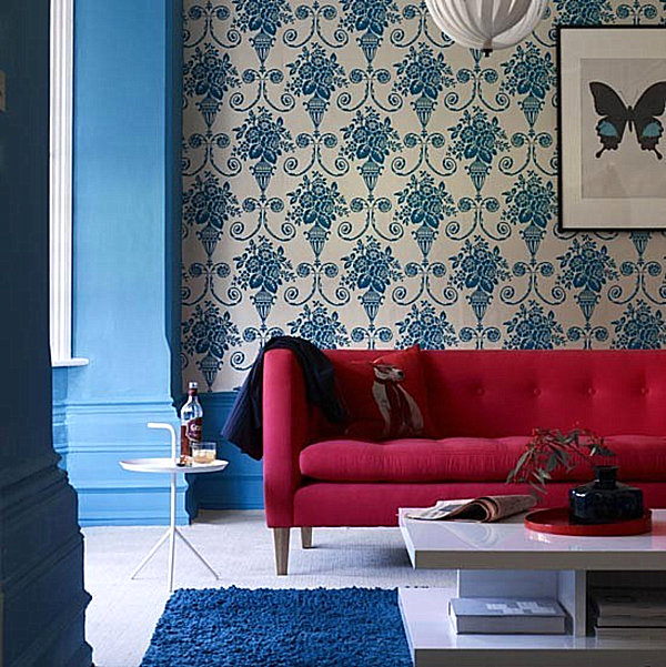
It’s hard to top a blue room with a touch of purple-red! The ombre cake above emphasizes the benefits of mixing light shades of blue with one bold hue. Similarly, the damask living room below is even more vibrant with a fuchsia-red couch as a focal point. [from House to Home]

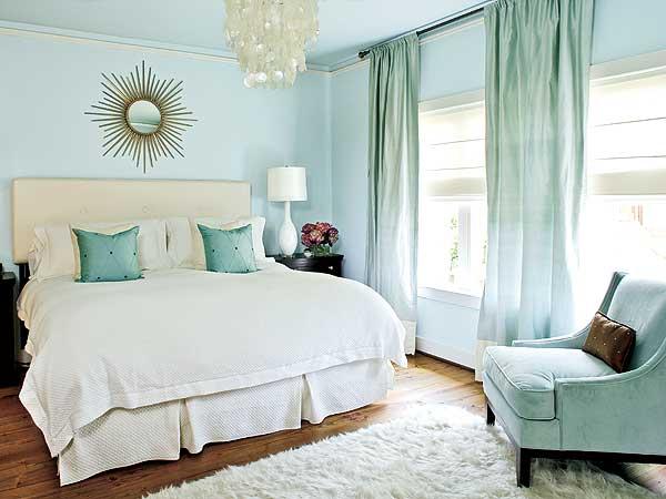
There’s no question that the light blue bedroom below celebrates the power of pastels. A rectangular upholstered headboard and sunburst mirror are modern touches, while the violet flowers by the bed add colorful depth to the space. [from My Home Ideas]

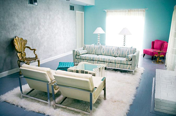
We end with an aqua space that boasts a light blue ikat-meets-wood grain patterned couch. But who can take their eyes off the magenta chair in the corner?! [from The Aestate]

We hope today’s pics have given new meaning to the term “eye candy!” How will you inject your room with a dose of sweetness? If a paint job isn’t in the works, try adding pastel power with a pillow or an upholstered chair. Artwork is another option for introducing light hues to your design palate. Don’t forget the power of smaller decor items, such ceramic vases, which can look positively dessert-worthy when purchased in pastel hues and arranged in a collection. Bon appetit!