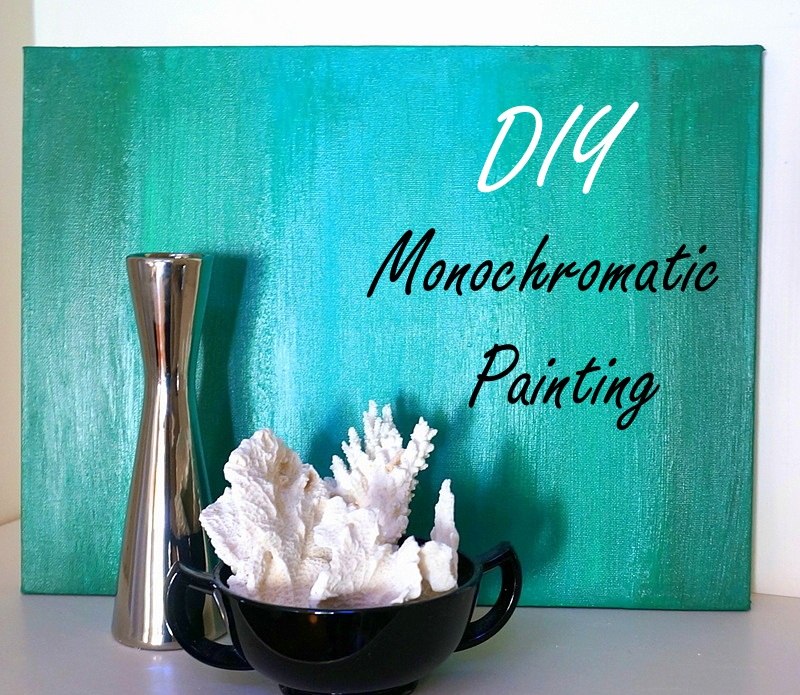
Ready for an easy DIY project? In fact, this one is so easy, affordable and fun, it’s hardly a “project”. More like an experience! Are you looking to add a dash of color to a specific place in your home? Maybe you want to bring out a color in your duvet cover, or perhaps you need that one piece to tie together a gallery wall of artwork. Do you remember when Thalita showed us how to create an abstract painting with gold foil? This DIY painting project is similar in its abstract nature, but it takes a monochromatic approach that celebrates all things ombre. Read on for all the details…

Project Supplies and Steps
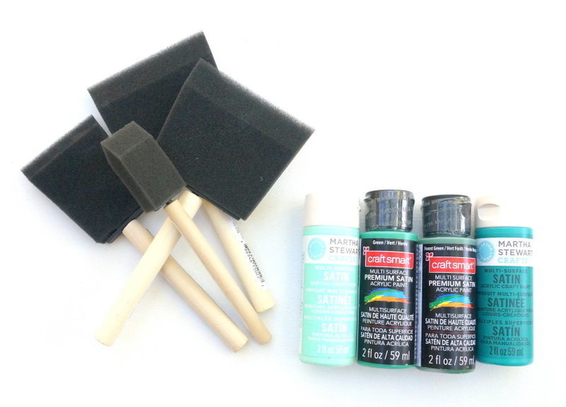
Here’s what you’ll need to get started:
- a canvas
- foam brushes in a variety of sizes
- acrylic paint (I chose paint with a satin finish)
- paper to protect your work surface

Step 1: Select the painting’s dominant color.
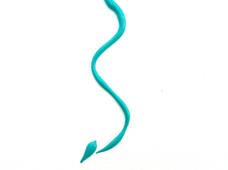
I knew that I wanted the overall hue of my painting to be somewhere between teal and emerald green. I bought four bottles of acrylic paint so the canvas would have depth and variety. Yes, even monochromatic artwork needs variation! I ended up not using the lightest shade of paint, but my dominant color was a Martha Stewart shade called “Mermaid Teal.” I knew this color would get the most “face time” on my canvas!

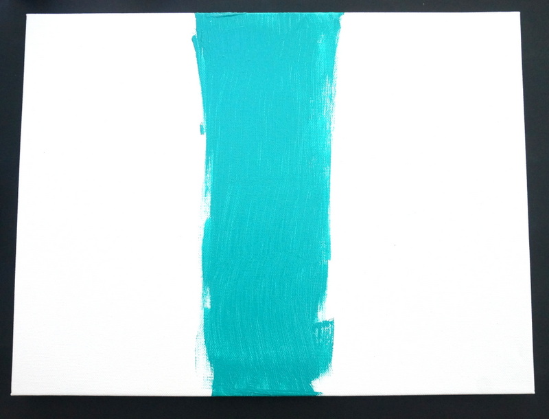
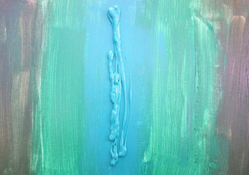
Step 2: Squirt a line of paint in the middle of the canvas, and use your foam brush to smooth it in.
To make this project really pop, make sure that your dominant color (the color in the middle) is also your lightest and brightest color. This will help create an ombre effect as the colors get darker toward the edge of the canvas. Don’t worry about making the brush strokes perfect. There is plenty of blending ahead–this is only the beginning!

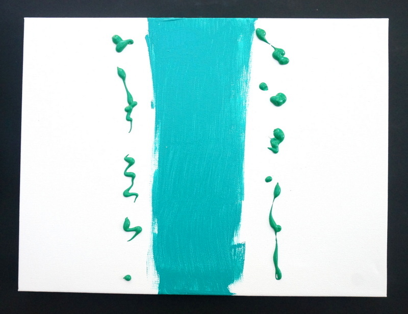
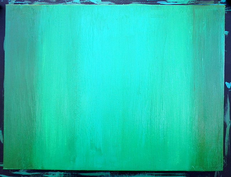
Step 3: Select your next darkest shade of paint, and squirt two more trails of paint–one on either side of the first stripe. Use another foam brush to smooth and blend the paint.

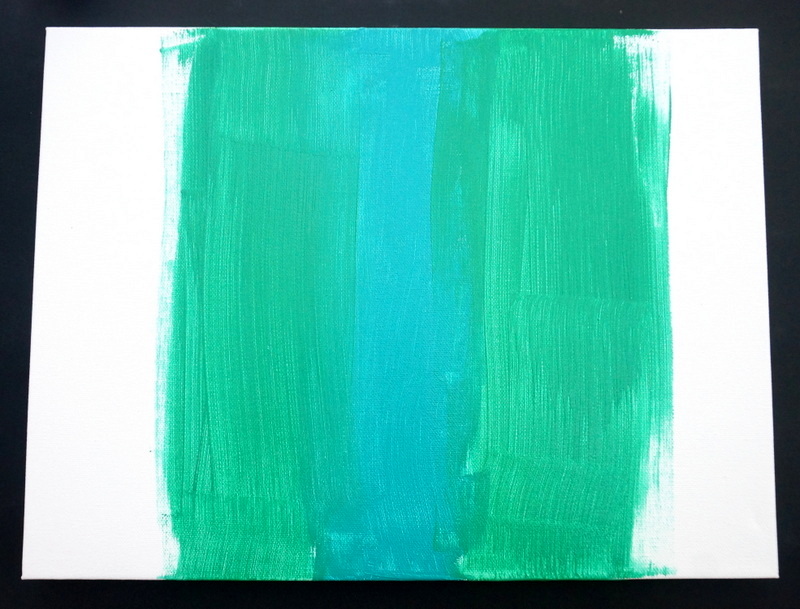
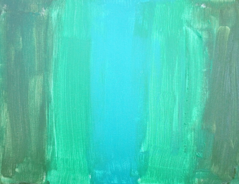
Keep the brushstrokes long and smooth for even coverage. When you’ve finished, your canvas will look a bit like the one below. As you can see, the white of the canvas is still showing through the paint. This painting gets its depth and intrigue from layering. Again, don’t worry too much about making anything perfect at this point. More layers to come, folks…

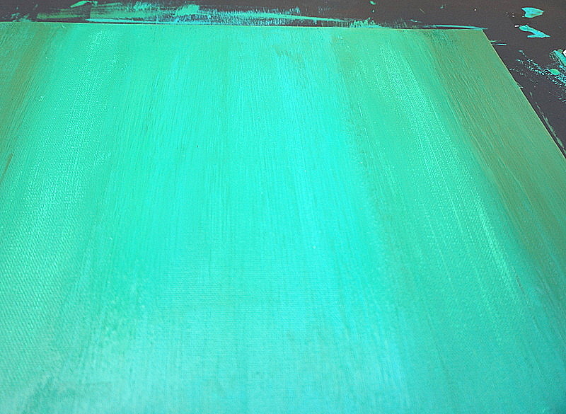
Step 4: Add your darkest layer of paint to the outer edges of the canvas and smooth/blend!

You should now have three distinct tones on the canvas. The amount you blend at this point depends on you. More likely that not, you won’t want to stop here.

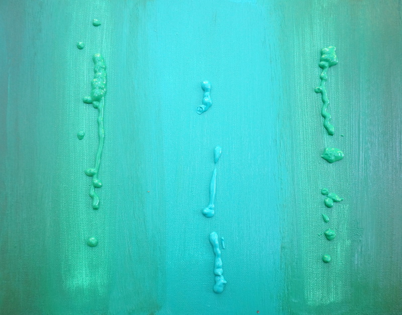
Step 5: Continue to layer on the paint by squirting it from the bottle and blending it with your foam brush.

As you add paint, you may want to switch to new foam brushes to keep the ones you started with from crumbling. Plus, there’s nothing more annoying than getting this painting right where you want it and then having a brush with old paint deposit color exactly where you don’t want it!

As you can see, my painting took on many layers:

I ended up adding a a third installment of color to get this painting to a good place. The middle shade of teal was a bit thin, so the white of the canvas continued to show through. I needed to thicken up the overall design. One possible project variation for the future: paint the entire canvas your dominant shade, and then add the remaining colors on top of that first layer. I might try that strategy the next time I do this project.

Finishing Touches
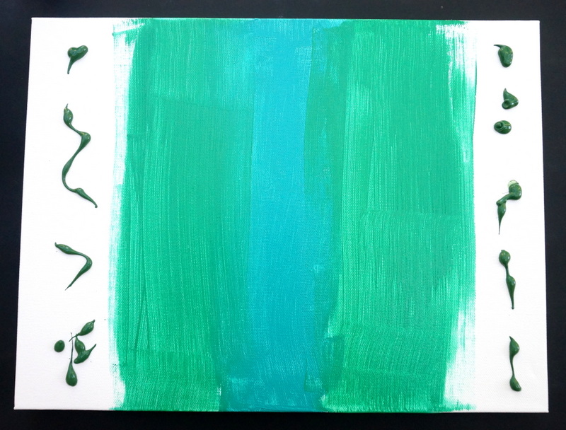
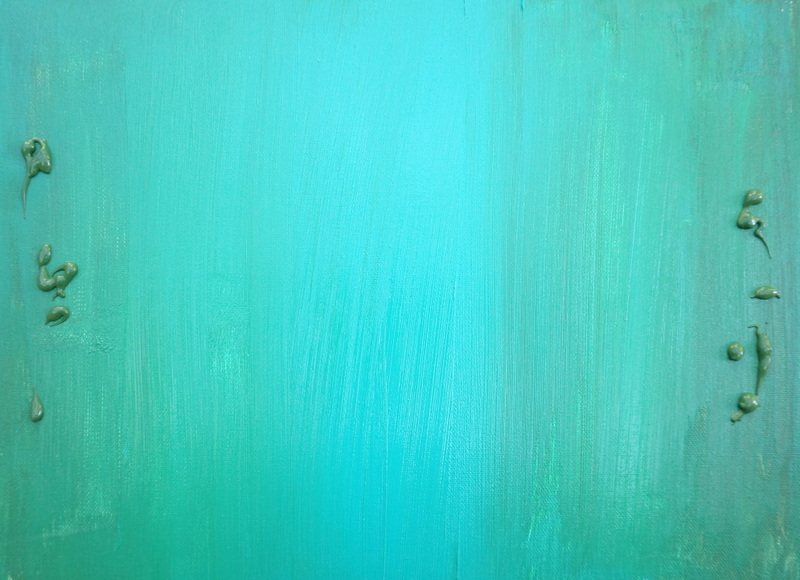
Here’s the final version of my monochromatic painting! I was really happy with the end result. I have to admit–I’m a bit of a perfectionist, and it was kind of hard to set the brush down and call it a day. You might have to tell yourself, “Put down the brush and step away from the painting”!

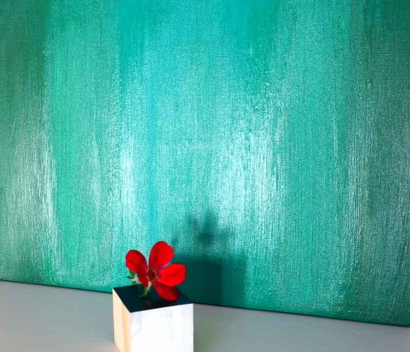
Here’s another view of the finished product. You can see how long brushstrokes are really important here:

When you display your painting, try finding a spot where the light hits the surface. That’s when you’ll really be able to see the details of your work:

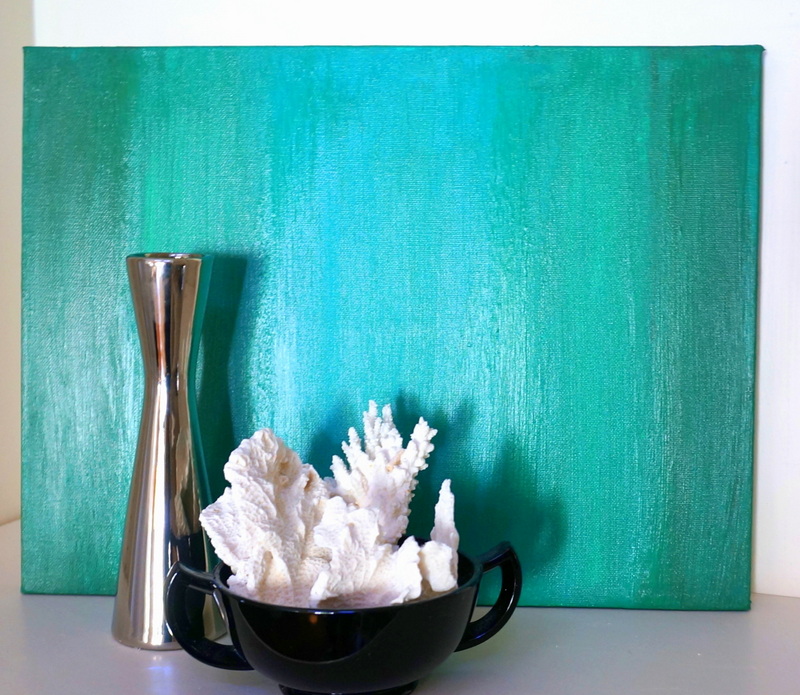
This painting is great for bookshelves or surface-top areas that need a colorful backdrop. Display the painting with neutrals, or combine it with other bright hues for a radiant effect:

I had so much fun figuring out where to display my painting, I almost forgot to clean up! Then again, my posterboard surface protector took on a personality of its own with this project. I’m pretty sure I wore that pattern on a dress in the ’80s!

Happy painting! If you try this project, let us know how your painting turns out by leaving a comment below…