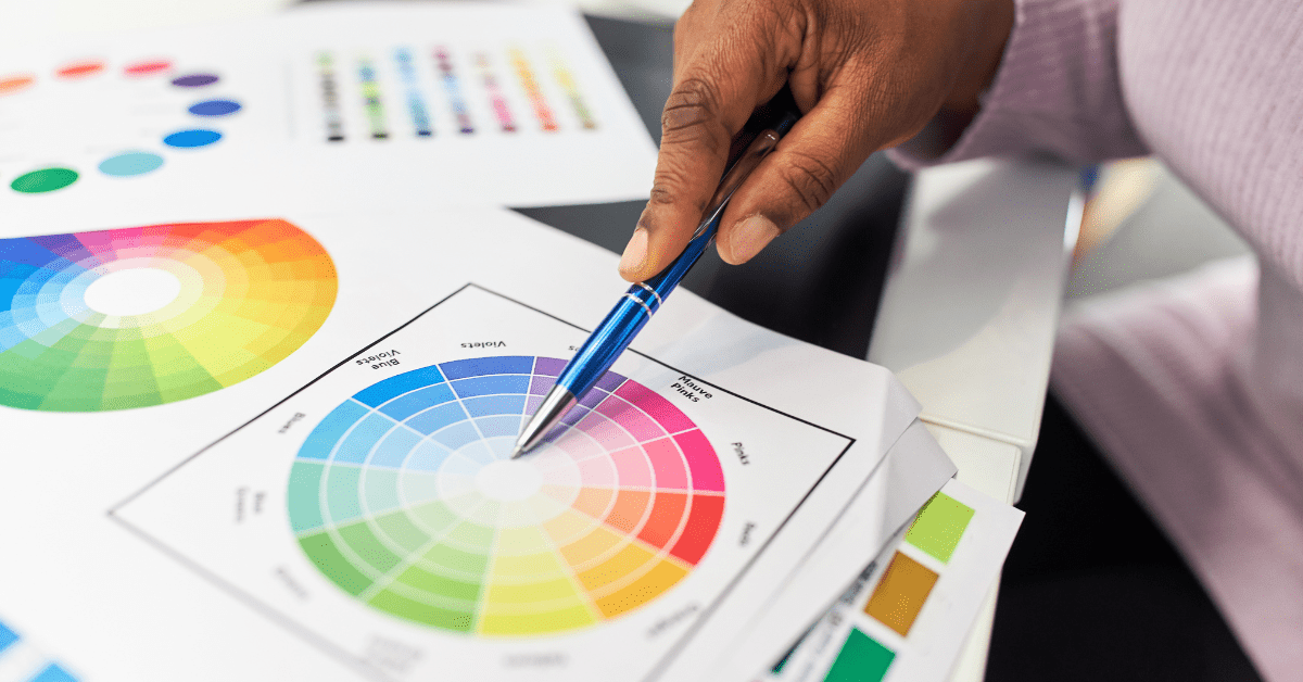
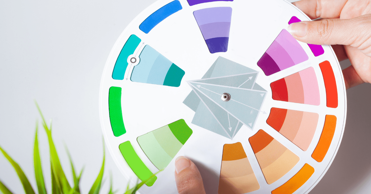
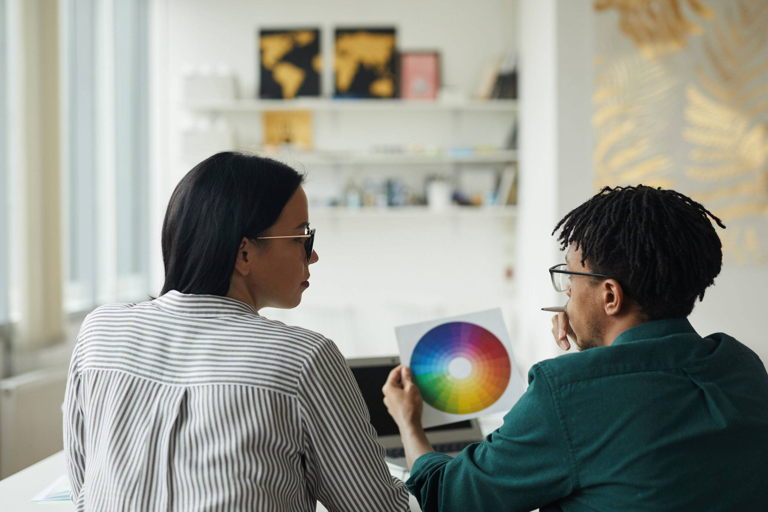
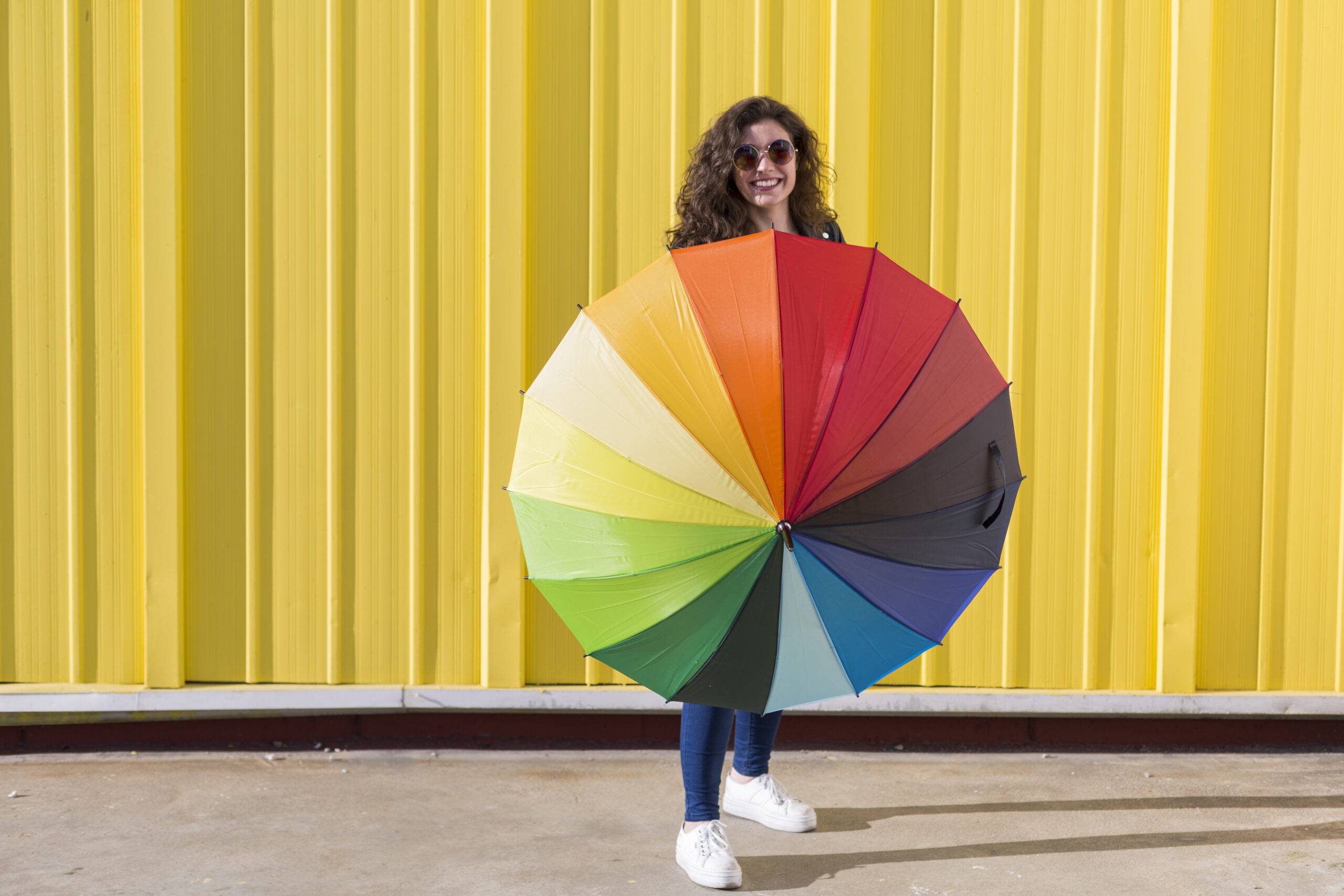
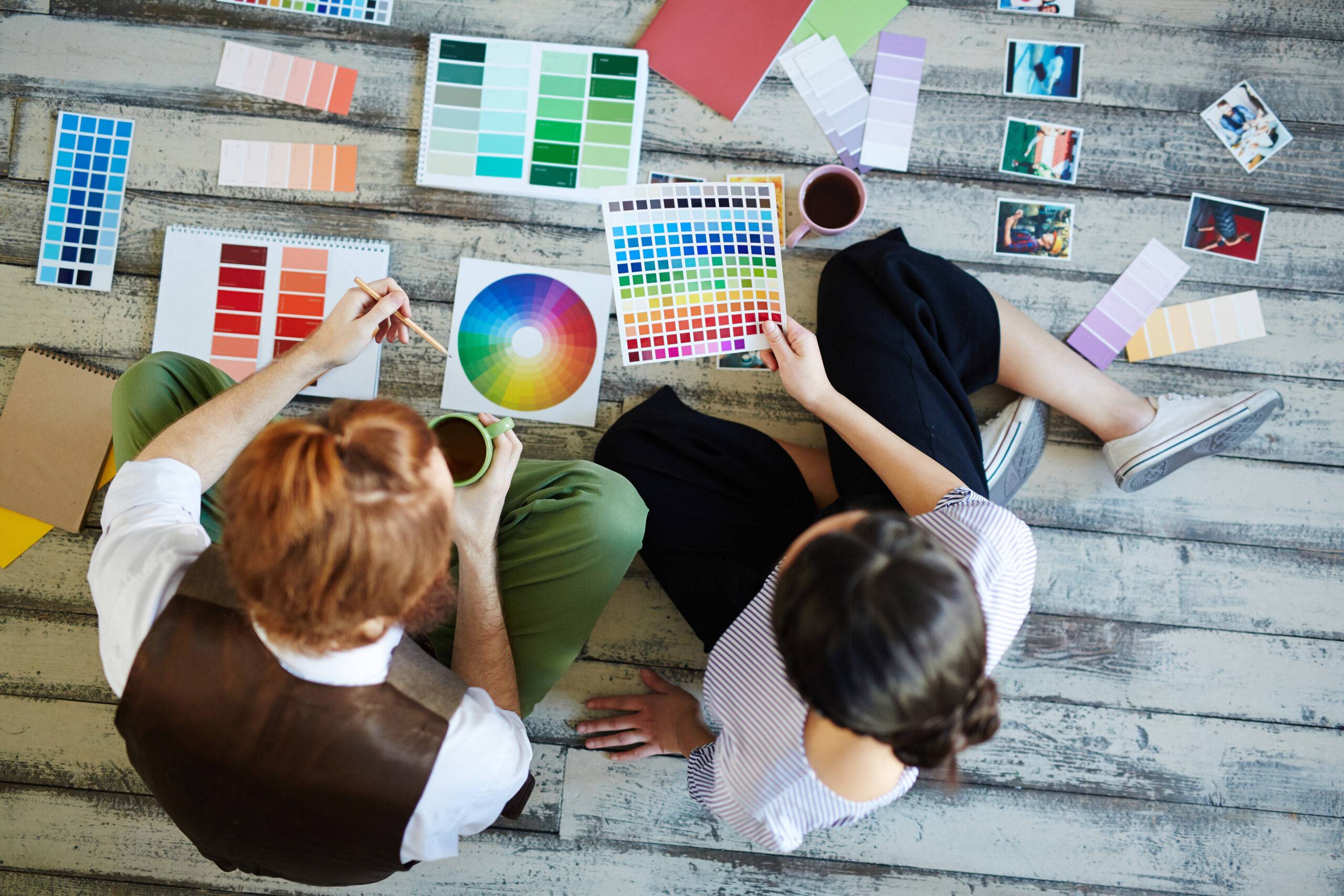
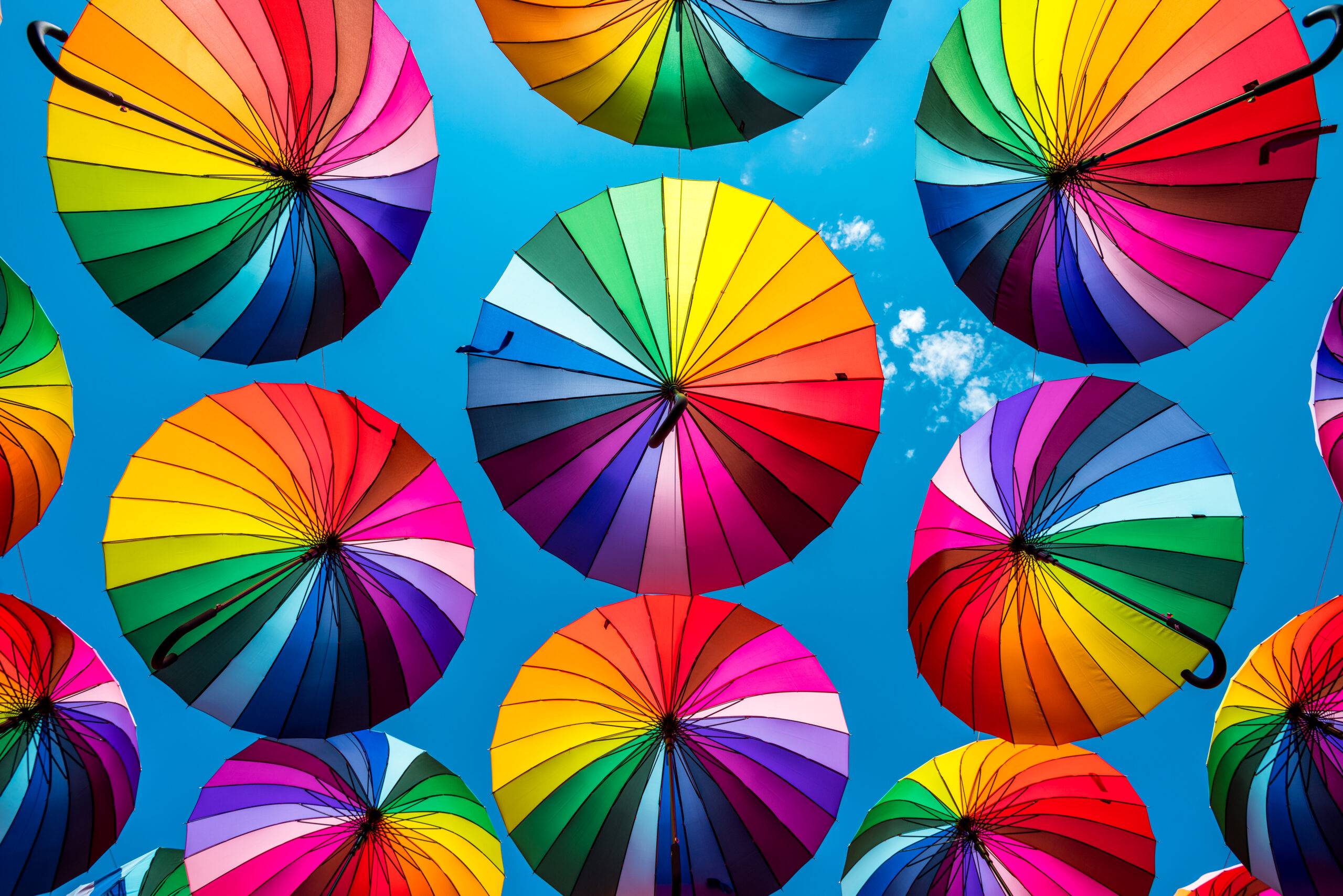
Delving into the realm of design and decoration, the color wheel emerges as a pivotal tool, guiding creators in their quest for harmony and visual appeal. This circular diagram elegantly organizes hues in a way that showcases their relationships with one another, providing an invaluable foundation for making informed decisions about color combinations.
It’s fascinating to observe how adjacent colors can create a sense of unity while those positioned as opposites on the wheel can introduce dynamic contrast, breathing life into a space or design. This interplay of colors, rooted in the principles of the color wheel, offers endless possibilities for creativity and innovation.
Understanding Primary Colors – The Building Blocks of the Color Wheel

In the world of design and decor, one cannot overlook the significance of primary colors, the very foundation upon which the entire spectrum of hues on the color wheel is constructed. These essential pigments—red, blue, and yellow—stand as the pillars that support a vast array of shades and tints, enabling designers to mix and match, creating an infinite variety of colors. Primary colors hold a unique position; they cannot be created by combining other colors, making them the original source from which all other colors are derived. This characteristic underpins their central role in the theory of colors and their application across various creative fields.
Using Opposite Colors Intentionally

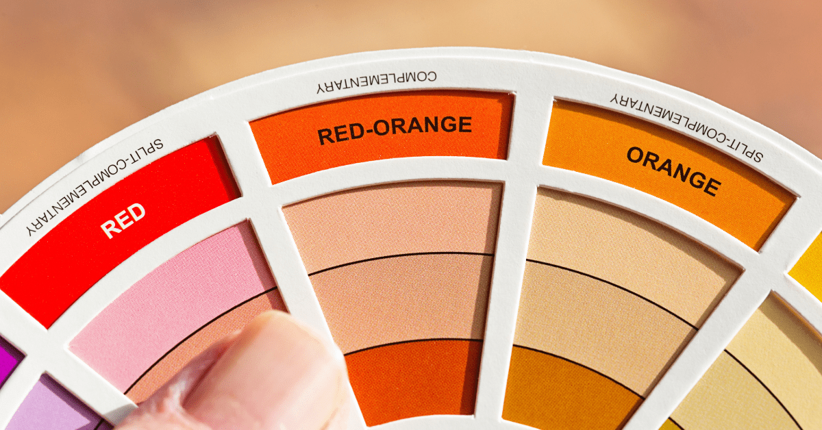
Exploring further, the relationship between these primary colors and their counterparts on the color wheel reveals an intriguing aspect of color theory—opposites. Each primary color has a corresponding opposite, known as a complementary color, which, when combined, can either enhance each other’s vibrancy or, when mixed, neutralize to produce a range of browns or grays. This interplay between colors is fundamental in achieving balance and contrast in visual compositions, whether it’s in painting, graphic design, or even interior decorating. Understanding how these colors interact not only enriches one’s appreciation of decor and design but also equips creators with the tools to convey moods, messages, and meanings more effectively through their work.
Exploring Secondary Colors – Mixing Primary Colors for Vibrant Results

When exploring colors, it’s fascinating to see how the simple act of mixing primary colors can lead to the creation of a vibrant spectrum of secondary colors. This process, rooted in the principles of the color wheel and opposites, reveals an intriguing interplay between hues. For instance, when you blend blue and yellow, the result is a lively green. Similarly, mixing red and blue yields a rich purple, while combining red and yellow produces a vivid orange. These secondary colors add depth and complexity to our visual experiences, allowing for more nuanced and expressive artwork.
Don’t Be Afraid Of Color Theory

The magic behind these transformations lies in understanding the relationships between colors. By exploring how colors interact on the color wheel, homeowners and designers can predict the results of their mixing endeavors, achieving the exact shade they desire. This exploration not only enhances their creative palette but also deepens their appreciation for the science of color theory. As we navigate through the artistic journey of combining primary colors, the outcomes are not just limited to the creation of secondary colors. It opens up a whole new realm of possibilities, paving the way for the discovery of tertiary colors and beyond, each with its unique charm and application.
The Role of Complementary Colors For Enhancing Visual Appeal Through Opposites

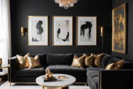
In the vibrant world of art and design, understanding the color wheel and opposites plays a pivotal role in enhancing the visual appeal of any creation. Complementary colors, situated directly across from each other on the wheel, have a dynamic relationship that is both fascinating and immensely practical. When used together, these colors create a contrast that is visually striking yet harmoniously balanced. This contrast not only grabs attention but also makes the colors appear brighter and more vibrant when placed side by side. For instance, the pairing of blue and orange can evoke feelings of warmth and coolness simultaneously, offering a visual experience that is both engaging and pleasing to the eye.
Complementary Colors Help With Visual Appeal

Moreover, the strategic use of complementary colors can significantly elevate the aesthetic value of designs, decor, and even everyday objects. By carefully selecting colors that are opposites on the wheel, designers can manipulate viewer perception, guiding the eye to focal points or creating an illusion of depth and space. This technique is where the right color combinations can transform the ordinary into the extraordinary. Through this understanding of complementary colors, designers unlock a powerful tool in their creative arsenal, enabling them to craft works that are not only visually appealing but also emotionally resonant.
Color Opposites and How To Leverage Them For Home Decor

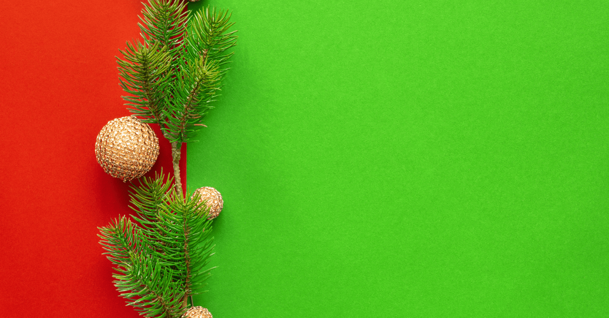
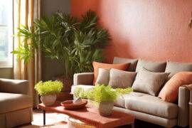
The opposite of green, according to the traditional color wheel used by designers, is red. This might seem surprising at first, but it’s all about balance and contrast. When green and red are used together, they create a striking visual effect because they are at maximum contrast, which can make each color appear more vivid and pure.
Opposite Colors Can Be Powerful

This understanding is not just theoretical; it has practical applications in everyday life, such as in interior design, where a red accent in a predominantly green space can add a lively spark of energy and interest. By exploring the relationship between green and its opposite on the color wheel, we can appreciate the powerful ways in which colors can influence mood, perception, and aesthetic appeal.
Which Color is the Opposite of Blue on the Color Wheel?


In this fascinating journey through hues and shades, we find that the color directly opposing blue is none other than orange. This pairing is not just a matter of coincidence but a reflection of the deep-rooted principles of color harmony and contrast. The relationship between blue and its opposite on the color wheel is more than just an aesthetic one; it’s a testament to how colors interact with and affect each other.
Balance Bold Colors With Calmer Colors

Orange, with its warm and vibrant qualities, stands in stark contrast to the cool and calming essence of blue. This juxtaposition is what makes the combination so powerful and widely used in various fields, from art to interior design. Understanding this dynamic can unlock new levels of creativity and innovation, allowing one to harness the full potential of color in their projects.
What Color is the Opposite of Purple?

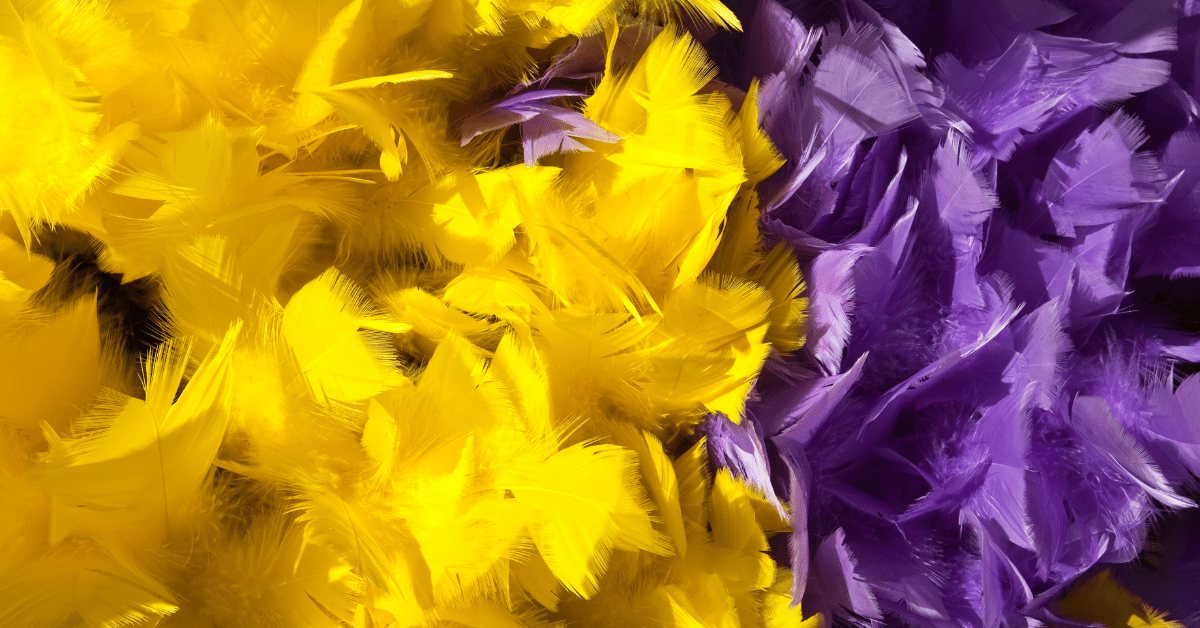
When we explore the realm of purple, a color often associated with royalty, mystery, and creativity, we naturally seek its counterpart across the wheel. This search leads us directly to the color yellow. Yellow stands as the direct opposite of purple, embodying characteristics of brightness, energy, and warmth.
This stark contrast between purple and yellow highlights the fundamental principles of color theory, where opposites not only attract but also enhance each other’s visual appeal. By strategically placing these opposites next to each other, designers can create a visual vibrancy that is both intriguing and harmonious.
Understanding how these opposites interact not only enriches our appreciation for decor and design but also enhances our ability to communicate visually, creating messages that resonate through their striking contrasts.
Ready to bring new life to your home? Subscribe to our newsletter for exclusive interior design tips, trends, and ideas that will transform your space. Click here to subscribe!