Each fall, I look forward to setting a beautiful table featuring the latest color palettes. Then I invite my friends and family over to toast the new season! This autumn, there are many deep, rich hues to celebrate. From berry tones to neutrals such as taupe, the beauty lies in the way it all comes together. Keep reading for a collection of fall table design tips, grouped by color palette…
Berry Tones
One of this season’s trendiest color palettes involves berry tones, such as navy and plum. The combination of blues, blushes and purples creates a rich feel that is both intriguing and soothing at the same time. [photo below from CB2]

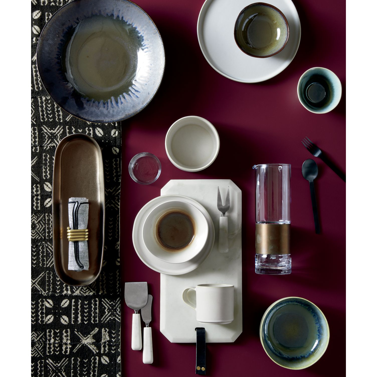
Fall Table Design Tip #1: Pair berry tones with black and white.
Bring on the black flatware and white serving pieces! Don’t shy away from black and white patterned items, such as table runners and napkins. In fact, the introduction of black into your berry-toned palette can easily take your fall table into Halloween territory, which is quite handy during the month of October. It can also simply channel the wonderfully moody feel of the year’s cooler seasons.

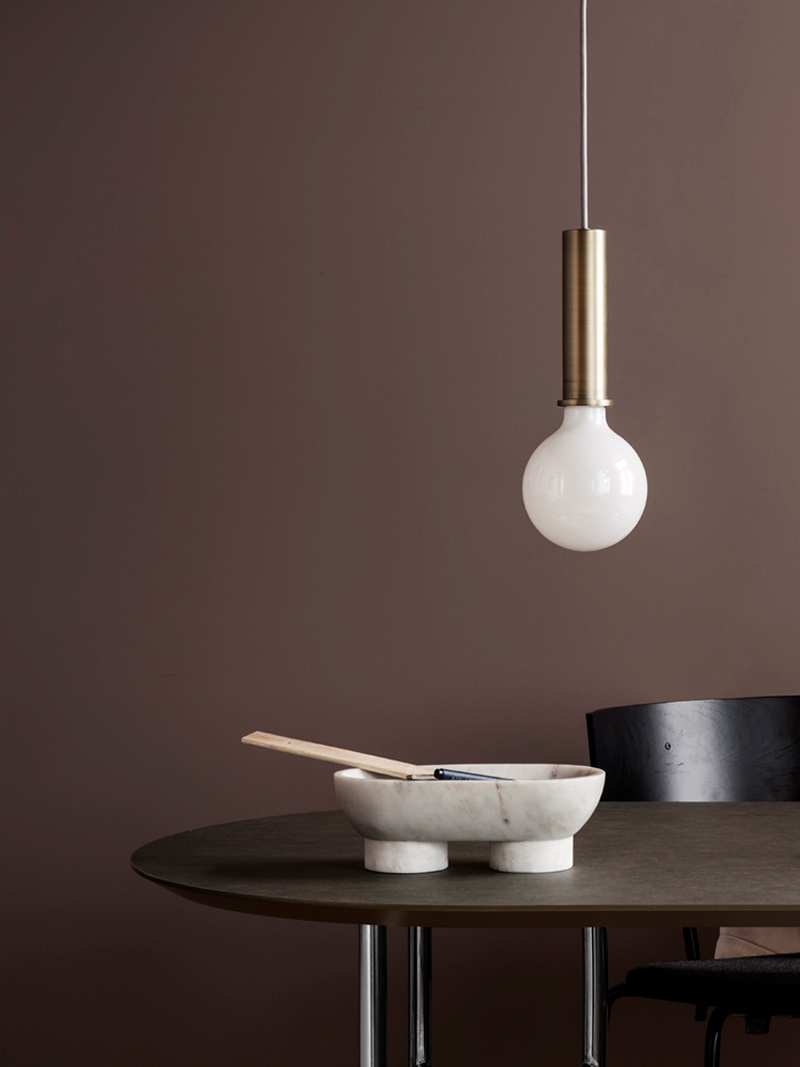
Fall Table Design Tip #2: Don’t be afraid to add warm tones to your berry palette.
While you may be tempted to see blues, purples and pinks as pairing best with cooler tones, keep in mind that warm hues such as rich browns can work beautifully on the fall table. Consider incorporating wooden serving platters and brown-hued pottery, as shown above. [deep blue table runner from CB2]

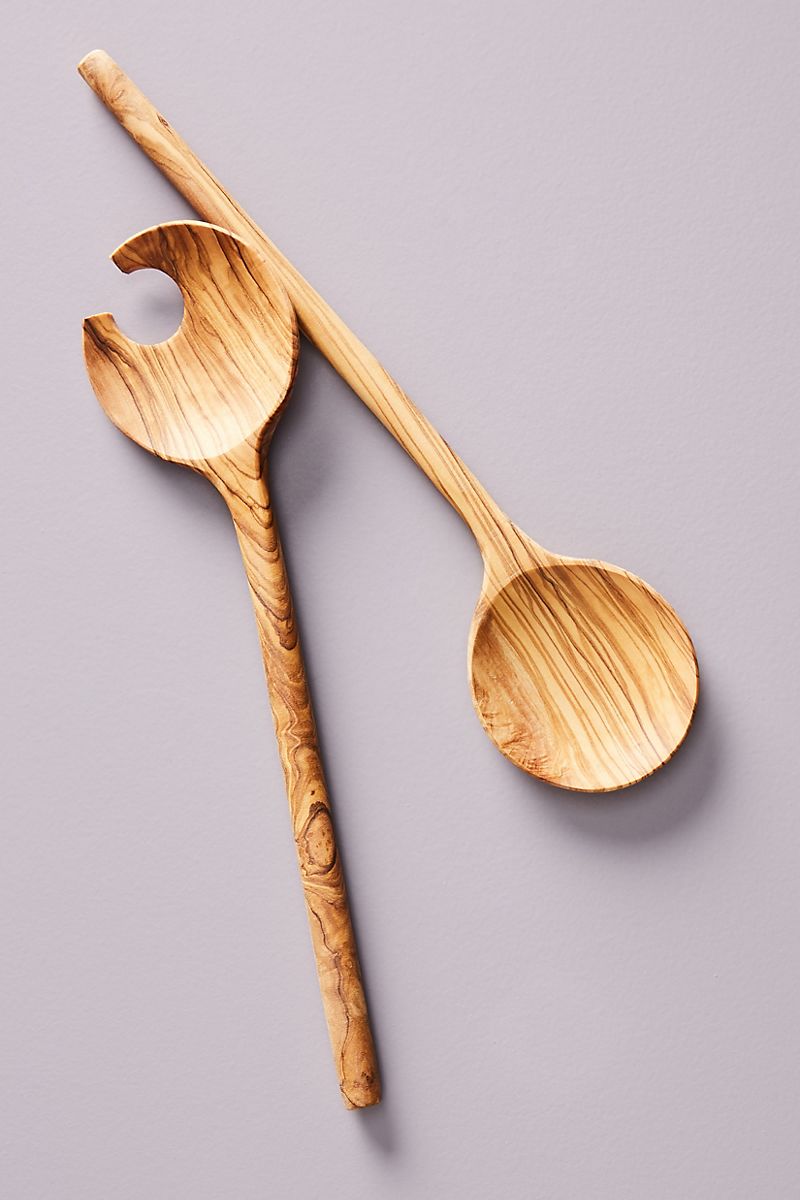
On a similar note, pale lavender is the ideal backdrop for these Crescent Serving Utensils from Anthropologie (shown above). Cool meets warm in a lovely contrast that is perfectly on trend.
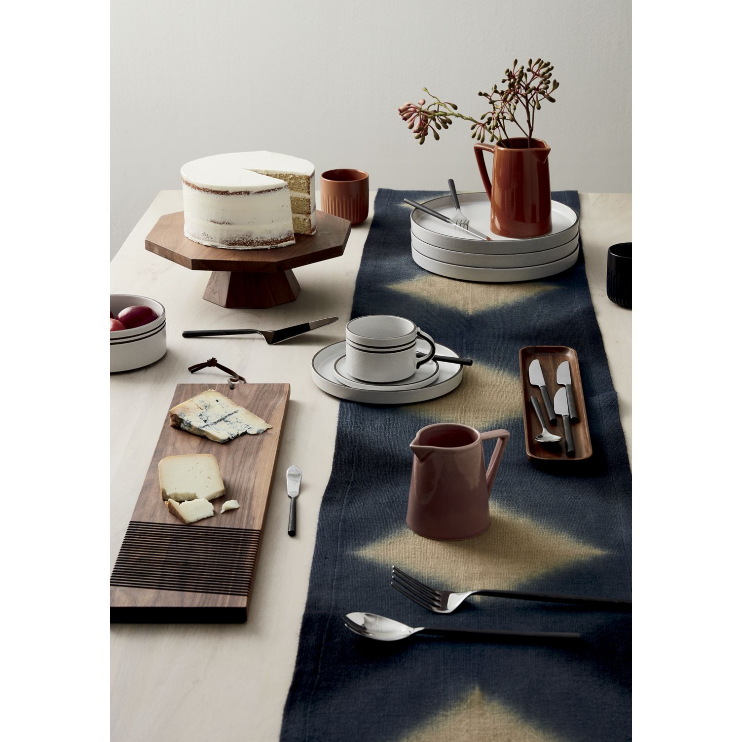
Tans and Taupes
One of the biggest surprises to me this fall is how much I’m loving neutral tones such as taupes and browns (more on brown in the next section). In the past I’ve preferred gray to beige. However, grey has been the star neutral for more than a few years, so warmer hues are a nice change. Not to mention, they mirror the warm tones of the falling leaves outside! Below we see the Comet Enamel White and Gold Serving Platter from CB2:

Fall Table Design Tip #3: Use tans and taupes as a backdrop for your table’s focal points.
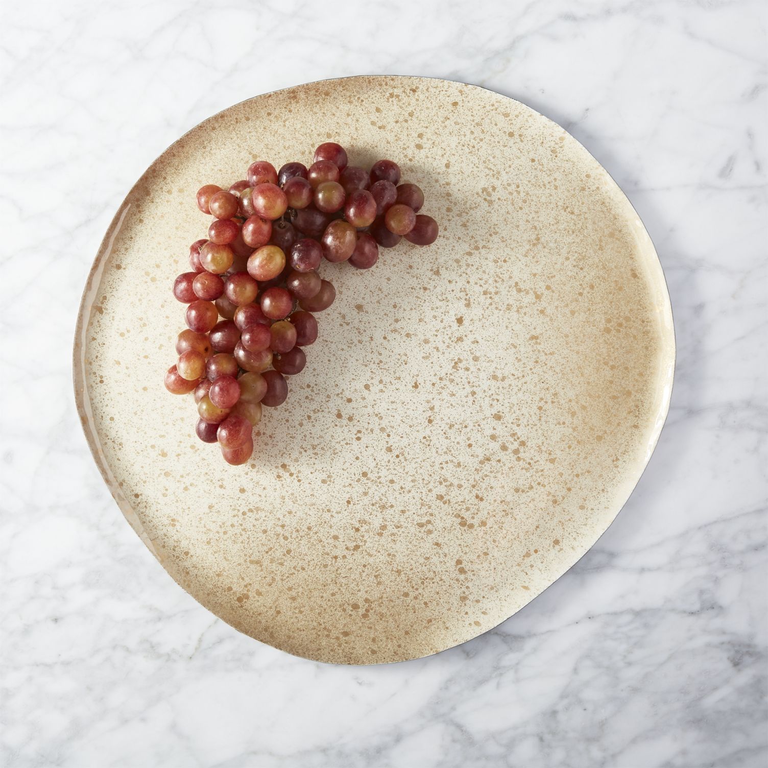
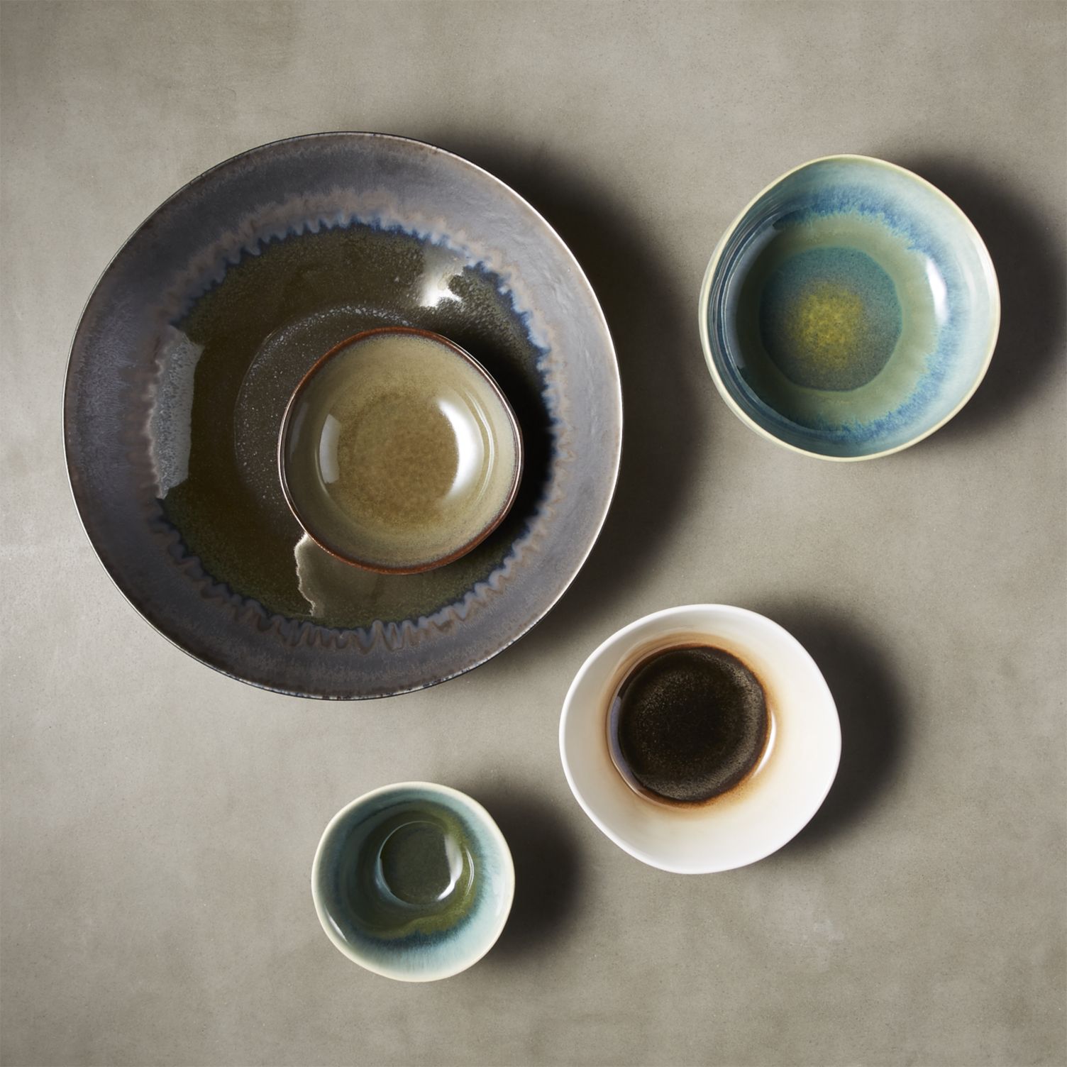
How stunning does CB2’s 5-Piece Matte Reactive Serving Bowl Set look against the taupe tabletop below?! Notice how even the more subtle tones of the bowls pop against the sandy neutral vibe of the table. And as shown in the photo above, red grapes come to life against the speckled platter. There is beauty in subtlety, and when tans and taupes are by your side, a whole rainbow of subtle tones can truly shine.

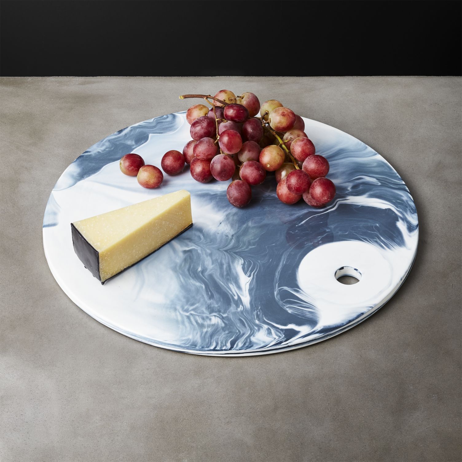
Fall Table Design Tip #4: Incorporate blues and greens into your neutral tablescape.
As you can see above and below, cool tones are equally striking against a light neutral backdrop. Don’t shy away from shades of blue and green this fall. Olive, turquoise and teal are equally at home in fall’s powerful palettes. [photo below from ferm LIVING]

Browns and Reds
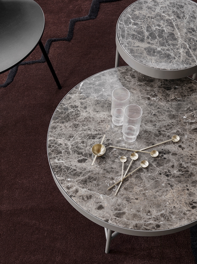
This fall, brown and red have intersected in the most intriguing of ways. Many of this season’s top brown tones have a slight red tinge. Then again, sometimes pure brown can shine on its own, especially when combined with other warm neutrals (and even a dash of black). Below we see the Marble Table in Brown from ferm LIVING. A sprinkling of gold-toned flatware adds another dimension of shine:

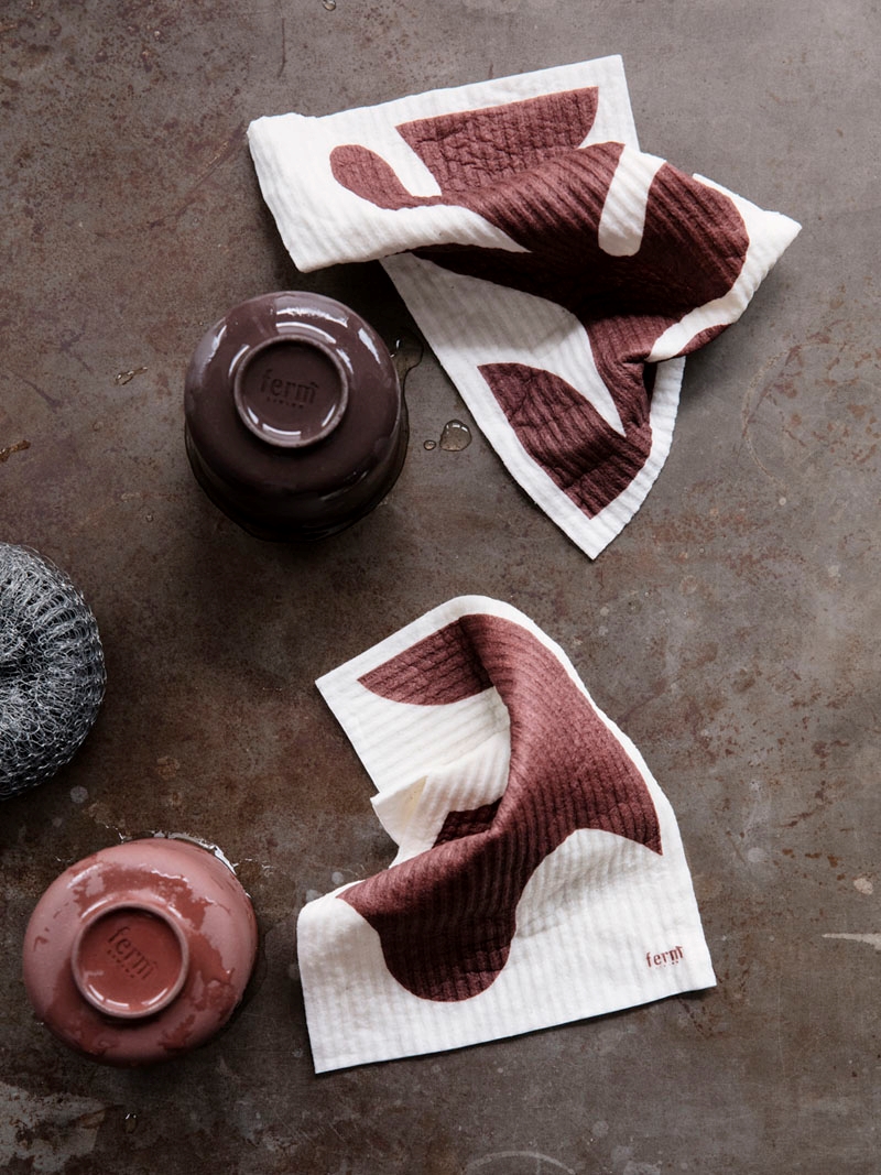
Prepare for a dose of ruddiness! These Leaf Dish Cloths in Red Brown, also from ferm LIVING, show just how rich brown can be when a dash of red is involved:

Fall Table Design Tip #5: Layer the rich hues for a decadent, modern monochromatic look.
Shades of brown can be quite striking when layered in a modern setting. Clean lines let the colors fill the space in a memorable way. Mix light and dark varieties of brown, and sprinkle in some white and black for contrast and depth. [table below from ferm LIVING]

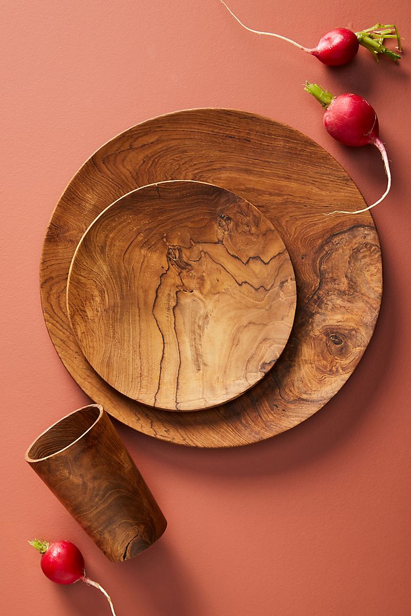
Fall Table Design Tip #6: Welcome terracotta tones!
While more peachy-red than brown, terracotta is one of this year’s top colors. It’s perfect for fall, as it can easily mix with other warm hues, including browns and blushes! Whether you paint an accent wall terracotta or bring it to your table in the form of serving pieces or linens, there’s an abundance of the color to enjoy this season. [image from Anthropologie]

A Touch of Darkness
There’s a reason why so many of this season’s most interesting tables include the color black: it’s striking, and it can’t help but encourage contemplation. [photo from CB2]

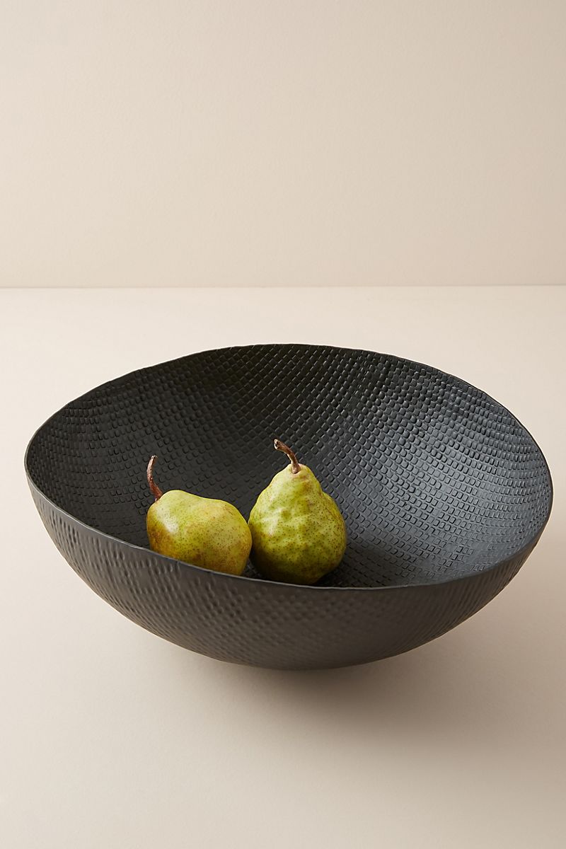
Dark colors can up the drama factor in a tablescape, but they can also be quite grounding. This Connor Serving Bowl from Anthropologie provides the perfect contrast to both the backdrop below and the delicious pears that it holds:

Fall Table Design Tip #7: Don’t be afraid of the dark (tones)!
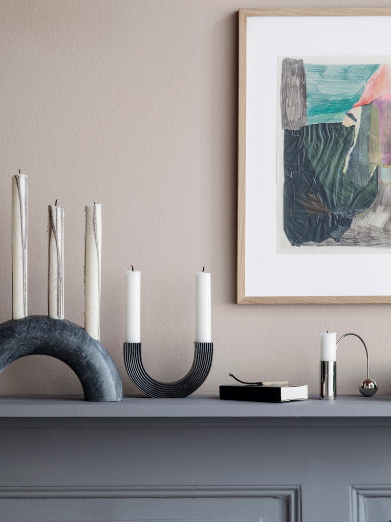
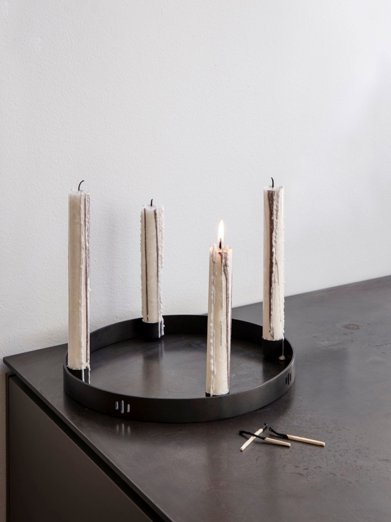
With colder weather comes chilly evenings and increasingly cooler days that gradually inspire us to increase our cozy time indoors. Revel in the darker skies and colder weather. Take time to reflect and look within. The color black, whether it shows up in your flatware, serving pieces or accessories, can inspire you to embrace the colder seasons of the year. Below we see ferm LIVING’s Candle Holder Circle, crafted from black brass:

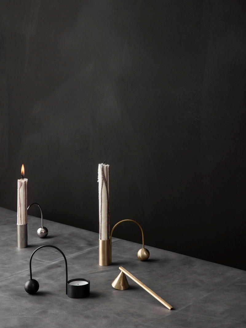
How gorgeous is the photo below?! Black, grey and metallic tones create a decadent yet sparse vignette. [Balance Tealight Holders from ferm LIVING]

Holiday-Ready…
While there is still plenty of time before the holidays begin, it never hurts to start collecting tableware that will look as amazing during festive winter celebrations as it does on your fall table at this very moment.
Fall Table Design Tip #8: Incorporate pieces that can grace your table throughout the holidays.
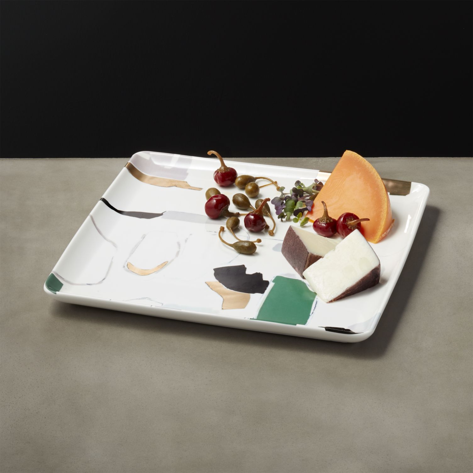
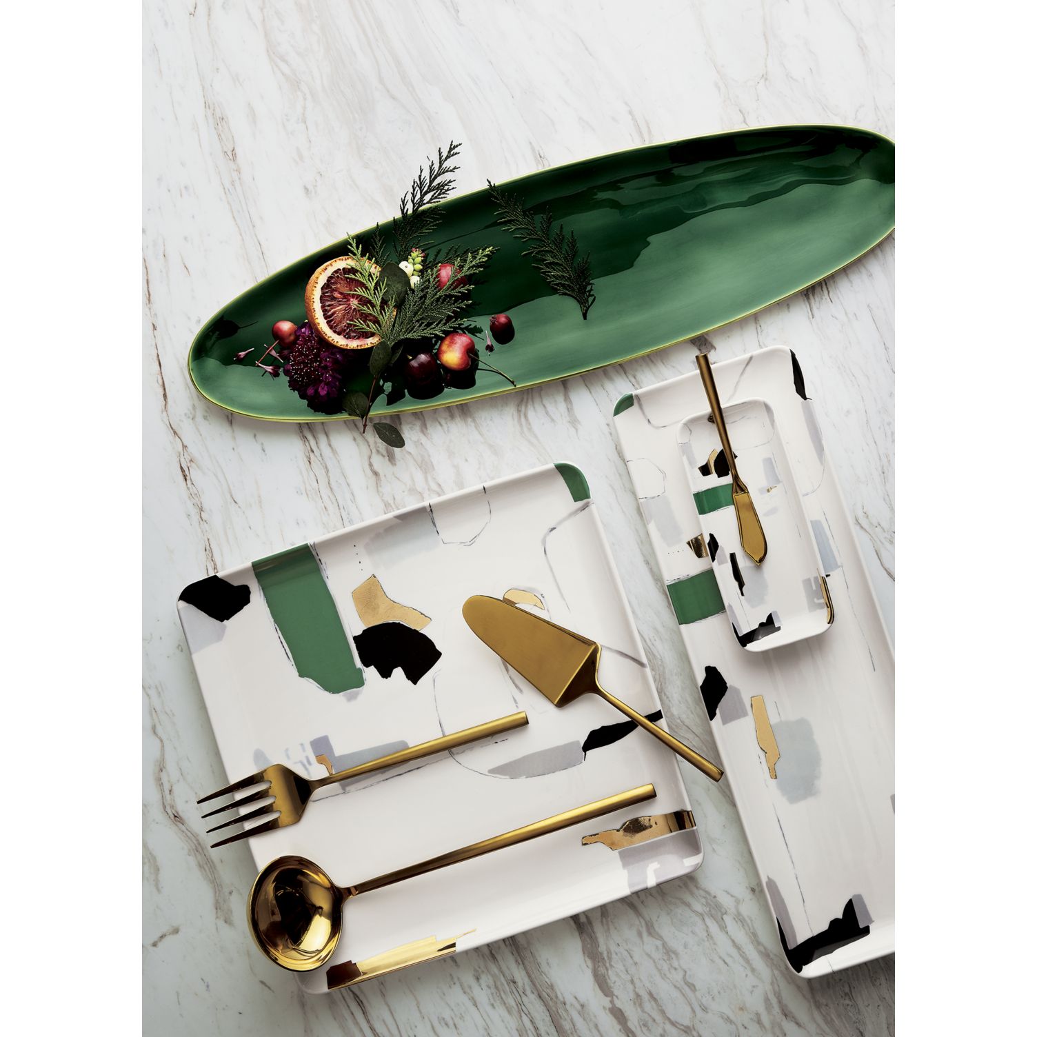
CB2’s Promenade Serving Platters are the perfect example of dishware selections that transition beautifully from fall to winter. Maybe it’s that dash of green in the abstract design:

In fact, you can add in even more green as the winter holidays approach. This Surface Emerald Green Platter-Server beautifully accentuates the Promenade platters, especially when winter fruit and fresh greenery are there to dress it up.

With this fall’s tabletop offerings at the ready, it’s never been easier to entertain in style and seamlessly transition to winter. Thanks for reading!