2015 has been the year of unexpected color combinations. Fall hit, and gone were the traditional burgundy, olive, rust and mustard tones! What replaced them was an interesting assortment of hues that included seasonal staples mixed with heavy doses of shades such as pink and dark lavender. Pink for fall? You betcha! As the winter holidays approach, there’s no need to forecast the top color trends. Product photography from leading brands, as well as photo shoots from beloved design bloggers have proven that when it comes to seasonal style, it’s time for a wake-up call in the color department! Read on for three of our favorite hues…
Pink
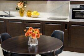
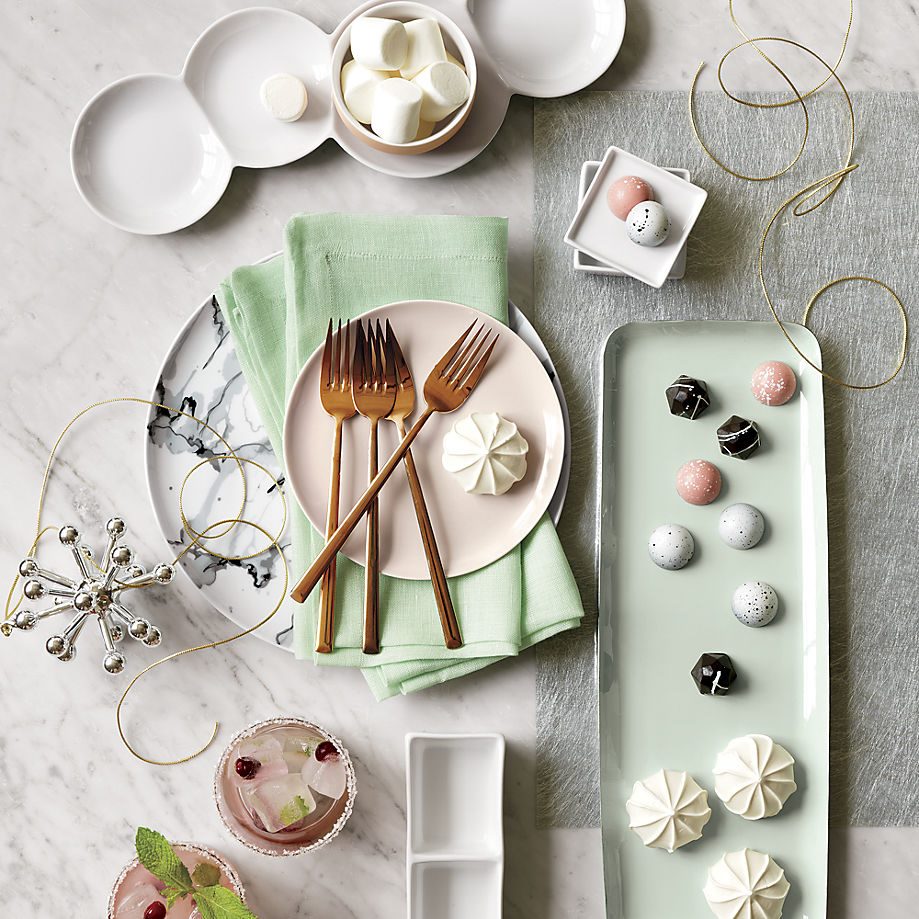
Pink shows no signs of fading anytime soon, so of course it’s emerging in many a holiday palette! Below we see a magical wintery spread featuring products from CB2. Note how the blush tone of the plates is beautifully enhanced by the copper flatware. More on copper later in the post!

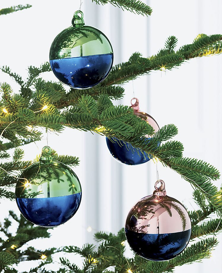
In another CB2 product shot, we get a sweet dose of pink in the form of Two-Tone Ornaments. The rosy accent hue is the perfect counterpart to richer holiday colors such as blue and green:

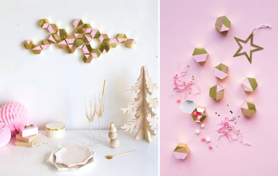
Rather than making a sugary sweet retro Christmas statement, pink is appearing in a range of modern holiday vignettes this season. Below we see a Modern Hexagon Advent Calendar from Oh Happy Day, a candy-colored DIY project that brings an unexpected twist to the standard winter palette:

Teal
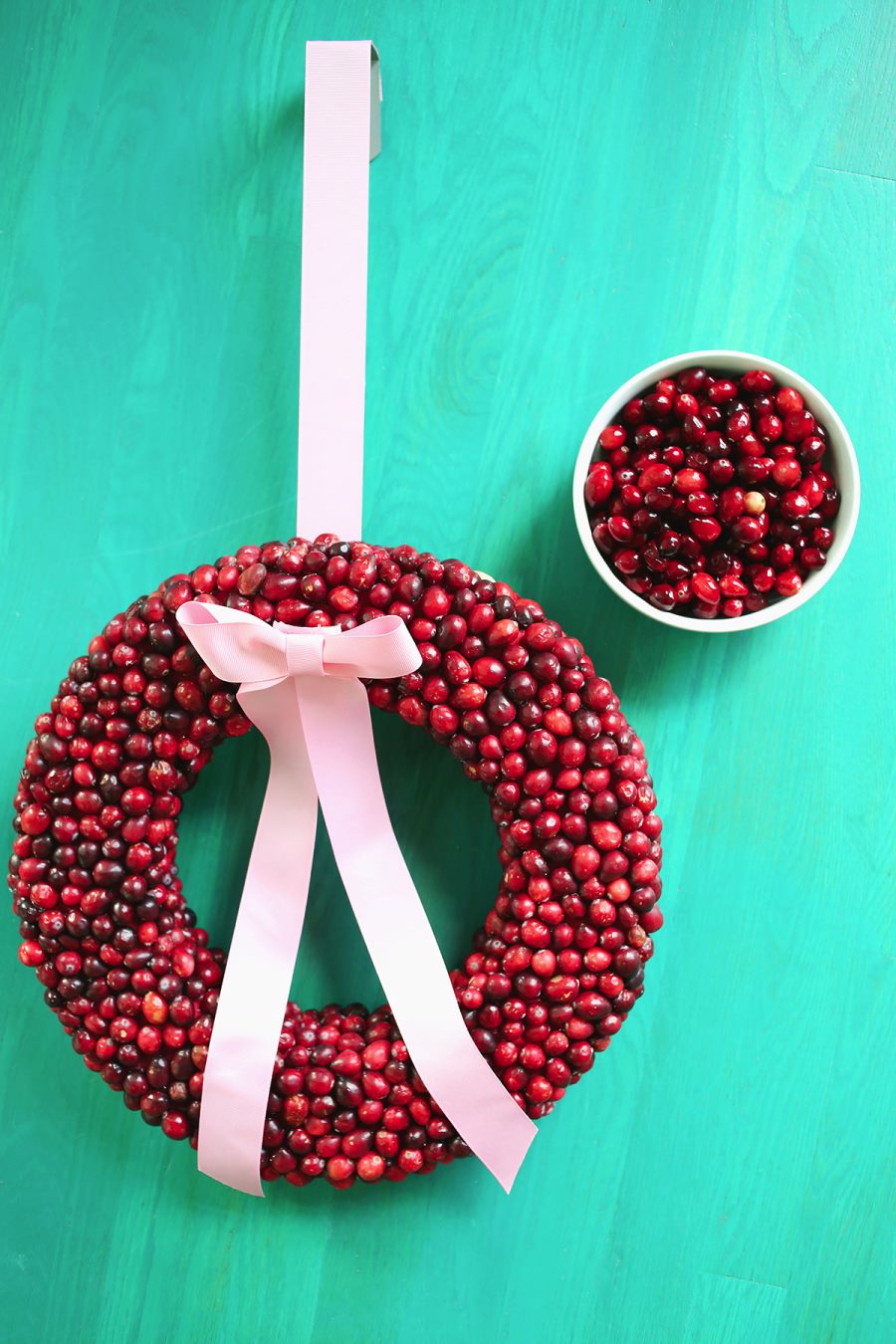
From pink to teal…there’s a natural flow between these two colors, as shown in this photo from A Beautiful Mess. Check out the full cranberry wreath DIY here, and continue reading to find your favorite shade of teal for the holidays!

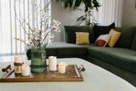
Here’s a darker take on teal, this time as a backdrop to a holiday buffet in a photo from CB2. Why teal? It’s a refreshing update of the typical hunter green tone used throughout the holidays!

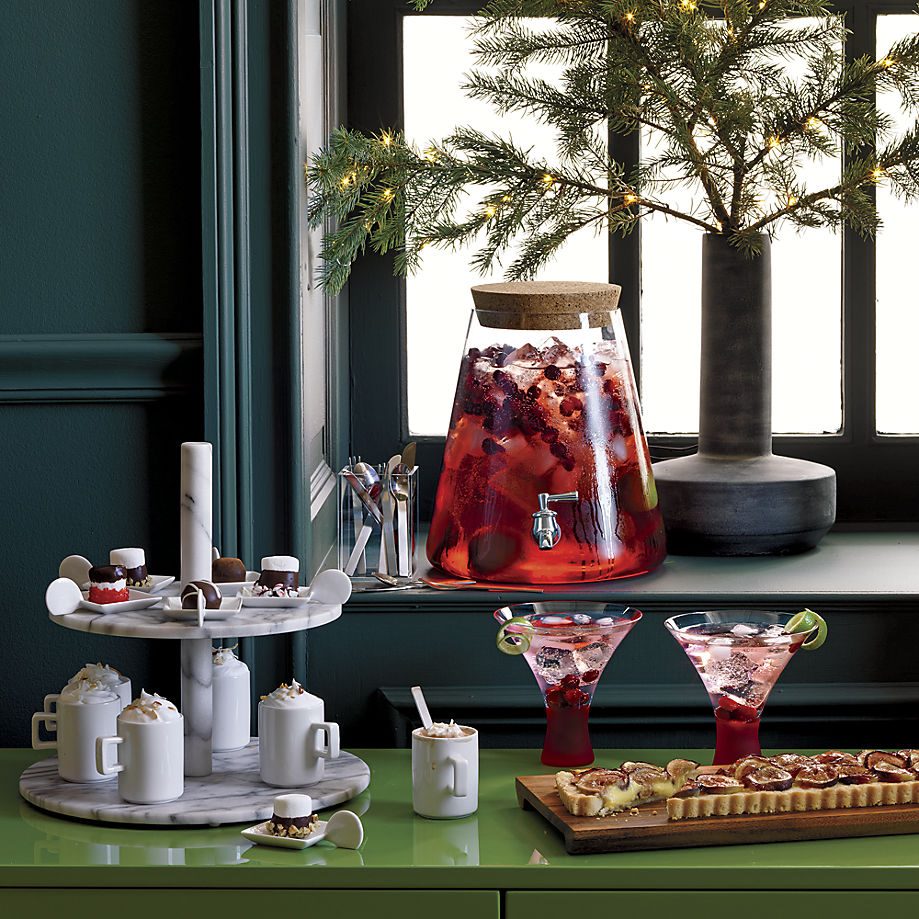
And what if you don’t have teal walls at home to offset your holiday decor? Go with a teal tablecloth! It will beautifully accent your feast while adding a joyful tone to the meal, as shown in this photo collab between Crate & Barrel and 100 Layer Cake:

Copper
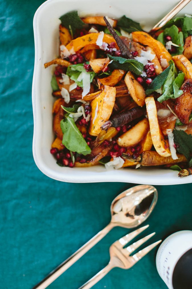
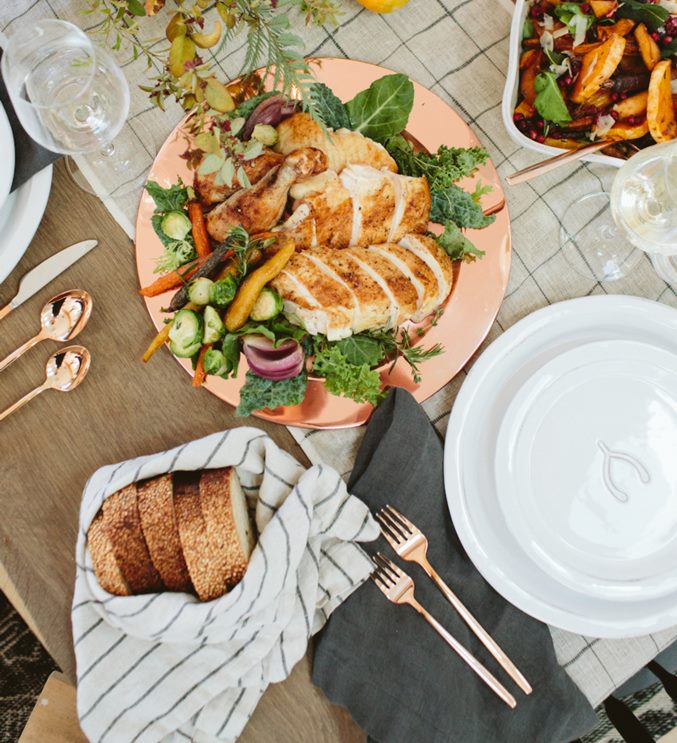
Let’s talk about copper! Metallics such as brass made their comeback years ago, but this season copper is taking center stage, especially when it comes to flatware. In another shot from the Friendsgiving collaboration between Crate & Barrel and 100 Layer Cake, we see coppery tones come alive in a set of Harper Rose Gold Flatware. A Copper Plated Charger Plate doesn’t hurt either!

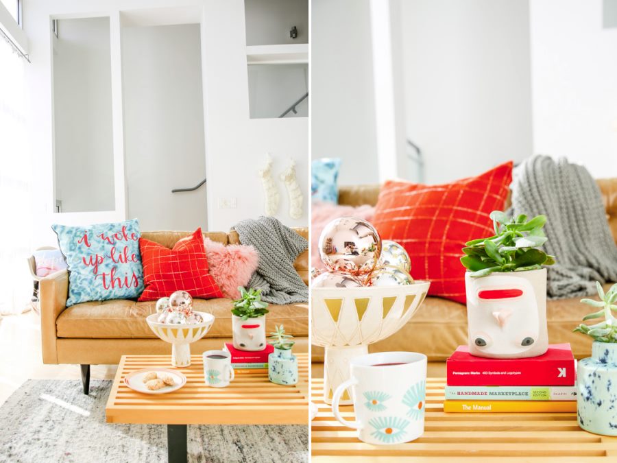
Copper obviously mixes well with other metallic tones, so don’t hesitate to display that bowl of silver, gold and copper orbs on your coffee table, as stylishly modeled in the vignette below featured at Paper & Stitch!

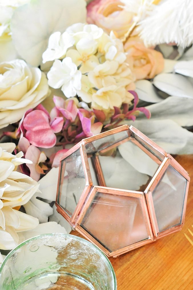
The beauty of copper is its ability to make a big impact in small doses. This tabletop from Proper features copper accents, such as the faceted sculptural votive with copper trim below:

Tell us your thoughts on this new wave of holiday colors! Did you see pink, teal and copper coming, or did they catch you off guard? Happy Holidays to you and yours!