It seems we have a DIY theme lately, and that theme is art! I’m on a mission here, and my mission is to make sure that your walls are bland no more! You can thank me later…
Let’s get going on this DIY though, which is all about perking up some potentially boring frames.

Enliven those Dull Walls
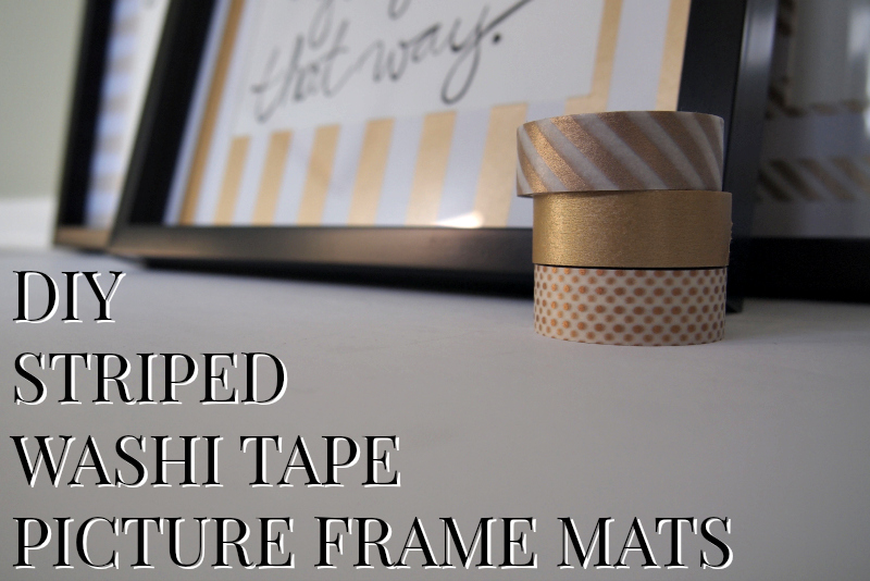
On a scale of 1 to 10, with 10 being an extremely difficult task (like building your own house), this project is like a 0.3! That’s pretty darn easy. If you think you could handle the striped storage box, you can definitely handle this! Here is what you’ll need:

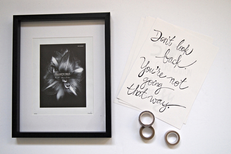
A frame, something to be framed and washi tape or any other kind of tape you think is cute enough to go on your picture frame mats. Not bad, right? Washi tape is super easy to find these days with big-box stores carrying them and small craft stores alike. Separate your mats from the frame and put the frames aside with the artwork. You won’t need them until the very end.

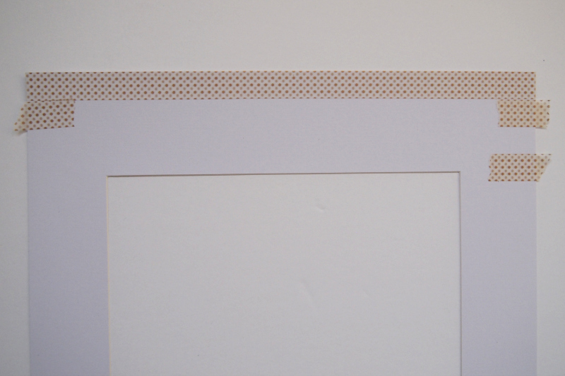
To start, you’ll need to “measure”. Why is that in quotations? Because there’s no ruler involved. I seem to have something against using them! But if it means my life is a little easier, I’ll take it!

Yes, this is exactly how I measured the space for the striped box as well. See a theme here?
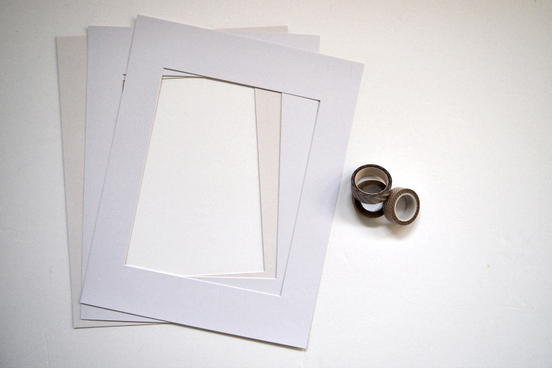
This is pretty easy to go along with, because it’s a small surface, so if you go a little crooked you’ll notice almost right away. Also, the washi tape is really easy to remove and shouldn’t do any damage to your mat if removed within a few minutes. When you finish taping your mat(s), you’ll have something like this:

Inspirational Wall Art!
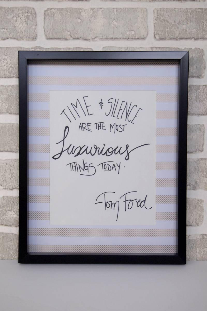
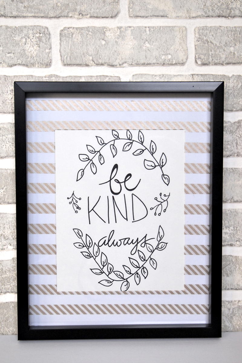
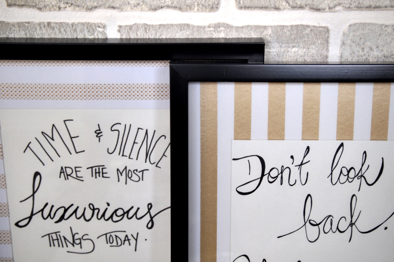
Want to see them all? Ok, you got it! Here is the first mat I completed, with a quote from Tom Ford on luxury. I framed a simple quote, because with busy mats, you want something simpler on the inside so that both things can stand out without competing with one another.

The next mat I did using a solid gold washi tape, and with stripes in the opposite direction of today’s first and third designs to give it a little variety. The golds match pretty well together, which I made sure of before I started this! The quote was a random one I saw online and liked, so I wrote it out in black pen.

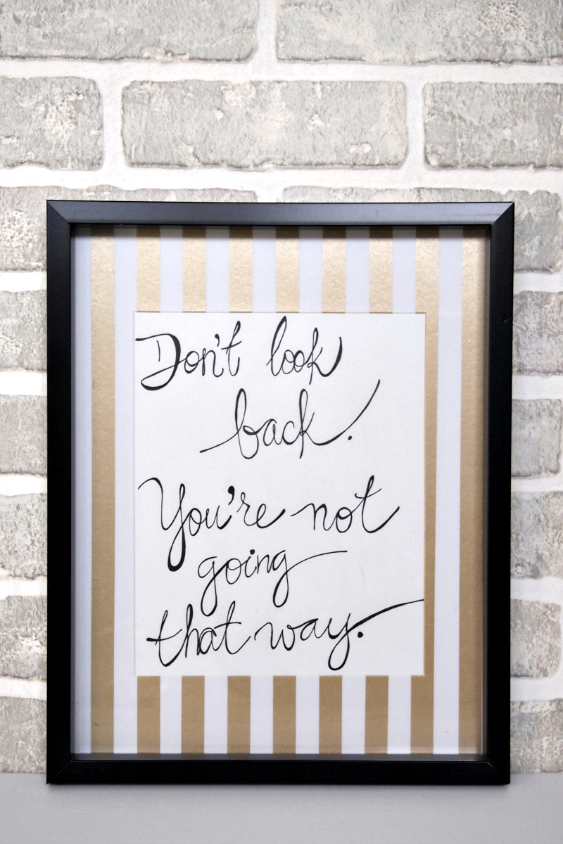
The last frame also has a pattern, but in stripes rather than dots. Although variety is the spice of life, I wanted these to look like they belonged together in a set, hence using all gold and two frames with stripes in the same direction.

Crafting A Beautiful Display
Let’s see them all together, shall we? I have to say, I love these as a coherent set. The quotes are meant to inspire, so they are also cohesive in that way, though their designs and lettering are different.


Looking at them now, I see that the first and last quotes also have a bit of a curve at the top, which I didn’t plan, but obviously it worked. You can also see that the tapes are slightly different in width and that I didn’t start the patterns in the same way for the two horizontal stripes. I meant to do that so that in case they didn’t line up perfectly, it didn’t look weird.

The creaminess of the paper doesn’t bother me because the gold is so warm. If the tape had been blue or silver, it might have looked a bit strange, but this works! Keeping it simple with a neutral palette is safe, but can also mean taking a chance like this on mixing patterns.
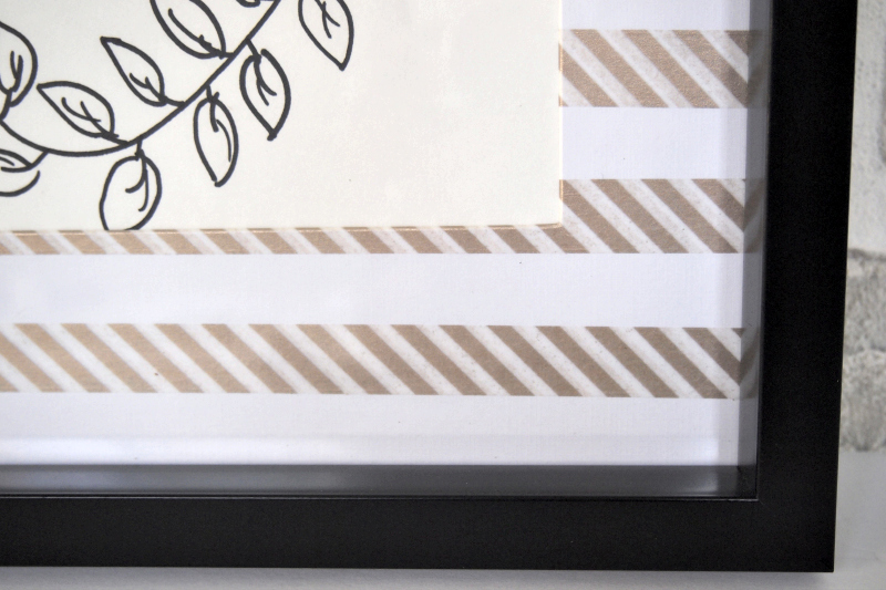
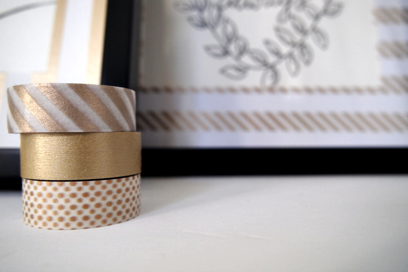
Here is a closer look at the tapes I used, which are all pretty popular if you’re ever looking for washi tape.

So are you brave enough to mix patterns, tape up your frame mats and create a little art collection of your own with some neutral colors? I say, heck yes you are!