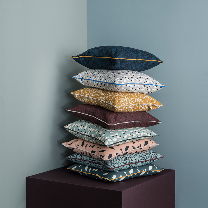
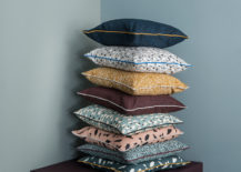
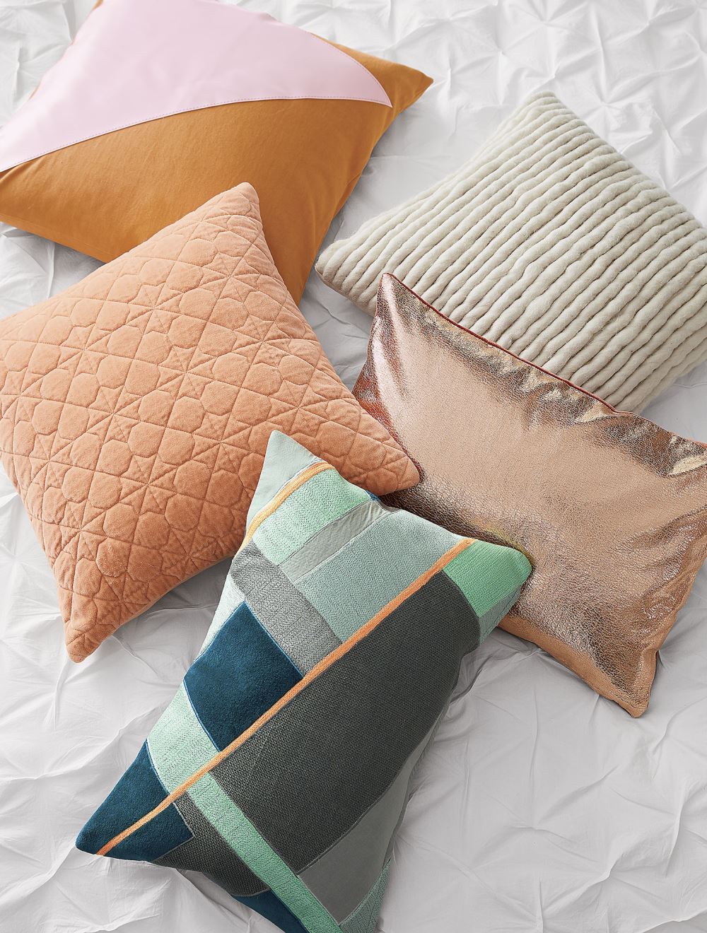
There’s nothing like planning a new color palette for a new season! Color lovers are quick to note the latest trends, including reports on the hottest hues from Pantone. While today’s featured fall colors have been moving to the forefront for awhile, the magic lies in the way they can be combined to create a fresh, unique feel. It can be hard saying goodbye to summer. Yet welcoming shades such as rust, lavender, teal, deep blue, mustard and eggplant can certainly give us something to look forward to as fall approaches! [cushions below from ferm LIVING]

Shades of Green
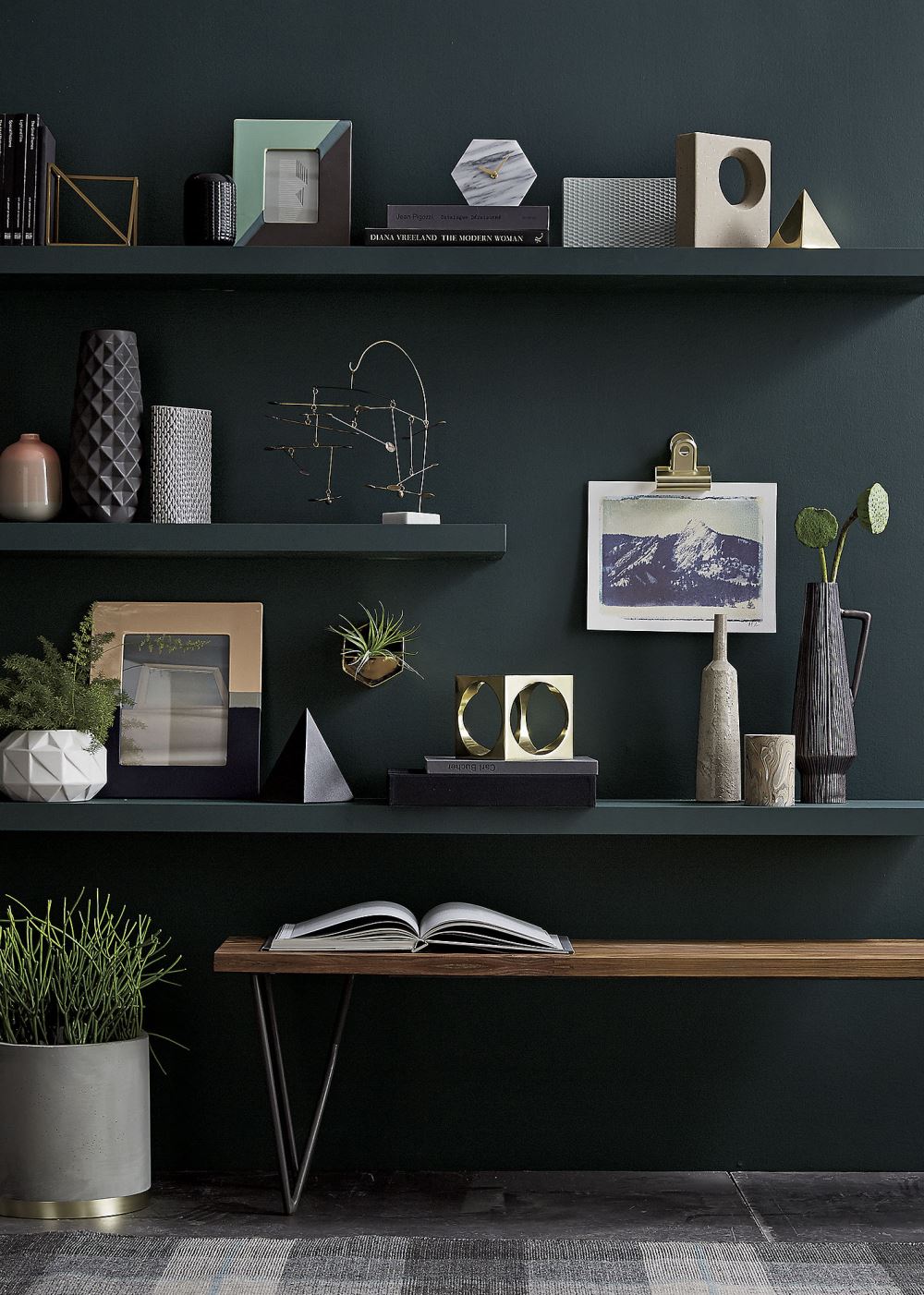
Green breathes new life into your space. While the green leaves change color and fall to the ground during autumn, we love that this verdant, lively hue is making an appearance this fall. Even a rich shade of green-grey can be the perfect backdrop to an interesting collection of objets d’art and houseplants. [photo from CB2]

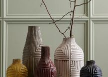
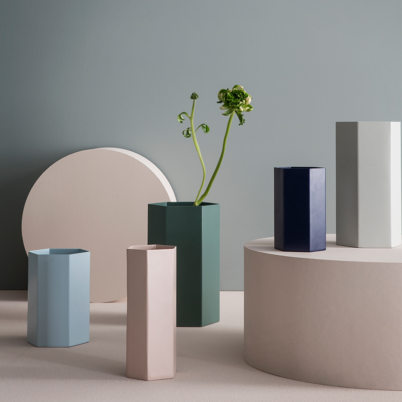
Teal is another popular choice this season. Its green-meets-blue quality makes it less like spring and more like fall! Below we see Savoy Vases in Teal and Rust from CB2. Note how beautifully the hues of these two vases complement one another:

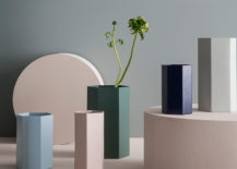
Green is also a natural fit for other popular fall hues, including blue, light pink and grey. In the next image, we see a collection of Hexagon Vases from ferm LIVING, featured in shades such as Dusty Green, Light Blue and Rose. While we’re eagerly awaiting ferm LIVING’s fall collection, we love how their spring palette forecast autumn’s hottest colors:

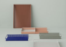
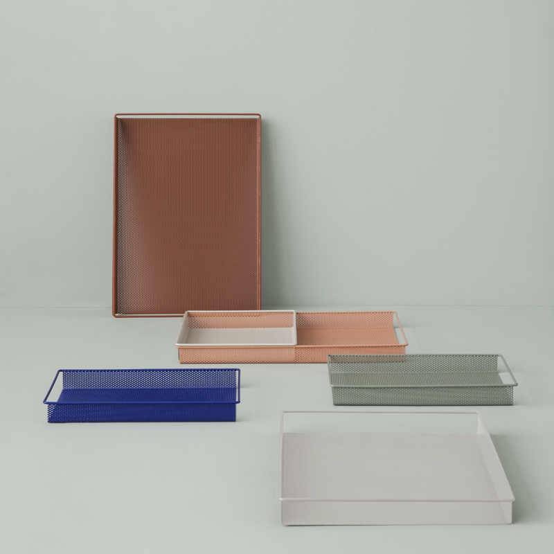
Mint is another lovely option for fall, especially if it veers into grey territory. Below we see how it can serve as an ideal backdrop for shades of rust and blue. Featured in the photo are ferm LIVING’s Metal Trays:

A Rosy Glow
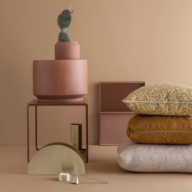
Warm tones are big this season. And why shouldn’t they be? They create a glow that mirrors the golden shades of the falling leaves outside. [photo below from ferm LIVING]

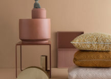
Plus, there are many rosy tones to choose from. Some sing of peach and copper, while others are unabashedly pink. Don’t forget the beauty of rosy shades when combined and contrasted with colors such as teal, mint and grey. [pillows below from CB2]

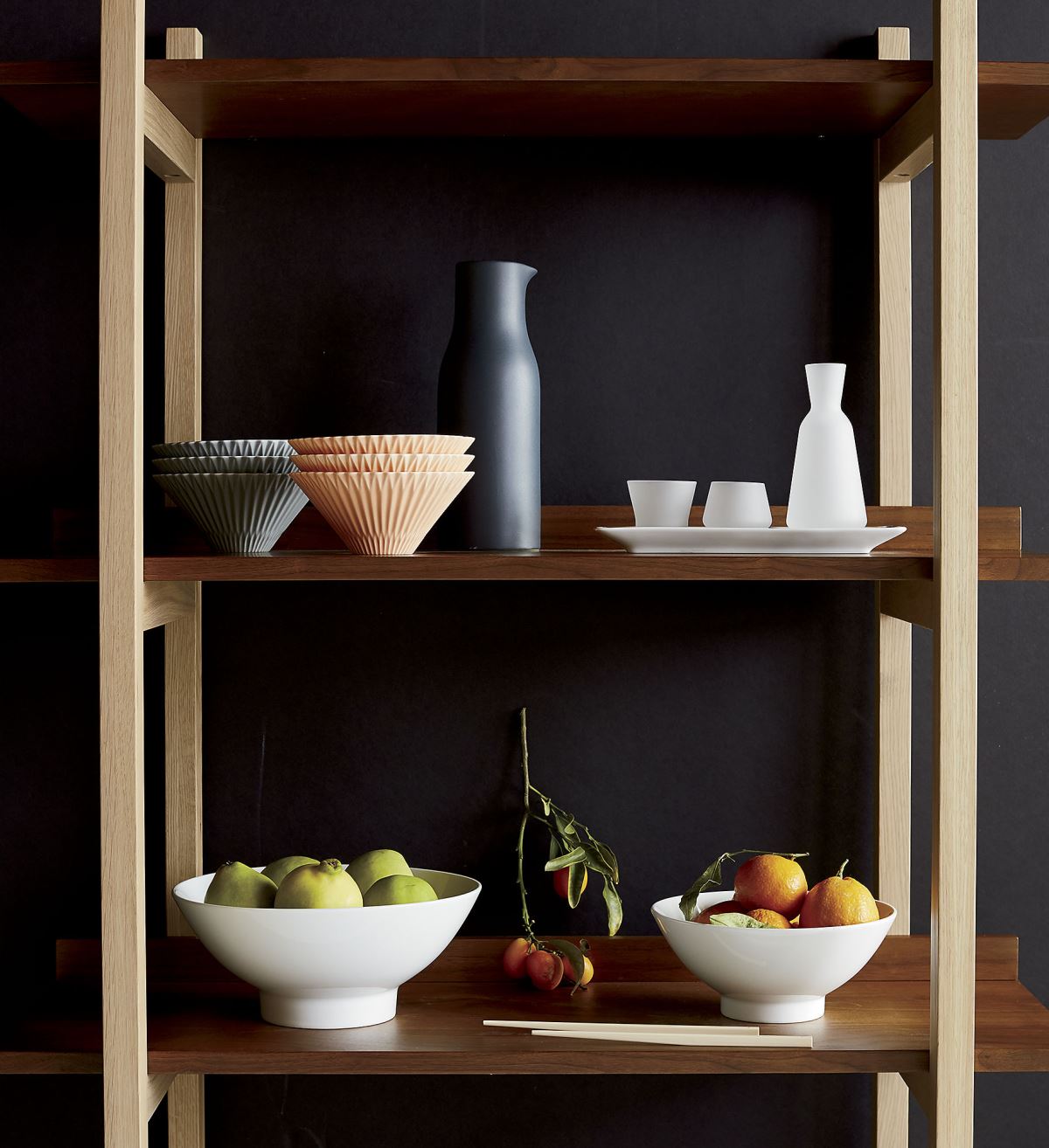
Next we see a display of Marcel Bowls in Grey and Salmon from CB2. Note how the light peach pops against the charcoal of the walls. A bowl of oranges makes another lovely addition to the vignette.

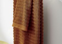
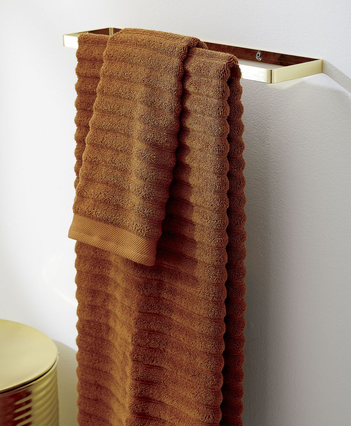
Camel is definitely one of this season’s “it” colors! Sometimes it’s light, and other times it’s saturated. These Channel Copper Cotton Bath Towels from CB2 promise cozy nights. Stylish, cozy nights!

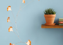
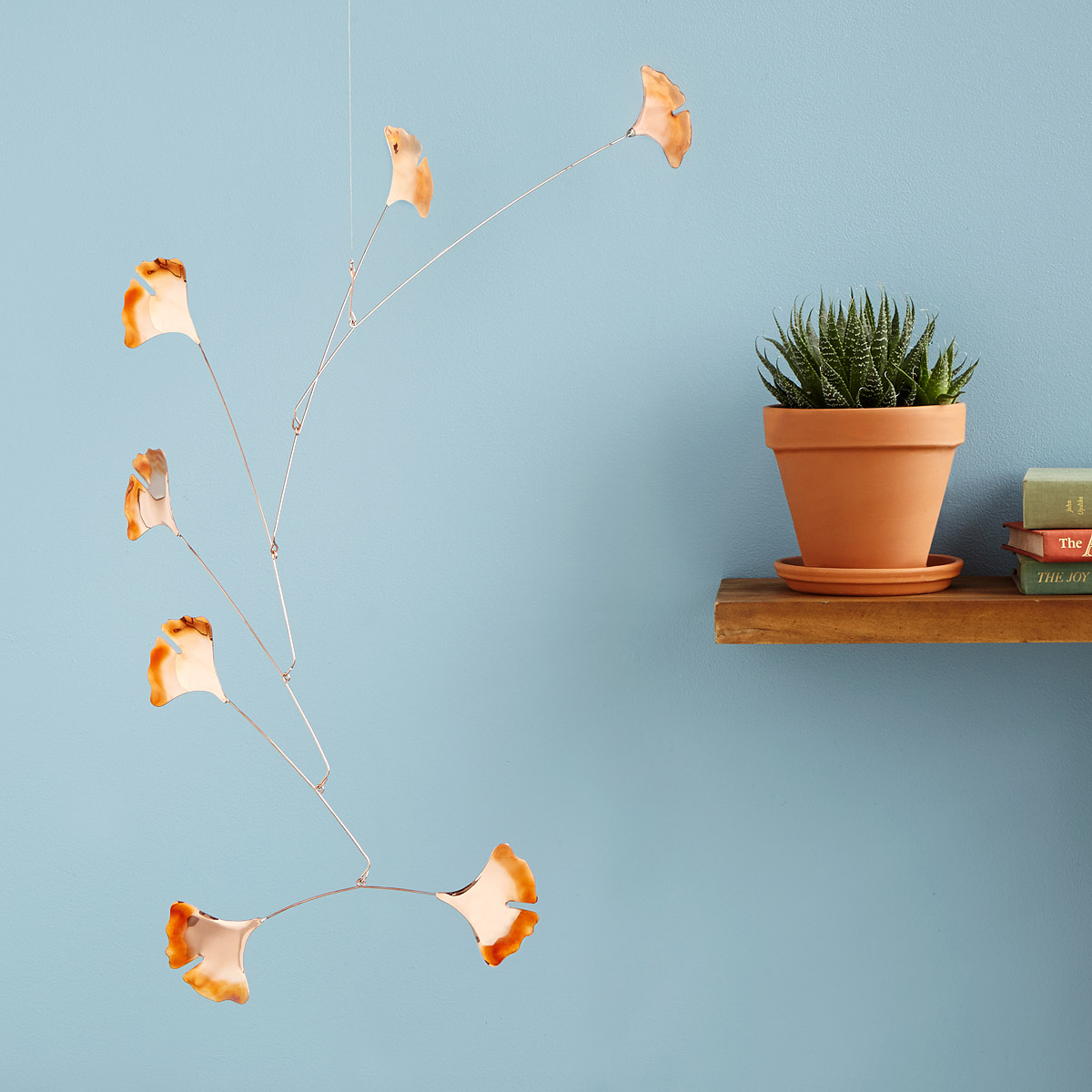
Does honoring a new fall palette mean repainting your walls? That’s not a requirement! Sometimes one powerful accent can set a special tone for the new season. In the next image, we see the Blowing Leaves Copper Mobile by Jay Jones, available through Uncommon Goods:

Rich Azure Hues
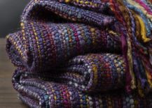
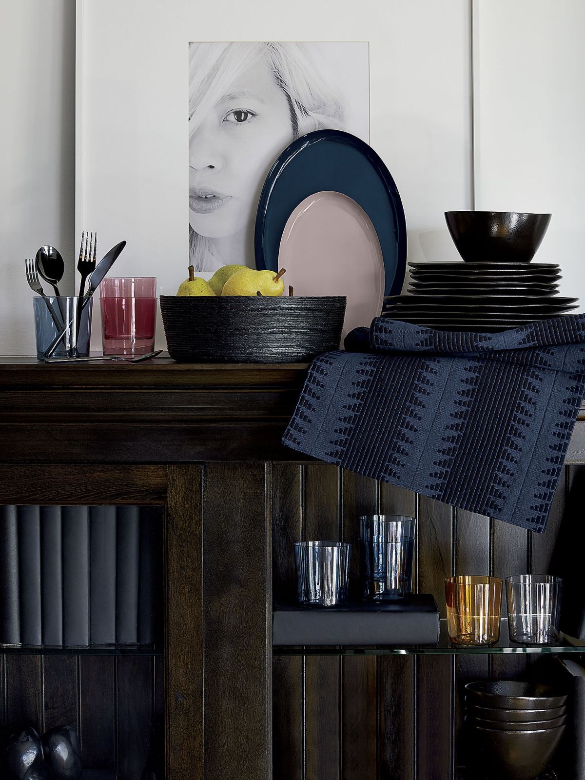
Shades of blue and violet are making a big statement this fall, and below we see a modern display of glassware and dishes, including Enamel Oval Trays in lavender and blue from CB2:

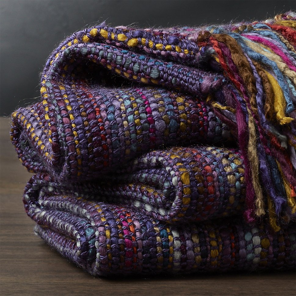
Blue and purple tones are stellar when mixed with classic fall shades such as rust and mustard. This Shelby Plum Purple Striped Throw from Crate & Barrel is ready for some fireside coziness:

Wine is another lovely color to add to this season’s palette. A natural fit with purple and blue, it can also add a festive preview of holiday cheer! [rich fall palette from Crate & Barrel]

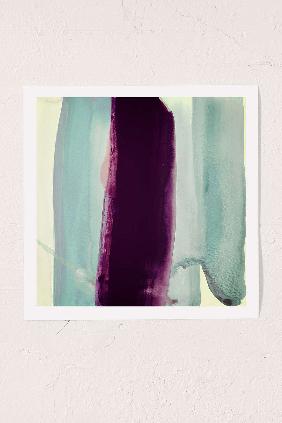
Shades of eggplant and magenta pair beautifully with mint, as shown by this Nell Bernegger Behind Art Print from Urban Outfitters:

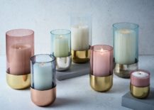
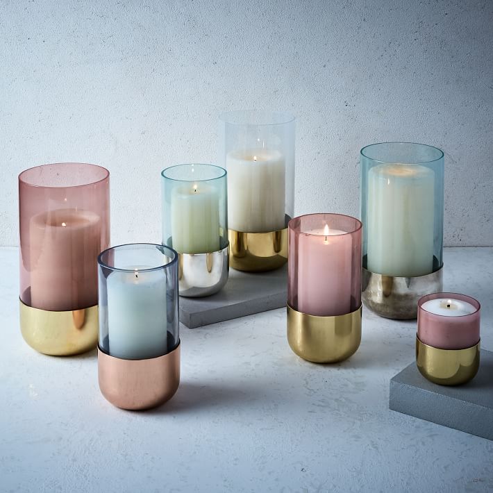
Blue and eggplant tones can also veer into pastel territory when translucent glassware is involved. Throw in some silver, copper and brass accents for a shiny, refreshing take on decadent fall style. [Metallic + Pastel Glass Candleholders from West Elm]

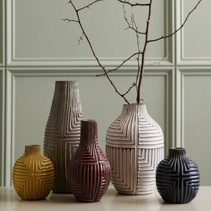
These Linework Vases from West Elm combine texture and color for an intriguing autumn grouping. Note the vase in Fig, shown at the center. Branches are the perfect addition to these rustic-modern pieces:

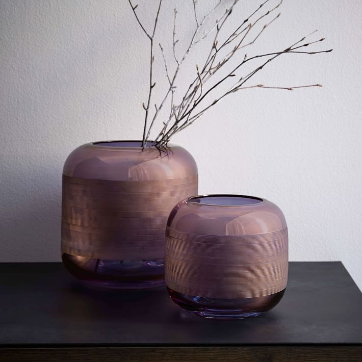
When the purple tones incorporate a hint of taupe, you have to take a second look! These Linework Glass Vases are part of the West Elm Collection:

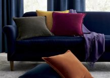
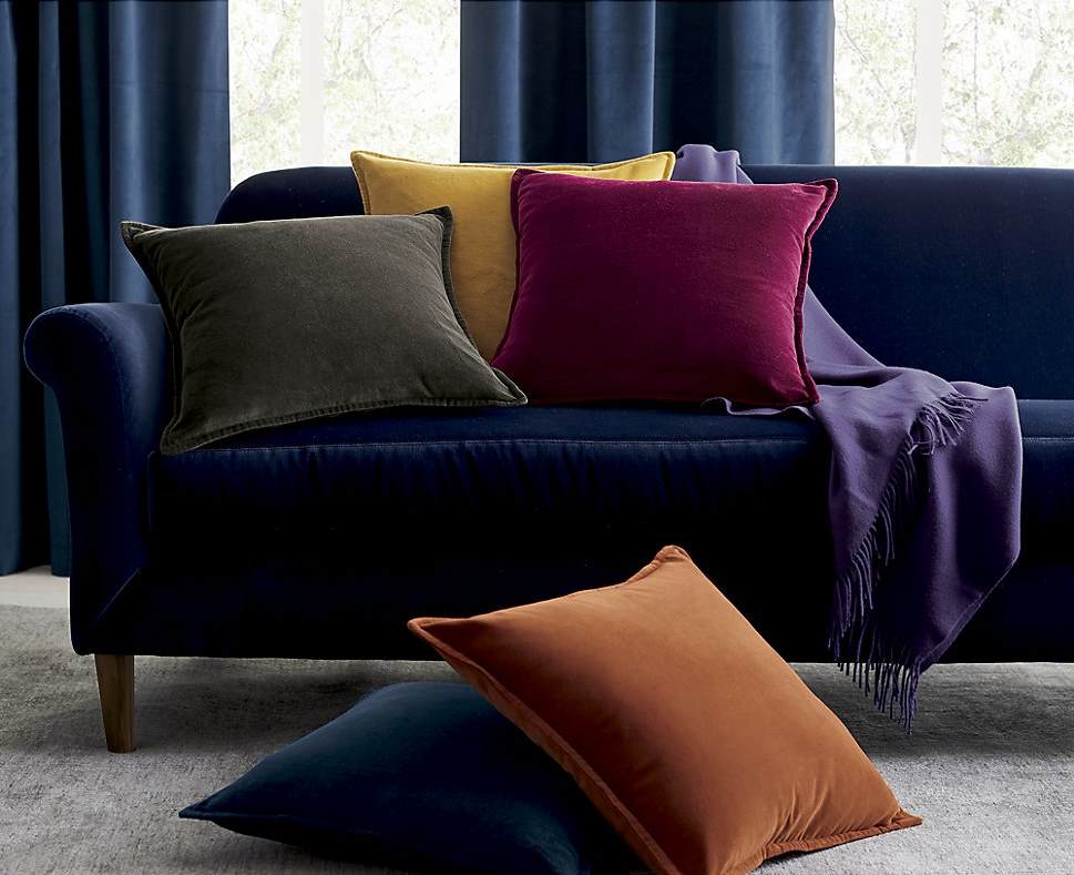
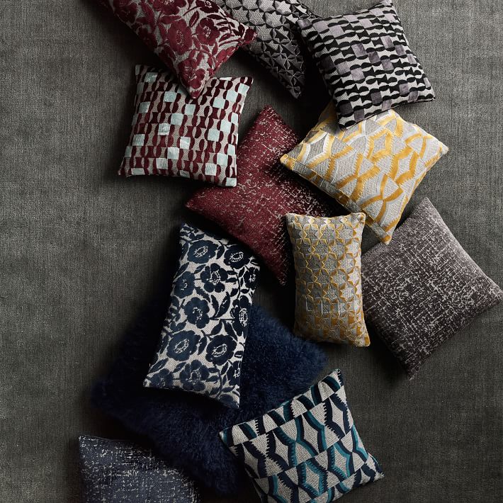
In a grouping of pillows from West Elm, we see how burgundy naturally fits with grey and midnight blue. Throw in a bit of mustard, and you have a luxurious look:

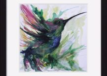
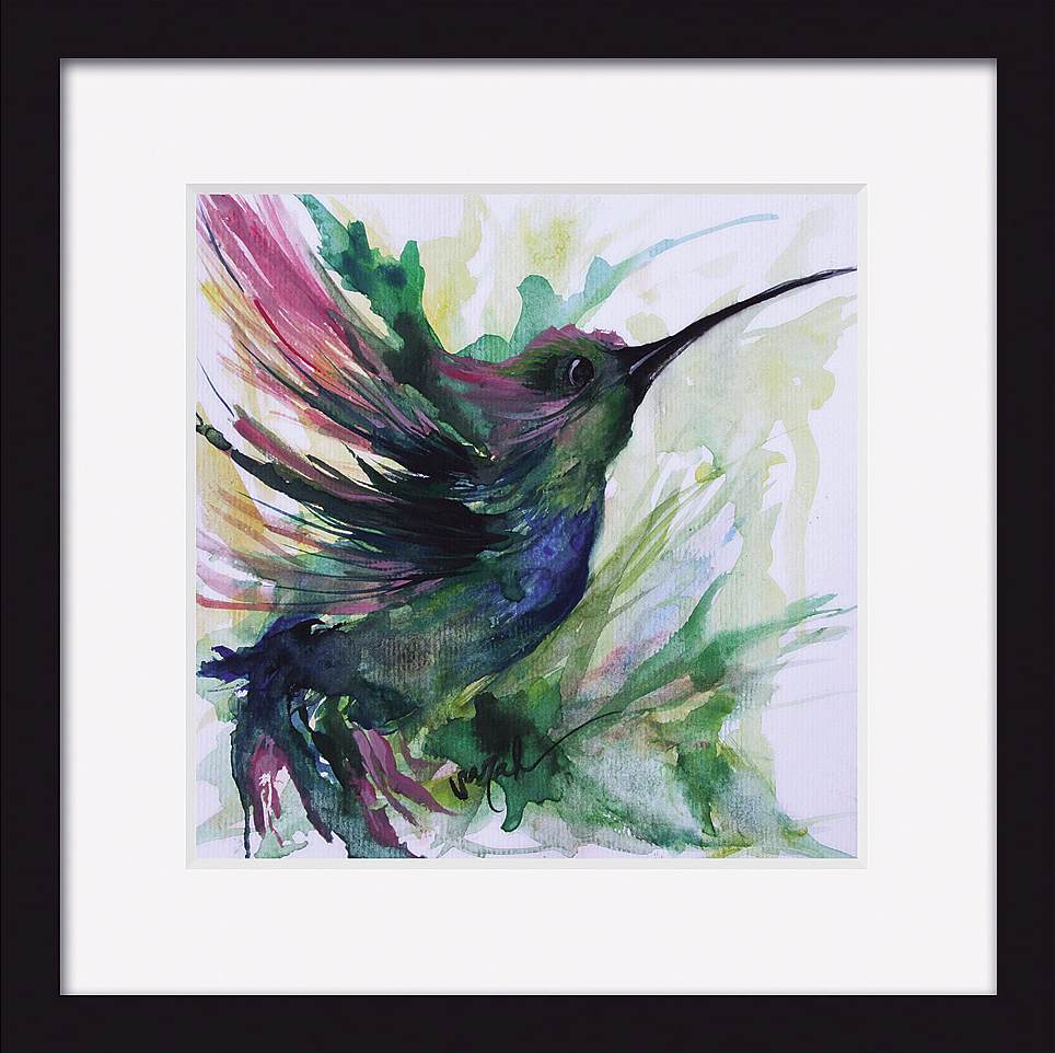
Don’t forget that emerald green can add another rich element to the fall palette, creating a jewel-toned range of vibrant hues. The artwork below is First Light by Sarah Janece Garcia, available at Uncommon Goods:

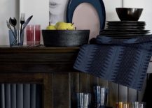
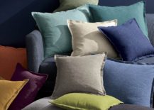
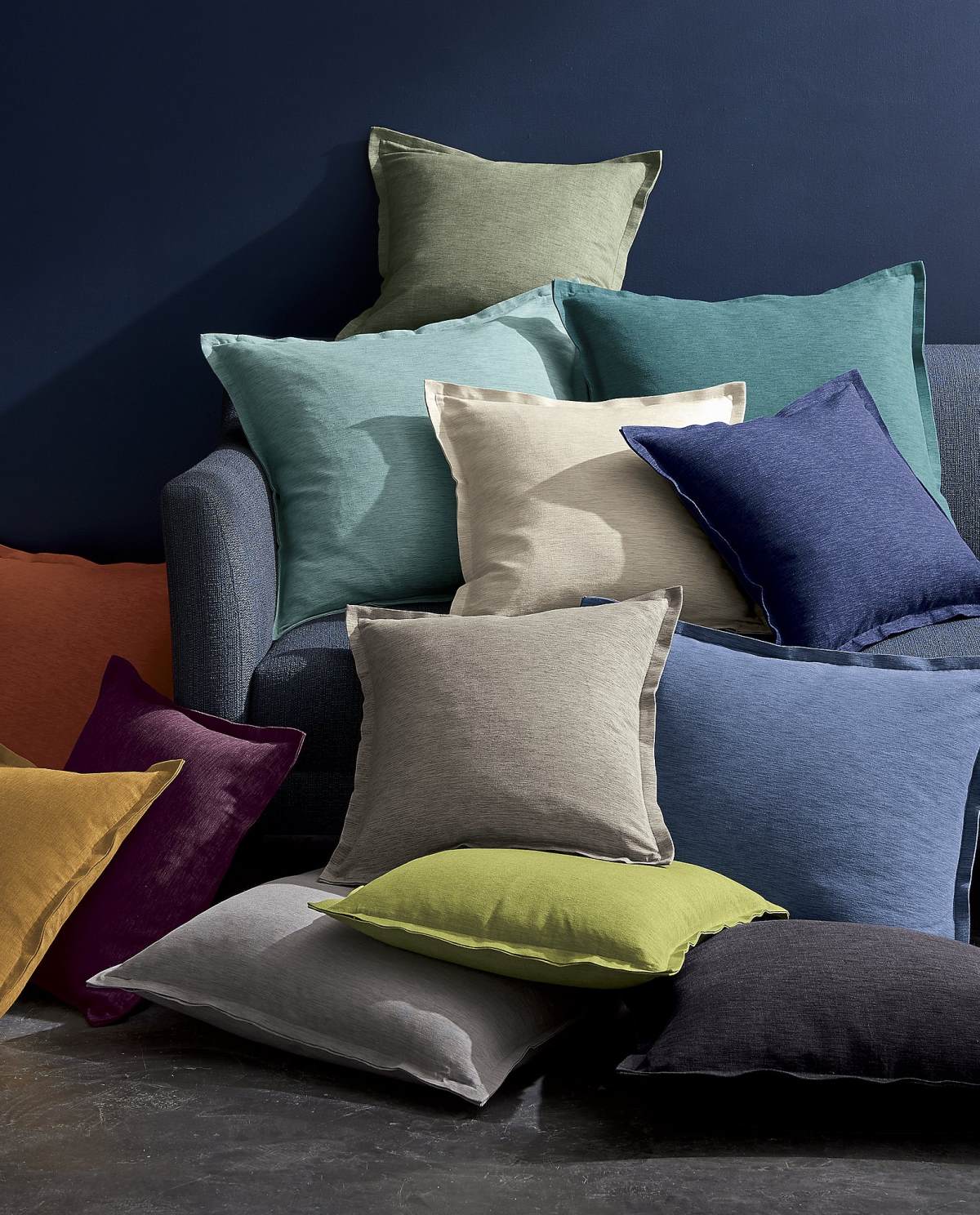
If you’re looking for a powerful paint color that will make your fall decor pop, try midnight or navy blue. Everything seems to stand out against this elegant hue, including green shades and warm tones. [pillows from Crate & Barrel]

Have fun planning your fall palette!…